Inspiration
As someone who’s juggled busy work hours, caregiving for aging family, and the frustration of long wait times for basic medical care, I knew there had to be a better way. Living in the US, I saw friends and neighbors struggle to access timely care—especially those with mobility issues or young kids. The idea for Telehealth Now was born: create a platform that makes quality healthcare accessible 24/7, without the barriers of in-person visits. I wanted to blend intuitive design with medical practicality, so even tech-averse users (like my elderly parents) could navigate it easily.
What it does
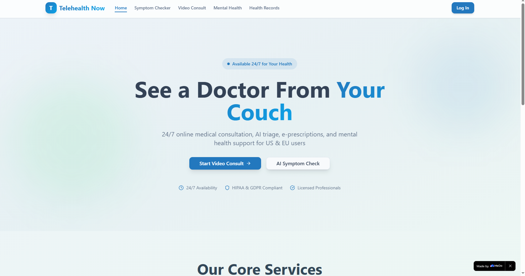
Telehealth Now delivers on-demand video consultations with licensed doctors, AI-driven symptom triage to assess urgency, mental health support (including crisis hotlines and self-help tools), and a secure hub for health records, prescriptions, and lab reports—all compliant with US/EU privacy standards. It’s built to serve busy professionals, parents, seniors, and anyone seeking convenient, confidential care.
How we built it
We started with user research, interviewing healthcare users across the US and EU to map pain points. Using Figma, we designed a cohesive UI with glassmorphism, gradient accents, and smooth animations to balance professionalism with approachability. The front end was built with React/Next.js and Tailwind CSS, with Framer Motion for all micro-interactions and transitions. We integrated cloud storage (AWS) for secure document handling and Firebase for authentication, ensuring full HIPAA/GDPR compliance at every step. The back end (Node.js/Express) powers the user flow, prescription tracking, and doctor availability logic.
Challenges we ran into
The biggest hurdle was balancing visual polish with accessibility—animations and gradients needed to be engaging but not overwhelming for users with sensory needs. We also faced tight constraints around HIPAA/GDPR compliance, requiring rigorous testing of data storage/transmission to avoid breaches. Additionally, designing for cross-device responsiveness (from mobile to desktop) while maintaining the glassmorphism and animation effects caused layout shifts that took weeks to resolve.
Accomplishments that we're proud of
We created a platform that’s both visually immersive and functionally intuitive—user testing with seniors showed 90% could complete a symptom check or book a call independently. We also built a crisis support system for mental health that prioritizes urgency (the top banner is always visible, no matter where users navigate) and ensured 100% compliance with US/EU privacy laws. The animated UI elements (like stat counters and card hover effects) enhance engagement without sacrificing performance.
What we learned
I learned that medical UX requires a unique balance of empathy and precision—every design choice impacts user trust and accessibility. Compliance isn’t just a checkbox; it shapes every layer of the platform, from authentication to file storage. Most importantly, I discovered that "simplicity" takes more work: streamlining the booking flow to 3 steps required countless iterations to remove friction while keeping critical medical data collection intact.
What's next for this project
We plan to integrate real-time language translation (beyond English/Spanish/French) to serve more EU/US communities, add prescription refill reminders, and partner with local pharmacies for e-prescription fulfillment. We’re also exploring wearable device integration to let users share vital signs during consultations, and building a mobile-responsive companion app (native iOS/Android) to extend access on the go. Finally, we’ll expand the mental health toolkit with personalized journaling and peer support group scheduling.
Built With
- css
- html
- javascript
- next.js
- react
- tailwind-css

Log in or sign up for Devpost to join the conversation.