-
-

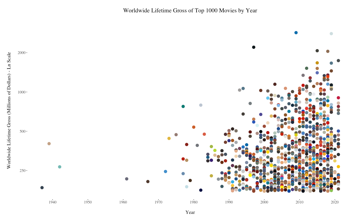
Worldwide Lifetime Gross of Top 1000 Movies by Year
-

Worldwide Lifetime Gross of Biography Movies by Year
-

Worldwide Lifetime Gross of Top 1000 Movies by Year, Extended Data
-

Worldwide Lifetime Gross of Animated Movies by Year
-

Worldwide Lifetime Gross of Action Movies by Year
-

Worldwide Lifetime Gross of Top 1000 Movies by Runtime
-

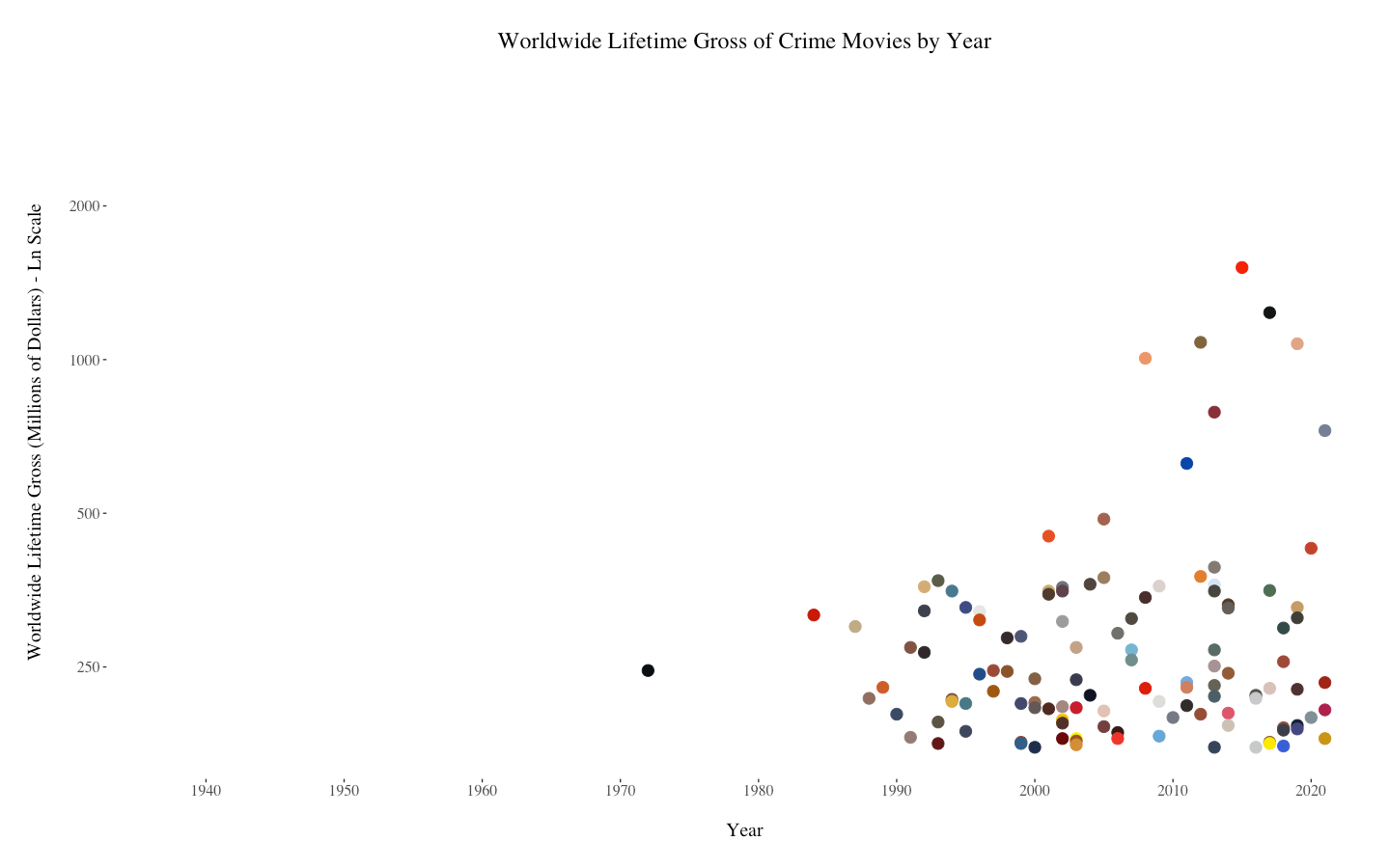
Worldwide Lifetime Gross of Crime Movies by Year
-

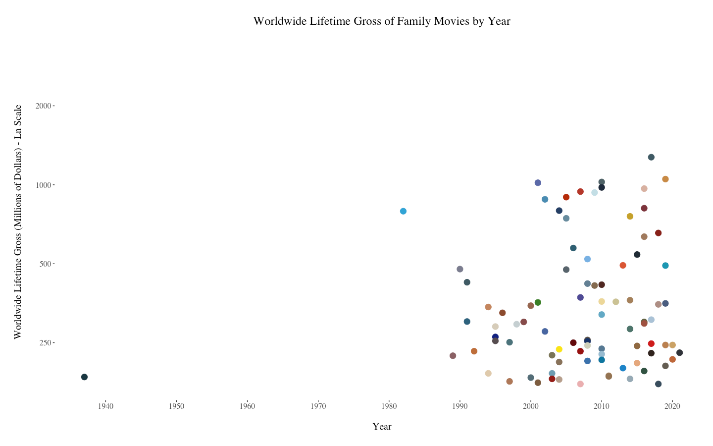
Worldwide Lifetime Gross of Family Movies by Year
-

Worldwide Lifetime Gross of Fantasy Movies by Year
-

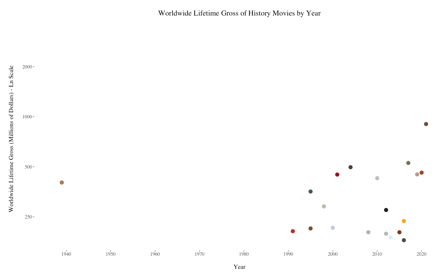
Worldwide Lifetime Gross of History Movies by Year
-

Worldwide Lifetime Gross of Adventure Movies by Year
-

Worldwide Lifetime Gross of Comedy Movies by Year
-

Worldwide Lifetime Gross of Horror Movies by Year
-

Worldwide Lifetime Gross of Drama Movies by Year
-

Worldwide Lifetime Gross of Musical Movies by Year
-

Worldwide Lifetime Gross of Music Movies by Year
-

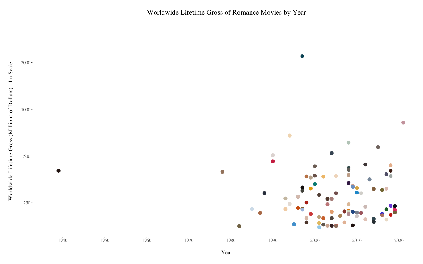
Worldwide Lifetime Gross of Romance Movies by Year
-

Worldwide Lifetime Gross of Sci-Fi Movies by Year
-

Worldwide Lifetime Gross of Mystery Movies by Year
-

Worldwide Lifetime Gross of Thriller Movies by Year


Inspiration
On its list of the top 1000 grossing movies, IMDb includes the movie poster of each movie. This formatting made me wonder how those posters vary by genre of movie. It's common sense that certain genres will feature certain color schemes (for example, dark colors for genres like Crime, Sci-Fi, Horror, and Thriller and bright colors for genres like Comedy, Animation, and Family). Additionally, Internet articles and videos like https://youtu.be/BEbW2fXSShc narrow down these color strategies even more. I wanted to see if this was an actual, universal pattern, or if people were oversimplifying the strategies and seeing patterns where there weren't any.
What it does / How we built it
The Python code created during this hack web scrapes IMDb's list of the top 1000 grossing movies and outputs a CSV file. Then, the R file outputs 20 graphs - one that showcases all 1000 movies and the dominant color of their movie poster sorted by year, 17 that divides the movies by genre, one that showcases all 1000 movies sorted by runtime, and one that adds rating and audience content rating as variables.
Challenges we ran into
"Dominant color" was one of the biggest challenges I faced. Going with the average color means that posters with more than a couple of colors create brown, but going with the most dominant color means that about half of the posters have black as the color displayed on the graph, which didn't look very nice. I decided the find the three most dominant colors and look for the "brightest" (the R, G, and B values are furthest apart). Logically, that's probably the color the eye is most drawn to first on a movie poster. It's not a perfect metric by any means, but I was satisfied with the results. I also had some issues with R, since it's been a while since I used it and I would classify myself as a beginner at it. Using the color codes from the csv file as the colors of the points gave me some issues, and the x and y axis scaling gave me some last-minute headaches.
Accomplishments that we're proud of
I created 20 graphs (technically four unique sections of code, with one being repeated 17 times for the 17 genres), which was pretty exciting. I'm also proud of being able to create a neat csv file that required minimal tweaking in R. Finally, this was my first time using web scraping, so I'm proud of my ability to retrieve the necessary HTML and cut it down to the necessary information.
What we learned
As I stated before, this was my first time trying my hand at web scraping, so now I'm definitely more familiar with how it works. Also, the average vs dominant color issue was completely new to me, and I learned a few things about programming based on images while debugging that section of code. Finally, I learned a couple of new commands in R, especially when trying to use the color codes from the csv file as the colors of the points.
What's next for Technicolor Trends
If I had more time, I would have put the graphs and analysis on a website instead of in a PowerPoint, so in the future I might create a simple webpage displaying the graphs.


Log in or sign up for Devpost to join the conversation.