-
-

Free & Reduced Lunch Program Application
-

Get ready
-

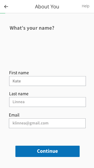
About You
-

Children's Income
-

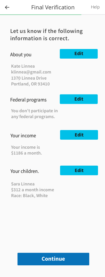
Final Verification
-

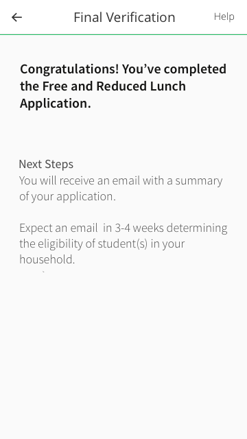
Finished!
-

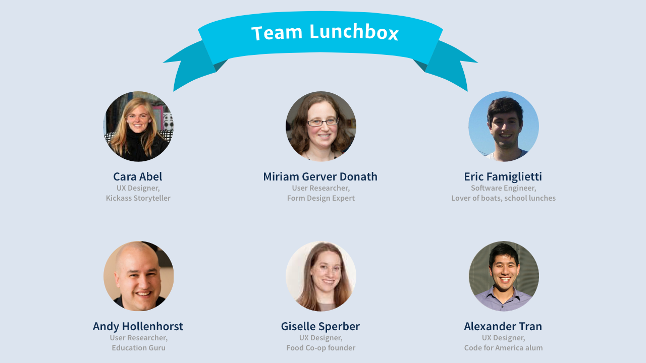
Team Lunchbox


Inspiration
Team member Alex Tran received free and reduced lunch as a young student. Although he was lucky to always had what he needed to do well as a student, he saw firsthand how important it was to have good nutrition to learn.
We on Team Lunchbox want to make it easier for all people who could qualify for free and reduced lunch to apply for the the program in a way that’s simple and not intimidating so that their kids have the best opportunity to learn.
What it does
Team Lunchbox’s Free and Reduced Lunch Program application uses modern form logic, user experience best practices, and a clean design aesthetic to provide users a way to apply for free and reduced lunch wherever they are - whether their primary Internet enabled device is a smartphone (for many, the only way to connect to the Internet) or a desktop computer, all should be able to easily fill out this application.
We adhered to 5 design principles fueled by our background research, user interviews, and user testing, including: mobile first design, contextual help with progressive disclosure, simple language at an 8th grade reading level, personalized flow through form logic, and consistent UI standards.
We know the impact of our application could be improved further by things like localization to different languages, so we’ve outlined further directions for our application to take after this initial sprint.
How we built it
As user experience professionals, we did extensive benchmarking research with the current paper application, user interviews, user testing, a content audit, and information architecture audit. We iterated through paper prototypes, hi-fidelity mockups, and ultimately our coded solution to increase the usability of our product.
The app is built with HTML, CSS, JS, and PHP on Bootstrap and hosted on Github.
Challenges we ran into
We were challenged by not having access to the target population to do user research with. So we did the next best thing - we performed web research to find forums where users were talking about their experiences (this is documented in our presentation.) There we found the frustrations and challenges users had navigating to find the case numbers they needed to fill out the form. We also conducted user research and testing with as many people as possible to remove further usability issues.
Accomplishments that we're proud of
We’re very proud of our user-centered design approach which informed our decision to build this as a mobile-responsive web application. Research shows that those under the poverty line depend 14x as much on their smartphones for critical services than those above the poverty line. Therefore, in our minds, it is critical that the application be delivered as a mobile-responsive solution.
What we learned
We learned that applying for free and reduced lunch can be a very stressful and intimidating process, which becomes a big blocker for completion.
We also learned while prototyping about how much this application has similar data sets to other applications, and how much opportunity there is for an API or other platform to share data across applications for different programs.
What's next for Team Lunchbox - School Lunch Mobile-Responsive Web App
We’d love to share our application with the wider community to get feedback. In our design we worked to include elements of the US Web Design Standards and would like their feedback on our implementation of them. And if we’re so honored, we’d love our work to inform how the free and reduced lunch application is deployed in the future!
Built With
- bootstrap
- css
- html
- javascript
- php
- us-web-design-standards


Log in or sign up for Devpost to join the conversation.