-
-
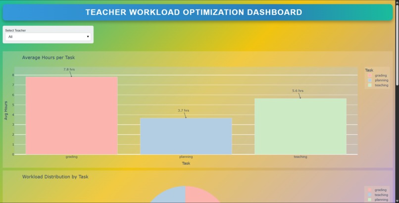
Dashboard Screenshot

✨ Inspiration As we delved into conversations with educators, one recurring theme stood out: teachers are overwhelmed—not by teaching, but by everything else. From administrative work to grading and planning, non-teaching tasks were consuming over 30 hours a week. With teacher burnout reaching alarming levels, we wanted to build something that would genuinely support the well-being of those shaping future generations.
🚀 What it does TeachEase is a smart workload optimization dashboard designed to reduce teacher stress and improve time management. Built with a powerful Python backend and visualized using Plotly, the dashboard:
Analyzes task distribution by subject, grade, and category
Provides AI-driven real-time suggestions for prioritizing work
Delivers clean, interactive visualizations to help teachers gain clarity over their schedules
Aims to save 3–5 hours per week through intelligent workload balancing
🛠️ How we built it Backend: Python for data handling, task mapping, and AI logic
Frontend & Visualization: Plotly for dynamic charts and UI components
Features: Filtering by subject/grade, smart prioritization tips, intuitive dashboards
Tools: Pandas, Plotly, Streamlit (optional for deployment), and Excel for sample datasets
We designed our system with scalability in mind, ensuring that schools of any size could adopt it seamlessly.
🧱 Challenges we ran into Building a meaningful AI suggestion model without complex datasets
Designing a UI that's simple enough for non-technical users yet rich in insights
Optimizing performance for real-time filtering and chart rendering
Crafting a solution that works offline and on limited infrastructure (for budget-constrained schools)
🏆 Accomplishments that we're proud of Developed a fully functional dashboard from scratch
Integrated real-time smart task suggestions
Created a clean, user-friendly interface that can be understood by any educator
Designed a project that could immediately impact teacher well-being
Completed a full presentation, use-case persona, and impact analysis within the hackathon timeline
📚 What we learned How to align technical tools (like Plotly, Python) to solve human problems
The importance of empathetic design—building with the user’s emotions and daily workflow in mind
Strategies for simplifying data visualizations to be meaningful without being overwhelming
How impactful even a small tech intervention can be in education
🔮 What's next for TeachEase – Teacher Workload Optimization Dashboard Live deployment via Streamlit or Render with sandbox demo
User testing with real teachers and feedback collection
Integration with LMS systems (Google Classroom, Moodle, etc.)
Mobile version to enable task tracking on-the-go
Predictive features to forecast workload spikes and suggest proactive adjustments
Built With
- csv
- jupyter
- pandas
- panel
- plotly
- powerpoint
- python

Log in or sign up for Devpost to join the conversation.