TD Hospital Exploration
Solution Steps: Analyze and clean data to allow input into PCA graphing method Compare different patient values with scatterplots to determine relevancy Run data through machine learning code to predict survivability
Analyzing the data & Cleaning the Data
Just by looking over the data, we immediately noticed many columns of patient attributes that were irrelevant to analysis. Columns dose, psych3, and pdeath were immediately eliminated due to the data being completely identical and unchanging.
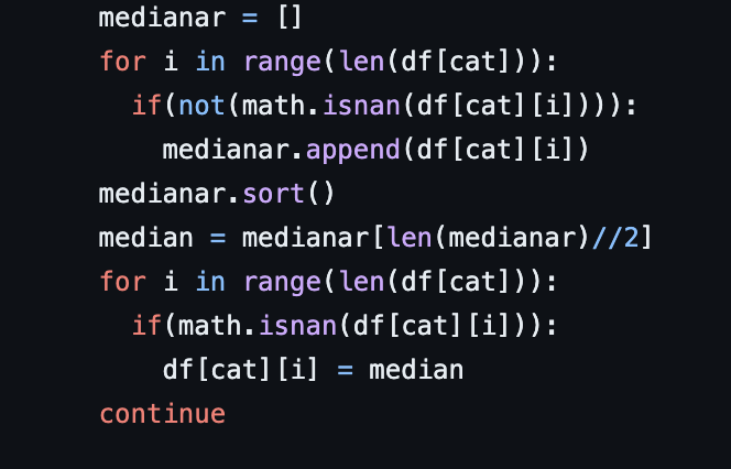
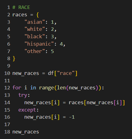
Our plan was to conserve as much data as possible while also keeping accuracy. We wrote a function to sort through the missing gaps in the data and fill it with the median of the other filled data cells. We chose the median to eliminate outliers in the data (outliers affect mean much more than median) and also to fill missing data cells with similar values. Then, we added code to convert all strings (data that was not numerical) into integers.
Thus, our data was sorted in numerical form which made it easy to input into graphs/charts.
Testing the Data
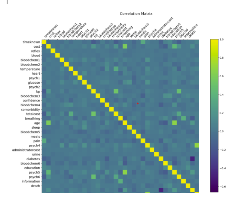
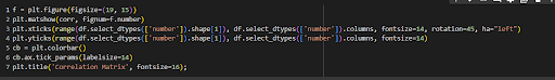
To test the data, we created a correlation matrix to show the different correlations between all the values. Our focus was on the relations between death and other values, which is shown in the last row and column of the correlation matrix. Below is the matrix with the code under.
To further test the data, we used a PCA model that compared two patient attributes by x and y, respectively, and then added a third criteria of death, which we measured by color(red and blue).
 Then we wrote a function that ran cleaned data(by column) through the PCA model and then compared columns to each other. Some of the clear examples of data variance included timeknown and blood pressure.
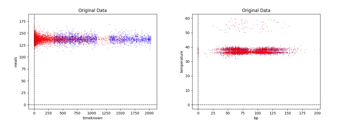 The above data shows that the datasets timeknown (days) and bp (blood pressure) have large variance which is shown by a large spread. As shown in the first graph, people who died (red) were concentrated close to the y-axis, which proves that the shorter the time known, the more patients died. In both the graphs, the variance is great, which is shown by bar charts below.
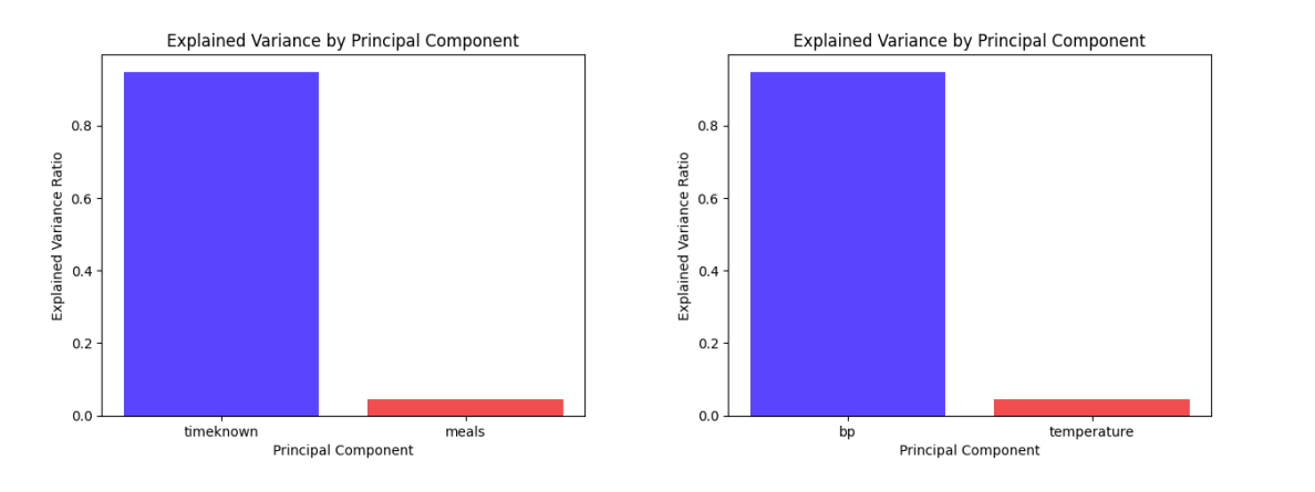 This shows that the data is very relevant because it shows that different values produce drastically different results, which is the kind of data that proves correlation.
Based on the values of the matrix correlation, which we reinforced with PCA variation graphing, we were able to eliminate additional columns: reflex, sex, blood, psych1, confidence, pain, breathing, sleep. This left us with our final data set which we put into our AI learning code. Overall, our process of cleaning the data and sorting it through visually is very effective because little data goes missing and when determining useful data, we tested it through two different parameters.
This shows that the data is very relevant because it shows that different values produce drastically different results, which is the kind of data that proves correlation.
Based on the values of the matrix correlation, which we reinforced with PCA variation graphing, we were able to eliminate additional columns: reflex, sex, blood, psych1, confidence, pain, breathing, sleep. This left us with our final data set which we put into our AI learning code. Overall, our process of cleaning the data and sorting it through visually is very effective because little data goes missing and when determining useful data, we tested it through two different parameters.


Log in or sign up for Devpost to join the conversation.