Inspiration
Urban heat is not evenly distributed—some neighborhoods experience significantly higher temperatures than others, often overlapping with lower-income communities. We wanted to build a tool that helps cities answer a simple but important question: where should we plant trees to reduce heat exposure for the most people?
What it does
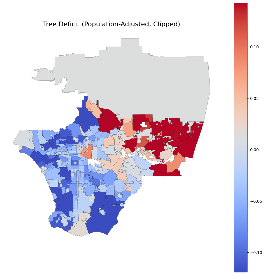
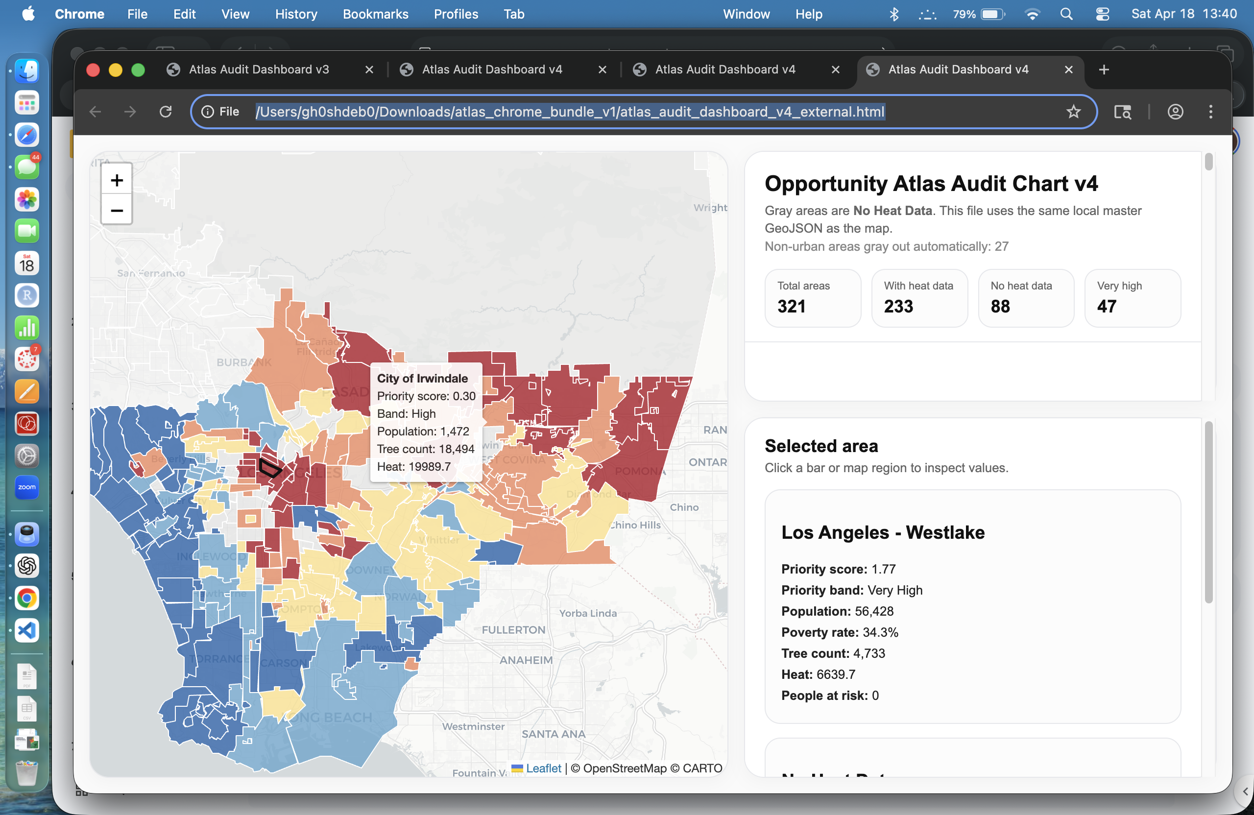
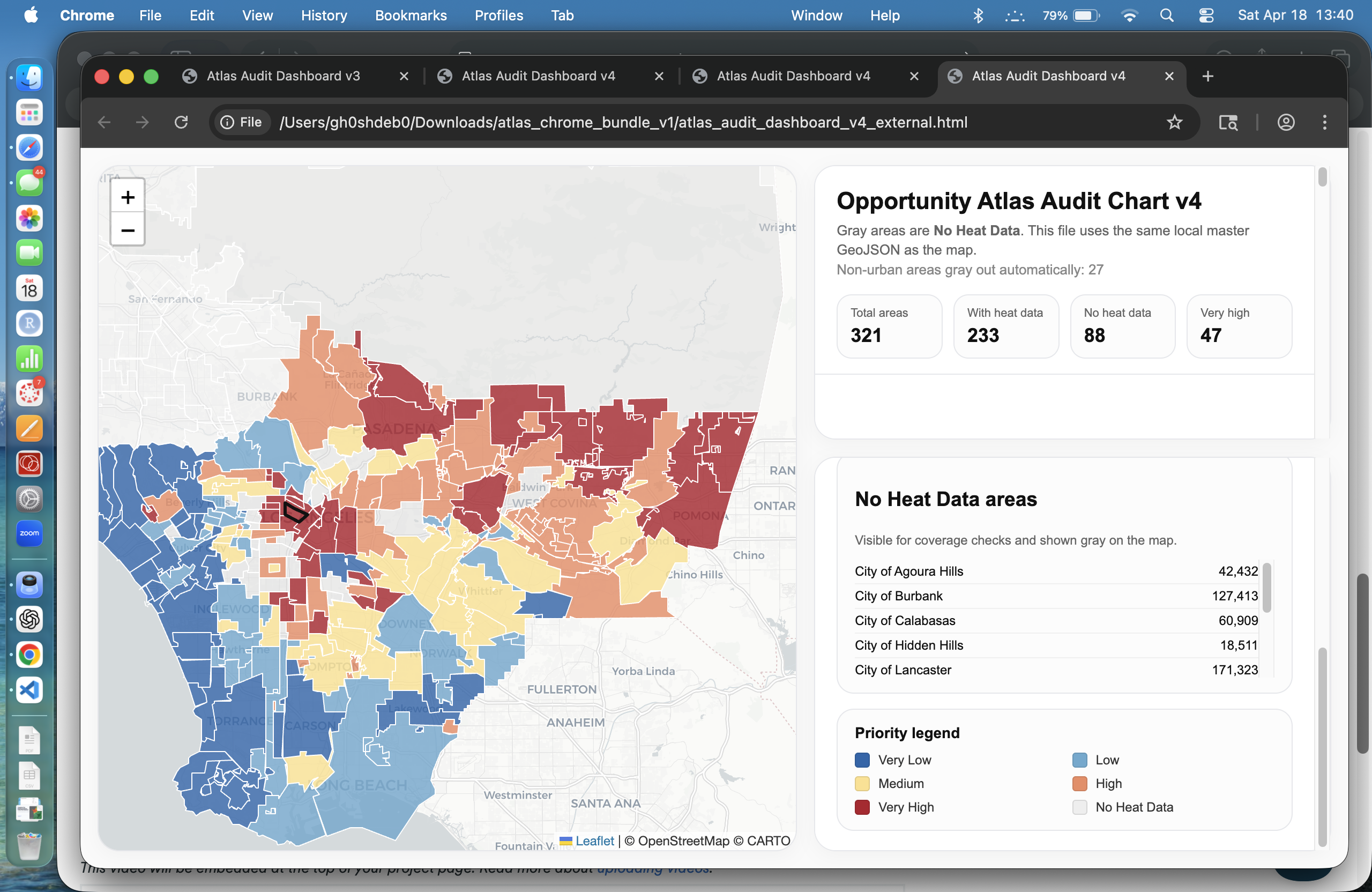
We built an interactive “Opportunity Atlas” for urban heat. The tool identifies neighborhoods where tree planting would have the greatest impact on reducing heat exposure by combining:
- Urban heat data
- Tree coverage data
- Population and poverty data
The result is a priority map that highlights high-impact areas for intervention, while clearly distinguishing non-urban regions and areas without data.
How we built it
We used Python and GeoPandas in Google Colab to clean and merge multiple spatial datasets, including:
- Satellite-derived tree data (2022)
- Urban Heat Index data
- U.S. Census population and poverty data
We performed spatial joins, created density metrics, and built a priority score that balances heat, tree coverage, and population exposure. The data was exported into a unified GeoJSON file and visualized using Leaflet and D3 to create an interactive atlas-style dashboard.
Challenges we ran into
One major challenge was data alignment across different spatial formats and resolutions. Heat and tree data did not always align perfectly, leading to missing values in some regions.
We also encountered edge cases like large non-urban areas (e.g., national forests), where standard metrics produced misleading results. We addressed this by explicitly identifying and separating non-urban regions from the analysis.
Accomplishments that we're proud of
- Built a fully interactive atlas-style dashboard from scratch
- Successfully integrated multiple geospatial datasets into a single pipeline
- Designed a clear and interpretable priority scoring system
- Identified and handled real-world data issues like missing coverage and non-urban regions
What we learned
We learned how to work with complex geospatial data pipelines and how important it is to critically evaluate data quality. We also saw firsthand how small modeling decisions—like handling missing data or excluding non-urban areas—can significantly impact results.
What's next
Next, we would:
- Improve heat data coverage using additional datasets
- Incorporate more environmental variables (e.g., land surface temperature, vegetation indices)
- Expand the tool to other cities
- Turn this into a real decision-support tool for urban planners and policymakers
Built With
- css3
- d3.js
- geopandas
- google-colab
- html
- javascript
- leaflet.js
- numpy
- pandas
- python

Log in or sign up for Devpost to join the conversation.