-
-
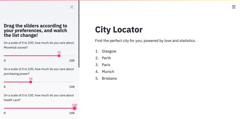
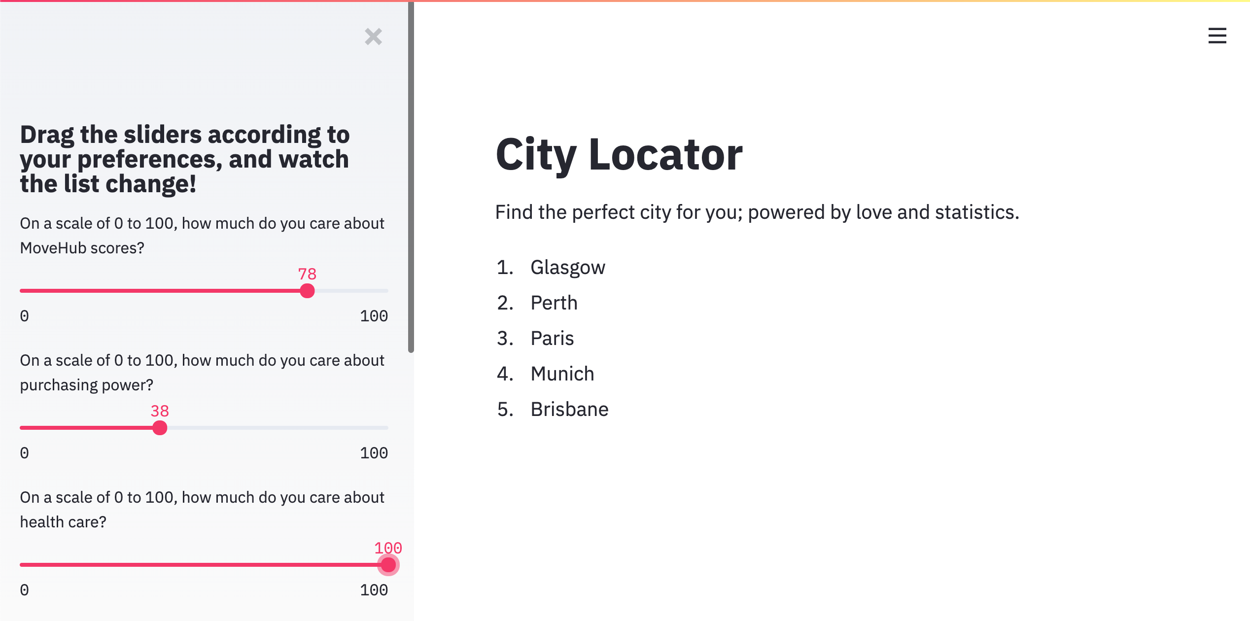
Here's the landing page!
-
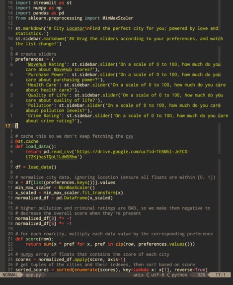
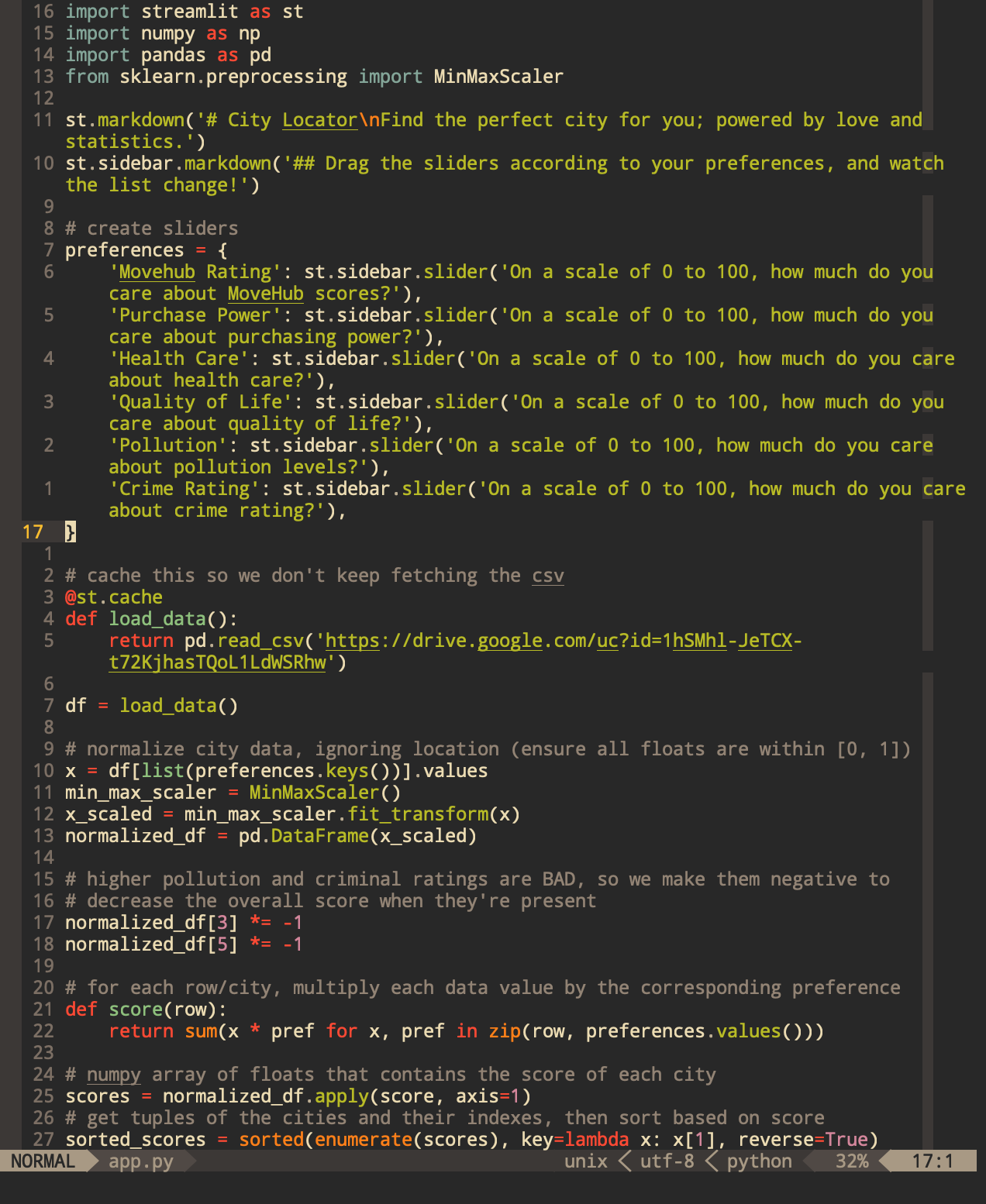
Here's some code!
Overview
This is a simple but functional Streamlit application that determines the top 5 cities to move to based on the user's preferences with respect to Movehub rating, purchase power, health care, quality of life, pollution levels, and crime rating.
The rankings are based on data from Kaggle Movehub dataset.
How we built it
Most of the work on the project centered on understanding the relationships between the categories in the data. To examine these relationships, we ended up using the corr method on our DataFrame instance to determine the Pearson correleation coefficients between each of the categories, and we used Seaborn's regplot to visualize these trends. Once we had these relationships in hand, we moved on to implementing said relationships in code.
After examining the data, we decided to create our own custom score to rank the cities. We used the Movehub ratings as a baseline since they're already precalculated from a wide variety of factors. To calculate our custom score, we multiplied each city's data by the corresponding magnitude of the preference, then summed up the values. To account for the varying intervals in the original data, we also had to normalize each of the categories (i.e. all inputs lie in [0, 1]). Based on the trends we saw during the visualization process, we also decided to apply a negative coefficient to the pollution levels and crime rating categories because they had negative correleation coefficients when compared to the Movehub ratings. Taking a step back, this makes sense because higher levels of crime and pollution should decrease the overall score if the user cares about them more.
We then sorted the cities based on our custom score, taking the top five as the choices to display to the user. The interface we settled on was a simple Streamlit application hosted on Heroku; the user inputs their preferences via a slew of sliders, and the output is a simple markdown list of the top 5 city names ranked on our custom score.
Challenges
We were all beginners in the realm of data science, so starting out was rough. It took a couple hours of playing around with pandas and seaborn (and much Googling/Stack Overflow) to figure out how to shape the data and visualize it. In terms of technical issues, hosting the app on an actual public website was a pain because the free sharing service that Streamlit provides never came through; we're still waiting an email from them to approve our project.
Takeaways
Through this project, we got firsthand experience into the field of data science, and it was eye-opening. We wish that we could've incorporating machine learning into our project, but we didn't have much knowledge about them, so for the next datathon, we'll have done our homework. Ultimately, although this datathon felt like we were being thrown into the deep end, we made it out in the end, and we all gained a deeper understanding of how computers can easily enrich the lives of others with a few simple clicks.

Log in or sign up for Devpost to join the conversation.