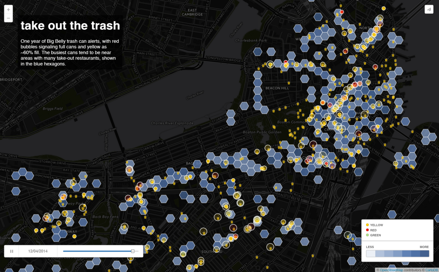
This is a visualization of all the Big Belly trash cans installed in Boston, and one year of alerts sent by those cans condensed into a one-minute animation. The yellow and red bubbles appear when the cans are over half or nearly full, respectively, so those cans that flash rapidly tend to fill up quickly before they can be emptied. I also included a hexagonal grid map showing take-out restaurants in Boston, with darker blues indicating denser areas of such restaurants. I wanted to see if take-out places aligned with the busier trash cans, since a lot of the waste in public bins comes from food packaging. From the animation, this seems to be the case, with cans closest to take-out clusters showing the most activity, while those in Boston Common or sparser parts of Commonwealth Ave alert less often. The correlation is not exact, so in future versions I'd like to incorporate data on convenience stores, retailers, street vendors, and food trucks. I hope that such visualizations might spark debate on the impact of excess packaging, which some cities have reduced through legislation, or at least guide the future placement of smart trash cans in areas that need them.
Technical details: I included only the Big Belly alerts when the can reached a 60% (yellow) or 100% (red) fill level, or when it hadn't sent an alert in 12 hours. This meant filtering out all the alerts that triggered when the bins were emptied. For the restaurant layer, I worked from Boston's active food establishment permit database and filtered out those that did not offer takeout. I also geocoded many of the addresses that did not have coordinates in the original dataset, but only roughly as the hexagonal grid would aggregate these anyway.
Built With
- cartodb
- data.cityofboston.gov
- excel
- microsoft-access
- postgresql


Log in or sign up for Devpost to join the conversation.