-
-

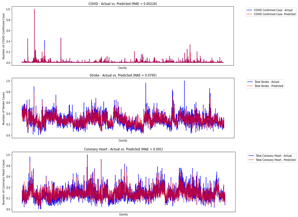
Performance plot showing actual vs predicted results
-
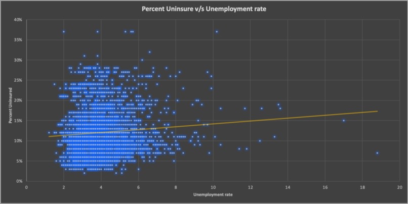
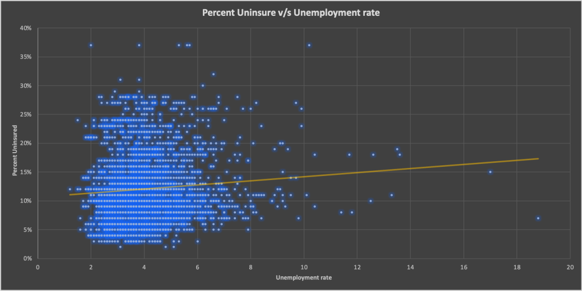
Scatter plot of unemployment rate and uninsured rate
-
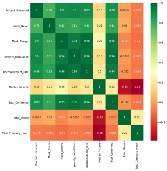
Heat map of variables examined
-
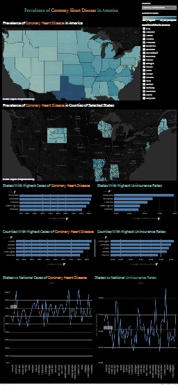
Dashboard of prevalence of 3 diseases


Inspiration
During the covid-19 pandemic, we were becoming aware of the healthcare disparities which may have worsened the spread of covid-19. We took it upon ourselves to closely examine the relationship between whether or not someone is insured to contracting the virus. While exploring our data further, we realized that there are other factors that we need to consider as well. For instance, we need to consider factors like the unemployment rate, median income, number of people who claim to always wear their masks, and number of people who never wear their masks. Examining the environment people live in in addition to the insurance rate could provide a broader and better picture. Furthermore, we were interested to see whether similar trends applied to other diseases. So, we looked up “the 3 most dangerous diseases to have if you are uninsured.” Two of them were coronary heart disease and heart strokes. We excitedly took upon this challenge to see if there indeed was a relationship between having insurance and having those medical conditions.
What it does
How many cases of COVID-19 or heart diseases can we reduce by reducing the uninsured population by 10%? Or by reducing the unemployment rate? These are the questions that policymakers need answered to implement efficient and effective policies. With our tool, you can compare the case counts in your area with other states and counties and predict the case counts by changing the parameters like uninsured population, income, unemployment, and more. This will allow the policymakers to quickly gauge the impacts of their policies and propose policies that are suitable for their areas.
How we built it
Based on our datasets, XGBoost model was built for each disease. The model takes state, county, income, poverty, unemployment rate, mask use rates, and uninsured rates as independent variables and return the predicted disease counts as the dependent variable. The model is deployed on a public server to anyone to use.
Challenges we ran into
We faced a few challenges that generally come with exploring new software applications, environments, and modeling data. During our analysis, we often encountered cases where no trend was found due to the magnitude of population. For example, 300 people in a small town is not the same representation of population as 300 people in a big city. In order to resolve these issues, we tried our analysis by converting the units to percentages or aggregating the data on a state level. In addition, we attempted to incorporate our model into Tableau's dashboard. However, we ran into version conflicts which led us to creating a different site to host our model.
Accomplishments that we're proud of
We are proud of coming together and creating a predictive model, analyzing our data from different perspectives, and putting it together on our website. Moreover, we are glad to provide our website to the public. They, especially policymakers, could use it as a tool in making crucial decisions.
What we learned
We learned how to deploy the python model to a public server, make a website, and create an interactive dashboard on Tableau.
What's next for Tackling Pandemic and Heart Disease with Predictive Tool
We hope to compare different pandemics over time and examine how the variables we examined affected the prevalence of those diseases.


Log in or sign up for Devpost to join the conversation.