-
-
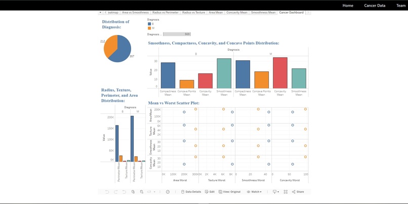
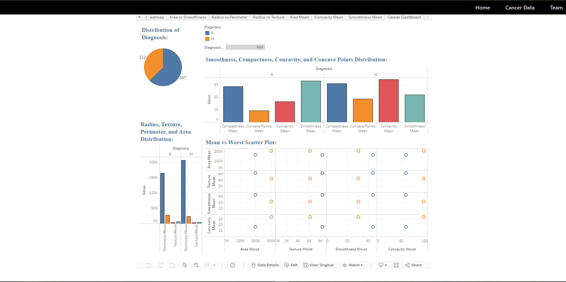
Tableau dashboard pic
Inspiration Our inspiration for creating the Cancer Data Dashboard stemmed from the pressing need to provide a comprehensive and accessible platform for visualizing and analyzing cancer-related data. With cancer being one of the leading causes of death worldwide, we recognized the importance of leveraging data-driven insights to advance research, improve treatment outcomes, and enhance preventive measures. We were driven by the belief that by harnessing the power of data visualization, we could empower researchers, healthcare professionals, policymakers, and advocacy groups to make informed decisions and drive progress in the fight against cancer.
What it does The Cancer Data Dashboard is a powerful tool that enables users to explore, analyze, and visualize various aspects of cancer data. From demographic trends and incidence rates to treatment outcomes and survival statistics, the dashboard provides a comprehensive overview of cancer-related metrics and indicators. Users can interact with dynamic charts, graphs, and maps to uncover insights, identify patterns, and gain a deeper understanding of the factors influencing cancer incidence, progression, and outcomes. Whether it's researchers conducting epidemiological studies, clinicians evaluating treatment protocols, or policymakers shaping public health policies, the Cancer Data Dashboard serves as a valuable resource for driving data-driven decision-making and advancing cancer research and care.
How we built it We built the Cancer Data Dashboard using a combination of cutting-edge technologies, including Tableau for data visualization and analysis, Python for data processing and integration, and HTML/CSS/JavaScript for front-end development. We collected and curated a diverse range of cancer datasets from reputable sources such as the National Cancer Institute (NCI) and the World Health Organization (WHO). Leveraging Tableau's robust features and functionality, we designed intuitive dashboards and interactive visualizations that enable users to explore cancer data with ease. Our development process involved iterative design, collaborative teamwork, and rigorous testing to ensure the dashboard meets the highest standards of accuracy, usability, and performance.
Challenges we ran into Building the Cancer Data Dashboard presented several challenges and complexities that we had to overcome during the development process. One of the main challenges was sourcing and integrating disparate datasets from multiple sources while ensuring data accuracy and consistency. Additionally, designing intuitive and user-friendly visualizations that effectively communicate complex cancer-related concepts and insights proved to be a daunting task. We also encountered technical hurdles related to data processing, visualization rendering, and performance optimization. However, through perseverance, collaboration, and creative problem-solving, we were able to address these challenges and deliver a robust and impactful dashboard solution.
Accomplishments that we're proud of We're incredibly proud of the Cancer Data Dashboard and the impact it has the potential to make in advancing cancer research, treatment, and prevention efforts. Our proudest accomplishments include:
Curating and integrating a comprehensive collection of cancer datasets covering various aspects of the disease. Designing intuitive and interactive visualizations that enable users to explore complex cancer data with ease and clarity. Collaborating effectively as a team to overcome technical challenges and deliver a high-quality dashboard solution. Receiving positive feedback and recognition from domain experts and stakeholders for the dashboard's utility and effectiveness. Overall, we're proud to have created a valuable tool that has the potential to drive meaningful progress in the fight against cancer and improve outcomes for patients and communities worldwide. What we learned Building the Cancer Data Dashboard was a valuable learning experience that provided us with insights into various aspects of data visualization, cancer research, and collaborative development. Some key learnings from the project include:
The importance of data quality, integrity, and accuracy in informing decision-making and driving insights. The significance of user-centric design principles in creating intuitive and impactful data visualizations. The value of collaboration, communication, and teamwork in overcoming challenges and achieving project goals. The potential of technology and innovation to address complex societal challenges and make a positive impact on public health. These learnings will continue to inform and inspire our work as we pursue future projects and initiatives aimed at leveraging data-driven insights for social good and positive change. What's next for Cancer Data Dashboard Looking ahead, we have several exciting plans and opportunities for enhancing and expanding the Cancer Data Dashboard:
Continuously updating and expanding the dashboard's dataset collection to incorporate new research findings, clinical data, and epidemiological trends. Enhancing the dashboard's functionality with advanced features such as predictive analytics, geospatial analysis, and personalized recommendations. Collaborating with domain experts, researchers, and healthcare organizations to validate findings, drive research agendas, and inform evidence-based practices. Exploring opportunities for partnerships, funding, and dissemination to maximize the impact and reach of the Cancer Data Dashboard within the global cancer research and healthcare community. Ultimately, our goal is to continue evolving the Cancer Data Dashboard as a valuable resource for advancing cancer research, improving patient outcomes, and ultimately, reducing the burden of cancer on society.
Built With
- css3
- express.js
- html5
- javascript
- tableau
- tableaucloud
- tailwind

Log in or sign up for Devpost to join the conversation.