Inspiration
Our inspiration came from the idea that behind every survey response is a customer’s story. We wanted to make those voices visible through data, transforming a dataset of survey results into visuals that reveal how people truly feel about their service experience.
What it does
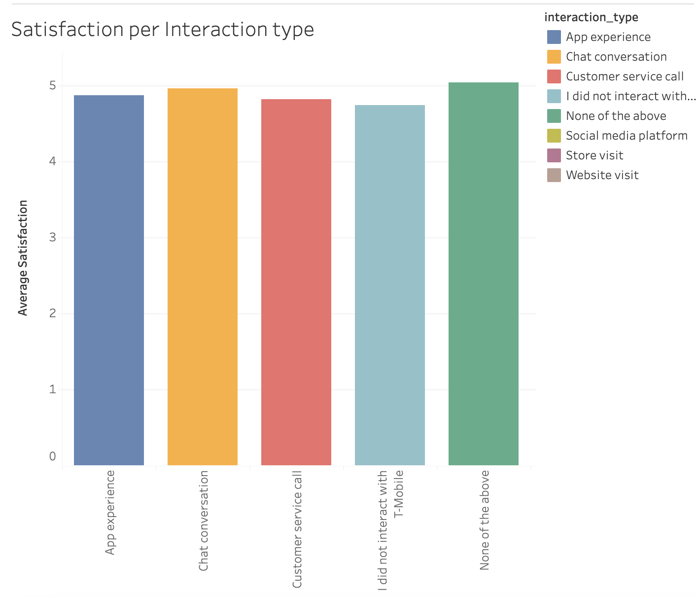
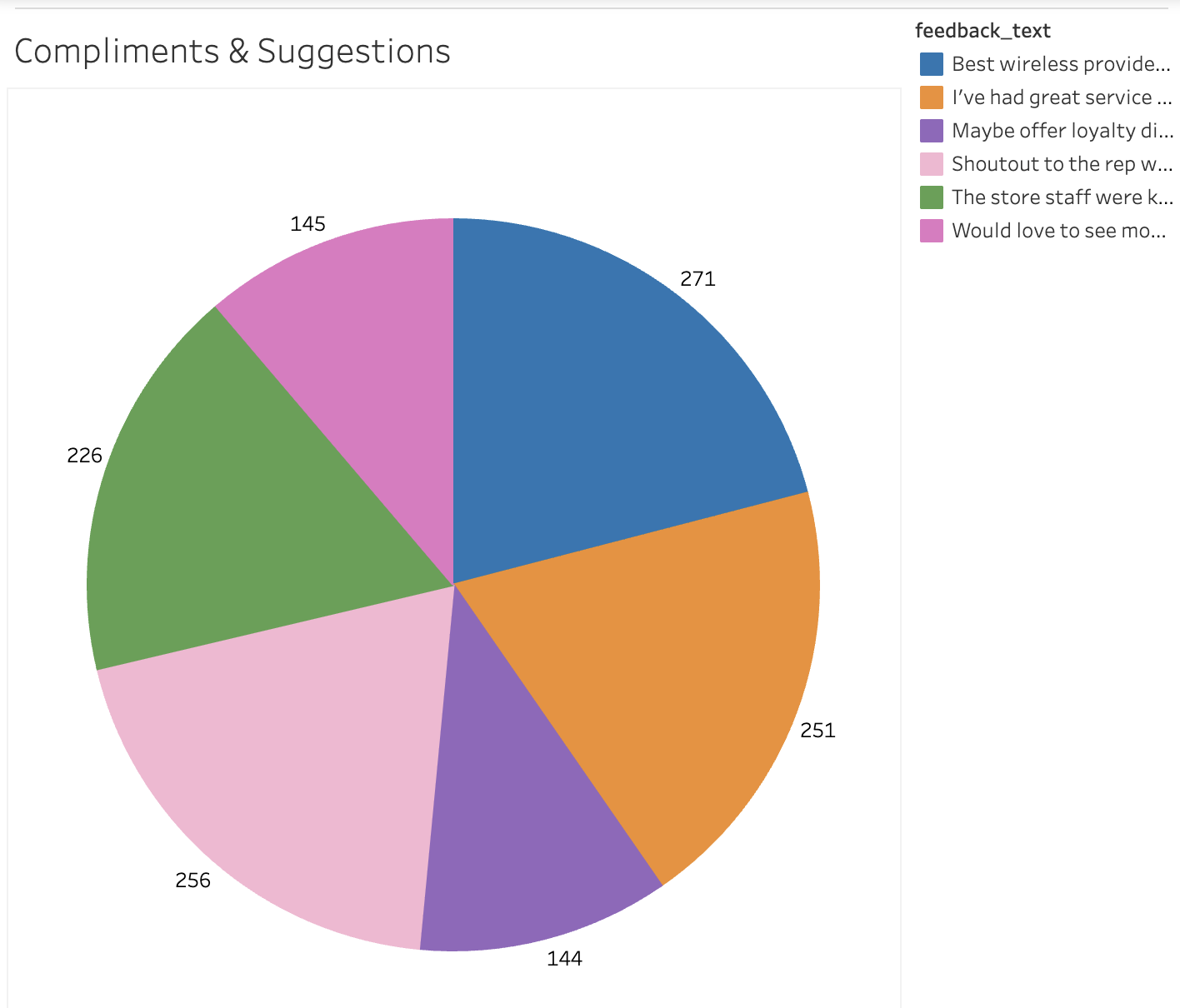
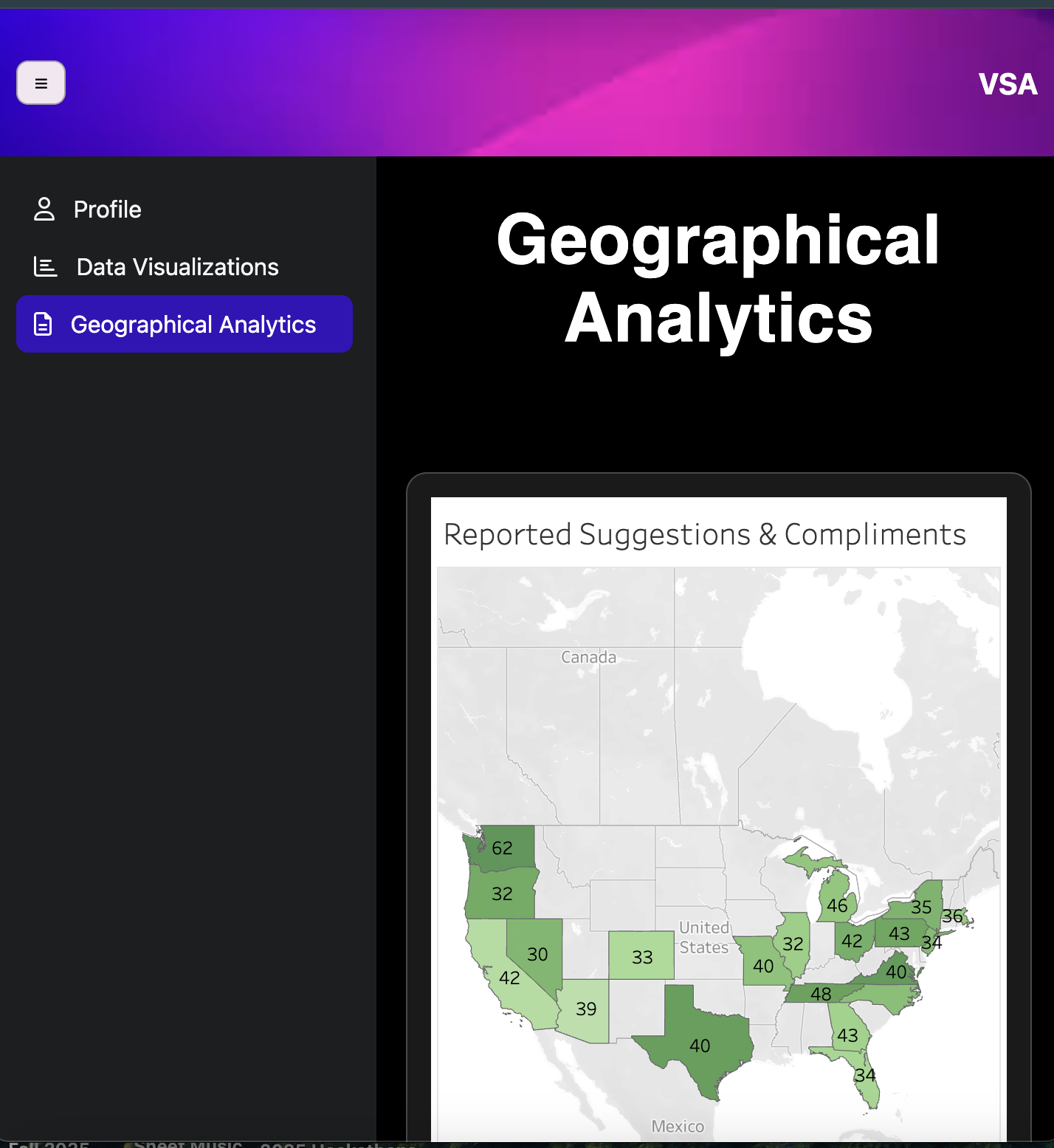
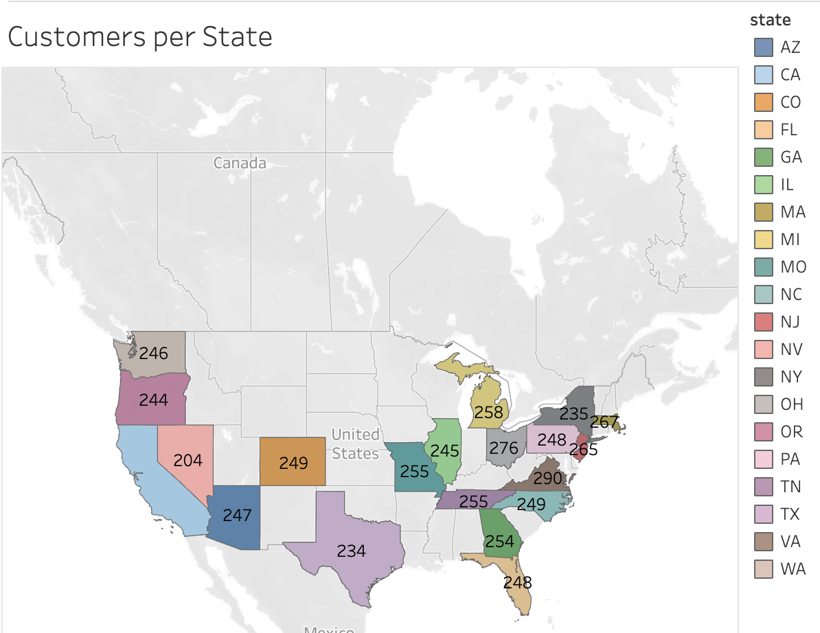
Our project visualizes customer “happiness” using seven core feedback questions from T-Mobile’s customer survey. The responses were compiled into a dataset and transformed into interactive diagrams that highlight key satisfaction trends. A T-Mobile Customer Experience Leader can log in to access three dashboard pages: the first for profile setup, the second for interacting with data visuals, and the third for exploring geographical analytics, all related to customer happiness.
How we built it
We built the front end of our project using HTML, CSS, and JavaScript to design an interactive and user-friendly dashboard. HTML provided the structure of each page, CSS handled the styling and layout, and JavaScript added dynamic features such as navigation and responsiveness. Together, these technologies created a smooth and visually engaging experience for users exploring the data. Our dataset was built using GenAI to quickly and efficiently generate realistic customer feedback data. This approach allowed us to focus more on analysis and visualization rather than manual data collection. We then used Tableau to transform the dataset into interactive figures and graphs that highlight key insights into customer satisfaction. After gathering the information from Tableau and creating the design, we merged our parts into VS Code and used Node to create a temporary local host to run our website.
Challenges we ran into
Communication between team members led to a rough start as we worked to align our ideas and divide responsibilities. Initially, it was challenging to stay organized and manage the various aspects of the project simultaneously. Once we established clearer communication and assigned specific roles, our workflow improved, and we were able to collaborate more efficiently.
Accomplishments that we're proud of
We are proud of the teamwork we showed and our ability to learn new tools together throughout the project. Many of the programs we used were unfamiliar to us, and learning Git and Tableau was especially challenging. Despite that, we pushed through, supported each other, and successfully built an interactive dashboard. The experience not only improved our technical skills but also strengthened our collaboration and problem-solving as a team.
What we learned
During these 24 hours, we were fortunate to learn from several great workshops, but we learned the most from each other. As a team, we taught and learned Git, JavaScript, Tableau, and JSON. But most importantly, we learned not to wait until the last minute to start coding.
What's next for Satisfaction Visual Analytics
Moving forward, we plan to expand Satisfaction Visual Analytics by making it mobile-friendly, allowing leaders to access insights conveniently on any device. We also aim to add more detailed pages that dive deeper into customer metrics and satisfaction drivers. In the future, we also envision integrating AI to automatically analyze survey responses, detect sentiment trends, and provide data-driven recommendations for improving customer experiences from the online community with T-Mobile.


Log in or sign up for Devpost to join the conversation.