Inspiration
The typical Web experience, in its current state, can be abstracted into atomic components: Buttons perform actions when clicked. Text inputs allow a user to enter their name. And dropdowns allow a user to select between a finite set of options. These elements are but a few among many; and they come together on the page to form a cohesive user experience—UX.
To accelerate the development of these user experiences, people create component libraries—collections of prebuilt UI components that can be dropped into a web application at a moment's notice. Some examples include Headless UI, Mantine, Material UI, Chakra UI, and more.
A common issue with these prebuilt components, however, is customizability. While each component library offers their own solutions to customizability, none can address every demand that their users might have. What if I want to make a button jump when clicked? What if I want my dropdown to have an infinite list of options? What if I want special input validation in my text inputs?
What if I want my switches to be more than just "on" and "off"?
That is the problem that we wish to solve.
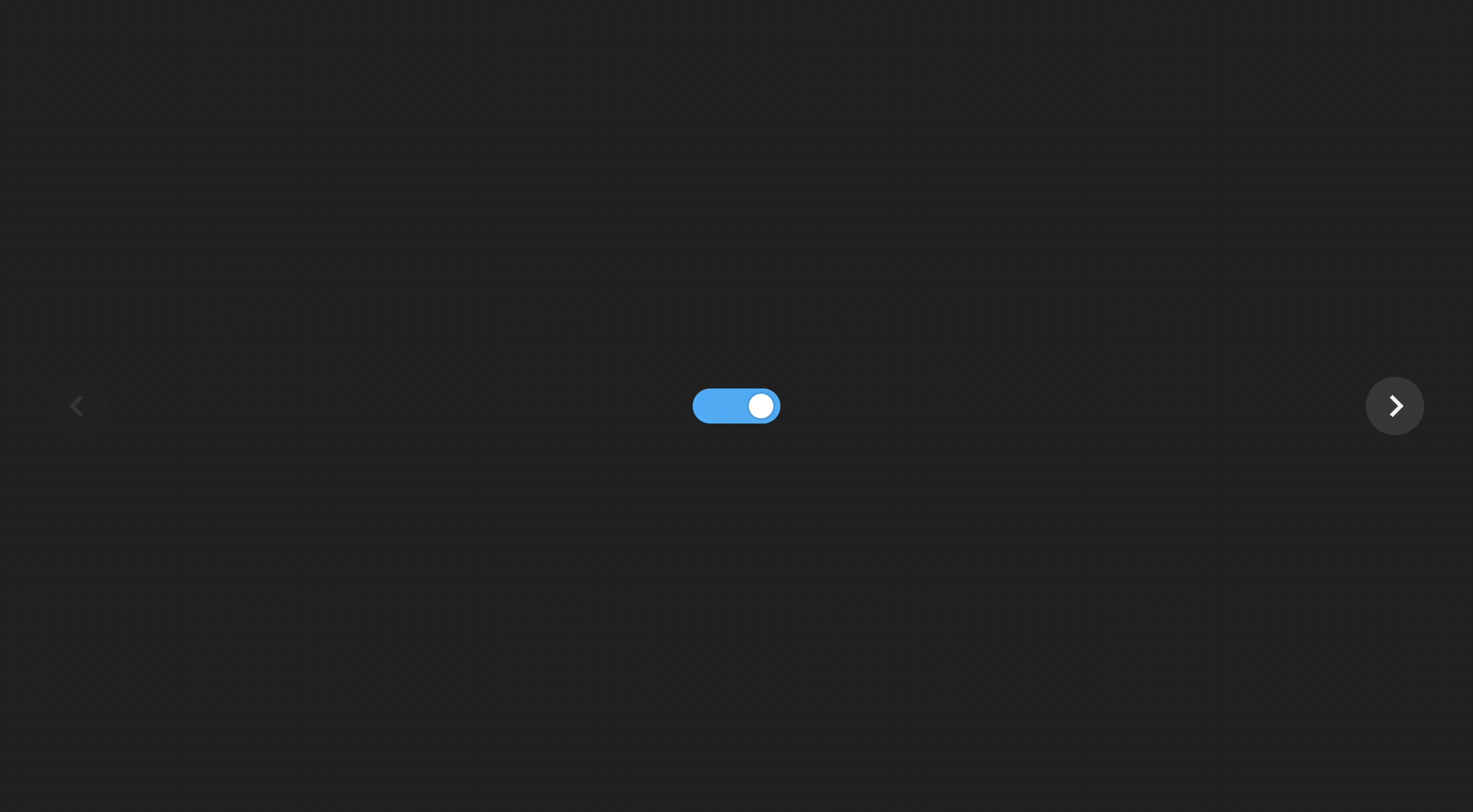
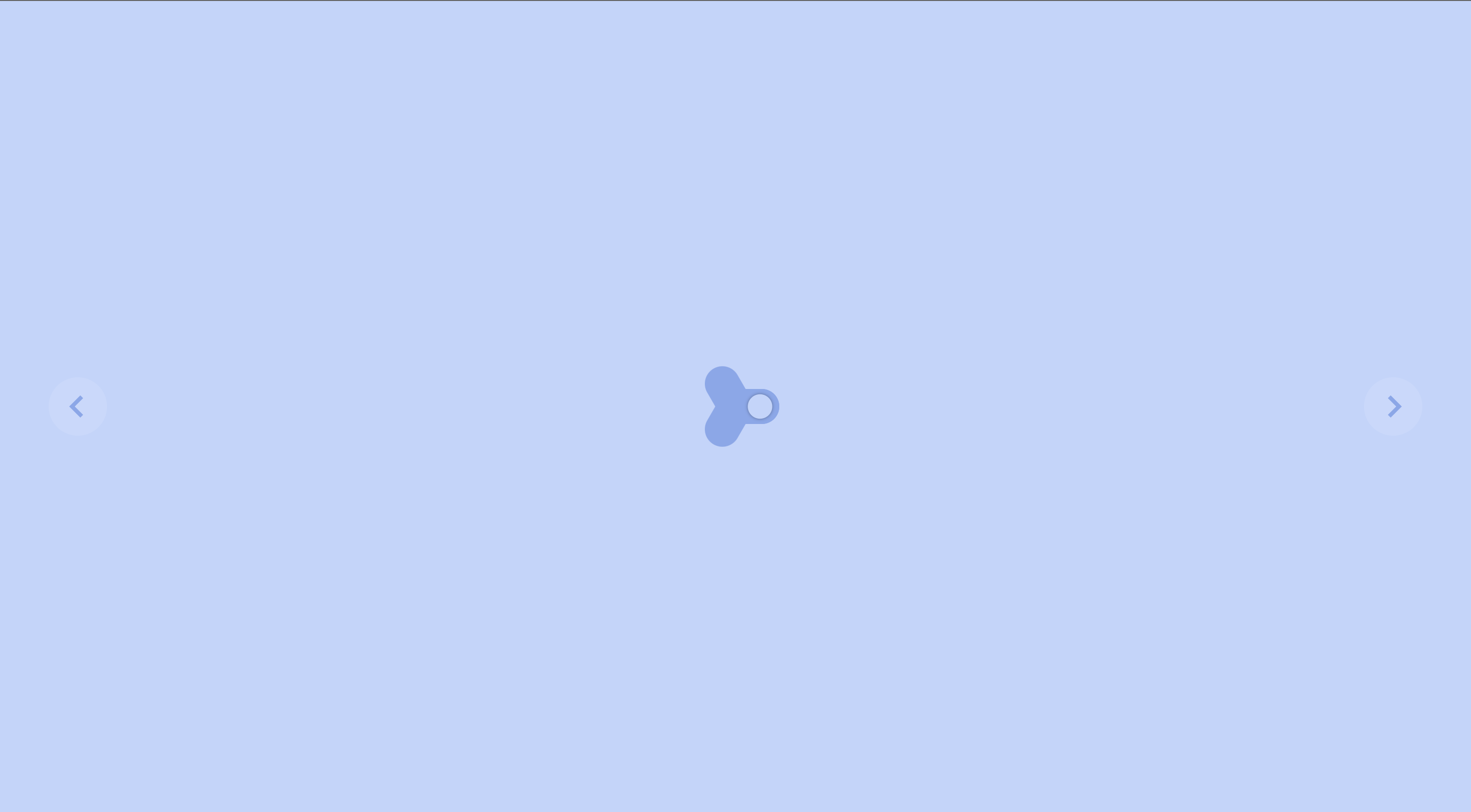
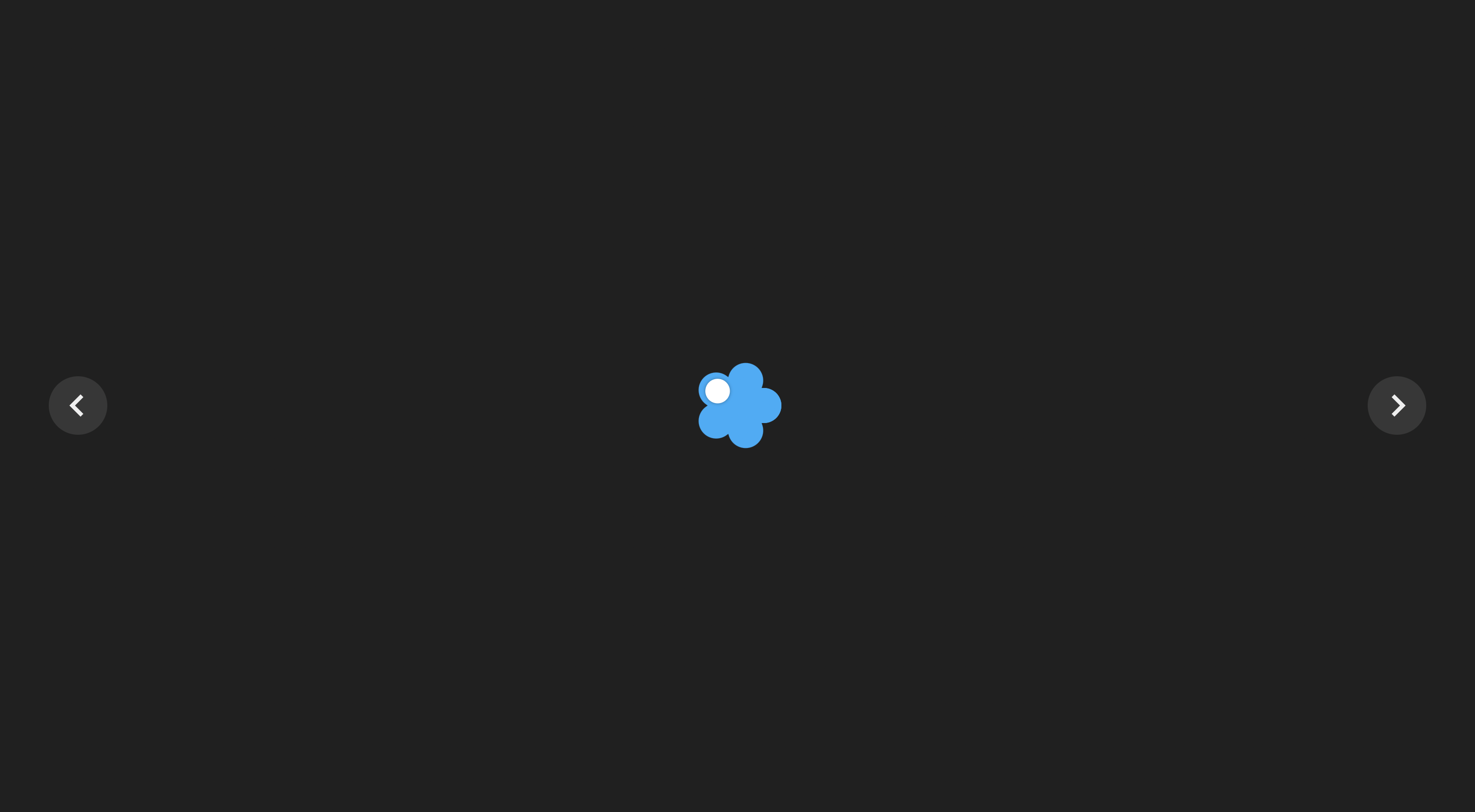
What it does
Switchr is a customizable web component that enables users to select more than 2 options in their switch elements. Why settle with just on and off when you could have on, off, and 50% on. Or even on, off, 50% on, 25% on, and 75% on? Or even on, off, 20% on, 40% on, and 60% on, and 80% on (or 20% off, if you enjoy seeing the glass half empty)? Or even on, off, 16.66% on, 33.33% o
How we built it
The component was made with React.js and Typescript. Animations were made using the react-spring library. Our demo is hosted using Vercel.
Challenges we ran into
Animating the switch. Making the switch thing move from one option to another is surprisingly difficult, especially when the number of options can change while the switch is moving.
Accomplishments that we're proud of
Animating the switch! Our solution was hacky (we "faked" the animation by combining two animations and tuning them to appear one after the other), but it looks surprisingly clean.
What we learned
We learned a lot about the features that react-spring has to offer. We also learned some cool stuff about CSS transformations that helped us make our design.
What's next for Switchr.io
- Smoother animations
- Tidying up and publishing the component to npm for others to use
- More much-needed components, such as:
- Binary tree dropdown
- Ring-based multi-option switch
- Scrolling container that also scrolls in the Z-direction
Built With
- react
- react-spring
- typescript


Log in or sign up for Devpost to join the conversation.