-
-
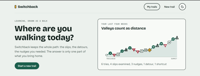
1st Page
-
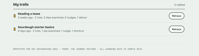
Botthom Side of 1st Page
-
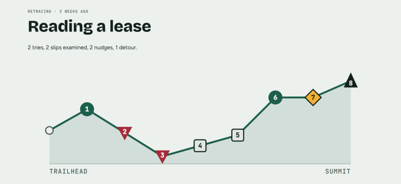
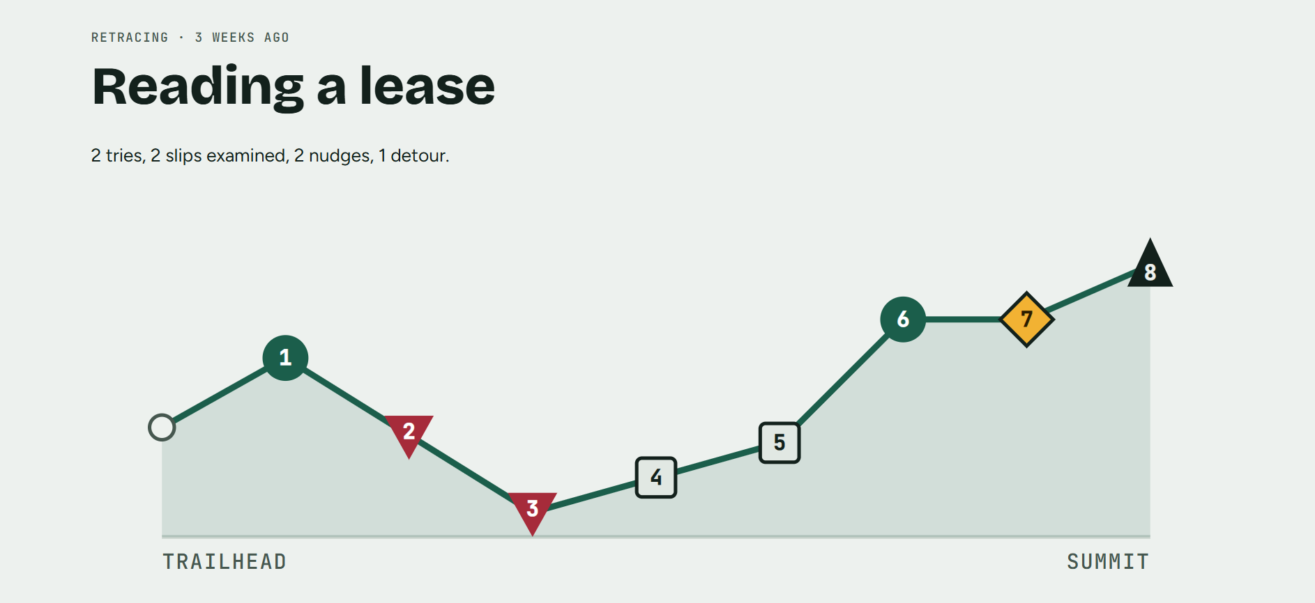
Reading a lease trend
-
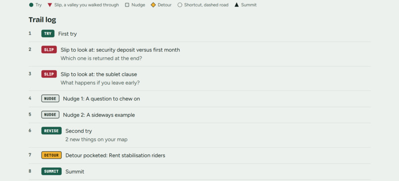
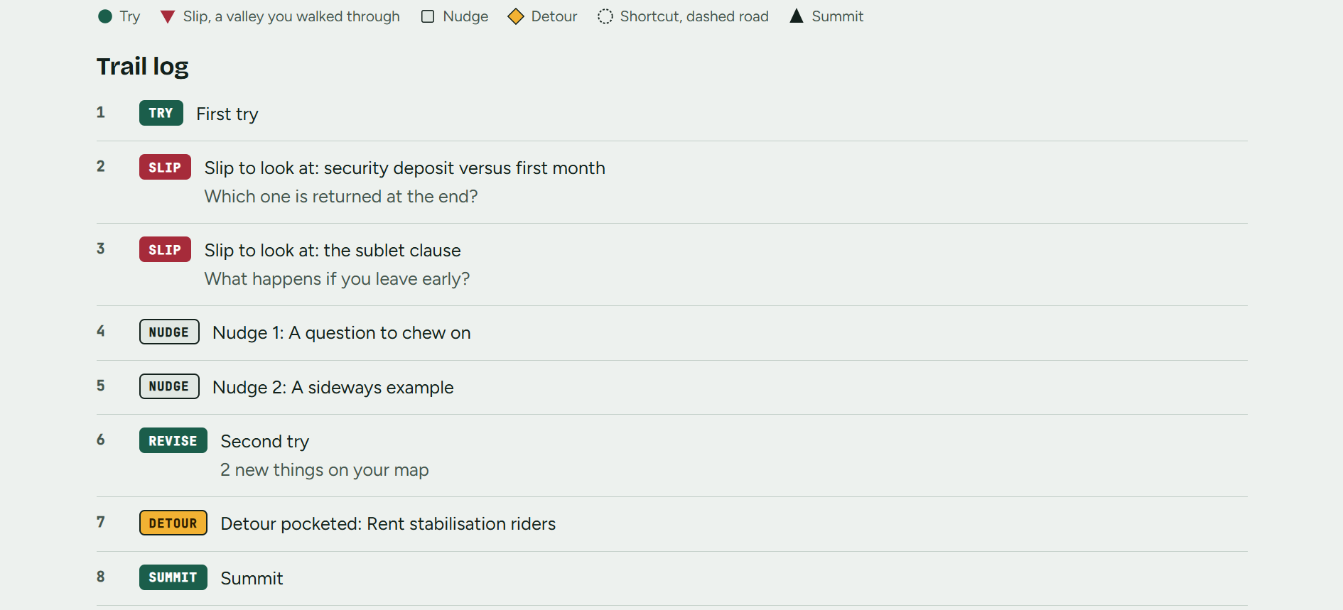
Reading a lease info
-
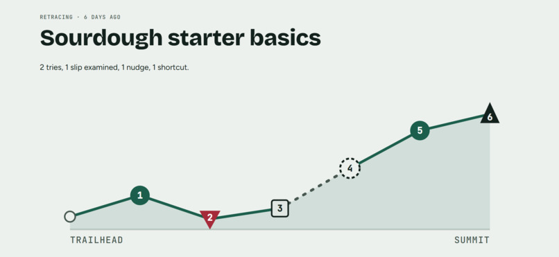
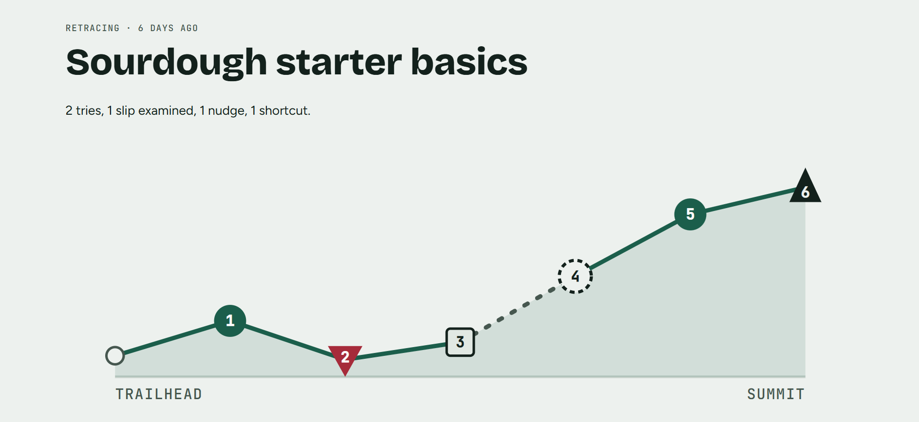
Sourdough starter basics 1st page
-
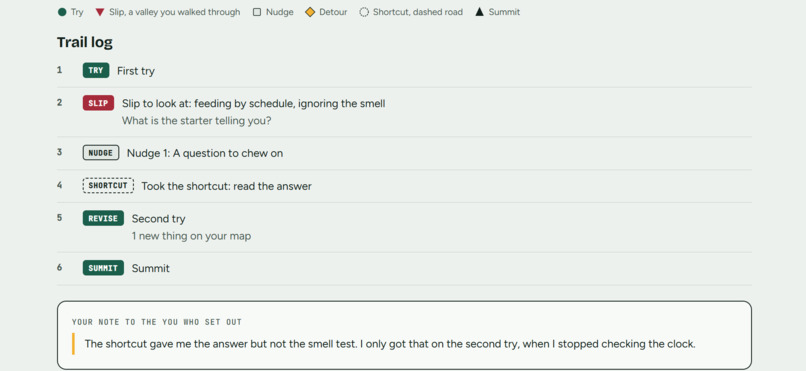
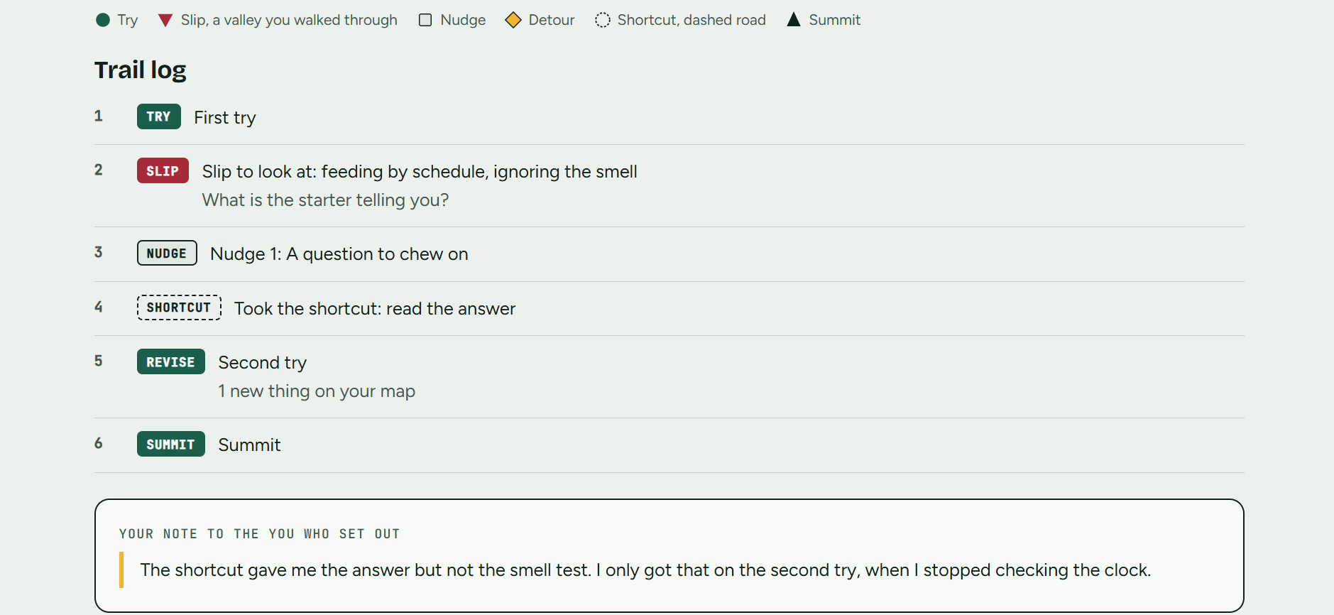
Sourdough starter basics info
Inspiration
AI can hand us a finished answer in seconds, but the slips, dead ends and side discoveries along the way are where we actually learn. Most learning apps make this worse by reducing progress to a streak or a percentage bar, which rewards speed and hides the path. The prompt asked what gets lost when we optimize for the fastest route. We wanted to build something that keeps it.
What it does
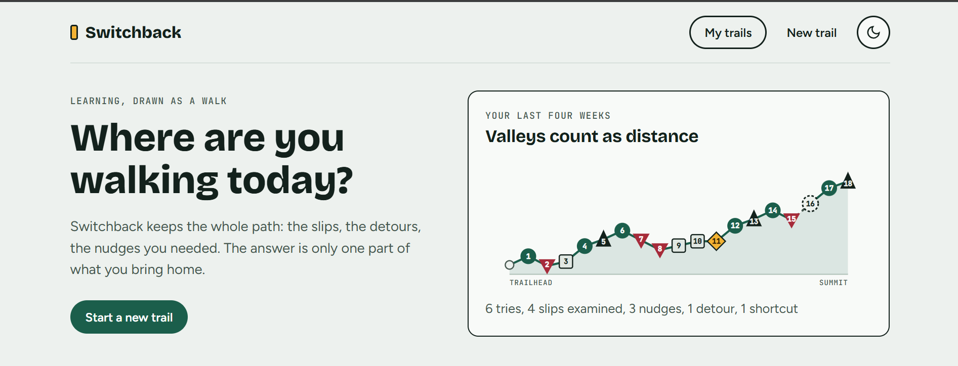
Switchback is a learning companion that draws progress as an elevation profile, like a hiking trail, instead of a progress bar. You pick a topic (compound interest, giving feedback to a teammate, or your own goal) and walk through it:
- First try: you write your own attempt before getting any help.
- Feedback: it shows what is already on your map and what is still open, as questions, not answers.
- Nudges: up to three rungs, a question, a sideways example, then a partial reveal. They unlock only after you try.
- Shortcut: always available. Taking it draws a dashed road on your trail and shows what that road held.
- Second try: revise and see what is new on your map.
- Detour: an optional, ungraded side path you can pocket.
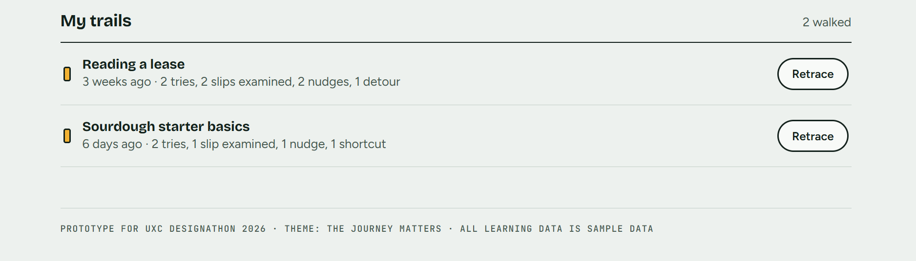
- Summit: your full trail as a profile, with a numbered text log, plus a note to the you who set out. Saved trails can be retraced later. Slips appear as valleys, and valleys count as distance.
How we built it
We started from the prompt's list of what speed erases (mistakes that teach, skills built unnoticed, unexpected discoveries, experiences that change what comes next) and designed one feature for each. We built a clickable web prototype in HTML, CSS and JavaScript with mock data and scripted feedback. The trail chart is drawn as SVG from the user's actual event log. The visual language borrows from trail signage: a marigold "blaze" marks the current step, with pine green for actions and a mono face for waypoint labels. We tested every path (full flow, shortcut flow, custom goal) at desktop and phone widths, in light and dark themes.
Challenges we ran into
- Making mistakes feel valuable instead of punished, which shaped the copy, the valley metaphor and the lack of scores.
- Deciding how to treat shortcuts. Blocking them felt preachy, so we allow them and make them visible instead.
- Keeping the chart accessible. Every marker uses a different shape and a number, and a matching text log means nothing depends on color or sight.
- Showing realistic AI feedback without a real model, so the prototype uses scripted responses.
Accomplishments that we're proud of
- A progress visual that makes slips, nudges, detours and shortcuts readable in one picture, with no scoring.
- A "try first, then nudge" rule that guides without blocking.
- A complete clickable flow with three trails, a live detour widget, a saved-trail archive and a retrace view.
- Accessibility built in from the start: shape plus text encoding, keyboard use, focus management, reduced motion, and tested contrast in both themes.
What we learned
A progress bar only moves in one direction, and that shapes what people think counts as progress. Changing the metaphor to a trail changes the emotions around learning: a dip is part of the route. We also learned that supportive wording (questions instead of corrections, "slip to look at" instead of "error") matters as much as the visuals.
What's next for Switchback
- Real AI feedback that reads the learner's own words and keeps the nudge ladder.
- Spaced retraces that bring you back to a trail after a week to try again.
- Shareable trails, so a mentor or study partner can walk alongside you.
- More trail types, such as writing, coding and language learning.
- A longer view that shows how your slips and detours change over months.


