-
-
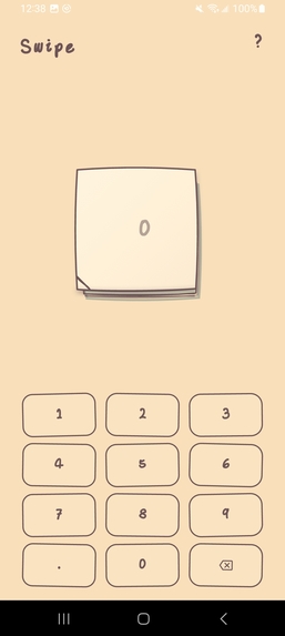
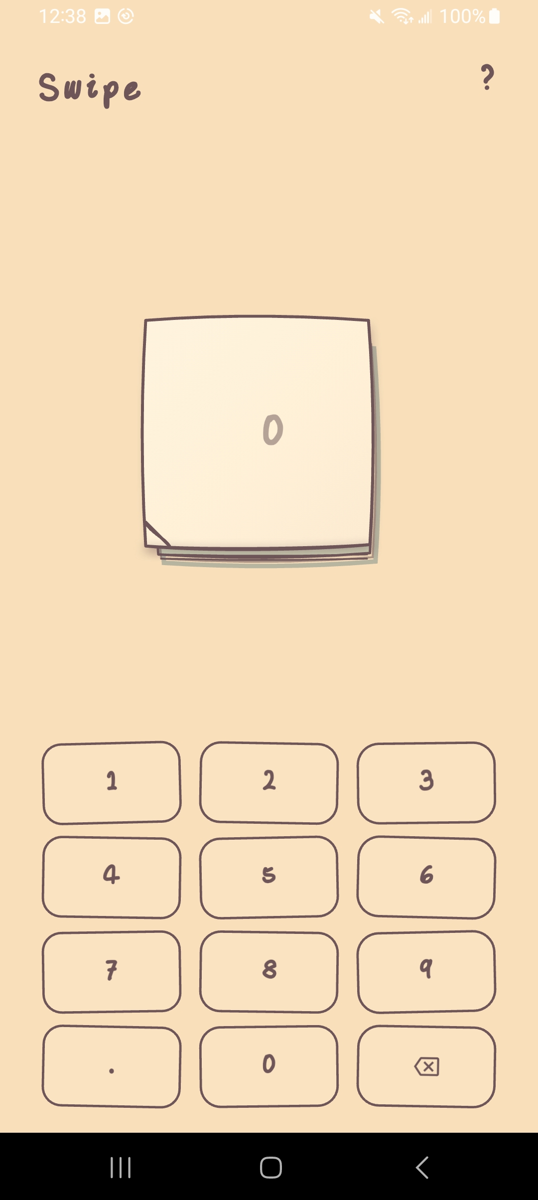
main page can enter the amount to record as income or
-
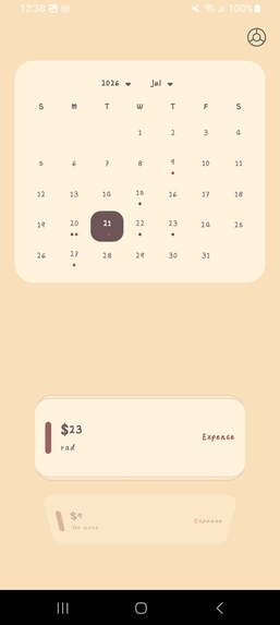
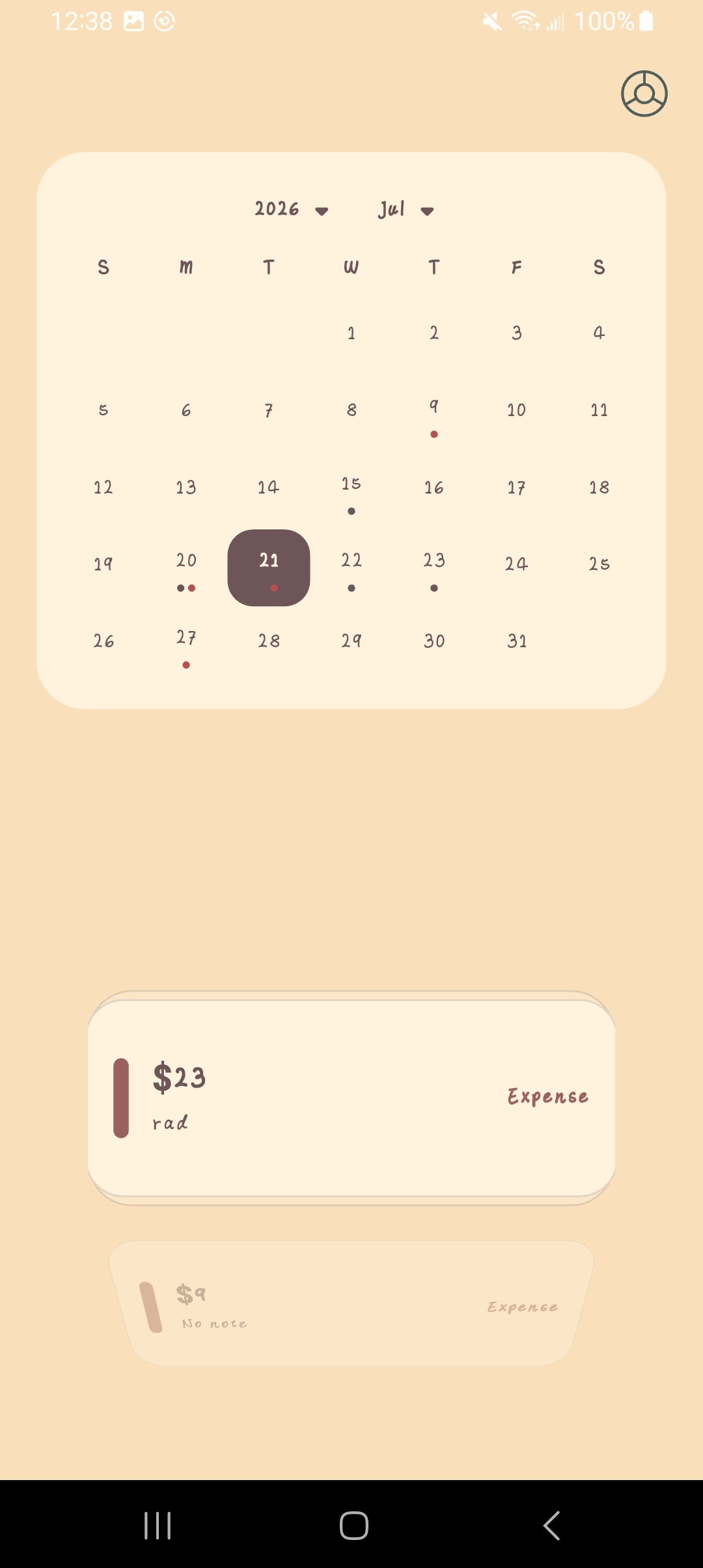
select the date on calendar can see the list below
-
-
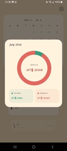
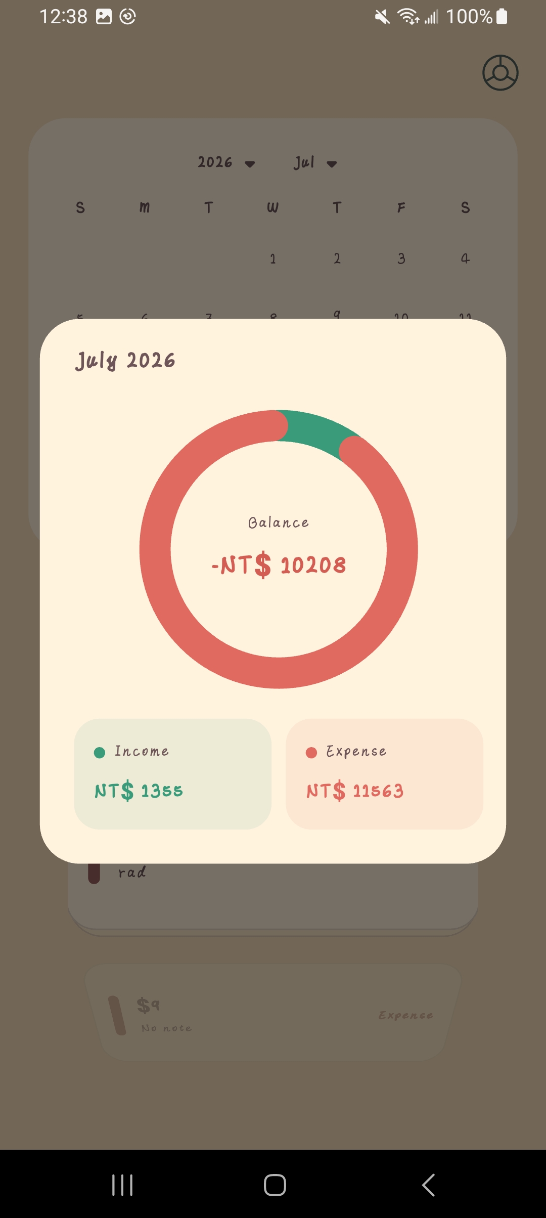
the amount can be view from the pie-chart
以下內容可直接複製使用:
## Inspiration

I wanted to build Swipe because I have always found it difficult to maintain a consistent expense-tracking habit.

Many mature finance apps ask users to select a category, date, location, account, and other details every time they record a transaction. Although this information can be useful when reviewing financial data, the recording process often feels too complicated and time-consuming. The more steps I had to complete, the less motivated I became to use an expense-tracking app at all.

Swipe was designed around the idea of frictionless expense tracking. The entire process should take less than three seconds: enter an amount, swipe, and finish. There are no unnecessary forms or complicated menus during quick entry.

Because nearly every action is performed through a gesture, I named the app **Swipe**. My goal is to make expense tracking approachable for people who are just beginning to build the habit.

## What it does

Swipe is a minimal, gesture-first expense tracker built for Android.

Users enter an amount using a custom hand-drawn numeric keypad and then:

- Swipe down to record income.
- Swipe up to record an expense.
- Swipe sideways to move between quick entry and the calendar.
- Select a date and swipe up to record a transaction for that specific date.
- Swipe a transaction to reveal its **Edit** and **Delete** actions.
- Review transactions by date.
- View monthly income and expense summaries.
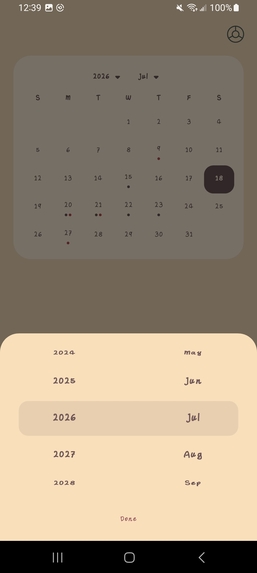
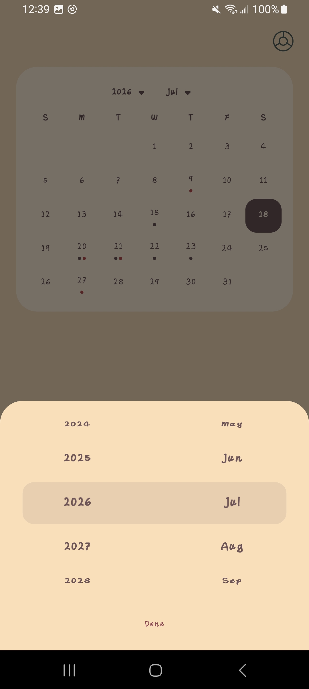
- Select a month and year using a mobile-friendly wheel picker.

When a valid transaction is submitted, the input area behaves like a handwritten sticky note being peeled away and thrown from the screen. A synchronized paper-tearing sound provides additional feedback.

All transaction data is stored locally on the device, so Swipe works without an account, backend, or internet connection.

## How we built it

I built Swipe with **Flutter** and **Dart**, using Android as the primary target platform. The application is organized into several layers:

- **Screen layer:** The quick-entry screen handles amount input and income or expense gestures. The calendar screen handles date selection, transaction history, editing, deletion, and monthly summaries.
- **Component layer:** Reusable widgets handle editable transaction rows, the month wheel picker, the monthly summary dialog, the custom keypad, and the sticky-note animation.
- **Data layer:** A transaction model stores the amount, transaction type, note, and date of each record.
- **State layer:** A centralized `LedgerStore` handles adding, editing, and deleting transactions while notifying the interface when data changes.
- **Storage layer:** `shared_preferences` stores transaction data locally so records remain available after the application is closed.
- **Audio layer:** `audioplayers` and a preloaded audio pool provide low-latency paper-tearing sound effects.
- **Testing layer:** Flutter Widget Tests verify navigation gestures, selected-date transactions, income and expense animations, audio playback, and previously fixed regressions.

Development began with the core interaction: entering an amount and using vertical gestures to classify it as income or an expense. I then created the transaction model, local persistence, quick-entry screen, calendar, and basic transaction-management features.

After completing the core workflow, I added the custom font, hand-drawn keypad, wheel-style month selector, selected-date recording, monthly summaries, editing, and deletion. I repeatedly tested the application on a physical Android device to identify layout problems and gesture conflicts that were difficult to notice in code alone.

The final development stage focused on the sticky-note experience. I combined translation, scaling, rotation, perspective, clipping, folding, and opacity animations to simulate a note being peeled away and thrown. I then synchronized the animation with a preloaded paper-tearing sound.

I also used **Codex with GPT-5.6** as a development collaborator to translate product requirements into Flutter code, investigate regressions, refine animation behavior, and create repeatable Widget Tests. Static analysis and regression tests were run throughout development to prevent previously fixed behavior from returning.

## Challenges we ran into

### Challenge 1: Transaction list overflow

One of the first challenges was making the transaction list fit correctly on different screen sizes. The list was initially too wide, causing content to extend beyond the screen or become clipped, especially when an item was enlarged.

I solved this by adding responsive width limits, reducing the enlargement scale, and clipping content within the visible list area.

### Challenge 2: Scrolling visual artifacts

Unwanted boxes and visual artifacts appeared at the bottom of the transaction list and during scrolling.

I adjusted the layout structure, clipping behavior, and widget layers to keep the scrolling area visually clean.

### Challenge 3: Unintuitive editing and deletion

The original workflow required users to hold a transaction for several seconds before performing another gesture. This made editing and deletion slow and difficult to discover.

I redesigned the interaction so users could swipe a transaction to reveal its **Edit** and **Delete** actions and placed the related buttons together.

### Challenge 4: Unclear editing state

Users could not easily tell when a transaction had entered edit mode.

I added changes to the background color, border, shadow, and elevation of the active transaction so its state became immediately recognizable.

### Challenge 5: Gesture conflicts

One of the most persistent challenges was separating transaction gestures from page-navigation gestures. Swiping a transaction could accidentally change screens, while swiping outside the list sometimes failed to return to the main screen.

I separated the gesture-detection regions and added regression tests to confirm that list interactions and screen navigation worked independently. This issue reappeared during development, which demonstrated the importance of automated regression testing.

### Challenge 6: Overly restricted date-entry gesture

After selecting a date, the upward gesture for creating a transaction originally had to begin near the bottom of the screen. This did not match the intended interaction.

I changed the detector so users could swipe upward from any position after selecting a date while still saving the transaction under the correct date.

### Challenge 7: Inconsistent custom font

The custom `MyfontV1-Regular.ttf` font was not initially applied to every interface element because the font-family configuration was inconsistent.

I corrected its registration and applied it through both the application theme and the default text style.

### Challenge 8: Difficult month and year selection

The original month and year controls used long dropdown lists that were difficult to browse on a phone.

I replaced them with a scrollable wheel picker inspired by the Apple Alarm interface, making the selection process faster and more mobile-friendly.

### Challenge 9: Incomplete instructions

The first version of the help dialog explained only the basic recording gestures. It did not cover editing, deletion, year selection, or recording a transaction for another date.

I divided the instructions into multiple pages so each interaction could be explained without overcrowding the interface.

### Challenge 10: Complicated dialog controls

The original dialogs depended on close buttons and navigation arrows, which added unnecessary controls.

I simplified them by allowing users to tap outside a dialog to close it and swipe inside the help dialog to change pages.

### Challenge 11: Unsaved edits

Users originally had to press **Save** after editing a transaction. Tapping elsewhere could make them believe that their changes had already been stored.

I added automatic saving when users left edit mode or tapped outside the transaction.

### Challenge 12: Unclear success feedback

The transaction confirmation message was initially difficult to notice because of its position and background.

I moved it to the top of the screen and added a semi-transparent dark background, making successful submissions easier to recognize without interrupting the workflow.

### Challenge 13: Creating a natural sticky-note animation

The most difficult visual challenge was creating a convincing sticky-note tear animation. Early versions did not contain enough animation stages, so the folding, movement, shrinking, and fading effects felt disconnected. The animation was also too slow and behaved differently for income and expense gestures.

I added more keyframes, unified both directions under the same motion system, adjusted the acceleration curves, and shortened the total duration. This produced a smoother and more responsive peeling and throwing effect.

### Challenge 14: Audio latency and synchronization

Loading the paper-tearing sound only when it was needed introduced noticeable latency. The sound also needed to begin at the correct point in the animation and remain silent for empty or invalid input.

I used a low-latency audio pool to preload the sound, started playback together with the animation, and restricted audio feedback to valid transactions.

## Accomplishments that we're proud of

I am proud that Swipe turns expense tracking into an interaction that can be completed in only a few seconds. The final experience remains intentionally simple while still supporting transaction history, editing, deletion, selected-date recording, and monthly summaries.

I am especially proud of:

- Creating a distinctive gesture-first workflow instead of relying on traditional forms.
- Building a custom handwritten visual style and numeric keypad.
- Producing a multi-stage sticky-note animation with synchronized sound.
- Keeping the application offline-first and functional without an account.
- Resolving complex conflicts between nested gestures.
- Testing the app on a physical Android device.
- Adding regression tests for problems that had previously returned after updates.
- Turning an initial personal frustration into a functional mobile product.

## What we learned

Through this project, I learned how to build an Android application with Flutter and Dart and how to combine interface design, gesture input, state management, local storage, animation, audio, and testing into one complete product.

Because Swipe relies heavily on gestures, I learned how Flutter recognizes vertical, horizontal, and nested interactions. I also learned that gesture behavior must be designed as a complete system: improving one interaction can unintentionally break another if their detection areas and priorities are not carefully separated.

I gained experience designing application data and state. Each transaction contains an amount, type, note, and date, while the store keeps the interface synchronized with locally persisted data.

The sticky-note animation taught me how timing curves, translation, scaling, rotation, perspective, clipping, and opacity work together. Adding more animation stages alone was not enough—the relationship between timing, acceleration, and user input was equally important.

Most importantly, I learned that testing is not only about checking whether a feature works once. Regression tests are essential for protecting previously fixed behavior as the application continues to evolve.

## What's next for Swipe

The next step is to keep Swipe simple while making it more reliable and useful over time.

Future improvements may include:

- Optional cloud backup and synchronization across devices.
- Email-based backup and data recovery.
- Import and export tools for transaction history.
- More detailed financial insights that do not complicate quick entry.
- Accessibility options for animation, sound, text size, and haptic feedback.
- Additional language support.
- Broader testing across Android devices and screen sizes.
- An iOS version after the Android experience is fully refined.
- Preparing Swipe for release to a wider group of users.

The long-term goal is not to turn Swipe into another complicated finance platform. It is to preserve the original idea: make recording a transaction fast enough that it can become an effortless daily habit.

Log in or sign up for Devpost to join the conversation.