-
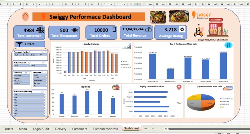
This is the Dashboard of swiggy analysis using Excel
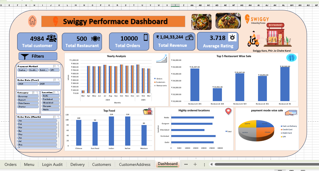
A Swiggy data analysis project is a deep dive into the business of food delivery, using data to uncover key insights and provide actionable recommendations. It's about turning raw transactional data—like order details, customer ratings, and delivery times—into a clear narrative that helps a company like Swiggy make smarter decisions.
Key Components of the Project:
- Data Preparation and Modeling:
Data Cleaning: The initial step involves cleaning the raw dataset, which might come from a source like Kaggle or a simulated database. This includes handling missing values, correcting data types (e.g., ensuring prices are numerical), and removing duplicates.
Data Transformation: Using tools like Excel for smaller datasets or MySQL for larger ones, you would transform the data into a more usable format. This could involve creating new columns (e.g., order_month from a date column) or aggregating data (e.g., total orders per restaurant).
- Key Performance Indicators (KPIs) Analysis: The project focuses on a set of core metrics to evaluate business health. These include:
Financial Metrics: Total revenue, total orders, and average order value (AOV).
Operational Metrics: Total restaurants, total customers, and average delivery time.
Customer Metrics: Customer satisfaction scores (from ratings data) and order accuracy.
- Exploratory Data Analysis (EDA): This is where the insights are generated. The project would explore:
Geographical Trends: Identifying top-performing cities or neighborhoods based on order volume and revenue.
Temporal Trends: Analyzing order patterns by day of the week, time of day, or season to understand peak hours and demand fluctuations.
Top Performers: Pinpointing the most popular cuisines, top-rated restaurants, and most-ordered food items.
- Dashboard Creation and Visualization: Using powerful Business Intelligence (BI) tools like Power BI or Tableau, the cleaned and analyzed data is used to create an interactive dashboard. This dashboard serves as a single source of truth for business performance. It includes:
KPI Cards: Prominently displaying the key metrics for a quick overview.
Visualizations: Using charts, graphs, and maps to tell a story with the data (e.g., a bar chart showing yearly revenue, a pie chart of payment methods, or a map of orders by location).
Filters: Allowing users to drill down into the data by filtering for a specific city, payment method, or time period.
- Actionable Recommendations: The ultimate goal of the project is to provide tangible business value. Based on the insights, you would offer recommendations such as:
Suggesting which restaurants or cuisines to focus on for marketing campaigns.
Identifying areas for operational improvements to reduce delivery times.
Proposing strategies to improve customer satisfaction and retention.

Log in or sign up for Devpost to join the conversation.