Inspiration
The inspiration to create the Global Renewable Energy Explorer app came from the growing need to understand renewable energy trends worldwide, to promote sustainability, and to provide a tool that helps researchers, policymakers, and students visualize and predict future energy production for better decision-making in addressing global energy challenges. With climate change and energy transitions becoming increasingly urgent, we saw a need for a platform that could simplify complex data and make it accessible to a broad audience. We were motivated by the idea of creating an app that goes beyond simple data presentation. By integrating advanced forecasting technology like Meta's Prophet, we aimed to provide more accurate, long-term predictions of renewable energy production.
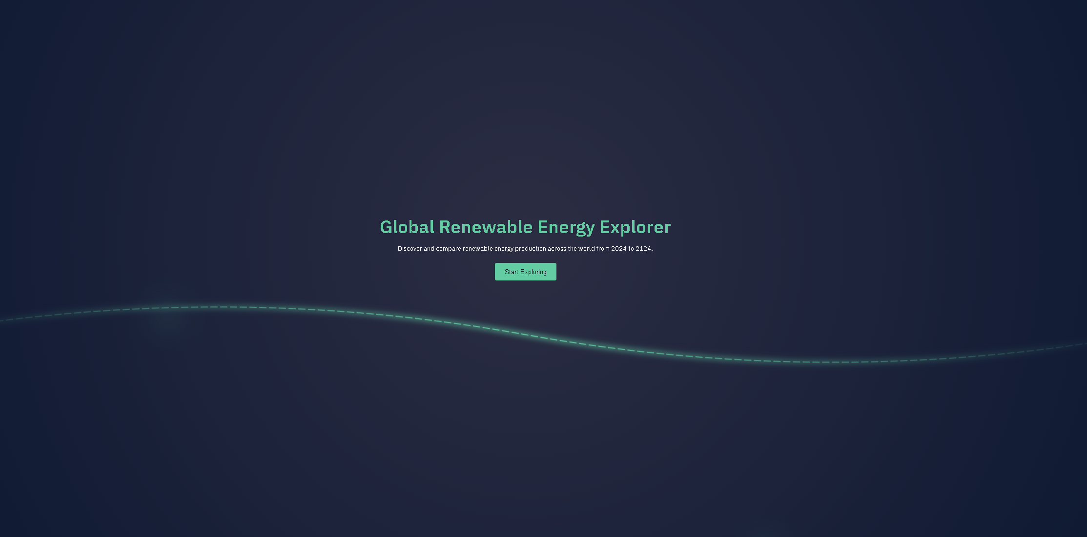
What it does
Users begin by pressing "Start Exploring" to access an interactive 3D globe. From there, they can select countries to view the predicted renewable energy production for the current year. A time-slider allows users to explore future predictions up to 100 years ahead. The app also provides global insights, including the top 5 renewable energy producers for each year and overall global rankings based on energy output. The dataset, sourced from 'Our World in Data,' is stored in a CSV for future analysis and visualization.
How we built it
Our app predicts renewable energy production using Meta's Prophet procedure, a highly advanced forecasting tool that analyzes global energy trends. The predicted data is stored in a MongoDB database, fetched via a Flask backend to ensure real-time updates and seamless data retrieval. The 3D globe is created using Globe GL.
Challenges we ran into
The development of the Global Renewable Energy Explorer app presented several technical challenges that shaped our journey. Initially, we aimed to create a visually engaging 3D model of the globe using Blender. However, this decision quickly became a source of frustration. As we delved into the complex usage of Blender, we found ourselves spending countless hours learning the software, attempting to build a realistic globe. Despite our dedication, progress was slow, and trying to create this 3D modeling overwhelmed us.
Recognizing that our original approach was hindering our timeline, we pivoted to GlobeGL, a more user-friendly tool that allowed us to focus on the app's core functionality without getting lost in the technicalities of 3D design. This switch proved beneficial, enabling us to create an interactive globe that users could explore to visualize renewable energy data more effectively by coding.
Additionally, we faced challenges in selecting the right data forecasting methods. Our initial strategy involved using linear regression for predicting energy production trends. While this method provided a basic understanding, it lacked the accuracy we desired. After some research, we transitioned to using Meta's Prophet for our forecasting needs. This advanced technology allowed us to generate more reliable, long-term predictions about renewable energy production, significantly enhancing the app's value for researchers, policymakers, and students.
Accomplishments that we're proud of
We're proud of accurately predicting data for the next 100 years and implementing a sleek front-end design with an interactive 3D globe.
What we learned
We learned how to integrate advanced forecasting tools like Meta's Prophet for accurate predictions and use Flask to manage real-time data fetching and updates. We also learned how to optimize data storage and retrieval with MongoDB, and how to create interactive, user-friendly interfaces using Globe GL. Additionally, we gained experience in designing a seamless user experience with a time-slider for exploring long-term predictions. Finally, we learned how to manage and visualize large datasets for future analysis.
What's next for Sustainable-Energy-Model
If we were to create a 2.0 version of the Global Renewable Energy Explorer app, several key improvements would enhance its functionality and user experience. First, we would focus on refining the user interface (UI) to make it more visually appealing, allowing for seamless navigation for researchers, policymakers, and students. This could include customizable dashboards and more. Additionally, expanding the dataset to include more granular data points, such as renewable energy sources at regional and local levels, energy efficiency metrics, and socio-economic indicators, would significantly increase the app's utility. Enhancing data visualization tools is also essential as this would allow users to explore trends and patterns more effectively. Finally, establishing a system for continuous data updates and enabling user contributions would ensure the app remains relevant and up to date for users to effectively use.

Log in or sign up for Devpost to join the conversation.