Inspiration
- Lack of Accessible Sustainability Information: Many resources on sustainability are overly technical or not easily accessible, making it challenging for everyday users to understand and engage with sustainability practices.
- Need for Actionable Data: People are often unsure how their daily actions impact the environment and do not know what steps they can take to improve sustainability in tangible ways.
- Limited Data on Local Environmental Impact: Understanding how one's community contributes to or mitigates environmental impact is often difficult due to limited localized data sources.
- Difficulty Visualizing Sustainability Metrics: Sustainability metrics can be abstract or complex, making it challenging to understand how they apply to individuals' daily lives.
- Lack of Understanding of Associations: Our dashboards explore associations between different variables, revealing patterns previously unknown, and making these associations easy to grasp through visualizations.
What are Association Rules
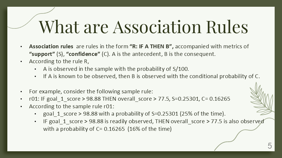
Association rules are in the form “R: IF A THEN B”, with metrics of “support” (S) and “confidence” (C).
- A is the antecedent, B is the consequent.
For example, consider the sample rule:
- r01: IF goal_1_score > 98.88 THEN overall_score > 77.5, S=0.25301, C= 0.16265
- Here, goal_1_score > 98.88 with a probability of S=0.25301 (25% of the time).
- IF goal_1_score > 98.88 is observed, THEN overall_score > 77.5 is observed with a probability of C= 0.16265 (16% of the time).
What it Does
The Sustainability Dashboards website provides accessible, data-driven insights into various aspects of environmental sustainability:
- Educational Dashboards: Easy-to-understand visualizations and metrics to help users grasp sustainability goals and progress.
- Localized Data: Insights into community-specific sustainability efforts, helping users understand environmental impacts at a local level.
- Interactive Learning Tools: Tools that allow users to interact with data, simulating the impact of different actions on sustainability outcomes.
- Practical Tips and Guidance: Actionable insights for individuals and decision-makers looking to make environmentally friendly choices.
- Accessible and Clear Content: Information is presented in a straightforward, jargon-free manner to make sustainability approachable.
How We Built It
The Sustainability Dashboards website was created using Google Sites for a user-friendly interface and flexibility. For data visualization, Tableau Public was used to create dynamic, interactive dashboards. Additionally, Orange data mining software helped design interactive visuals and conduct association mining.
Challenges We Faced
- Simplifying Complex Sustainability Data: Translating dense environmental data into actionable insights without losing accuracy.
- Engagement and Usability: Balancing detailed information with an intuitive interface to make sustainability approachable.
- Designing the Best Dashboards: Choosing designs that are most useful across multiple dashboard versions.
What We Learned
Presenting complex sustainability data in an engaging, accessible format is crucial for fostering understanding and action. Emphasizing user-friendly design was essential for making sustainability data approachable and clear for a broad audience.
What’s Next for Sustainability Dashboards
- Real-Time Data Feeds: Link to real-time data (e.g., local air quality, energy consumption, or water usage) to keep dashboards current and actionable.
- Add Interactive Quizzes or Challenges: Gamified elements like quizzes or challenges (e.g., "7-Day Green Challenge") to drive engagement and learning.
- Social Sharing and Community Interaction: Allow users to share insights on social media or join a forum to discuss ideas, challenges, and achievements, building a community around sustainability.
Built With
- google-sites
- orange
- tableau


Log in or sign up for Devpost to join the conversation.