-
-

Easy Sign In with Google
-

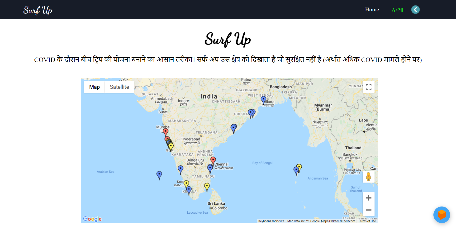
Blue marker: Represents the number of fewer cases and its safe to visit
-

Yellow marker: This represents the number of moderate cases and it's a bit risky to visit
-

Red marker: Represents the number of many cases and it's very dangerous to visit
-

Dialogflow Chatbot
-

Home pageAvailable in other language


Inspiration
Summer is here and everyone wants to relax and take a break from their busy life. And the first thing that strikes in our mind is beatches. But due to COVID, it's risky to step out without precautions. Therefore representing Surf Up, a web platform where you can check the number of COVID cases with a warning marker so that you can plan your trip safely
What it does
Surf Up shows the number of COVID cases with a different marker for safety measures so that you can plan your trip safely. The different Markers represents:
- Blue: Represents the number of fewer cases and its safe to visit
- Yellow: This represents the number of moderate cases and it's a bit risky to visit
- Red: Represents the number of many cases and it's very dangerous to visit
How we built it
- Google Map API
- Google Cloud
- Dialogflow
- React Js
Challenges we ran into
As it was the first time working with google cloud it was a bit difficult in beginning, but once I try building with it, it came out to be easy to use.
Accomplishments that we're proud of
Learning google cloud, and integration with the application, and completing the project in the given time frame.
What we learned
Use of Google Cloud and integrating it with our web application.
What's next for Surf Up
- Adding more batches.
- Deploying it on the web.
Built With
- css3
- dialogflow
- google-cloud
- google-maps
- react


Log in or sign up for Devpost to join the conversation.