-
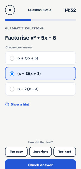
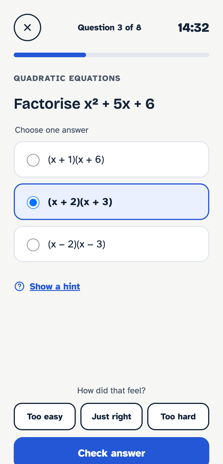
Question Screen
-
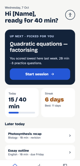
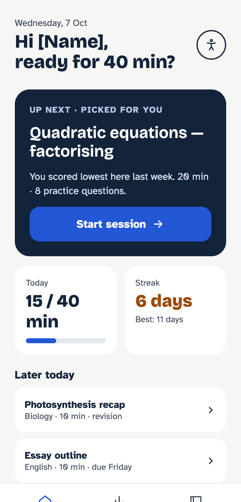
Dashboard Screen
-
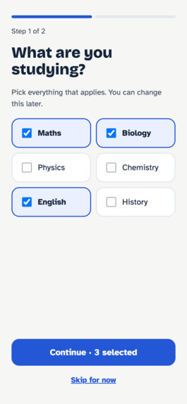
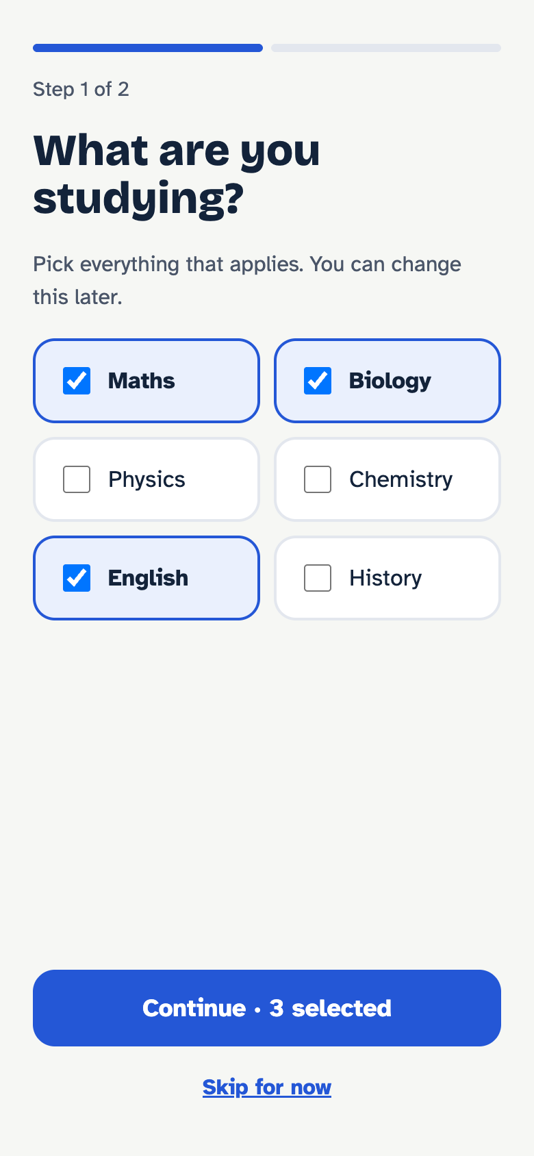
Onboarding: subjects
-
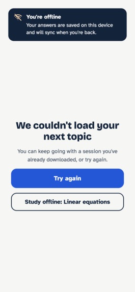
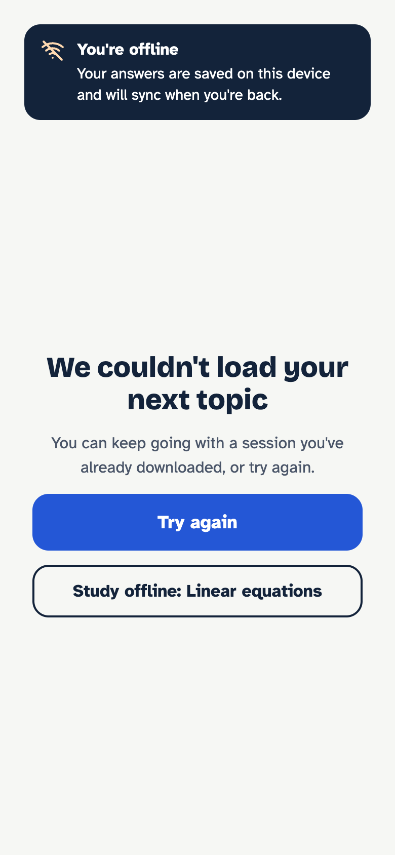
Error state
-
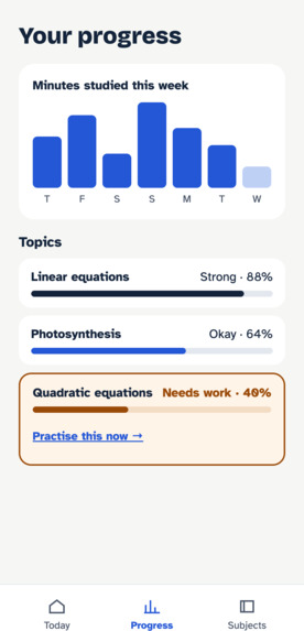
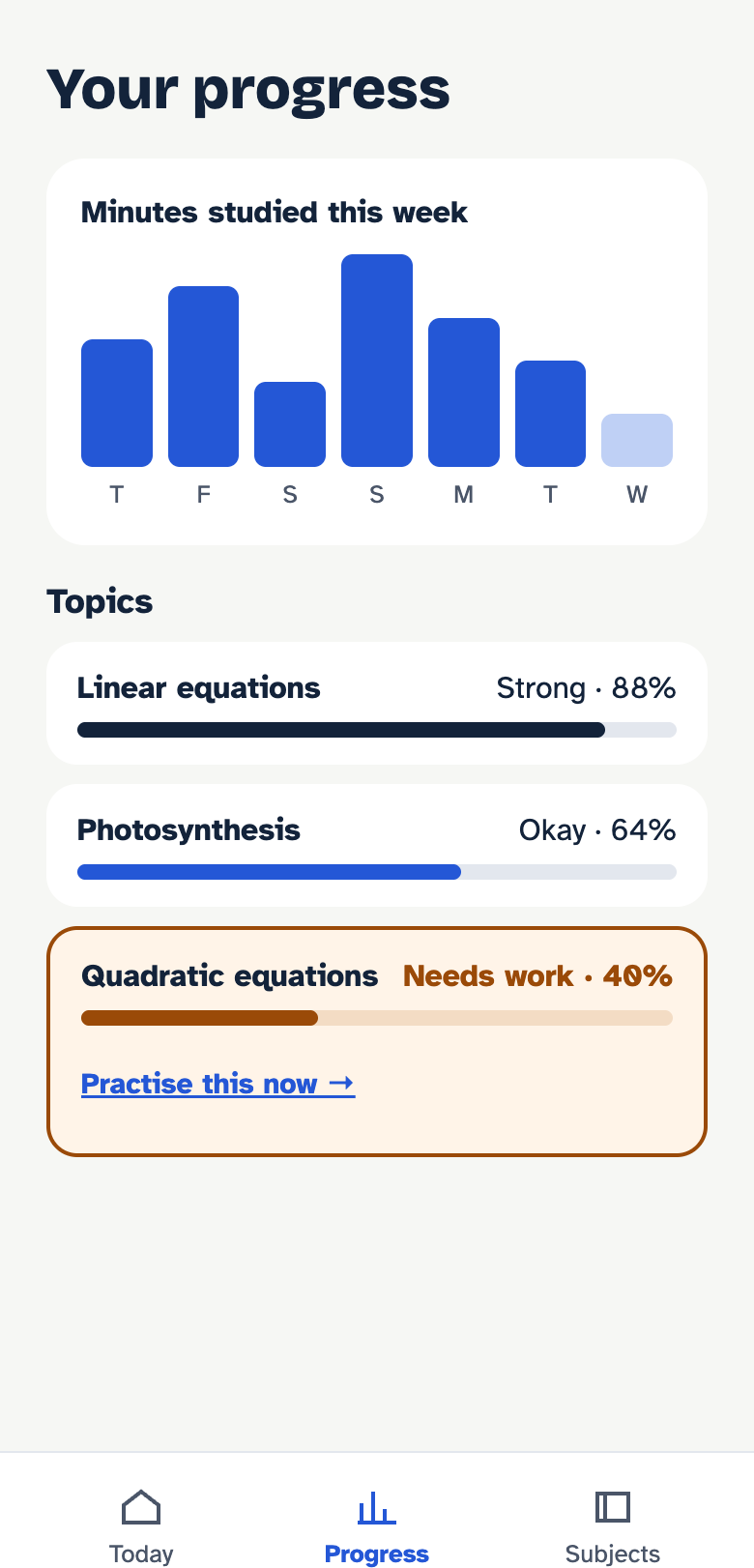
Your Progress Screen
-
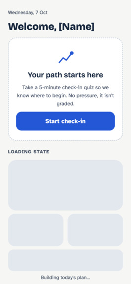
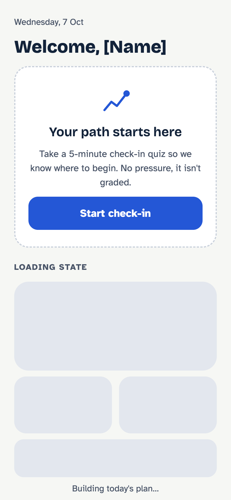
Empty + loading
-
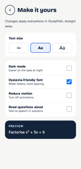
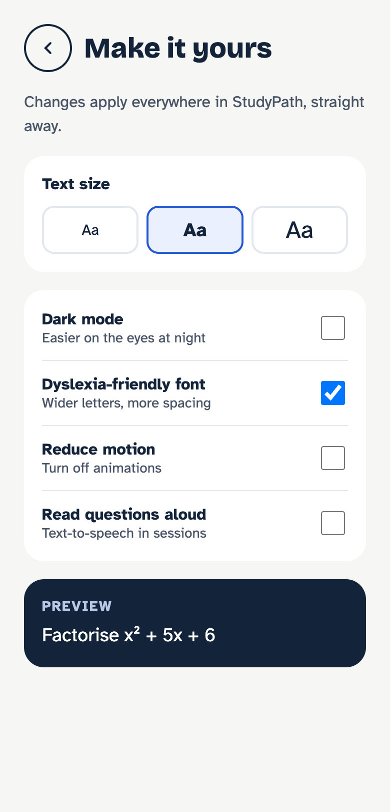
Accesibility Screen
-
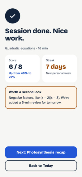
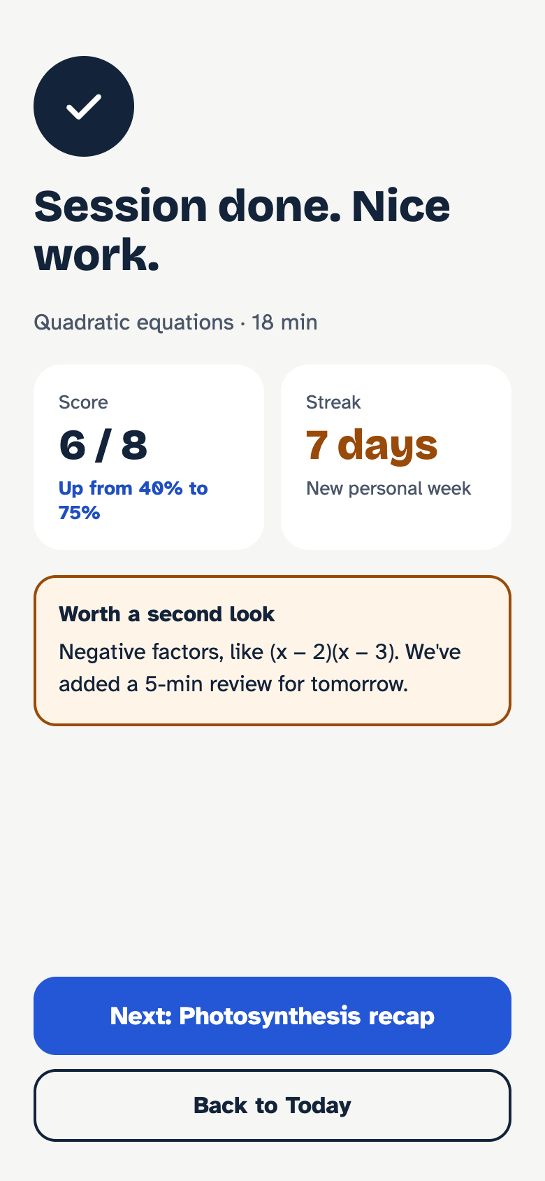
Session complete
-
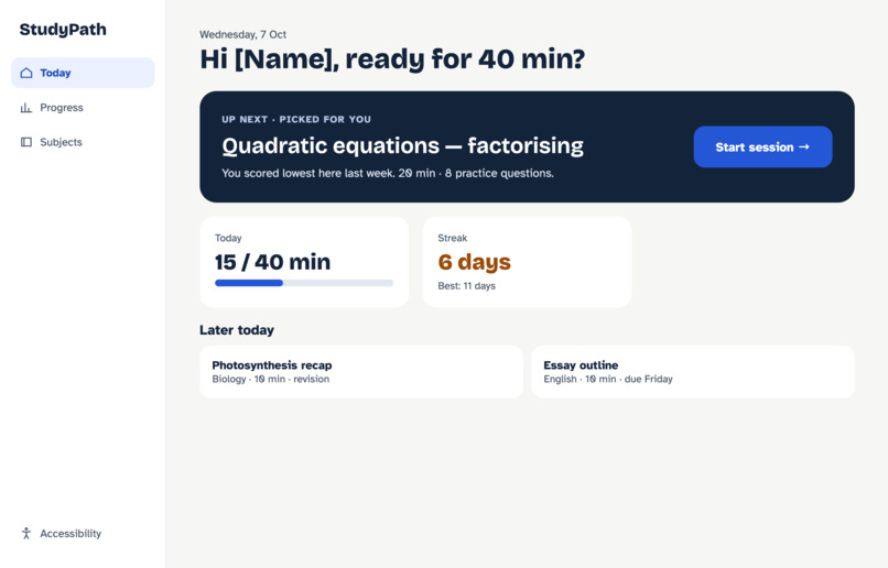
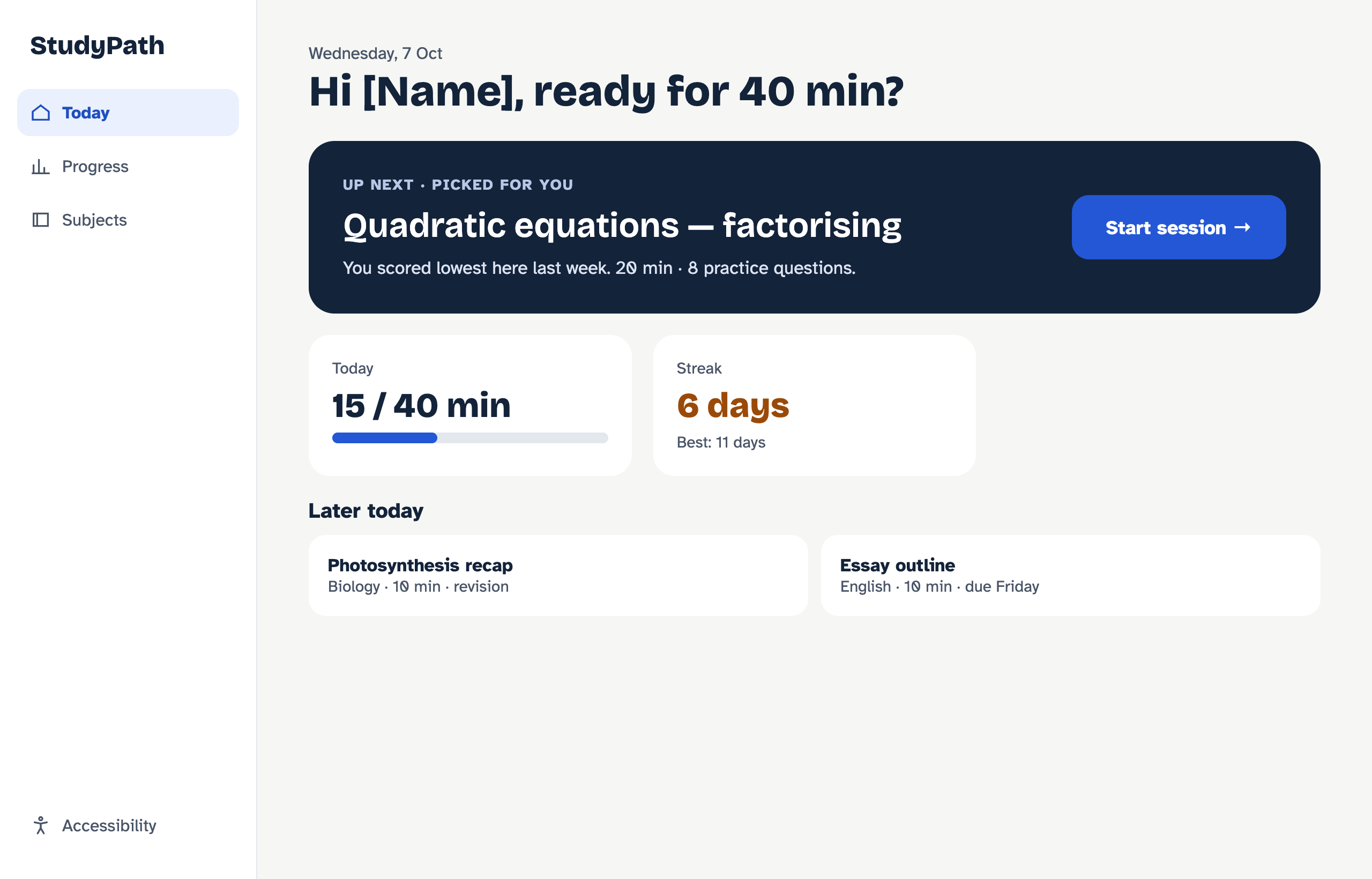
Today (desktop)
-
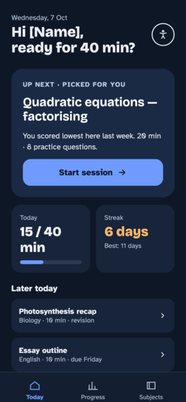
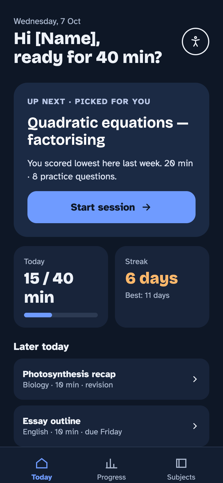
Today (dark mode)
-
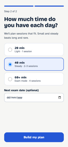
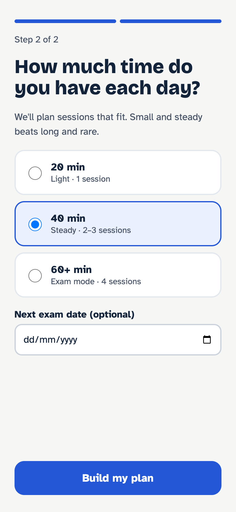
Onboarding: goal
Inspiration
I built TaskFlow, an adaptive-learning web app, and noticed a frustrating pattern: students opened it and then spent their first few minutes deciding what to study instead of studying. The smart recommendations were there, but buried in a busy dashboard. I also realised that small text and low-contrast greys made it harder for students with low vision or dyslexia. StudyPath is my redesign, built around one question: what if the next step were always one tap away?
What it does
StudyPath is an accessible, adaptive study companion.
Today screen: One "Up next" card picks the student's weakest topic, explains why, and starts a session in one tap. Focused study sessions: One question at a time, with a timer, hints, and a "too easy / just right / too hard" rating that tunes future sessions. Session results: Score improvement, streak, and one topic to revisit tomorrow. Progress: Weekly study minutes and topic strength, with weak topics linking straight back into practice. Accessibility settings: Text size, a dyslexia-friendly font, dark mode, reduced motion, and read-aloud, with a live preview. Thoughtful states: A friendly first-visit screen, loading placeholders, and an offline mode that saves progress.
How we built it
I started by interviewing [N] students and running a short survey to understand how they choose what to study. From that I built a persona and mapped the core flow: onboarding, Today, session, results, progress. I then sketched wireframes and created a design system with accessible colour tokens, Atkinson Hyperlegible for readability, and Bricolage Grotesque for headings. Finally, I designed 11 high-fidelity screens, including dark mode and a responsive desktop layout, and linked them into a clickable prototype in [Figma].
Challenges we ran into
Saying no to features. It was tempting to add profiles, notifications, and teacher tools, but cutting them kept the core flow simple and polished. Contrast in dark mode. White text on my lighter dark-mode blue failed WCAG contrast, so I switched the main button to dark text on light blue. Not relying on colour. Weak topics needed a label and border, not just an amber colour, so colour-blind users could see them too. [Add any real challenge, such as time management or Figma prototyping.] Accomplishments that we're proud of A complete, clickable flow from first launch to finished session and progress review. Accessibility built in from the start: AA contrast, 44px touch targets, screen-reader labels, and user-controlled display options. Designing the empty, loading, and error states that are often skipped. A design that works on both mobile and desktop.
What we learned
Good UX is often about removing choices rather than adding them. I also learned that accessibility decisions, like readable fonts and clear labels, make the app better for every student, not just those who need them. And talking to real students early changed my design more than any amount of guessing would have.
What's next for StudyPath
Build the redesigned Today and session screens into the live TaskFlow app. Test with screen readers and with more students, including students with dyslexia. Add a teacher view to track class progress and assign topics. Introduce gentle study reminders and exam countdown planning.
Built With
- atkinson-hyperlegible
- bricolage-grotesque-tech-(if-you-built-the-website):-html
- css
- dark-mode
- design-system
- design:-figma
- figma-prototyping
- html.to.design
- inclusive-design
- javascript
- next.js
- prototyping-accessibility:-accessibility
- react
- responsive-design-fonts:-google-fonts
- ui-design
- ux-design
- ux-research
- vercel
- wcag
- wireframing
