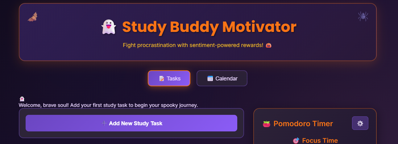


👻 Study Buddy Motivator: Emotion‑Aware Study Companion Procrastination isn’t just a time‑management problem, it’s an emotional problem. Feeling bored, anxious, or overwhelmed about a task makes it hard to start, even when you know exactly what to do. Study Buddy Motivator was built to tackle this emotional barrier head‑on: instead of pretending feelings don’t exist, the app listens to how you feel, analyzes your sentiment, and turns that into smart rewards, structure, and gentle pressure to help you move.
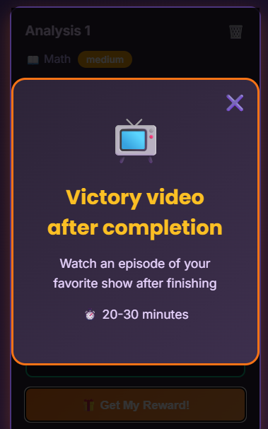
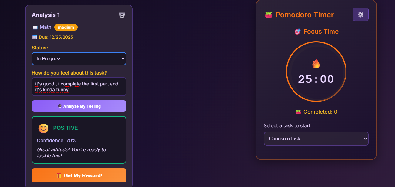
The inspiration came from the mix of three ideas: classic to‑do apps, the Pomodoro technique, and the reality that many students scroll funny videos or music anyway when they’re stressed. The project asks: “What if we embraced that and turned it into a system?” So the app lets you add study tasks, honestly describe how you feel about them, and then uses a simple sentiment engine plus a rule‑based reward system to suggest tiny, mood‑appropriate incentives—like a 5‑minute funny cat video break for strong negative feelings, or a post‑completion gaming session when you’re already motivated.
🧪 What I learned & how I built it On the frontend, the app is built with React and Vite, using functional components and hooks for state management. Components like App, AddTask, TaskList, TaskItem, SentimentAnalysis, PomodoroPanel, CalendarView, and MotivationalCompanion work together to create a smooth, reactive UI. Animations are implemented with Framer Motion to make task cards fade and slide in, modals pop with a satisfying motion, and Halloween icons float subtly around the interface. The UI follows a dark, spooky Kiroween theme with purple/orange highlights, ghost and pumpkin emojis, and playful micro‑interactions that make the experience feel more like a game than a sterile productivity tool.
On the backend, a Node.js + Express REST API handles task CRUD operations, sentiment analysis, reward recommendations, and a simple “procrastination index.” Tasks are stored in an in‑memory array for the hackathon MVP, with helper functions to create, update, delete, and read tasks, calculate the index, and log helpful debug information when something goes wrong. The sentiment analysis is intentionally simple but transparent: it uses keyword matching on lists of positive and negative words, computes a score, and returns a label plus an emoji. The reward engine is rule‑based: given a sentiment label/score and task status, it selects a random reward template (video, music, break idea) from predefined lists.
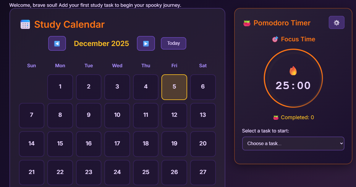
🍅 Pomodoro, 📅 Calendar, and the Frankenstein spirit The Pomodoro panel is integrated directly with tasks rather than existing as a totally separate feature. You select a task from a dropdown, start a focus session, and the active task card gets a glowing border and a “⏱ Focus now” badge while a circular timer runs on the side. Each phase (focus, short break, long break) has its own color, emoji, and animation. When a first Pomodoro finishes, the app can automatically move the task from “Not Started” to “In Progress”, and play a small audio cue. This makes the timer feel like part of the study flow, not just a stopwatch sitting next to it.
The calendar view gives a second, higher‑level way to see your workload. Tasks appear on their deadline dates, with Halloween icons indicating how “scary” a day is: a spider for one task, a ghost for a few, and a pumpkin for very busy days. Clicking a date shows its tasks and lets you jump directly back to their cards in the Tasks view. Together with the Pomodoro and sentiment‑driven rewards, this brings three different “body parts” (planning, emotion, and time‑boxing) into one stitched‑together Frankenstein app that still feels coherent and fun.
⚔️ Challenges faced Several challenges showed up along the way:
State sync vs. in‑memory backend: because the backend stores tasks in RAM, restarting the server clears all tasks. Keeping the frontend state and backend data consistent required careful handling of 404s (e.g., deleting tasks that no longer exist) and clear “refresh” behavior.
Error handling and developer clarity: when things went wrong (missing task IDs, bad ports, wrong URLs), it was important to add logging and user‑friendly error messages so debugging and UX both stayed manageable.
Balancing theme vs. usability: adding Halloween decorations, animations, and spooky text without overwhelming or distracting the user required iteration—keeping the UI clean, legible, and responsive while still fun.
In the end, the biggest win was proving that even a simple, keyword‑based sentiment engine and rule‑based reward system can create an experience that feels emotionally aware and supportive, especially when combined with small design details and helpful timing structures.
Built With
- ccs
- cors
- cors-logic:-keyword?based-sentiment-analysis
- css-backend:-node.js
- data
- express.js
- framer-motion
- in?memory
- keyword?based-sentiment-analysis
- node.js
- react
- reward
- rule?based
- rule?based-reward-engine-other:-web-audio-api-(pomodoro-sounds)
- store
- uuid
- vite
- web-audio-api-(pomodoro-sounds)


Log in or sign up for Devpost to join the conversation.