-
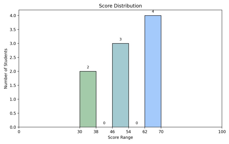
Score Distribution

I was inspired by how teachers analyze and summarize student grades to better understand their performance. I wanted to create a tool that can visualize student scores clearly and interactively. During this project, I learned how to use Python, especially Matplotlib, to draw histograms and customize charts. I faced some challenges in fine-tuning the intervals and making the visualization both accurate and easy to read, such as adjusting the number of score intervals based on input and adding clear labels on the bars. Overcoming these difficulties helped me improve both my coding skills and my understanding of data visualization.


Log in or sign up for Devpost to join the conversation.