-
-

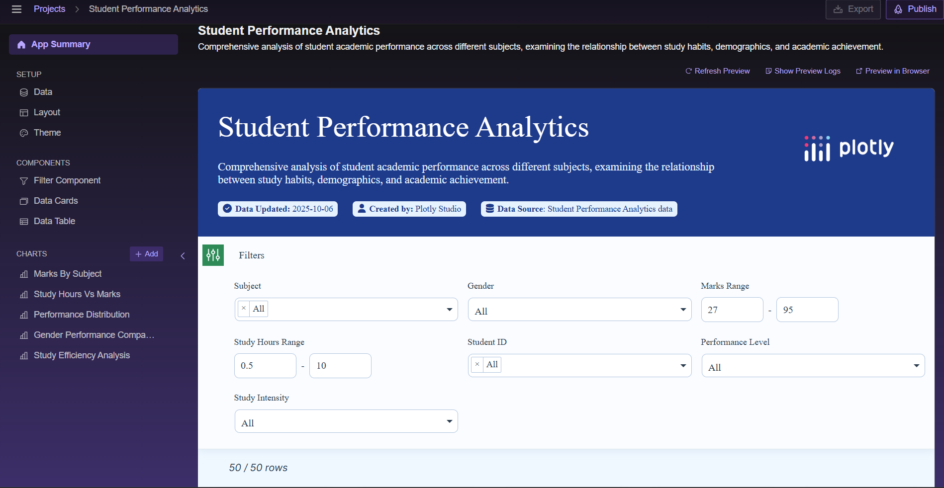
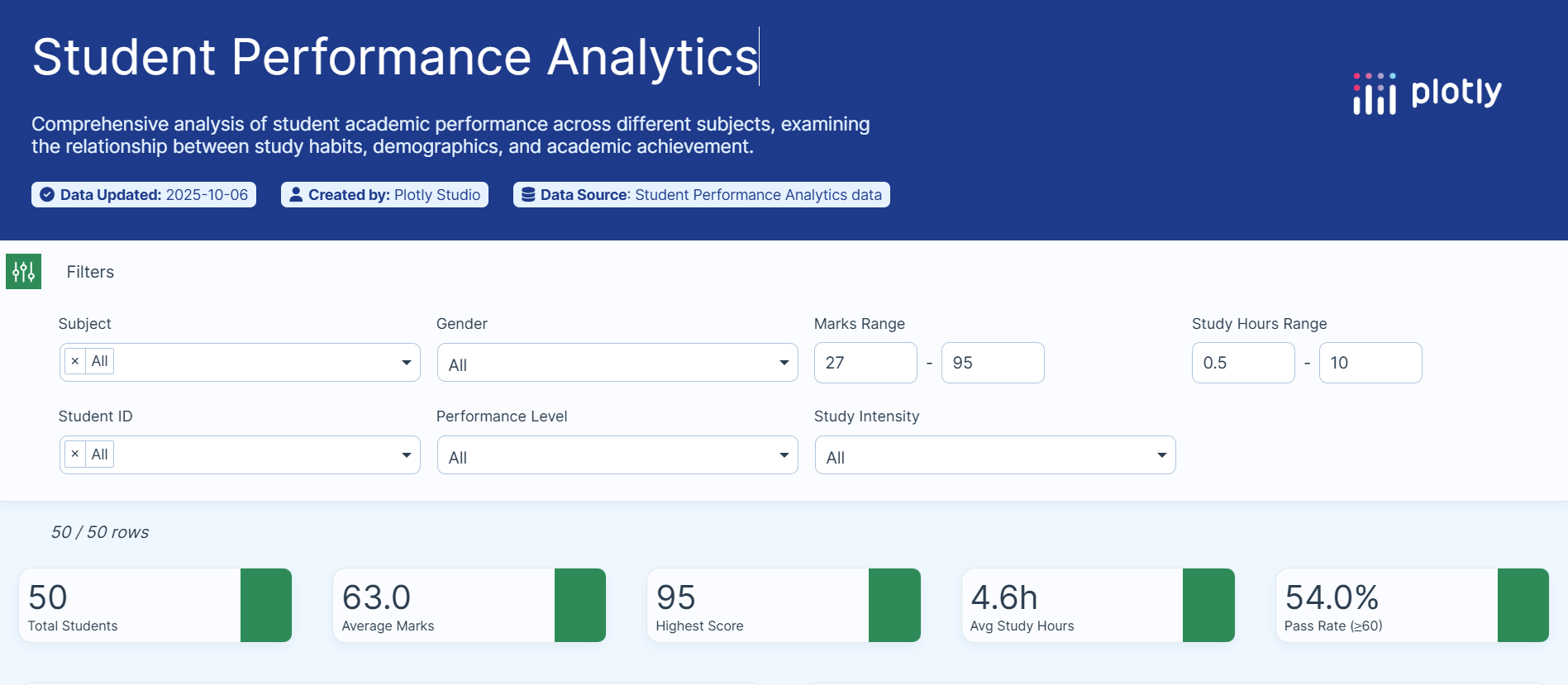
Filter Panel
-

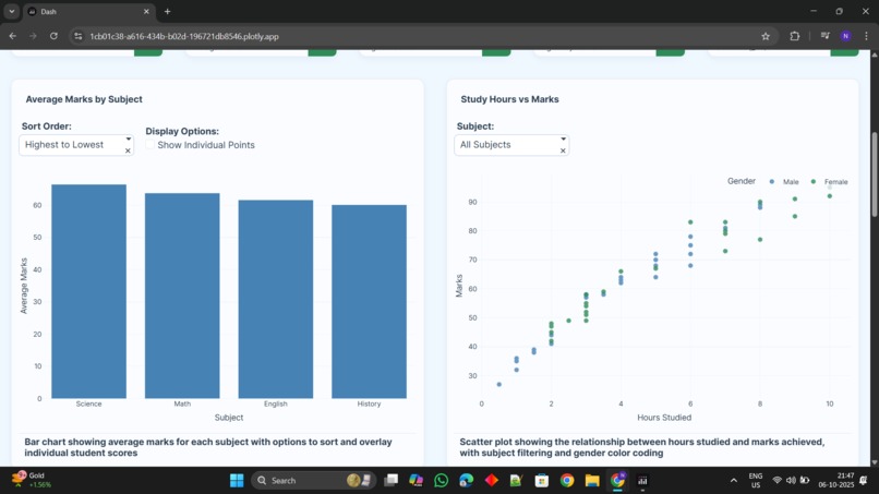
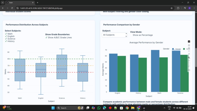
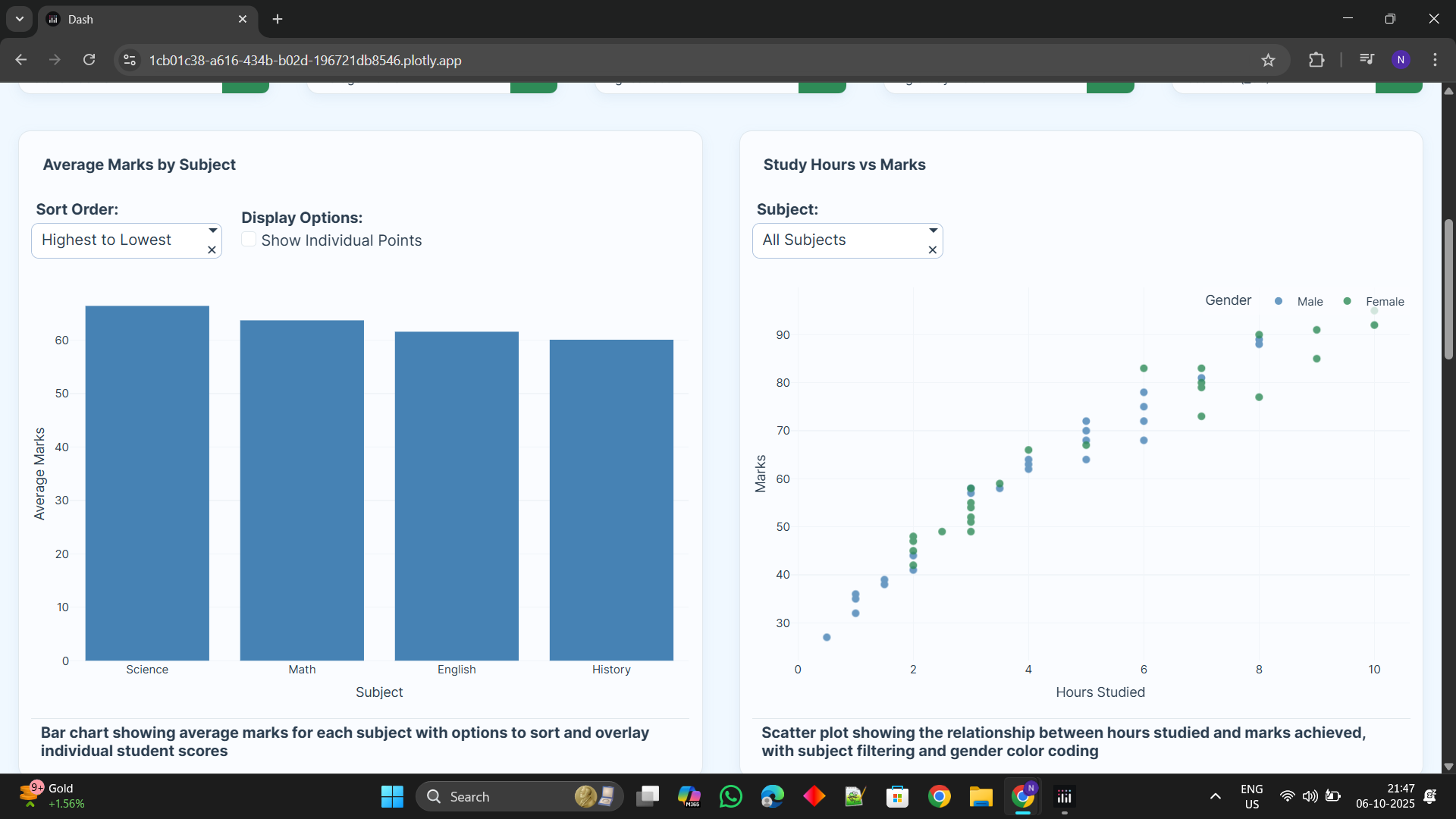
Graphicl represtation
-
-
-
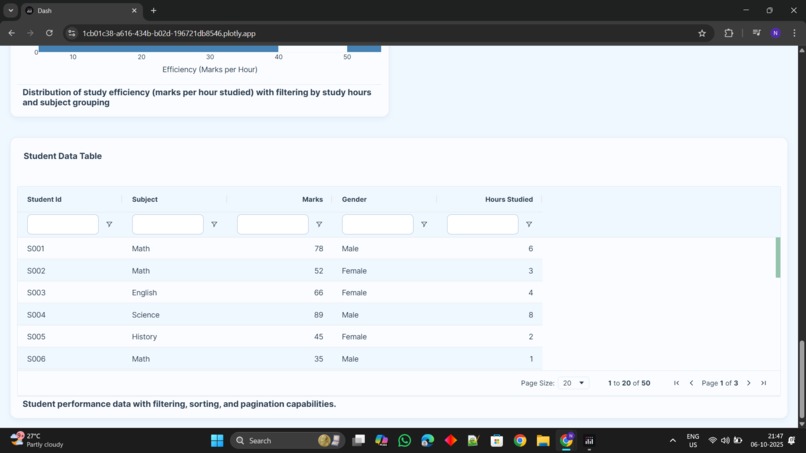
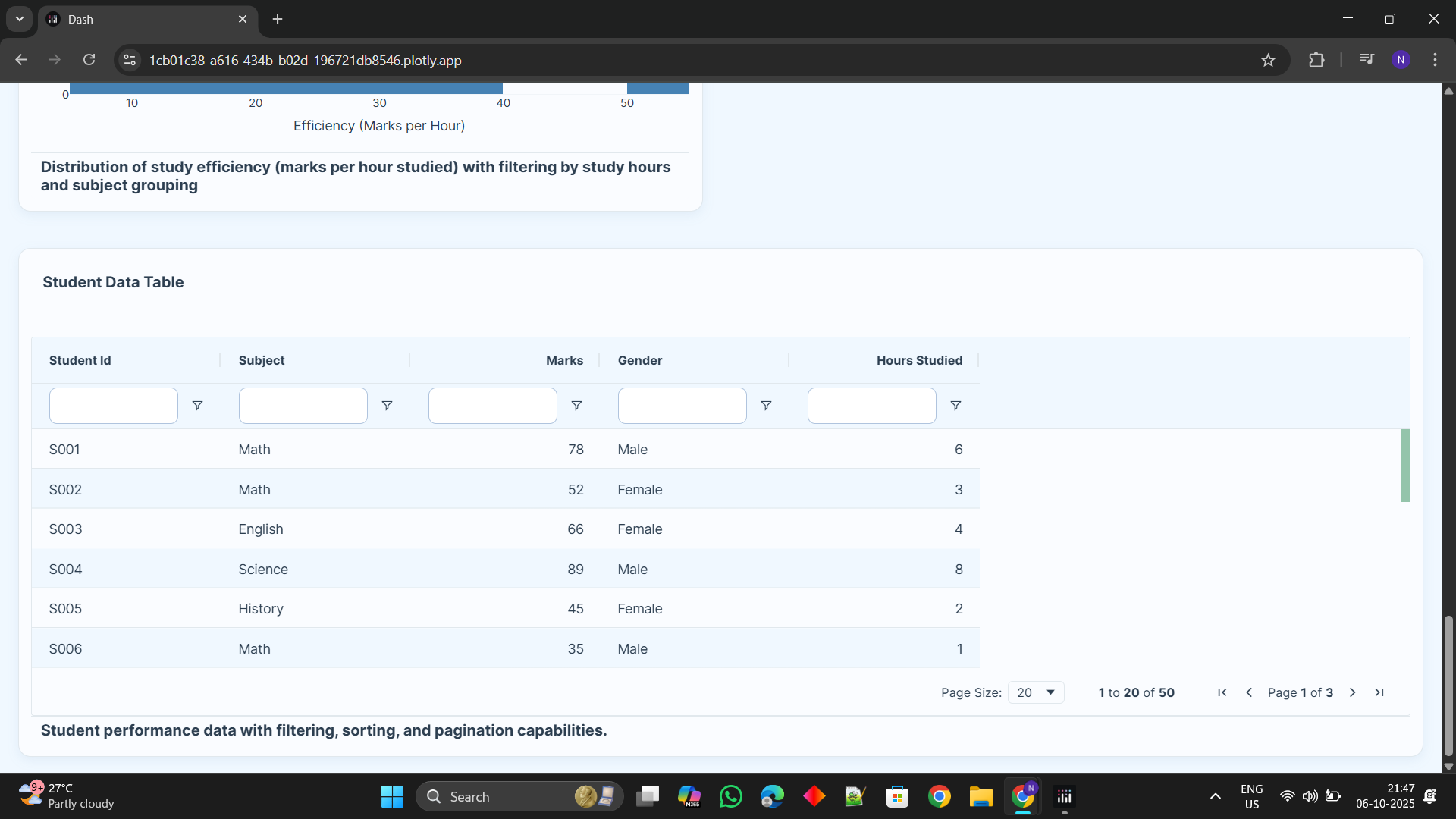
data uploded

Inspiration:
Problem: Student data in raw spreadsheets is hard to understand. Goal: Turn such complicated data into easy-to-understand, actionable information. Audience: Give teachers, administrators, and students the power of data. Need: A simpler way to identify student trends and potential dropouts. Solution: Build an interactive dashboard for non-technical users.
What it does:
Gives an overall visual summary of student performance. Visualizes principal metrics via interactive graphs and charts. Dynamically filters data through subject, gender, and others. Facilitates easy identification of trends and school patterns for educators. Identifies students who could need extra academic help.
How we built it:
Backend: Applied the Pandas library in Python for every data processing. Framework: Developed the interactive web app with Plotly Dash. Visualization: Produced responsive graphs and charts via Plotly Express. Language: The whole application was coded end-to-end in Python.
Challenges that we encountered:
It was challenging to maintain complex code for dependent filters. Keeping the dashboard responsive and quick even with huge datasets. Optimizing code for processing data to avoid performance lag. Creating an intuitive and intuitive layout took multiple iterations.
Achievements that we are proud of:
Transformed from a static script to an end-to-end interactive web application. Constructed a robust multi-filter system that seamlessly integrates. Created a sleek and professional user interface from the ground up. -mMade complex data easily actionable for non-technical users. Created a working tool that delivers real utility to teachers.
What we learned:
Learned the end-to-end data science project workflow. Learned how to make a data analysis a useful software product. Gained hands-on experience with web app development using Plotly Dash. Learned fundamental principles of UI/UX design for data visualization. Acquired skill in data storytelling to present insights in a useful manner.
What's next for Student Performance Analytics:
Integrate machine learning models to forecast student results. Add user accounts with roles such as "Teacher" and "Administrator." Connect the dashboard to a live database for real-time analysis. Include an ability to automatically prepare and send PDF reports via email. Proactively identify at-risk students for early intervention.


Log in or sign up for Devpost to join the conversation.