-
-
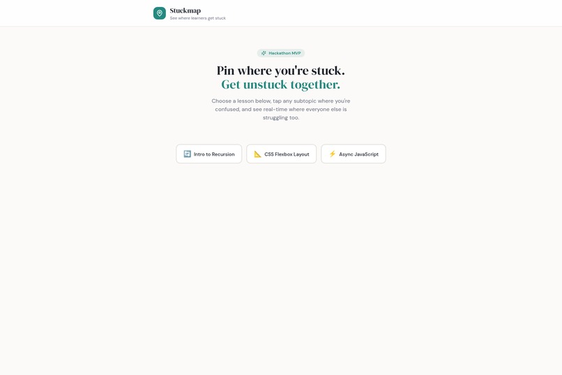
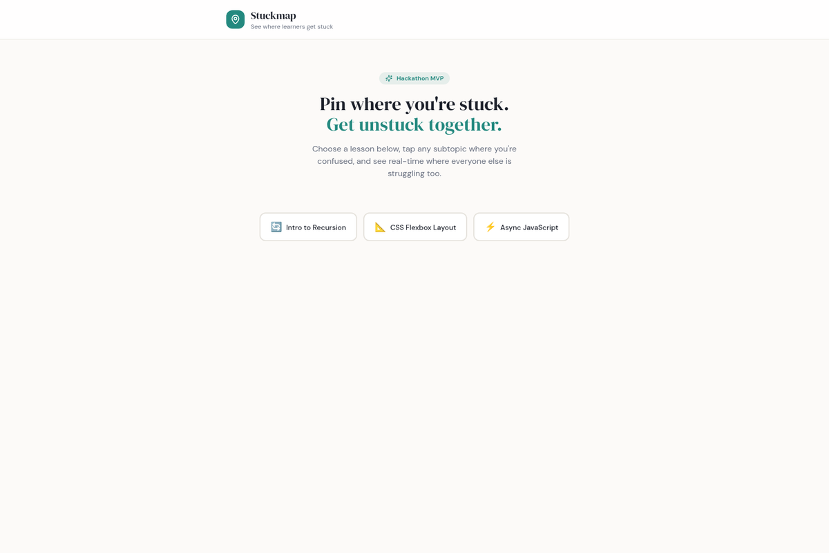
landing
-
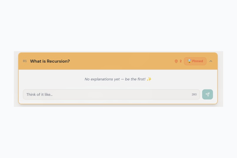
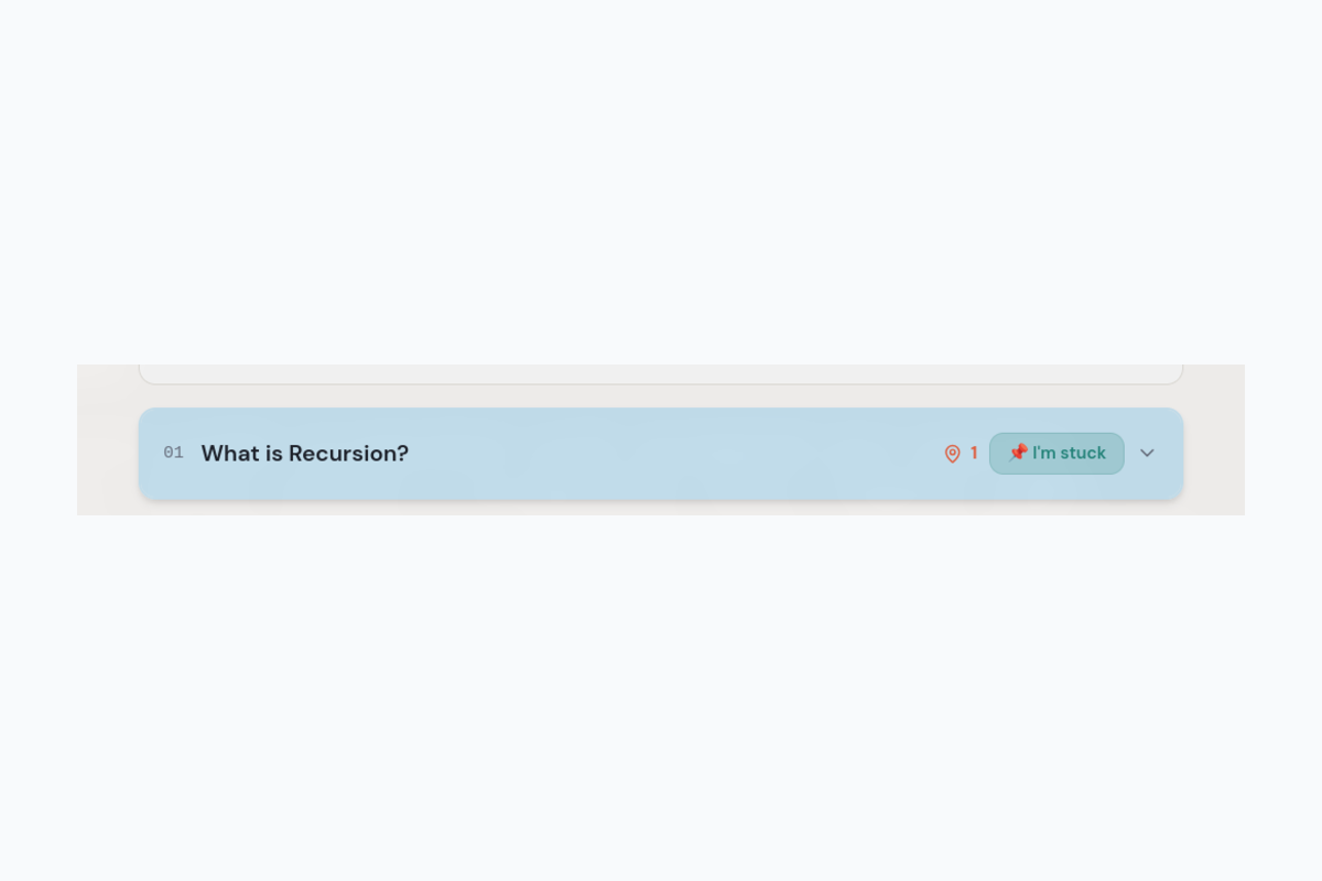
pinned
-
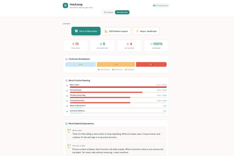
instructor
-
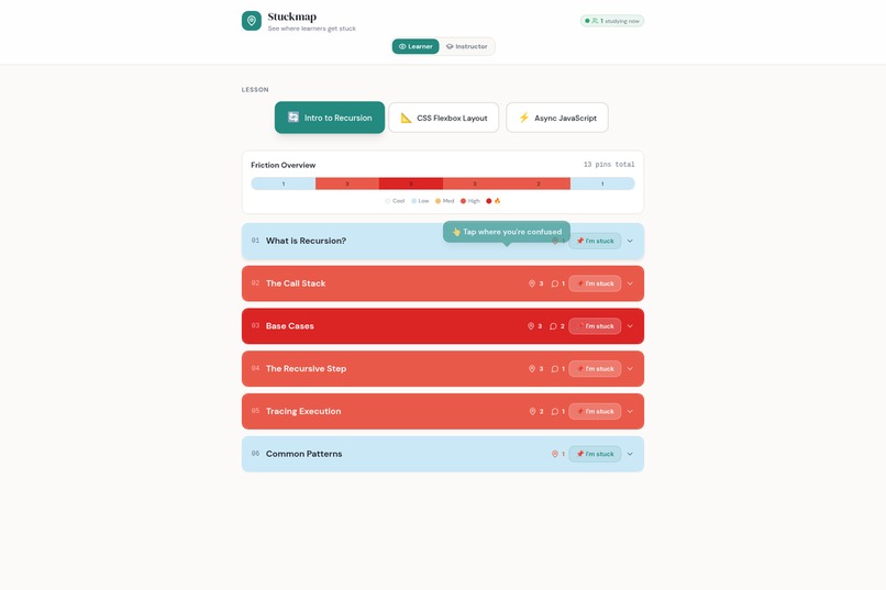
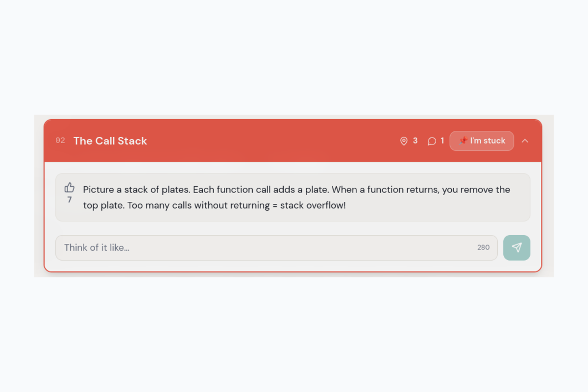
heatmap
-
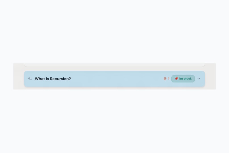
im stuck
-
reaction
-
comment


Inspiration
Every classroom has a silent majority — students too shy to raise their hand or ask "can you explain that again?" We wanted to build a tool that makes confusion visible, turning it from a hidden problem into actionable data. Inspired by heatmaps and anonymous polling, we imagined: what if learners could "pin" where they're stuck, and peers could crowdsource explanations in real time?
What it does
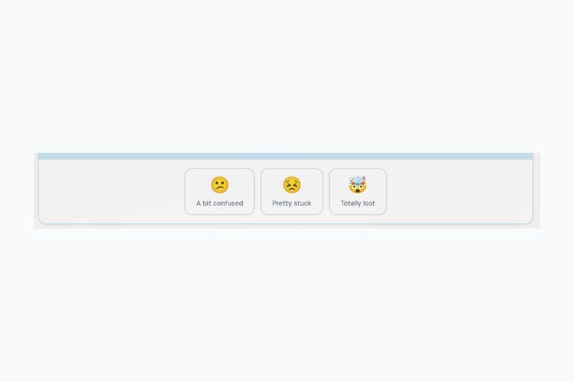
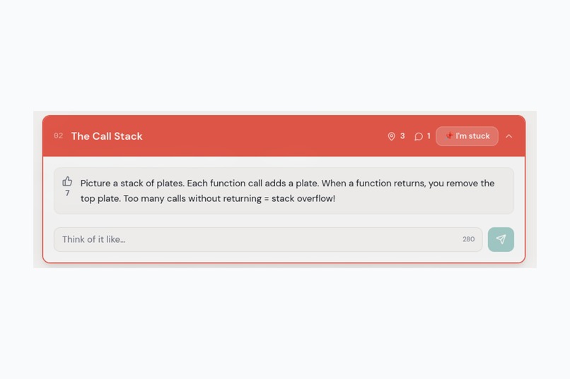
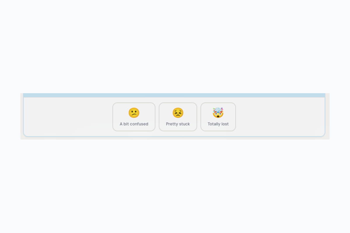
Stuckmap is a real-time confusion heatmap for any lesson. Students anonymously pin subtopics where they're confused (😕 a bit confused → 🤯 totally lost), and blocks light up from cool blue to critical red based on aggregate confusion. Peers can write short "think of it like…" explanations and upvote the most helpful ones. Instructors get a live analytics dashboard showing friction rankings, confusion breakdowns, and coverage gaps — all updating in real time.
How we built it
- Frontend: React + TypeScript + Tailwind CSS + shadcn/ui, built entirely on Lovable
- Backend: Lovable Cloud (Supabase) for real-time database with Postgres changes subscriptions
- Real-time: Supabase Realtime channels for live presence counters and instant pin/explanation sync across all connected browsers
- Design: Custom heatmap color system with semantic CSS tokens, adaptive contrast (white text on dark heat backgrounds), and a pulsing onboarding tooltip for first-time users
Challenges we ran into
- Contrast on hot blocks: When blocks turned deep red (critical heat), all text became unreadable. We solved this with a dynamic
isDarkflag that switches to white text/icons on high-intensity backgrounds. - Anonymous sessions + security: Without auth, we couldn't use RLS to validate ownership. We balanced frictionless participation with database-level CHECK constraints for input validation.
- Seed data strategy: Empty lessons looked dead. We seeded realistic confusion patterns across all three demo lessons so the app feels alive from first load.
Accomplishments that we're proud of
- The heatmap "lights up" beautifully as pins accumulate — it genuinely feels like watching a classroom's confusion in real time
- The onboarding tooltip ("👆 Tap where you're confused") auto-dismisses after first interaction — zero-friction UX
- Instructor dashboard provides actionable insights (coverage %, friction ranking) not just raw data
- Built and shipped in a single hackathon sprint using Lovable
What we learned
- Anonymous participation dramatically lowers the barrier to engagement — students who'd never raise their hand will tap a button
- Real-time visual feedback (heatmap colors changing live) creates a compelling "wow" moment
- Simple peer explanations ("think of it like…") are often more effective than instructor re-explanations
What's next for Stuckmap
- AI-generated starter explanations when no peer help exists yet
- Shareable lesson links so instructors can distribute to their class with one URL
- Historical analytics showing confusion trends across sessions
- LMS integrations (Canvas, Google Classroom) for seamless adoption
- Custom lessons where instructors can create their own subtopic blocks
Built With
- css
- lovable
- react
- shadcn
- supabase
- tailwind
- typescript

Log in or sign up for Devpost to join the conversation.