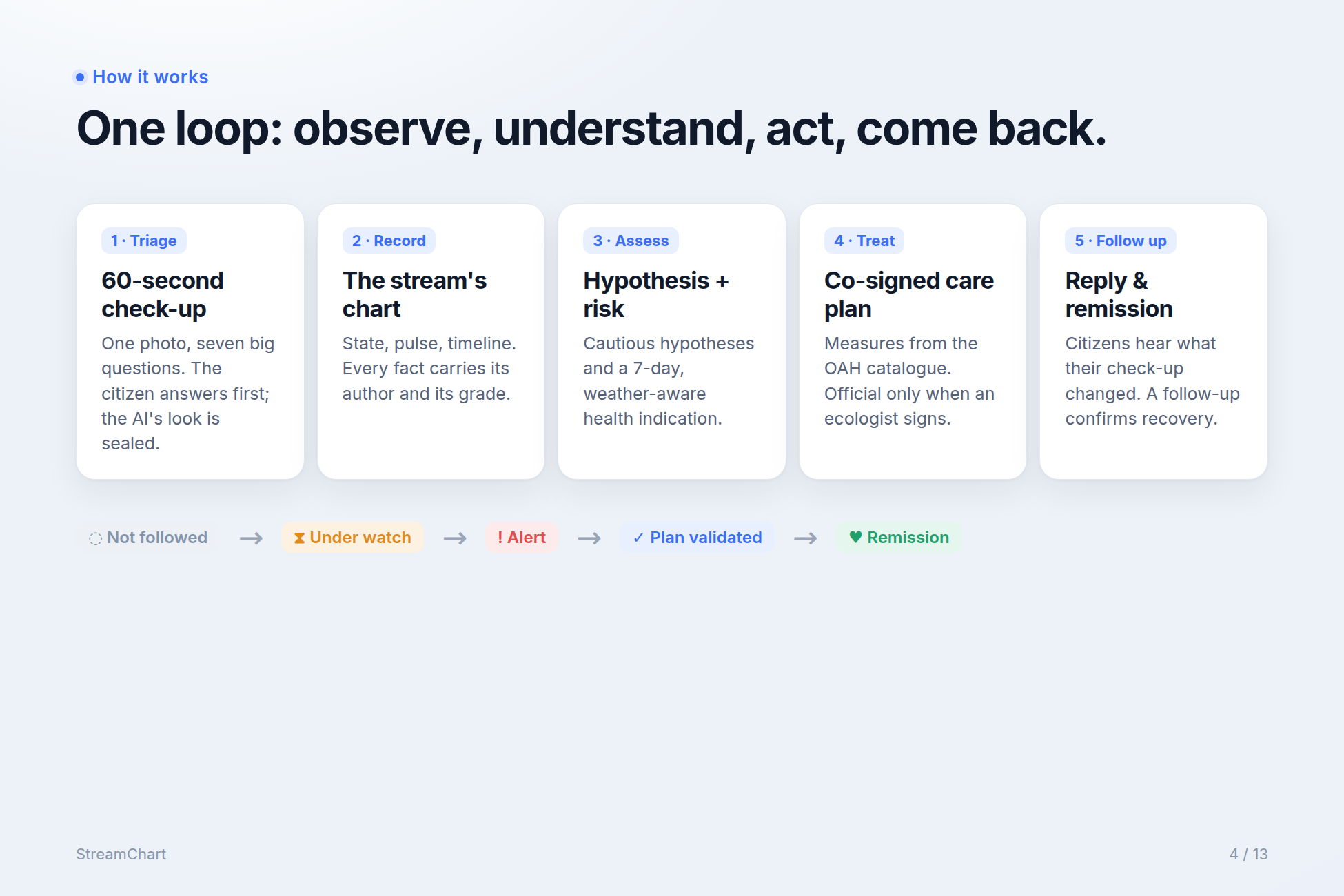
The loop has five steps.
1. Triage: the 60-second check-up, with a sealed AI second look
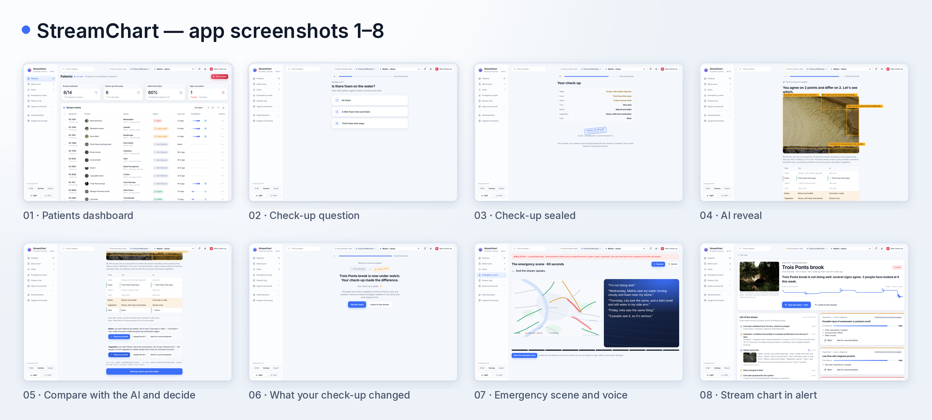
A resident scans the sign at the foot of the stream, or opens the app. The stream introduces itself, and if nobody has visited for a while, it says so: “Nobody has looked at me for nineteen days.” A safety reminder comes first: observe from the bank, never step into fast or deep water, children come with an adult.
The resident takes one photo and answers seven questions with very large buttons. The questions follow the OneAquaHealth citizen indicators that can be judged with the naked eye and no equipment: water clarity and colour, foam, odour, flow, banks and bed, riparian vegetation, and litter. Each question comes in three language levels, chosen with a switch: Child (“the water looks like dirty milk”), Curious (“cloudy, with whitish deposits”) and Expert (“elevated turbidity”). The underlying information is identical; only the vocabulary changes, and technical terms open a one-line explanation. This answers Track 1's request to simplify ecological terms without dumbing down the data.
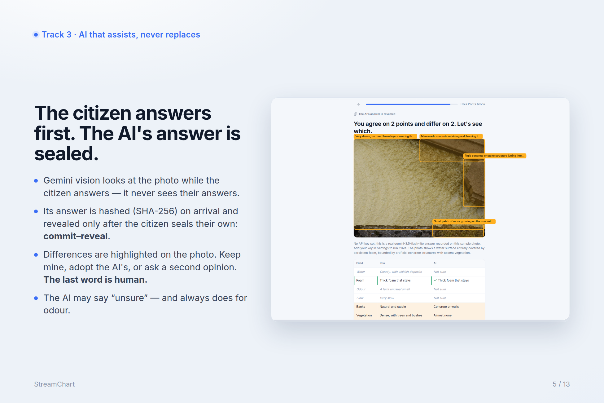
Most AI applications show their answer immediately, and people accept it without thinking. At that point the observation is no longer human. StreamChart does the opposite, and this is the mechanism I'm proudest of. The citizen answers first. While they answer, Google's Gemini vision model looks at the same photo. It never sees the citizen's answers, and its own answer is sealed: hashed with SHA-256 the moment it arrives and kept hidden. The citizen then seals their check-up with a deliberately solemn button, “I confirm my check-up”, and a small stamp animation. Their answers are hashed too. Only then is the AI's answer revealed. It is a commit–reveal protocol, the same idea used in sealed-bid auctions and blockchain voting, applied to a citizen and an AI looking at the same stream.
The reveal is a comparison, not a correction. The two answers sit side by side, field by field. Agreements get a discreet green mark. Disagreements are highlighted, and the AI's observations are drawn as boxes on the photo with a plain sentence, such as “Here: man-made concrete retaining wall framing the water body.” For each disagreement the citizen chooses: keep my answer, adopt the AI's, or ask for a second opinion. The last word always belongs to the human.
The AI is allowed to say “I don't know”, and it uses that right. It answers unsure whenever the photo doesn't let it judge, and it is hard-wired to answer unsure for odour, because a photo cannot carry a smell. Ecologists will notice that detail, and I think it is one of the things that shows we understand the science.
Finally, the citizen immediately sees what their check-up changed: the stream moves from not followed to under watch, or their check-up joins a neighbour's and raises its grade. Nobody leaves without a reply.
2. The record: the stream's chart
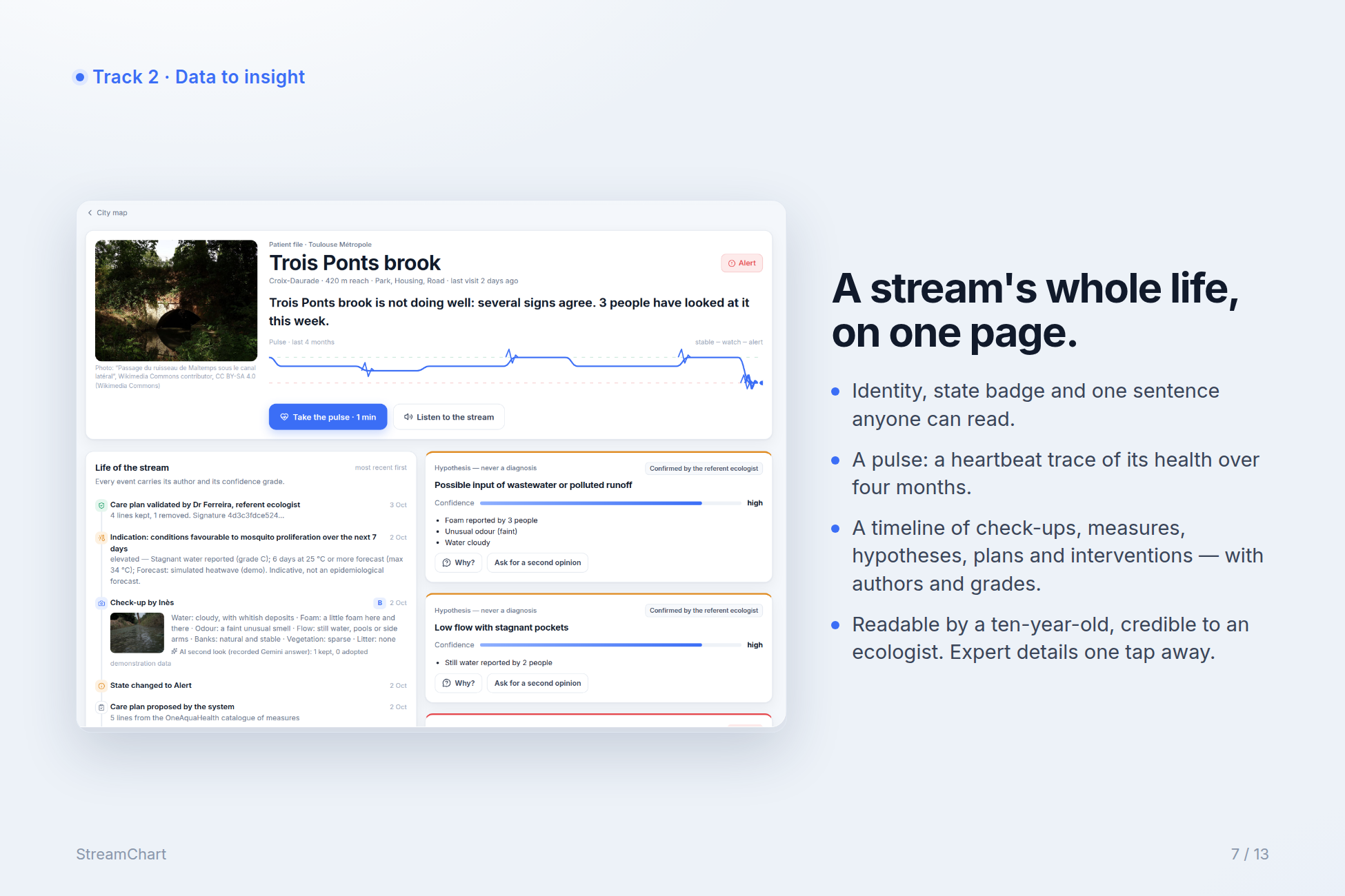
The chart is the screen that carries the whole idea. It reads like a hospital record with the warmth of a personal page:
- Identity: name, city, district, length of the reach, surroundings, date of the last visit, a photo, and a state badge, followed by one sentence in everyday language: “Trois Ponts brook is not doing well: several signs agree. Three people have looked at it this week.”
- The pulse: a heartbeat-like trace drawn from the stream's state over four months, with a blip for each check-up. One glance tells you whether it is recovering, relapsing or asleep.
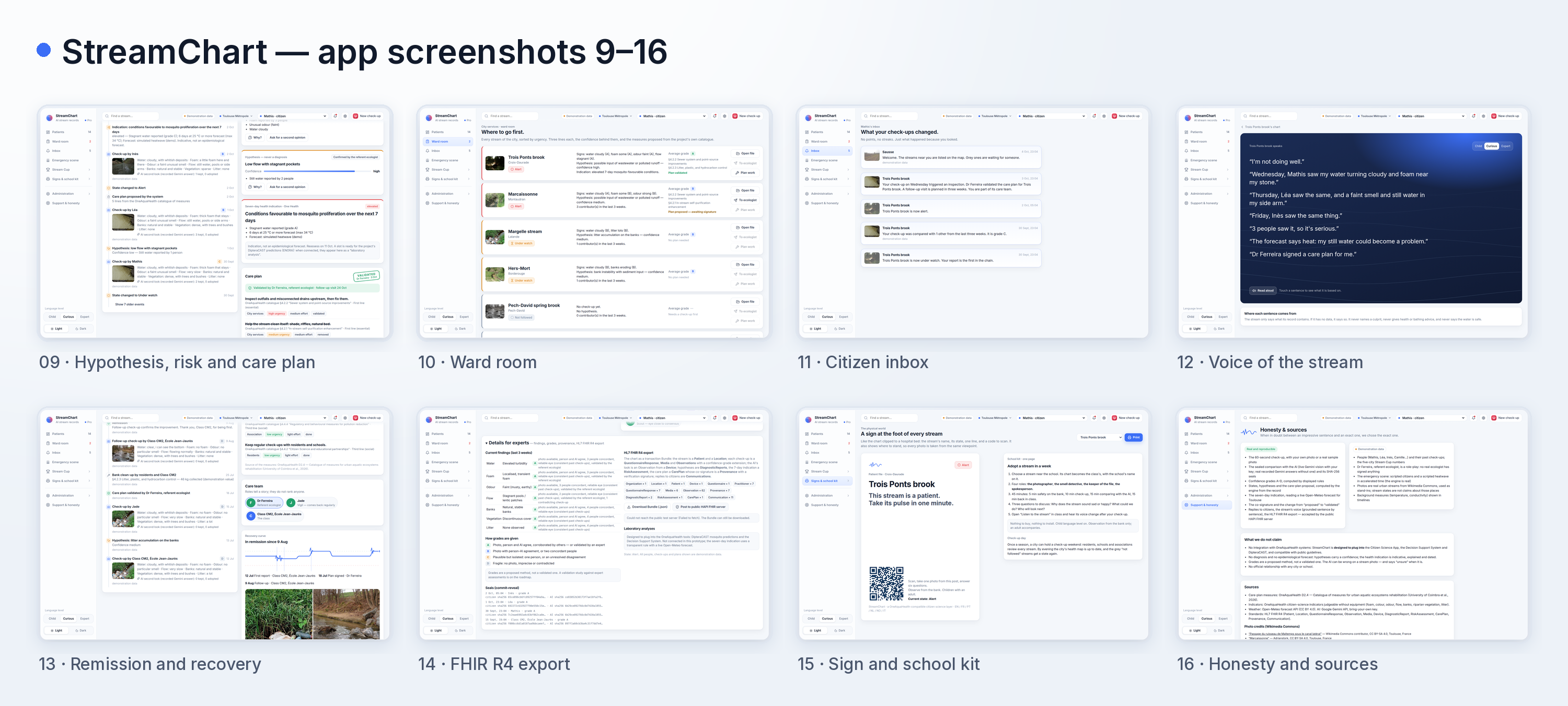
- The life of the stream: a timeline, most recent first, of check-ups (with the photo and how each was compared with the AI), background measures, hypotheses, the health indication, care plans and signatures, interventions, follow-up visits and remissions. Each entry carries its author and its confidence grade.
- The care team: small avatars with pseudonyms and roles that tell a story without ranking anyone: the sentinel who reported first, the vigil who comes back regularly, the scout whose eye is often closest to the consensus, the class that adopted the stream, and the referent ecologist.
- Details for experts: the current findings with their grades and the reasons for each grade, the grading rules, the seals of the latest check-ups, and the HL7 FHIR export.
The chart works on a phone, a ten-year-old can read it, and an ecologist can take it seriously. Anything that doesn't help understand the state, the history or the next action stays in the expert details.
3. Assessment: confidence grades, hypotheses and a seven-day health indication
StreamChart doesn't claim to tell the truth about a stream. It says what can reasonably be thought, and how far that can be trusted.
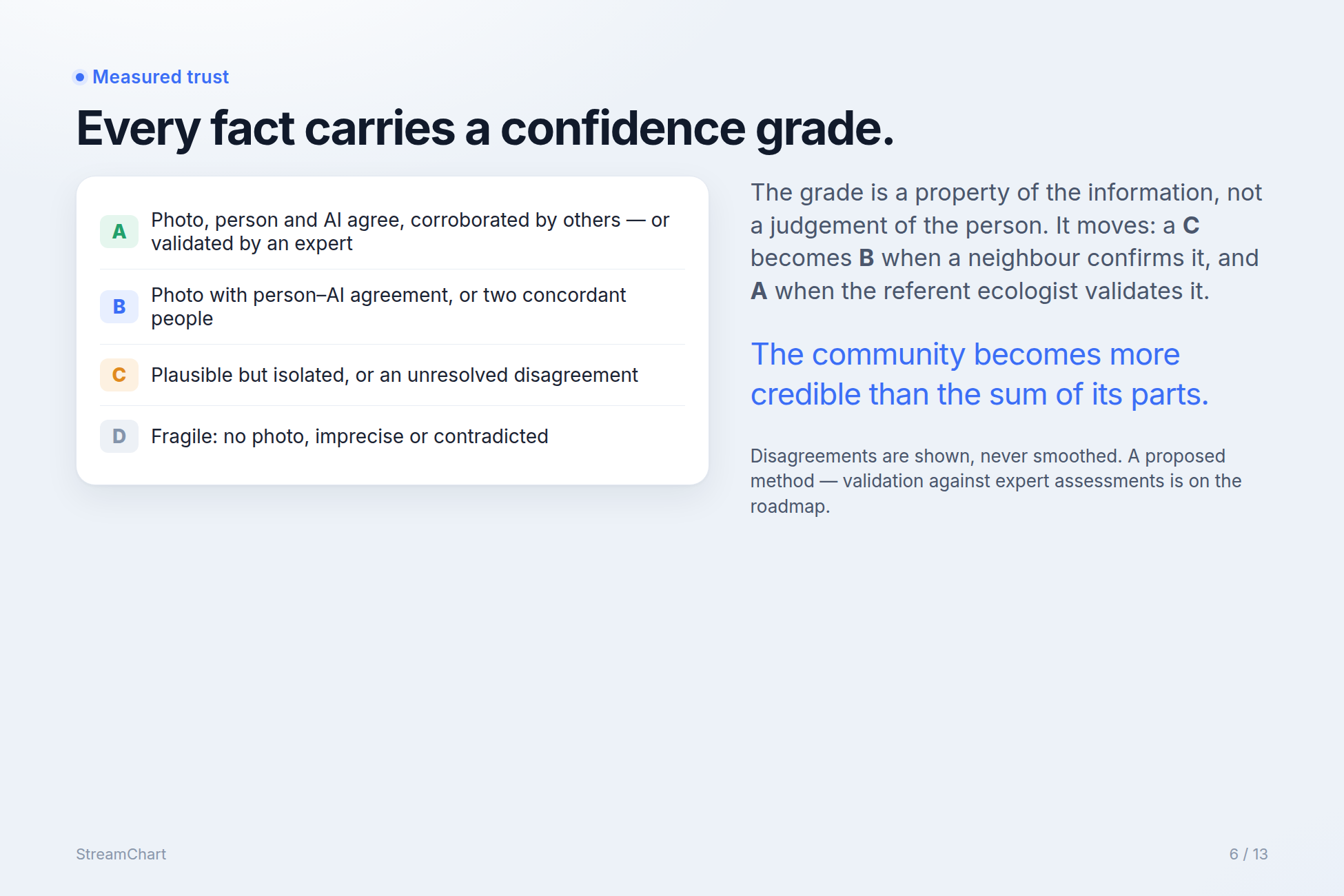
Every finding carries a confidence grade, modelled on levels of evidence in medicine:
- A: solid. There is a photo, the person and the AI agree, and others corroborate, or an expert has validated it.
- B: reliable. A photo with person–AI agreement, or two concordant people.
- C: plausible but isolated. One person, or an unresolved disagreement.
- D: fragile. No photo, imprecise, or contradicted.
The grade is a property of the information, not a judgement of the person. It moves over time. Mathis reports foam on his own: grade B (photo, plus agreement with the AI). His report of an odour is grade C, because only one nose was there and a photo can't confirm a smell. The next day Léa reports the same thing, and the odour climbs to B. When the referent ecologist signs the care plan, the findings she relied on reach A. Watching a grade rise is one of the most satisfying moments in the product: the community becomes more credible than the sum of its parts. Disagreements are never smoothed away. A contradiction within a week is shown and lowers the grade.
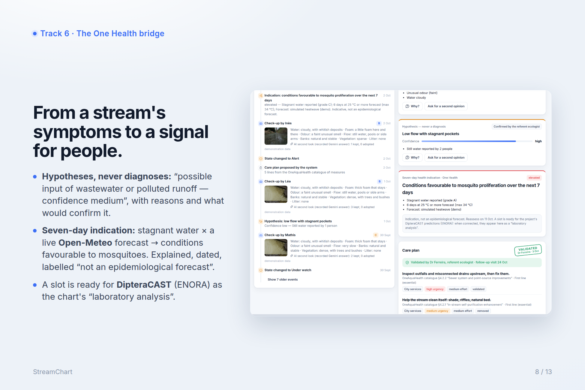
When several symptoms combine, the engine proposes one or two hypotheses, never a certainty. For example: “Possible input of wastewater or polluted runoff — confidence medium.” Each hypothesis lists its reasons (persistent foam reported by two people, unusual odour, cloudy water), offers a Why? button that opens the underlying check-ups and their grades, and says what would confirm it: “a visit by the referent ecologist, or a water-quality measurement upstream.” The wording always speaks of probability, never of blame.
Then comes the bridge from ecosystem to human health, the heart of One Health. The system crosses observed symptoms with a live seven-day weather forecast from Open-Meteo. If stagnant water has been reported and several hot days are forecast, the chart shows an indication: “Conditions favourable to mosquito proliferation over the next 7 days.” The indication comes with its reasons, the forecast it used, a reassessment date, and the explicit note “indication, not an epidemiological forecast.” The current rule is transparent and deliberately simple. The chart already has a slot, labelled as a laboratory analysis, ready to receive predictions from the project's own DipteraCAST tool.
4. Treatment: a care plan co-signed by a human
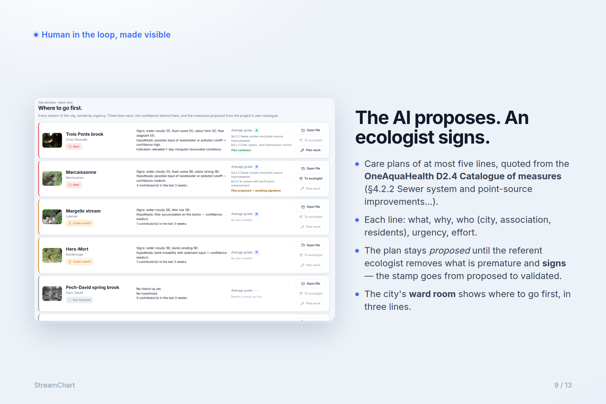
A diagnosis without treatment is a worry, not a system. When a stream goes into alert, the system proposes a care plan of at most five lines. StreamChart doesn't invent measures: each line is a measure from the OneAquaHealth D2.4 Catalogue of measures for urban aquatic ecosystems rehabilitation, quoted with its real section number and title (for example §4.2.2 Sewer system and point-source improvements, §4.2.3 Litter, plastic, and hydrocarbon control, §4.1.2 Active riparian vegetation restoration), its line in the catalogue's hierarchy (first line essential, second line structural, third line social, fourth line complementary), a plain-language gloss, the hypothesis it addresses, who can carry it out (the city, an association, residents, the ecologist), and its urgency and effort. Part of every plan is meant for residents themselves, such as regular check-ups or a bank clean-up, because a community that only observes eventually drifts away.
Until a competent human signs, the plan is marked “proposed by the system.” Signing is the solemn moment of this step. The referent ecologist opens the file, looks at the photos, confirms or questions the hypothesis, removes any line she judges premature (with a reason that stays in the record), and presses “I validate this plan.” The band turns from proposed to validated by Dr Ferreira, referent ecologist, a stamp prints, and her name, role and date go into the record together with a SHA-256 signature hash. The system is never allowed to write “validated” on its own. Most AI projects talk about a human in the loop; StreamChart makes that human's signature the visible centre of the workflow. Sealing the check-up and signing the plan are the two solemn gestures at the two ends of the loop, and they share the same visual grammar.
For city services there is a ward room: every stream in the city sorted by urgency, each with a three-line summary, the average confidence grade, the measures proposed, and three buttons: open the file, send to the ecologist, plan the work. The technician doesn't need to understand ecology. They need to know where to go first.
5. Follow-up: the loop closes
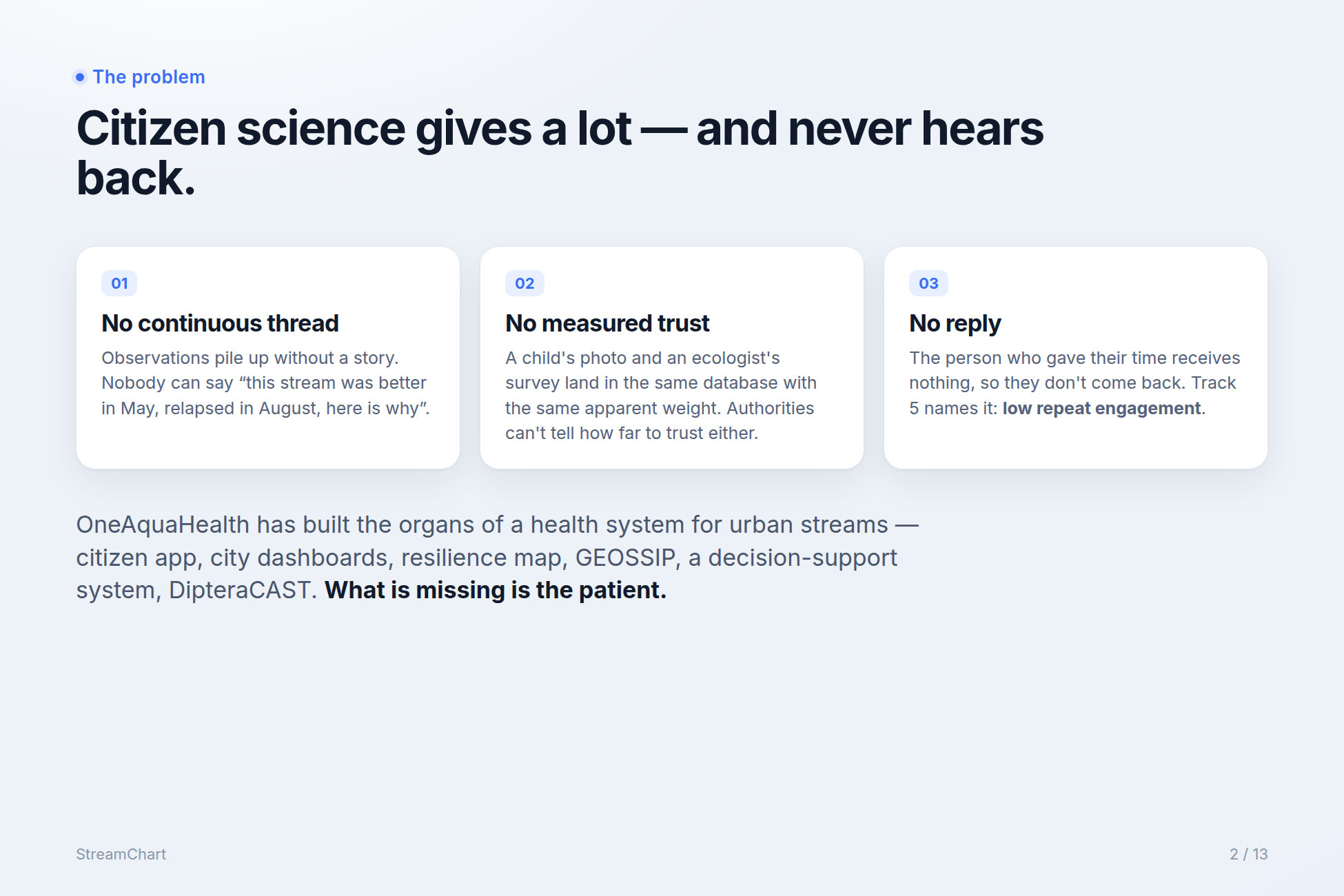
This is the step almost nobody builds, and it is the one that makes people come back. Without it StreamChart would be a nice reporting tool. With it, it becomes a system people want to return to. The message is simple: what you do has consequences, and you get to see them.
Every time a check-up contributes to something, the person receives a short, personal, concrete message at a precise moment:
- when it is compared: “Your check-up was compared with one other from the last three weeks. It is grade C.”
- when the stream changes state: “Trois Ponts brook is now under watch. Your report is the first in the chain.”
- when a plan is validated: “Your check-up on Wednesday triggered an inspection. Dr Ferreira validated the care plan. A follow-up visit is planned in three weeks. You are part of its care team.”
- when an intervention is done: “The city completed ‘Litter, plastic, and hydrocarbon control’. Would you take the photo again from the same spot?”
- and when the stream recovers: “Trois Ponts brook is in remission. Thank you for being the first to notice.”
There are no points, flames or streaks. The tone is that of a person, not a machine.
A follow-up check-up after an intervention closes the episode. If it confirms the improvement, the stream goes into remission and the chart shows a recovery curve with the three dates that matter (first report, plan signed, follow-up visit) and the names of the people involved, plus a before/after slider between the first photo and the follow-up photo.
The stream's voice
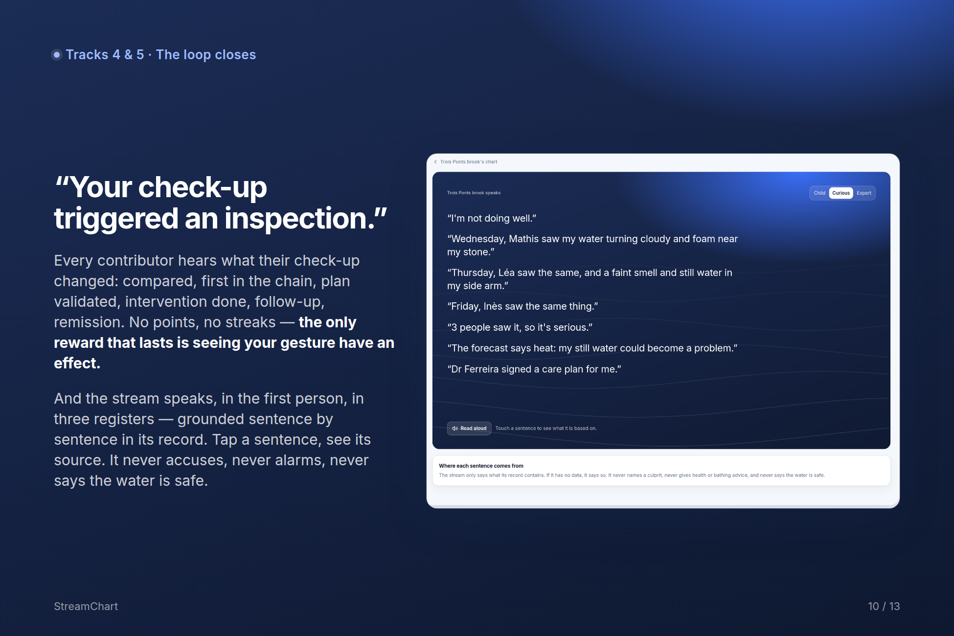
The stream has a voice, and that voice is the emotional signature of the project. A Listen to the stream button opens a short first-person account of three to six sentences, read on screen or aloud, in the same three registers. “Sunday, Mathis saw my water turning cloudy and foam near my stone. Monday, Léa saw the same, and a faint smell and still water in my side arm. Three people saw it, so it's serious. Dr Ferreira signed a care plan for me. For the first time in a long while, I know someone is taking care of me.”
It follows one absolute rule: it never lies. Every sentence is generated from the record, and touching a sentence shows the check-up, plan or forecast it comes from. If the stream has no data, it says so. It never invents a cause, never names anyone, never gives medical or bathing advice, and never says the water is safe. That discipline is what turns the voice from a gimmick into an instrument scientists can respect. In a classroom it turns into a lesson: why does the stream sound sad? Who will go and look?
The physical world
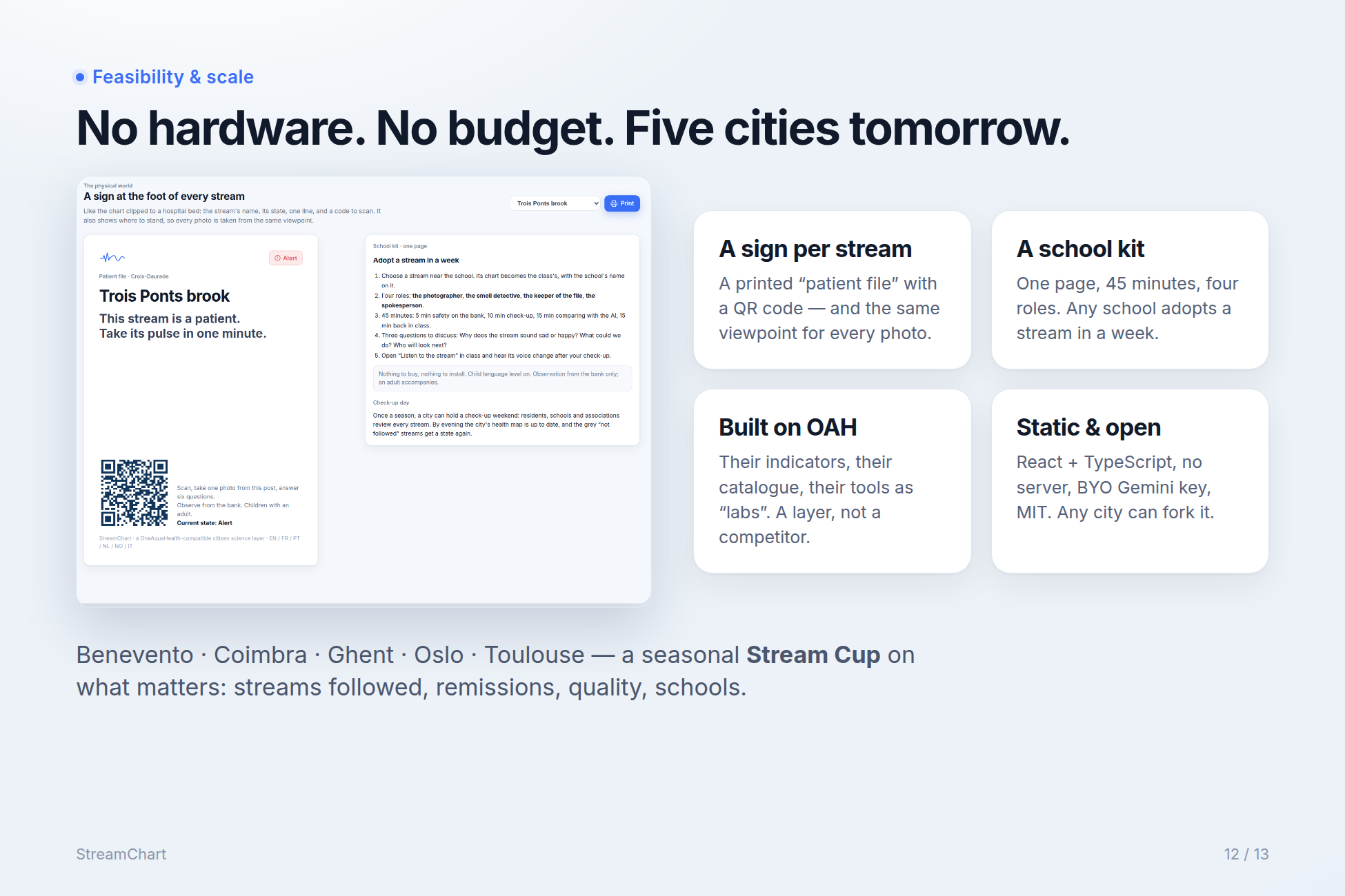
Half of StreamChart's strength lies off the screen. The app generates a printable sign for each stream, styled like the chart clipped to a hospital bed. It shows the stream's name and current state, the sentence “This stream is a patient. Take its pulse in one minute.”, a QR code that opens the check-up directly, and the spot to stand on so that every photo is taken from the same viewpoint, which is what makes before/after comparisons possible. There is a one-page school kit: choose a stream near the school, four roles for the pupils (the photographer, the smell detective, the keeper of the file, the spokesperson), a 45-minute plan, and three questions to discuss back in class. Nothing to buy, nothing to install. Once a season, a city can hold a check-up day that brings every grey “not followed” stream back onto the map.
Built on standards: the chart is an HL7 FHIR R4 record (Track 7)
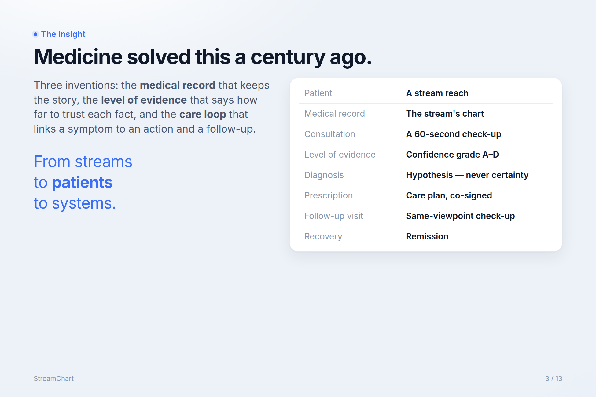
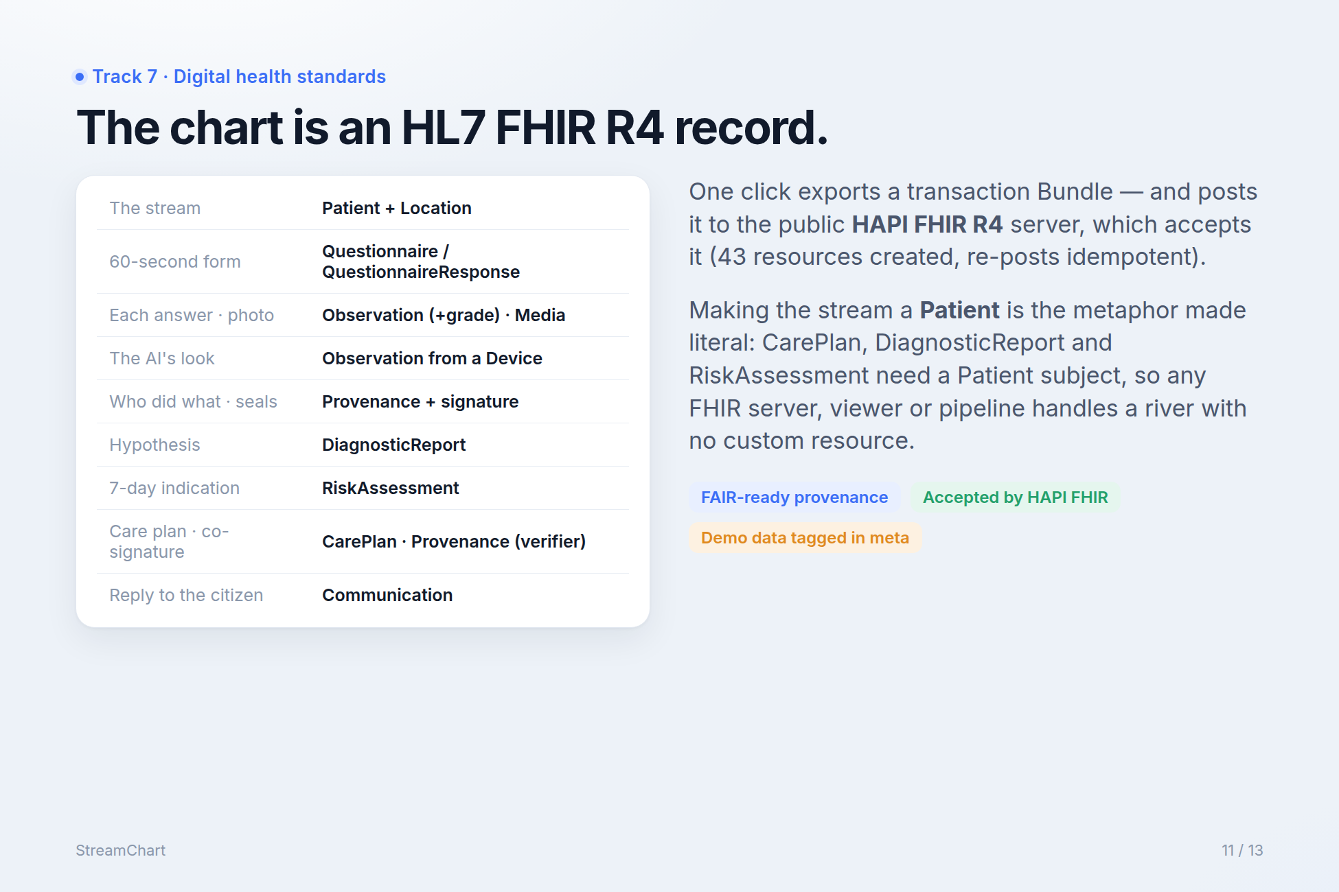
The medical metaphor isn't only a story; it is also a data model. Every stream's chart exports as an HL7 FHIR R4 transaction Bundle, and one button posts it to the public HAPI FHIR R4 server, which accepts it: 46 resources, 43 created and the rest matched, and the export is idempotent when re-posted.
- The stream is a Patient (carrying an extension that flags it as a non-human environmental subject) and a Location (its geography). This is the metaphor made literal, and a deliberate modelling decision. In R4, CarePlan, DiagnosticReport and RiskAssessment require a Patient or Group subject. Representing the reach as a Patient means any FHIR server, viewer or analytics pipeline can handle a river with no custom resource type.
- The 60-second form is a Questionnaire. Each check-up is a QuestionnaireResponse (carrying its seal hash), a Media for the photo, and one Observation per indicator with a confidence-grade extension,
derivedFromthe questionnaire response and the photo, grouped in a panel Observation. - The AI's look is a separate Observation produced by a Device (the model), carrying its own seal hash and a note saying whether it came from a live call or a recorded answer.
- A Provenance records who did what: the citizen as author, the AI as informant, with a signature carrying the seal.
- Each hypothesis is a DiagnosticReport: preliminary until signed, final afterwards.
- The seven-day indication is a RiskAssessment with a qualitative risk, a time window, its rationale and its method.
- The care plan is a CarePlan whose activities are coded with the D2.4 section numbers. It moves from draft/proposal to active/plan to completed, and removed lines become cancelled with the ecologist's reason. The co-signature is a Provenance with an ISO Verification Signature by the ecologist (Practitioner).
- Every reply to a citizen is a Communication.
Demonstration data is tagged as such in meta.tag. For researchers, every fact carries its provenance, including the fact that an AI took part and what it answered. That is what makes these observations reusable under FAIR principles.
Who it is for
- Citizens and schools who observe, and finally hear back.
- Ecologists who validate, and get a queue of cases sorted by difficulty, with photos, the AI's view, the citizens' view and a confidence level, so they can decide in ten seconds and sign their name to it.
- Municipal services that prioritise and act, with a ward room that tells them where to go first.
- Public-health actors who need early, cautious, explained signals rather than sirens.
- Researchers who need reusable data with provenance.
- The OneAquaHealth consortium itself, whose tools gain a common front door and a reason to be used after the project ends.
How I built it
StreamChart is a static single-page application in React 18 and TypeScript, built with Vite. It has no server and stores no secrets. The browser calls Google's Gemini API and Open-Meteo directly, so the app can be hosted anywhere for free. That is part of the feasibility argument: a city can fork it and run it tomorrow.
The core is a pure TypeScript domain layer with no UI code, which models the medical logic of a stream:
fields.tsdefines the check-up: the seven OneAquaHealth indicators, their options, which ones are abnormal, which ones a photo can judge, and the wording in three registers.engine.tsholds the clinical reasoning. It consolidates check-ups from the last three weeks into findings and grades each one A–D with explicit rules: photo, person–AI agreement, corroboration by distinct people, the reliability of the person's eye over past check-ups, expert validation, and contradictions within a week. It then computes the state (not followed, stable, under watch, alert), the hypotheses with their confidence and reasons, the seven-day indication, the three-line ward-room summary, the pulse series, and the stream's voice, sentence by sentence with sources.world.tscontains the actions that change the record (submit a check-up, sign a plan, record an intervention, update the forecast) and the side effects that close the loop: state-change events, hypotheses, the proposed plan, notifications, remission.ai.tscalls Gemini vision (gemini-3.5-flash-liteby default, selectable in Settings) with a structured-output JSON schema. The schema forces one of the allowed values orunsurefor each field, a confidence, a short note, and up to four observations with bounding boxes normalised to 0–1000, so they can be drawn on the photo. The prompt forbids diagnosing, naming culprits or saying the water is safe or unsafe. The response is validated, clamped, and sealed with SHA-256 over canonical JSON before anyone can see it.sha256.tsis a small synchronous SHA-256 with canonical JSON serialisation, so seals are reproducible and the domain stays pure and testable.fhir.tsbuilds the FHIR R4 transaction Bundle described above, with deterministic UUIDs and conditional creates.catalogue.tsquotes the measures from the D2.4 catalogue with their section numbers.
Because the domain is pure, it is covered by tests. One of them tells the brief's whole story as an automated test: a forgotten stream, Mathis's first check-up (under watch, foam at grade B, odour at grade C), Léa's concordant check-up (odour rises to B, hypothesis appears), Inès's report of stagnant water, a heatwave forecast (seven-day indication, state goes to alert, plan proposed), the ecologist's signature (findings reach grade A, every contributor notified, the voice mentions her), an intervention, and a follow-up three weeks later (stable, remission, thank-you message to the first reporter). The same test checks that the FHIR bundle contains every expected resource type.
AI: bring your own key. The Settings page accepts a Google AI Studio key, stored only in the user's browser and sent only to Google. Judges shouldn't need a key to see the product work, so for the eight bundled sample photos I recorded real Gemini answers in advance with a script that uses exactly the same prompt and schema as the app. Without a key, those recorded answers are replayed and labelled as recorded wherever they appear. For a user's own photo without a key, a simple offline colour analysis gives a minimal answer, again clearly labelled and never presented as AI vision.
Photos. I didn't want stock imagery or generated pictures pretending to be real. Every photo in the app is a real urban stream from Wikimedia Commons under a Creative Commons licence, most of them from Toulouse (the Marcaissonne, the Sausse, the Maltemps brook), credited in the app and the README. The demonstration streams use them as stand-ins, and the app says that the states shown make no claim about those places.
Design. The interface follows a calm, airy dashboard design system: a cool blue-grey canvas, a framed app, white glass-like cards, Inter at small sizes, a blue accent, soft status pills with icons (stable, under watch, alert, not followed), tapered confidence bars, and a single warm gradient for the most important gesture on each screen. There is a light and a dark theme. The check-up is phone-first, with very large touch targets.
The emergency scene. To show the whole loop within the attention span of a judge, the app includes a 60-second accelerated simulation of one week in the life of a stream. It is labelled “SIMULATION — accelerated time” from the first frame. The people and the heatwave are scripted, but every grade, state, hypothesis, risk, plan, signature and notification on screen is computed live by the real engine. At the end, the simulated record can be opened and explored like any other chart.
Tools. I used Playwright to drive the app end to end for visual QA and for the screenshots, ffmpeg to assemble the demo video, and Fish Audio for the narration. Claude Code was my pair-programmer throughout.
Challenges I ran into
Keeping the metaphor honest. The medical metaphor is powerful, but it could easily slide into pretending: a “diagnosis” from a photo, a “validated” label nobody earned, an alarming red screen. I wrote four rules (hypothesis not diagnosis, a human signs, no drama, no blame) and enforced them in code, not just in copy. The system literally can't write validated without a signature, the voice can only speak from the record, and the health indication always carries its reassessment date and its disclaimer.
Designing grades that move for the right reasons. My first version treated any different answer as a contradiction, so a stream that was clear three weeks ago made today's foam look doubtful. Real streams change. I had to separate contradiction (a different answer within a week) from history (an earlier state). Odour needed its own rule, since a photo can't corroborate a smell, so a single nose stays at grade C until someone else confirms it. Expert validation had to be scoped to the fields the ecologist actually confirmed, not to everything in the same check-up.
Making the AI humble. A vision model asked to fill a form will happily fill every field. The structured-output schema always offers an unsure value, the prompt treats “unsure” as good practice, and odour is forced to unsure. Seeing the model answer “unsure” for water clarity when the surface was covered in foam was one of the moments where the design felt right.
Making the comparison trustworthy. If the citizen sees the AI's answer first, the comparison means nothing. Sealing both answers with hashes before the reveal costs almost nothing to implement, and it turns a UX intention into a verifiable property. The seals are shown in the expert details and exported in the FHIR Provenance.
Mapping a river onto FHIR. FHIR R4 has no resource for an ecosystem. Modelling the stream only as a Location would have been tidy, but CarePlan, DiagnosticReport and RiskAssessment need a Patient or Group subject. Representing the reach as a Patient, flagged by an extension and paired with a Location, keeps every standard workflow resource usable. I also had to make the export idempotent: the public HAPI server rejects exact duplicates, so stable resources use conditional creates on their identifiers.
Being honest about what is real. A demo works better when every part of it is real, but some parts can't be real in a prototype: a real ecologist's signature, weeks of follow-up, five cities competing. I chose to label every simulated element where it appears: a demonstration data pill in the header, a simulation banner on the emergency scene, illustrative tags on the Stream Cup, role-play next to the ecologist's name. There is also an Honesty & sources page listing what is real, what is demonstration data and what we do not claim.
Accomplishments I'm proud of
- The sealed second look. Citizen first, AI sealed, comparison second, and the last word human, with verifiable hashes. It addresses Track 3's worry about AI replacing human judgement and Track 1's worry about inconsistent observations in a single gesture.
- A co-signature you can actually see. The human in the loop isn't a sentence in a slide. It is a button, a stamp, a name in the record and a Provenance resource.
- A loop that closes. Almost every citizen-science tool handles the observation; StreamChart handles the reply, all the way to remission and a thank-you to the first person who noticed.
- A voice that never lies. A first-person stream that moves children and still holds up to scientific scrutiny, because every sentence links back to its source.
- Real standards, really accepted. A FHIR R4 export that a public FHIR server accepts, with a data model that makes every fact traceable.
- Respect for the project's own work. The indicators are OneAquaHealth's, the measures are quoted from their D2.4 catalogue with section numbers, and DipteraCAST and the DSS have a natural place in the chart. StreamChart is meant as a common front door for the tools the consortium already built, not a competitor to them.
What I learned
The most important feature of a citizen-science tool is the reply. A grade, a hypothesis and a dashboard are all means to one end: telling the person who looked what their looking changed. Every design decision got easier once I asked what does this change for the patient, and who gets told?
Humility can be designed. “Unsure” answers, confidence grades, a “why?” button, a reassessment date, and a disagreement shown rather than hidden all cost very little to build, and together they make a system that scientists can trust and citizens aren't intimidated by.
Standards can carry a story. Expressing a stream's chart in FHIR wasn't a compliance exercise. It made the metaphor rigorous: if the stream is a patient, then the plan is a CarePlan, the signature is a Provenance and the reply is a Communication. The narrative and the data model turned out to be the same thing.
Finally, the physical world matters. A sign at the foot of a stream, the same photo viewpoint every time, and a one-page school kit will probably do more for participation than any feature I could add to the app.
What's next for StreamChart
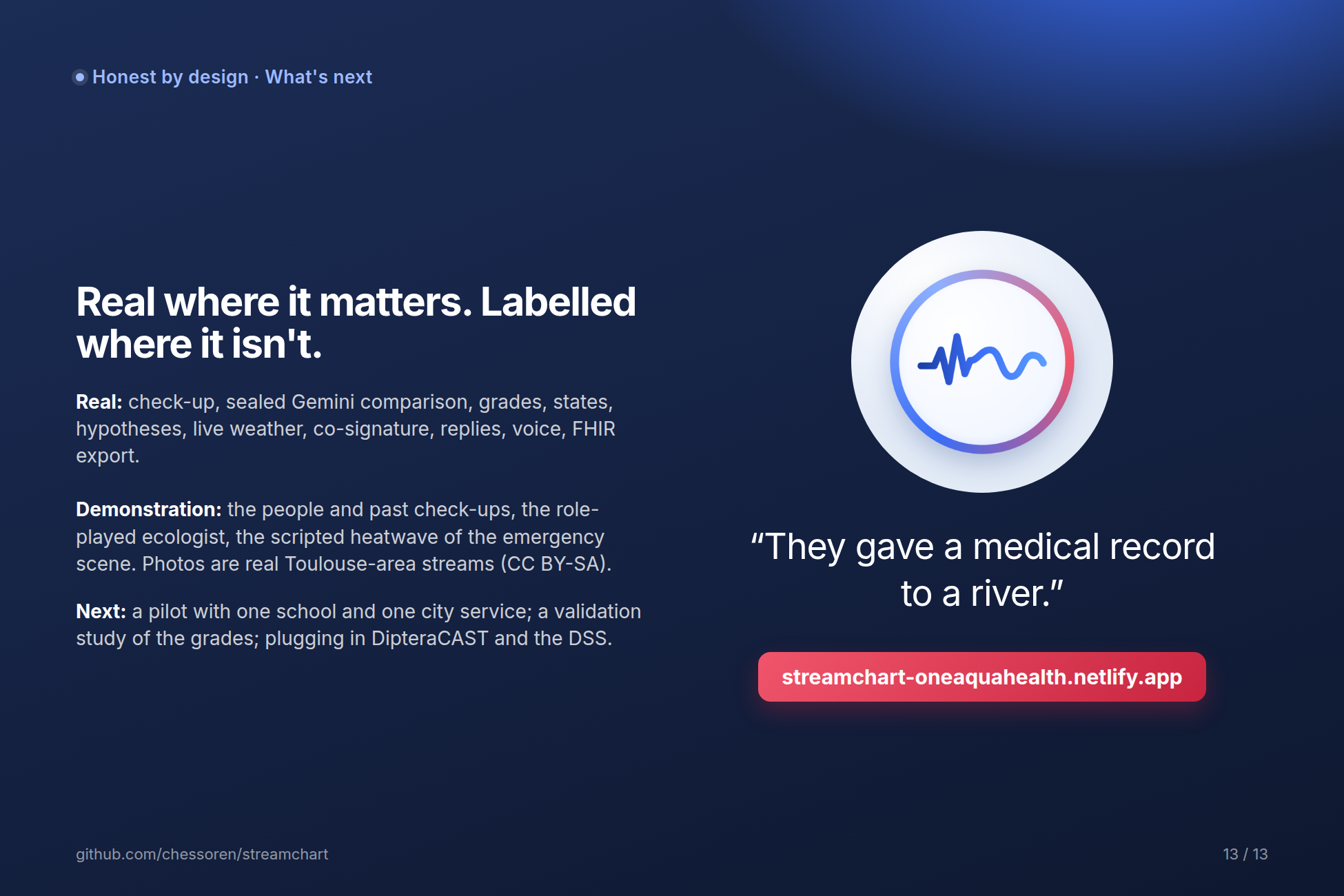
- A pilot with one school and one municipal service in one of the five research cities. Toulouse is the natural first, with signs installed on two or three real streams.
- A validation study of the confidence grades against expert assessments: do A-grade findings hold up, and how should the rules be tuned?
- Plugging into the OneAquaHealth tools: DipteraCAST predictions as the chart's laboratory analysis, the Decision Support System as the source of care plans, and the Citizen Science App's data model as the check-up's back end. StreamChart is designed to plug into these tools; it isn't connected to them yet.
- Full multilingual support for the five cities (French, Portuguese, Dutch, Norwegian, Italian), plus English, using the same three-register structure.
- The Stream Cup: a seasonal challenge between the five cities that measures what matters (share of streams followed, remissions, average grade, school participation) rather than raw volume. It is sketched in the app and labelled as roadmap.
- An open template so that any city adopting the same indicators can publish its streams as patients.
Honesty: what is real, what is demonstration
Real and reproducible: the 60-second check-up with your own photo or a real sample photo; the sealed comparison with the AI (live Gemini vision with your key, real recorded Gemini answers without one) and its SHA-256 seals; the confidence grades computed by displayed rules; states, hypotheses and the care-plan proposal computed by the engine; the seven-day indication reading a live Open-Meteo forecast; the co-signature and the change from proposed to validated; the replies to citizens; the stream's voice, grounded sentence by sentence; and the HL7 FHIR R4 export accepted by the public HAPI FHIR server.
Demonstration data, labelled as such: the people (Mathis, Léa, Inès, Camille and others) and their past check-ups; the referent ecologist, Dr Ferreira, who is a role-play (no real ecologist has signed anything); the scripted heatwave and citizens of the emergency scene, which runs in accelerated time on the real engine; the Stream Cup figures for the four other cities; and the background measures shown in timelines. The photos are real urban streams used as stand-ins, and the states shown make no claim about those places.
Not claimed: any integration with OneAquaHealth systems beyond public information and compatibility with their indicators and catalogue; any diagnosis or epidemiological forecast; any validation of the grading method; any official relationship with a city or a school.
If you only remember one sentence, I hope it is the one I'd love to hear judges repeat to each other over coffee: they gave a medical record to a river.

Log in or sign up for Devpost to join the conversation.