Inspiration
The eerie, immersive world of Stranger Things—especially the Upside Down's flickering lights, Demogorgon terror, and cryptic Morse code communication—inspired me to create more than a fan site. I wanted a playable portal where users step into Hawkins' horror: surprise scares when least expected, interactive mini-games pulled straight from the show's lore, and a UI so haunting it fits the Costume Contest perfectly. The vision was simple: make fans feel the suspense of random Demogorgon appearances, solve Hawkins Lab puzzles, and communicate through the Christmas lights wall—all powered by Kiro's AI to turn chaotic creative energy into a polished React app.
What it does
Stranger Things Portal delivers a full cinematic experience:
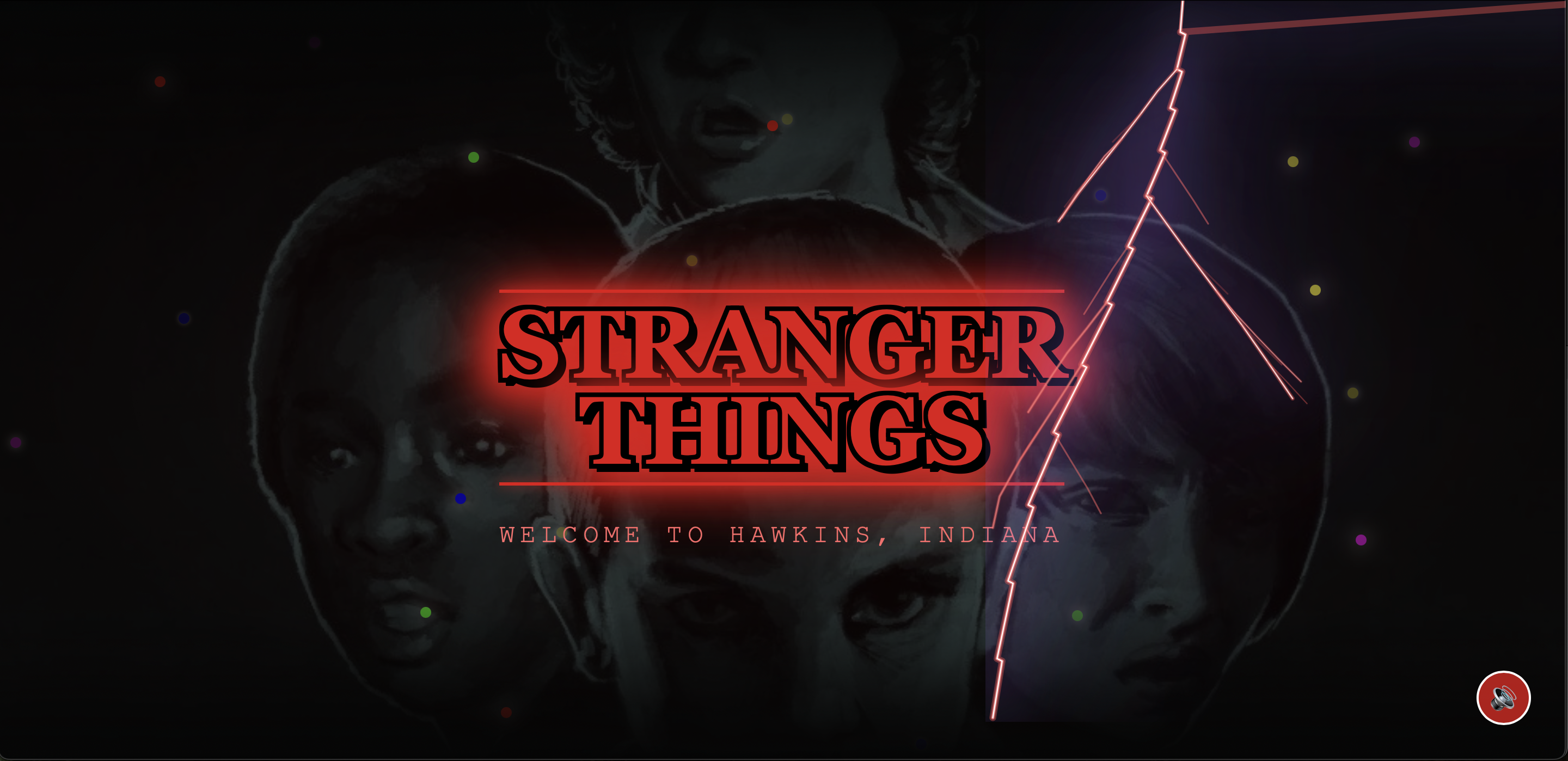
Animated Landing Page: Stranger Things logo with neon glow, Eleven & Vecna silhouettes fading in with mist—smooth 8-second transition to main app.
Mini-Games Section: Unique ST-themed games like Upside Down Maze Escape (navigate foggy corridors avoiding Demogorgons), Hawkins Lab Codebreaker (match symbols under timed pressure), and Walkie-Talkie Frequency Match (align signals amid growing static).
Interactive Elements: Randomized AI-driven Demogorgon jumpscares (flower-mouth design, glitch UI, rumbling audio), flickering Christmas lights alphabet for Morse chat, haunted audio controls, shadow particles, screen glitches, and Upside Down theme toggle.
What we learned
Describe behavior, not just implementation Kiro responds best when the prompt captures mood, timing, and UX (“a scare that feels rare and expensive”) rather than just “add animation X.” That mindset shift produced better components and fewer rewrites.
Specs are a safety net Having the app’s zones, sections, and flows written down in .kiro made it much easier to refactor without losing the core idea. It also provides judges with an audit trail of how Kiro was actually used, beyond “just for snippets.”
Iterative prompts beat one big ask Complex features like the Upside Down UI or domain‑specific effects worked best when broken into steps: layout, then color, then animation, then performance. Kiro fit naturally into that loop.
AI as collaborator, not just generator The most valuable use of Kiro wasn’t only writing new code; it was asking it to fix, clarify, and improve existing pieces when something felt off.
Challenges we ran into
A lot of the work was wrestling the ambition into something stable enough to demo:
Fidelity to the show vs. tooling limits Prompts asking for “actual Eleven photos”, “Vecna animations”, or “the exact flower‑mouth Demogorgon” ran into obvious constraints. The solution was to shift to “inspired by” silhouettes and shapes rather than literal assets, and then lean on color, motion, and audio to deliver the Stranger Things feel without depending on perfect character renders.
Upside Down and hub UI breaking The Upside Down layout and audio controls were especially fragile: overlapping layers, odd z‑indexes, and stuttering animations. Kiro was used not just to generate components but to diagnose and refactor them: migrating from scattered vanilla JS to structured React components, cleaning up effects, and simplifying where needed.
Random horror without random bugs Making Demogorgon scares and glitches feel unpredictable meant timers, randomness, and global state—all things that can easily introduce jank. Several iterations were needed, asking Kiro to adjust timing, trigger conditions, and cleanup logic so scares felt surprising without constantly interrupting or breaking navigation.
Scope vs. time There were more ideas (AI chats with Will, deeper season data, multiplayer) than hackathon time. Specs helped ruthlessly prioritize what made it into this version.
How we built it
The project went through multiple incarnations, and that journey is where Kiro mattered most.
Vibe‑first exploration The first iteration started as a loose “Stranger Things spooky site” where everything was vibe coded: Demogorgons that should “appear out of nowhere”, Upside Down transitions, fog overlays, and haunted audio. Those early Kiro prompts were pure description—no concern for architecture—just, “make it scary and cinematic.”
Full reset into React + hubs When that initial version became too fragile, the app was rebooted from scratch in React. This time, the first thing defined in Kiro was a spec: a hub screen with four distinct regions (Hawkins Laboratory, Upside Down, Will’s Home, Vecna’s Domain) as entry points, plus sections for mini‑games, interactive elements, and recaps. Spec mode then scaffolded the React layout, routing, and basic component structure so the UI matched this mental model.
Deep Kiro integration
Vibe coding generated most of the visual and interaction pieces: neon typography, glow effects, hover animations for each location card, fog and particle layers, glitch transitions when entering the Upside Down, Demogorgon surprise logic, and custom audio controls.
Specs kept everything from drifting into chaos. The .kiro spec defined pages, zones, and behaviors (for example, “Vecna’s Domain should feel like the ‘final boss’ area with heavier FX and sound”).
Hooks ran formatting, linting, and basic tests automatically when files changed, and were used to regenerate docs and keep the mini‑game logic and spooky effects from silently breaking as the app evolved.
Steering docs captured styling and behavior rules: consistent neon color system per zone, animation guidelines (slow build, then sharp scare), and accessibility constraints so even in a dark theme the experience remained navigable.
Because of this, it was possible to toss out a broken prototype, keep the ideas, and have Kiro help re‑implement them in a cleaner, more maintainable stack.
Accomplishments that we’re proud of
A cohesive, four‑domain portal Ending up with a landing experience where Hawkins Laboratory, Upside Down, Will’s Home, and Vecna’s Domain each feel distinct yet part of the same neon horror system was a big win. It looks like a costume, but the layout is clear and functional.
From “vibes” to architecture The biggest success was using Kiro to bridge the gap between wild, horror‑movie ideas and a working, sectioned React application. Vibe coding made it fun and fast to experiment; spec mode and hooks made the final result something that could actually be maintained.
Recovering from a failed first version Restarting the project mid‑way is risky, but Kiro made the reset viable. The second version is cleaner, clearer, and better aligned with the hackathon criteria (Costume Contest + deep use of Kiro’s features).
An experience that actually feels tense Small things—randomized scares, ambient audio per zone, glitch transitions, subtle motion on the hub cards—add up to an experience that feels eerie even when you know how it works.
What’s next for Stranger Things Portal
The current version establishes the core experience: the four‑location hub, themed mini‑games, and interactive horror systems. From here, the roadmap could include:
Mobile friendly version
Deeper logic per domain (e.g., unique mini‑game or story sequence per location).
AI‑driven interactions like “talk to Will in the Upside Down” or a Vecna “mind invasion” sequence.
More polished content in the recap section, potentially powered by real episode/character data.
A tighter sound design pass and better mobile responsiveness so the portal feels like a horror app, not just a website.
Built With
- kiro

Log in or sign up for Devpost to join the conversation.