-
-

-
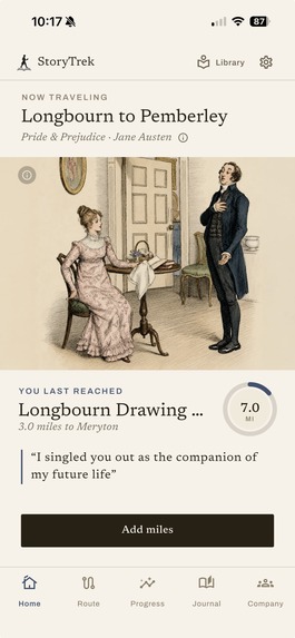
Home Screen
-
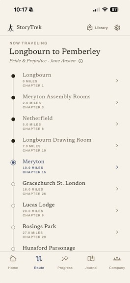
Route Screen
-
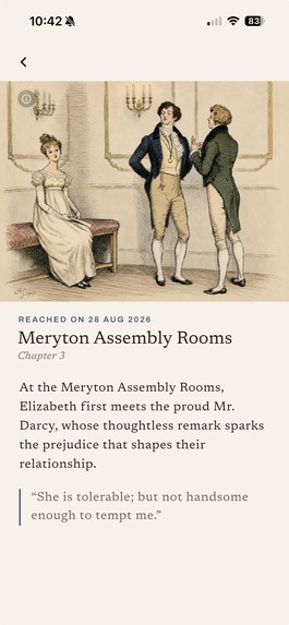
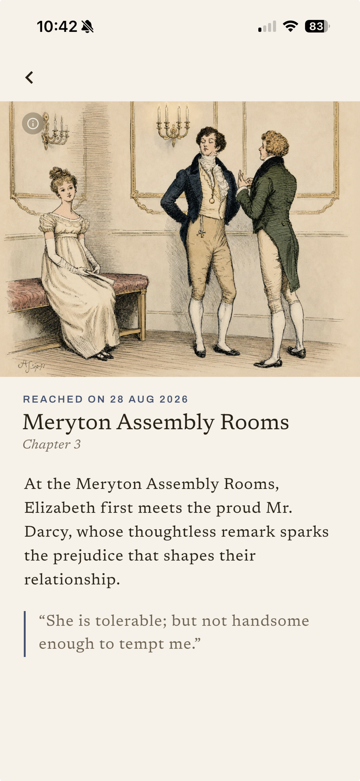
Waypoint Screen
-
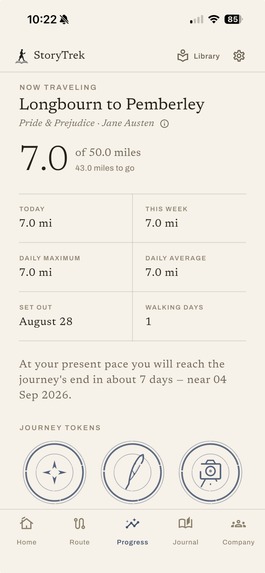
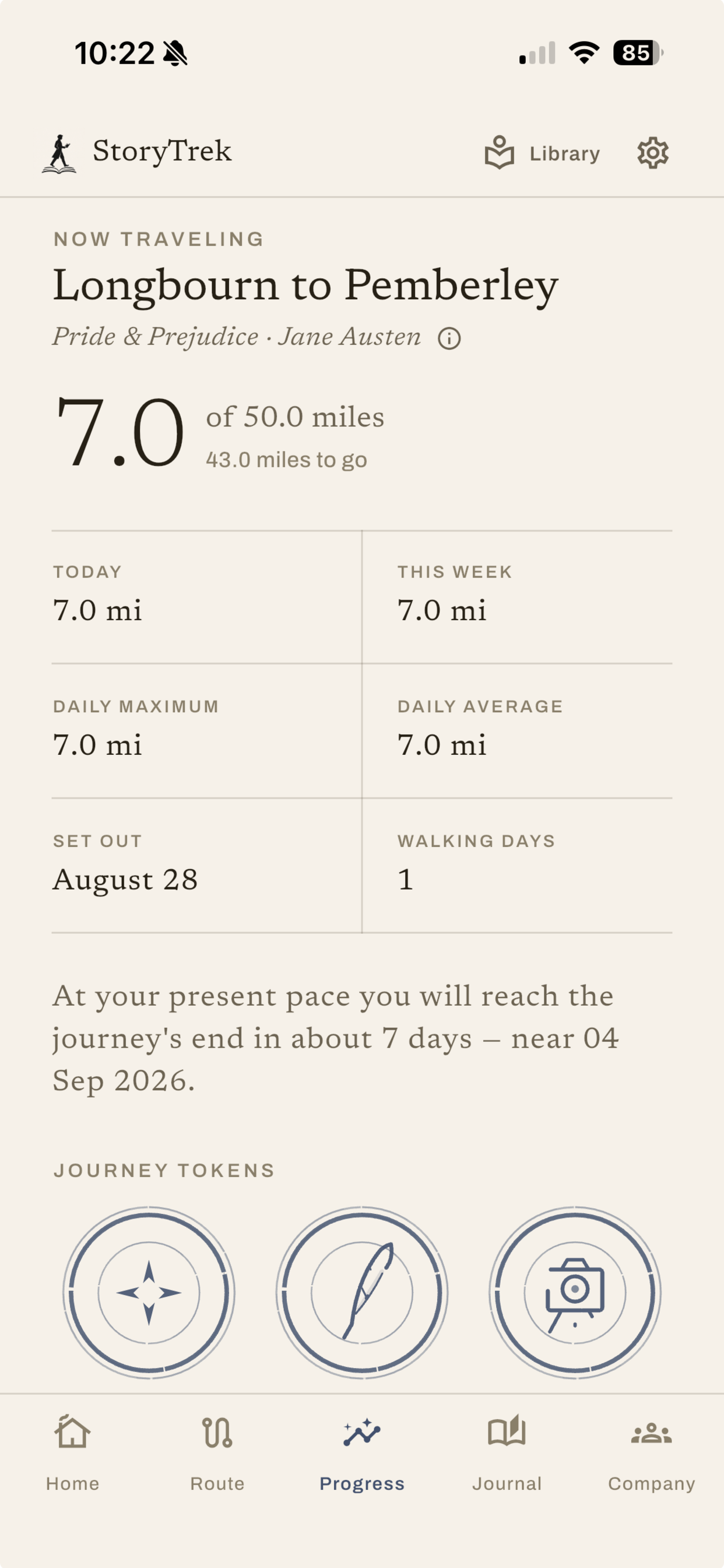
Progress Screen
-
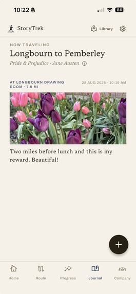
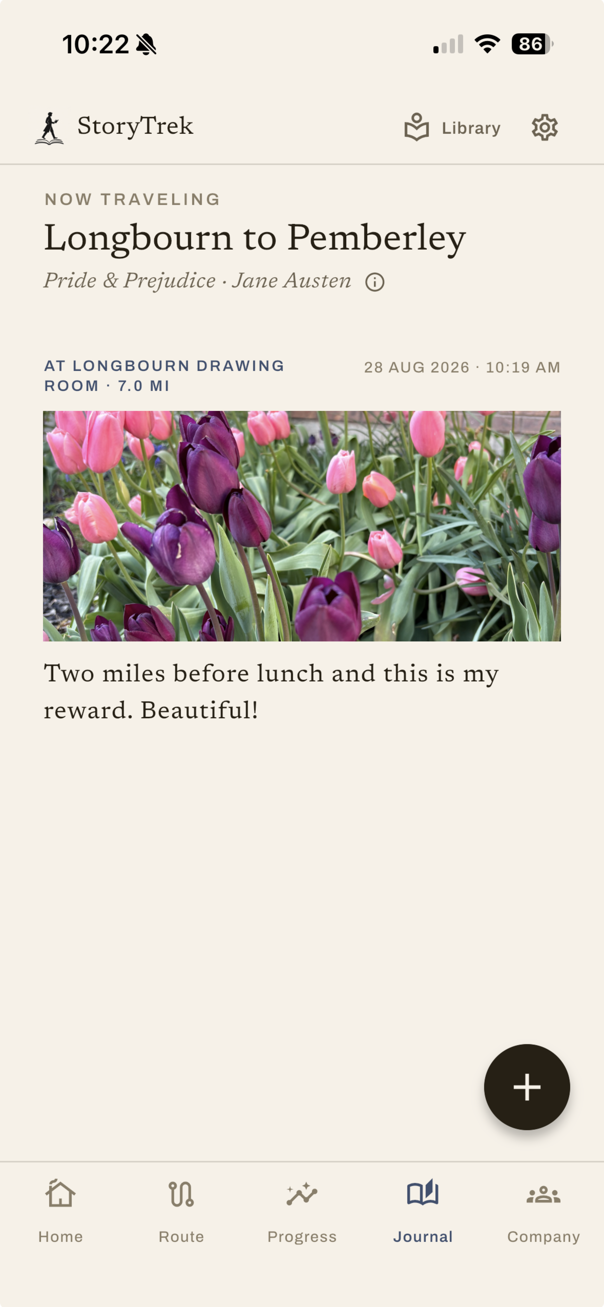
Journal Screen
-
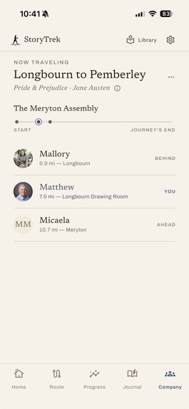
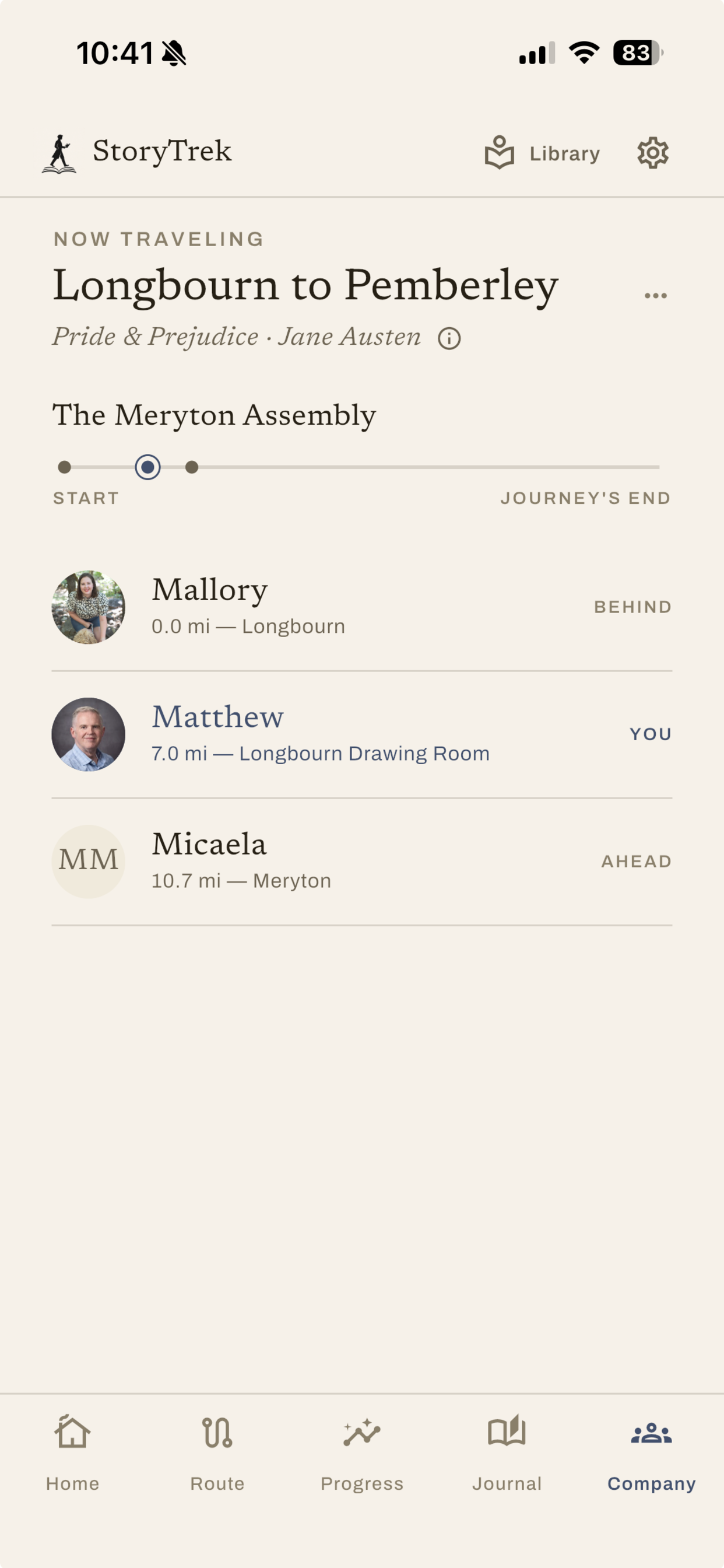
Company Screen
-
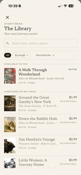
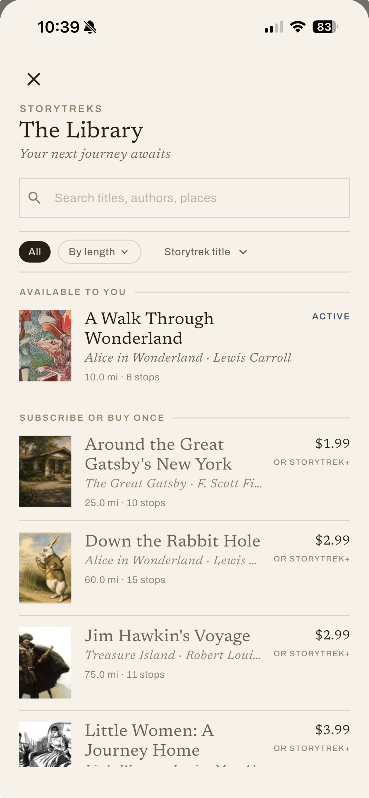
Library Screen

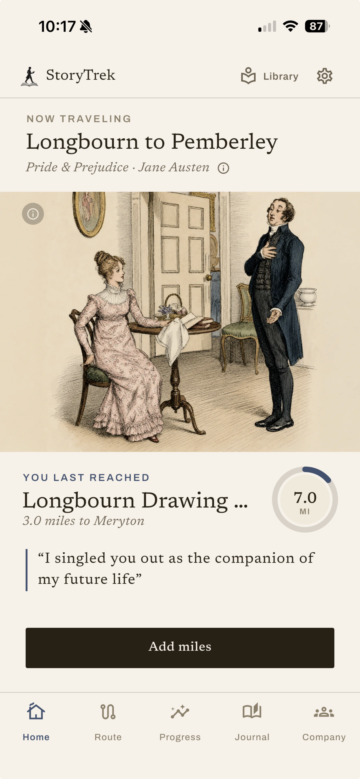
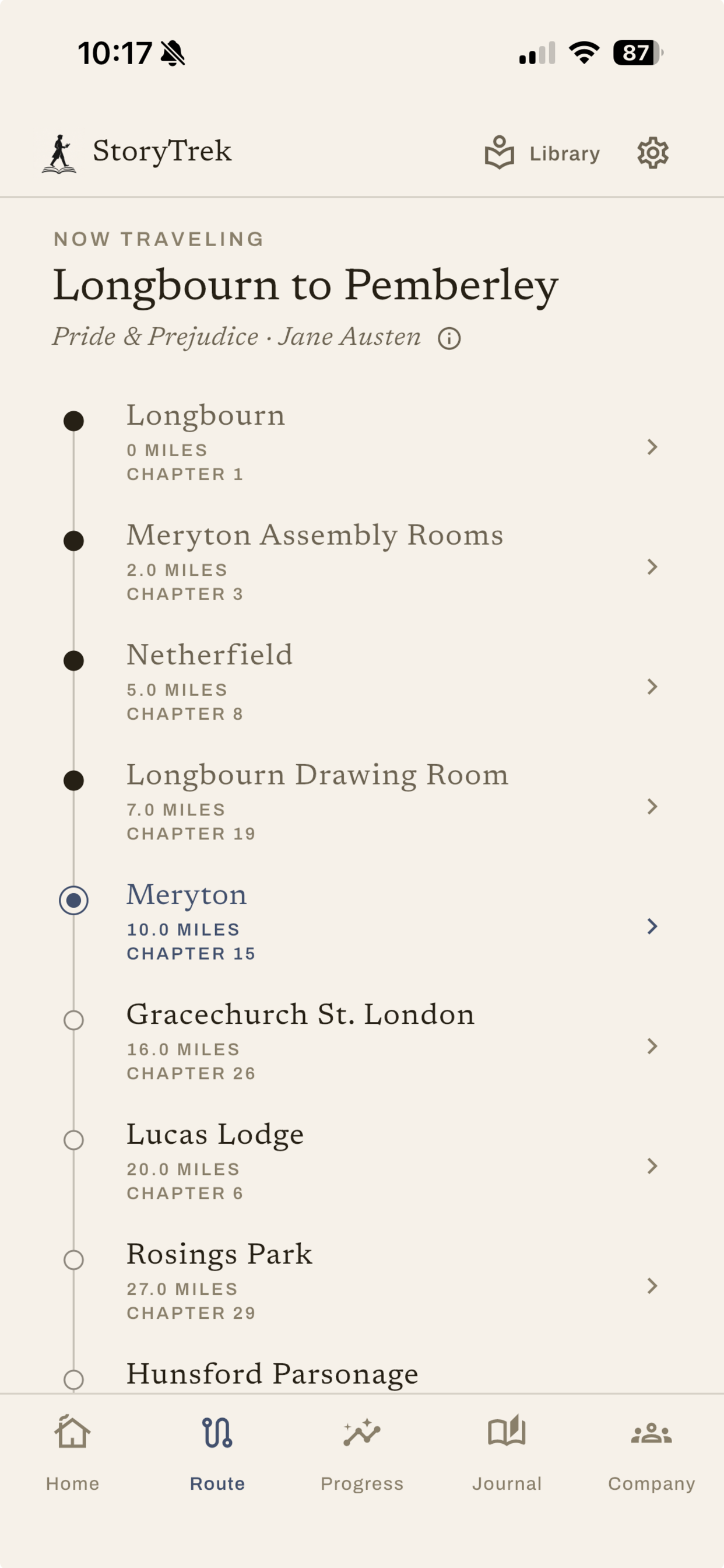
StoryTrek — The last page is only the beginning
StoryTrek turns the distance you already travel into progress along a journey drawn from a book you love. Choose a route (the Yellow Brick Road, Longbourn to Pemberley, the Odyssey), then walk, run, or ride wherever you normally would. Your miles carry you down the book's road. Each waypoint you reach opens into a moment from the story: a passage, its context, and an illustration made for that book.
Live now on the App Store and Google Play. storytrek.app
Inspiration
StoryTrek starts from a simple question: what if finishing a book did not mean leaving its world behind? Reading ends on a fixed date. A journey doesn't have to. The attempt here is to make the distance register and put a reader on the road for as long as it deserves.
The routes are inspired by the text's. So we shape each journey around the places the book actually moves through and its turning points, then set a length that holds the shape of that journey and is honestly walkable. Ten miles through Wonderland, 905 across Don Quixote's road. The waypoints are where the story is. The mileage is what gets you there.
The art half of that had its own reason. The illustration made for these books over the last two centuries is almost entirely invisible to the people reading them today. Editions get reprinted without it. It sits in archives. If someone was going to spend six weeks walking through Pride & Prejudice, that seemed like the right occasion to put a Hugh Thomson illustration in front of them.
The idea was Micaela's. She is pursuing a PhD in Public Health and has been examining Self-Determination Theory or how behavior becomes self-sustaining when it satisfies three basic psychological needs: autonomy, competence, and relatedness. Each tab in StoryTrek is grounded in this theory.
She also had a working example. She'd been walking to Mordor, logging her real miles against the distance from Hobbiton to Mount Doom, when it stopped feeling like exercise and became something she both needed and wanted to do. She wanted the same arrangement for the other books she reads but nothing like it existed.
So she called me, her father, and asked whether the two of us could build it. StoryTrek is simply a way to spend more time inside a story you love, encounter the art made for it, and get healthier in the same act, with none of those three feeling like the price of the others.
The design problem
The problem was not how to keep people tapping. It was how to help someone spend more time with literature, encounter artwork in a context that means something, and get healthier while doing it.
Conventional mobile engagement patterns were a poor fit for all three. Prompts, confirmations, streaks, and daily tasks would have turned both the walk and the story into work performed for an app. So StoryTrek asks for almost nothing. You pick a journey and go about your life. Your phone or watch records distance the way it already does. The app doesn't prescribe a route, doesn't need to be open, and doesn't interrupt the walk it's supposedly about. You come back, and your movement has revealed something.
The goal was for the application to recede, to feel like a companion to walking and reading rather than a system directing you through a checklist.
The artwork
For every scene we look for real art first: paintings, prints, and illustrations already in the public domain, often made in the same era as the story. More than 90% of what you see in StoryTrek is exactly that, work by artists across generations who read these books and made images in response.
We took the harder path deliberately. Generating every illustration would have been faster and cheaper, but we decided that an app about spending time with literature should put a Hugh Thomson or a Tenniel in front of you when one exists, because a period illustration carries history and personality that a generated image does not. Micaela researched and curated every piece, reading the books and matching each image to the moment in the journey where it belongs.
The remaining share is AI-generated, and we say so in the app rather than burying it. Some scenes, characters, and waypoints simply have no fitting match in the historical record, at least none we have found, and a two-person team cannot commission original illustration at the volume a growing library needs. We expect the public domain share to keep climbing as the library grows, and we want to bring human illustrators into more of our stories, starting with reader favorites.
Nothing reaches a traveler unreviewed either way. We search, select, write prompts, and curate every result ourselves, rejecting or reworking anything that does not fit the story's voice.
That standard created the content-engineering problem underneath the app. Each image has to be verified, matched to the right waypoint, prepared for mobile, and kept available offline. Behind the library sits a content model connecting every book, waypoint, quotation, source, and image. That part of the craft is never visible on screen, and it is the reason the visible part holds together.
Features
A library of literary journeys. Each route traces a book's world, with waypoints shaped by its places and turning points. They run from a 10-mile Walk Through Wonderland to Don Quixote's 905-mile epic road, with Gatsby's New York, the Yellow Brick Road, Pride & Prejudice, and the Odyssey between. Filter by distance and pick a road that fits the distance you actually cover.
Waypoints that open. Reaching a milestone reveals story context, a quotation from the book, and the illustration curated for that moment. This is the whole payoff loop, and everything else in the app exists to protect it.
Passive distance. StoryTrek reads distance already recorded in Apple Health or Health Connect. No timer to start, no session to end, nothing running in your pocket. Walk, then pull to refresh.
A travel journal. Save photos and notes at the waypoints you reach, so the journey ends up holding your walks alongside the book's road.
Pace and arrival. Miles traveled, daily pace, and the date you'll arrive at your current rate, so a 200-mile journey reads as a plan rather than a wall.
Shared company. Walk a journey with other people, each of you wherever you are, each at your own pace, all following the same road.
Only distance. StoryTrek reads health-derived distance and nothing else. Never your location, your route, or any other part of your health record. By default it stays on your device; data leaves only if you subscribe to sync or join a shared company, and then only as hourly distance totals.
How we built it
Flutter and Dart, shared across iOS and Android. Apple Health and Android Health Connect for distance. Supabase and PostgreSQL for cloud data. RevenueCat for purchases and entitlements. Sentry for issues and tracking.
Challenges
Synchronization. This was the hardest engineering problem in the app. A traveler can be online or offline, signed in or signed out, on free, purchased, or subscription content, in any combination. The app has to preserve local progress, add cloud features after sign-in, recover cleanly when a connection returns, and keep access rights separate from cached content. Health data, purchases, authentication, local storage, and cloud sync each have different rules and failure modes. We modeled them as explicit state transitions, so the systems agree with each other without asking the traveler to understand why.
The content pipeline. Searching the archives first moved the difficulty rather than removing it. Every candidate image has to be verified as out of copyright, attributed to its source, matched to the waypoint it belongs to, and prepared to render offline on a phone, and the search fails often enough that we also had to decide what to do about the gaps. Multiply that by a library of journeys and it becomes a data problem with a research problem inside it, all of it upstream of anything a user sees.
Designing for absence. Building an app whose goal is to stay out of your way removes the usual instruments. No streaks, no notifications, no daily loop. Every mechanism we might have reached for to make the app feel alive was one we'd already ruled out, so the payoff had to come entirely from the waypoint opening, which put all the weight on the curation being good.
Two stores, mixed purchase models. One-time purchases and subscriptions behaving consistently across App Store and Play Store, on a two-person team, with no purchase backend of our own.
What we learned
Curation was the part that couldn't be automated, and it was also the part that made the product. We expected the artwork to be a content-sourcing task. It turned out to be the thing the whole app rests on: a waypoint only lands if the image is right for that exact moment, and knowing which image is right requires having read the book. The work that resisted automation most is the work we'd least want to give up.
Modeling the mess as explicit state transitions was what made it tractable. The combinations of offline, signed-out, and partially-entitled states were unmanageable as conditional logic and manageable the moment we wrote them down as states with defined transitions between them.
Entitlements are a seam, not a checkout. The useful thing RevenueCat gave us wasn't payment handling. It was a clean answer to "what does this person have access to," separate from "what is on this device right now." Once the sync layer asked that question of RevenueCat rather than inferring it from cached content, several categories of bugs disappeared.
Restraint has to be defended repeatedly. Every few weeks one of us proposed something that would have made the app more engaging and less like itself. Deciding the philosophy once was not enough; we had to keep re-deciding it against specific, individually reasonable features.
Monetization
Three tiers through RevenueCat. One journey is free, so a new traveler reaches a waypoint and feels the loop before being asked for anything. From there you can buy other journeys outright and keep them, or subscribe for the full library plus cross-device sync, shared company journeys, and journal backup.
The one-time purchase matters to us. A reader who wants their book and has no interest in another subscription should be able to buy the thing they want.
RevenueCat handles customers, products, and subscriptions imported from both app stores, which is what let two people ship a mixed one-time-purchase and subscription model across iOS and Android without building a purchase backend. Entitlements are the seam between what someone has bought and what the app syncs. The sync layer asks RevenueCat what a traveler is entitled to, and keeps that decision separate from whatever content happens to be cached on the device.
Team
A father and daughter. Micaela Manley led content development: researching the journeys, sourcing the quotations, and curating the artwork. Matt Manley led product architecture, the content system, mobile engineering, health integrations, local and cloud data, purchases, and delivery. Product and experience design was shared.
The curation is the part of StoryTrek we are most attached to. Every illustration in the app is there because someone read the book and decided it belonged.
What's next
The library is the roadmap. We're expanding it with journeys timed to the year, so that the book waiting in the library is the one you're already in the mood for. Frankenstein and Dracula both arrive in late October.
Seasonal releases suit the shape of the app. A journey takes weeks to walk, so a new one landing at the right moment gives a traveler who just arrived somewhere a reason to set out again, and gives a reader a reason to open StoryTrek who hasn't thought about it since spring.
Built With
- dart
- flutter
- resend
- revenuecat
- sentry
- supabase

Log in or sign up for Devpost to join the conversation.