Inspiration
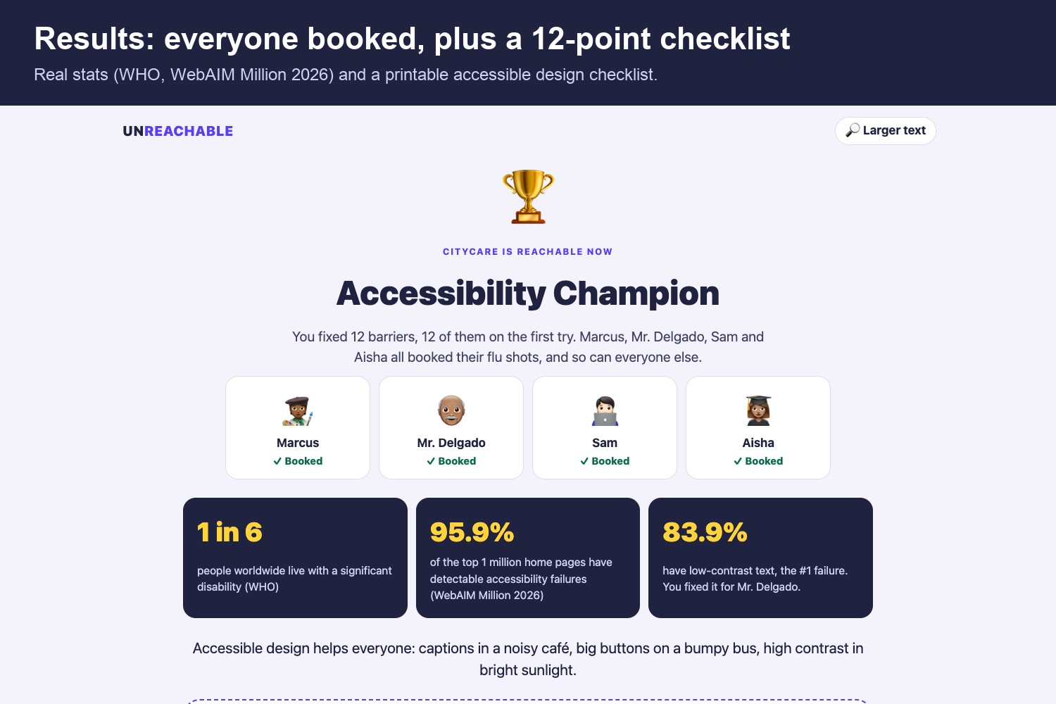
Booking a doctor's appointment online takes most of us a minute. But 1 in 6 people live with a significant disability (WHO), and the WebAIM Million 2026 report found detectable accessibility failures on 95.9% of the top one million home pages. The three most common failures are low-contrast text (83.9%), missing image descriptions (53.1%) and missing form labels (51%).
Most people have never felt what that's like. I wanted a game where you don't just read about barriers: you hit them, get frustrated, and then become the person who removes them. The idea behind it is the social model of disability: the person's disability isn't what stops them. The design is.
What it does
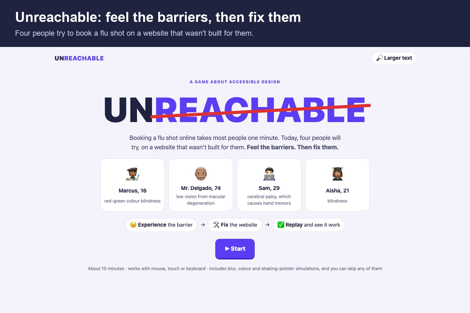
Four people try to book a flu shot on the same clinic website, one booking step each:
| Person | Barrier | What you experience |
|---|---|---|
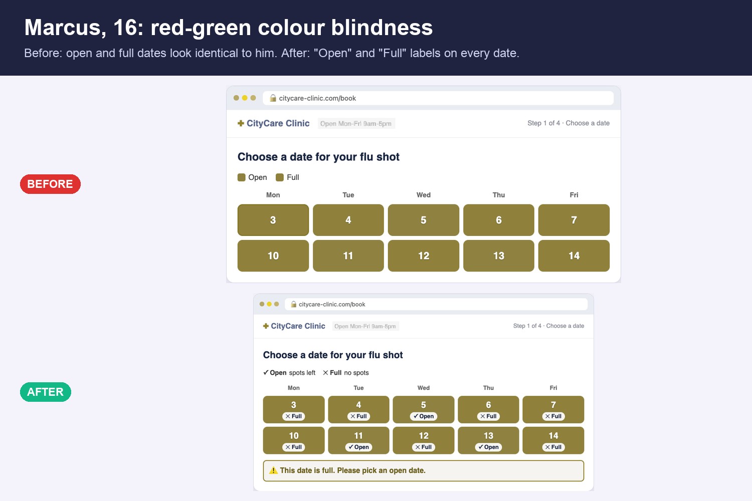
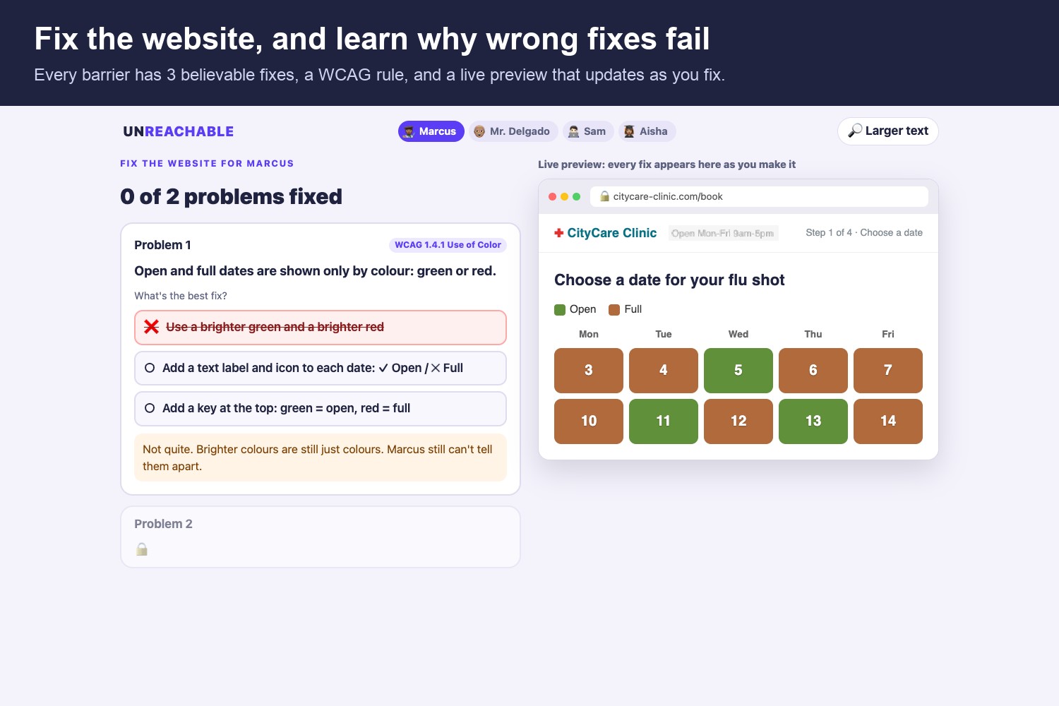
| Marcus, 16 | Red-green colour blindness | Open and full dates look identical |
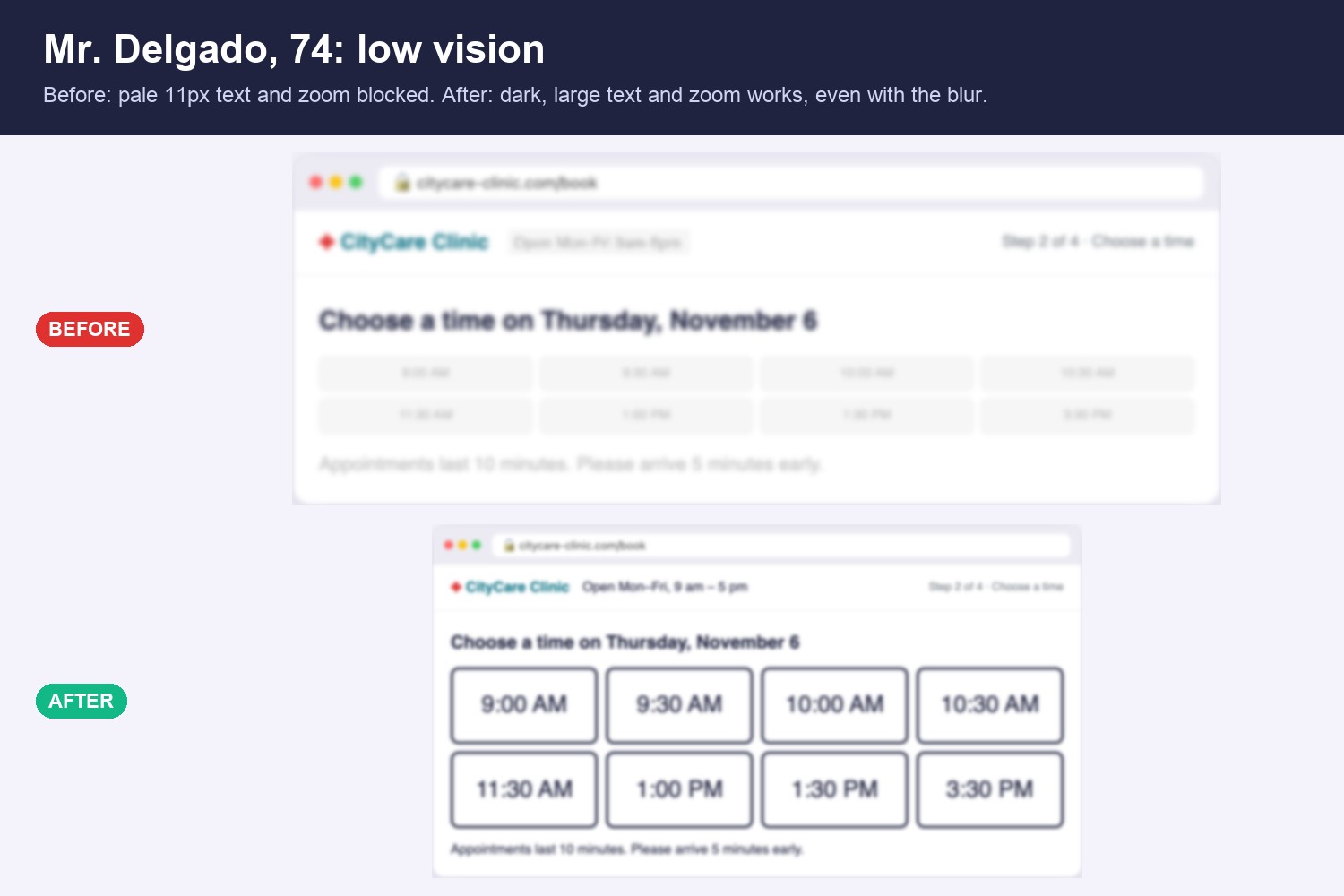
| Mr. Delgado, 74 | Low vision | Blurry, pale 11px text, and zoom is blocked |
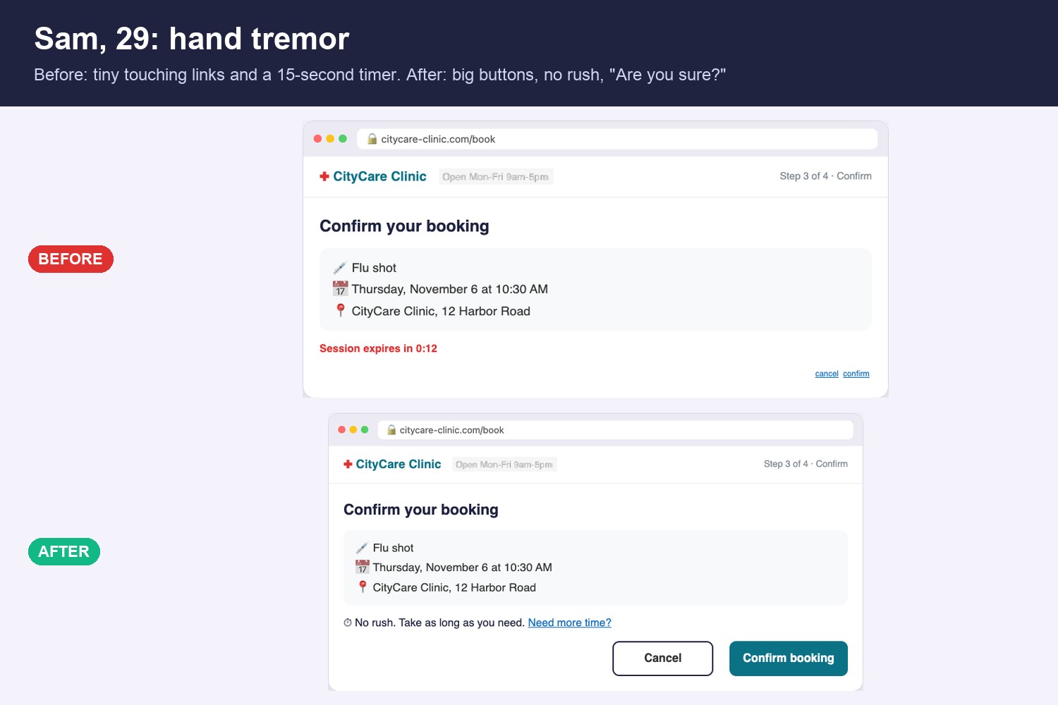
| Sam, 29 | Hand tremor | A shaking pointer, tiny links, a 15-second timer |
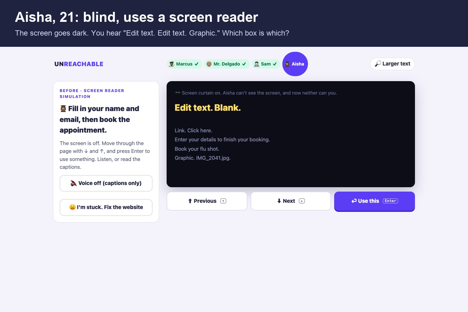
| Aisha, 21 | Blind, uses a screen reader | A black screen, "Edit text. Edit text. Graphic." |
Every level has three steps:
- Experience the barrier through a simulation.
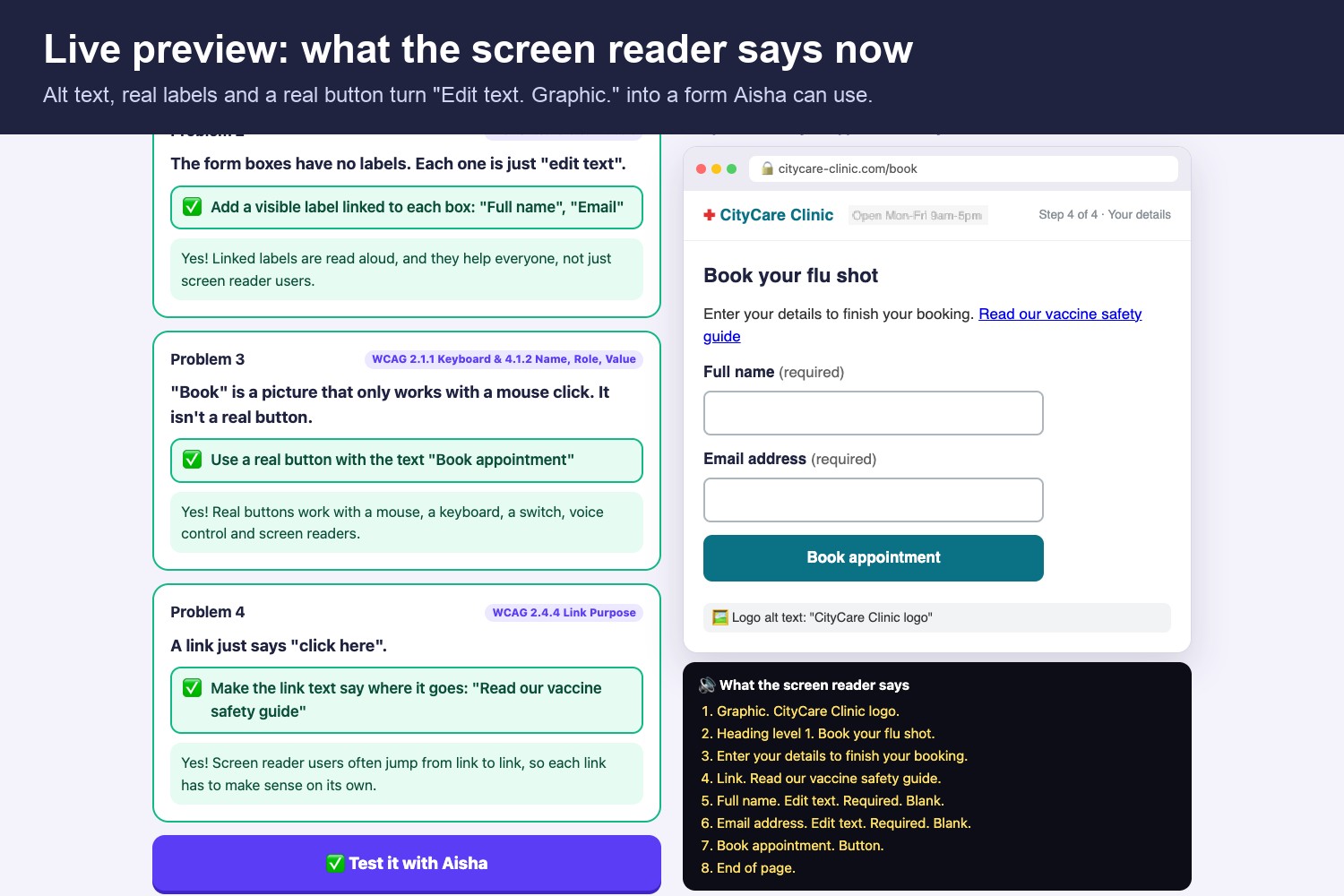
- Fix the website by choosing between three believable fixes. Wrong answers explain why they don't work (for example, why a placeholder isn't a label). A live preview updates as you fix.
- Replay the same task, with the same disability, on the fixed site, and see it work.
The game ends with real statistics and a printable checklist of 12 fixes, each linked to its WCAG success criterion, for players to use in their own projects.
How I built it
- React 19 + TypeScript + Vite, deployed on Vercel. There's no backend, account or tracking.
- Colour blindness: an SVG
feColorMatrixfilter using the Machado et al. (2009) deuteranopia matrix in linear RGB. I chose the "open" and "full" colours with the same model so they look clearly different to most people but almost identical to Marcus, and a unit test checks this. - Low vision: blur, an image of text, and blocked zoom. The fix is checked with the WCAG contrast formula:
$$\text{contrast} = \frac{L_1 + 0.05}{L_2 + 0.05}$$
where (L) is relative luminance. The "before" grey text scores 1.6 : 1. The fixed text scores 15.3 : 1, well above the AA minimum of 4.5 : 1.
- Hand tremor: the real pointer is hidden and replaced with a shaking one, and clicks land wherever the shaking pointer is. There's an extra "intention tremor" kick at the moment you press, because many tremors get worse when you aim. I modelled the hit rates: the tiny links get about 39% Confirm, 23% accidental Cancel and 38% complete misses, while the fixed 44px+ buttons get about 99% Confirm.
- Screen reader: the screen goes black. You move with ↓ / ↑ / Enter, and the page is read aloud with the Web Speech API (with captions too). The broken page has unlabeled fields and an image instead of a real button, so it can't be completed until you fix it.
- The game is accessible itself: keyboard play everywhere, a larger-text mode, screen-reader announcements, visible focus, reduced-motion support, and every simulation can be skipped.
- I built it with the help of Claude Code, an AI coding assistant, and tested it with Vitest (contrast maths, the colour-blindness model, the screen-reader logic and the level data).
Challenges
- Making the simulations honest but not cruel. Each one had to be frustrating enough to make the point, but the fixed version had to work for the same simulated person. Otherwise the lesson would be "disabled people can't use websites" instead of "bad design blocks people".
- Choosing colours that fool the simulation. I searched for a red/green pair that differs a lot in normal vision but is almost identical with deuteranopia.
- Tuning the tremor. At first, clicks almost never hit Cancel by accident. I made it mostly side-to-side, added the intention-tremor kick, and checked the hit rates with a simulation.
- Writing wrong answers that sound right. "Make the green brighter", "add a placeholder" and "make Cancel red" are mistakes real teams make, so each one needed a clear explanation.
What I learned
- Many accessibility fixes are small: a text label, a darker colour, a real
<button>, alt text. They help everyone, like captions in a noisy café or big buttons on a bumpy bus. - Placeholders are not labels, colour should never be the only signal, and people need to be able to zoom.
- Feeling a barrier for even 30 seconds changes how you design.
What's next
More people (deaf users and captions, cognitive accessibility, keyboard-only users), a "fix your own page" mode that checks real HTML, and a classroom version with teacher notes.
Built With
- accessibility
- claude-code
- css3
- html5
- react
- svg
- typescript
- vercel
- vite
- vitest
- wcag
- web-speech-api
