-
-
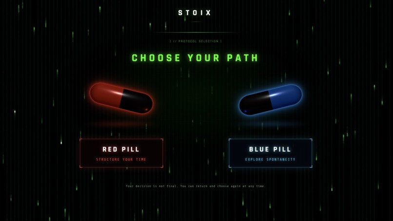
Landing Page
-
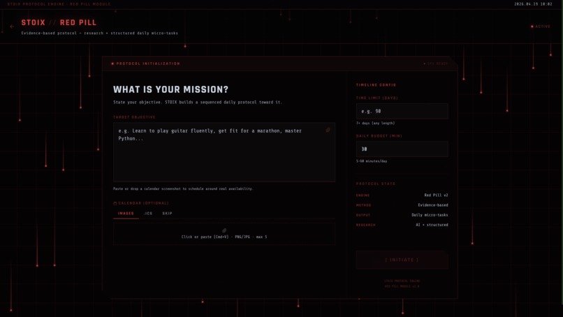
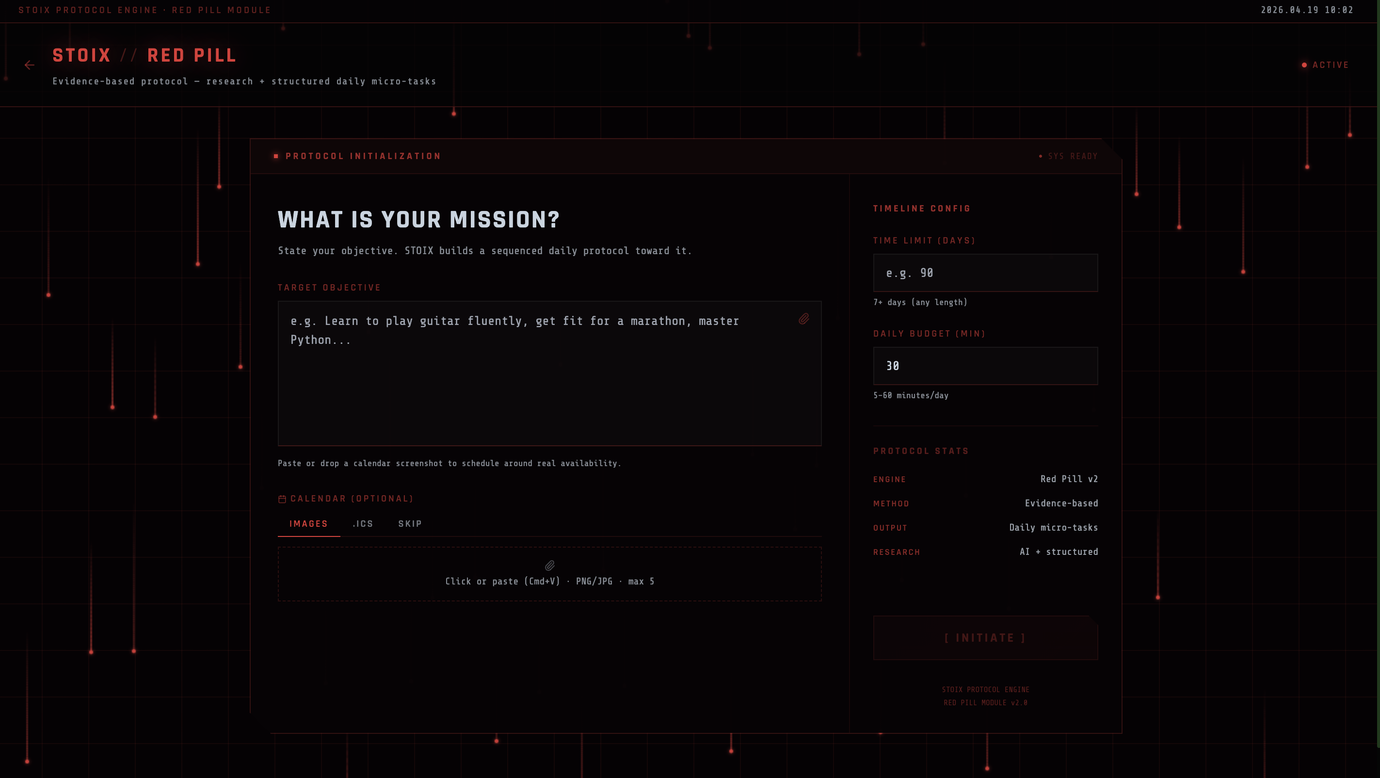
Red Pill User Input
-
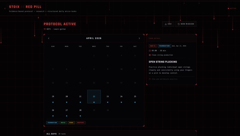
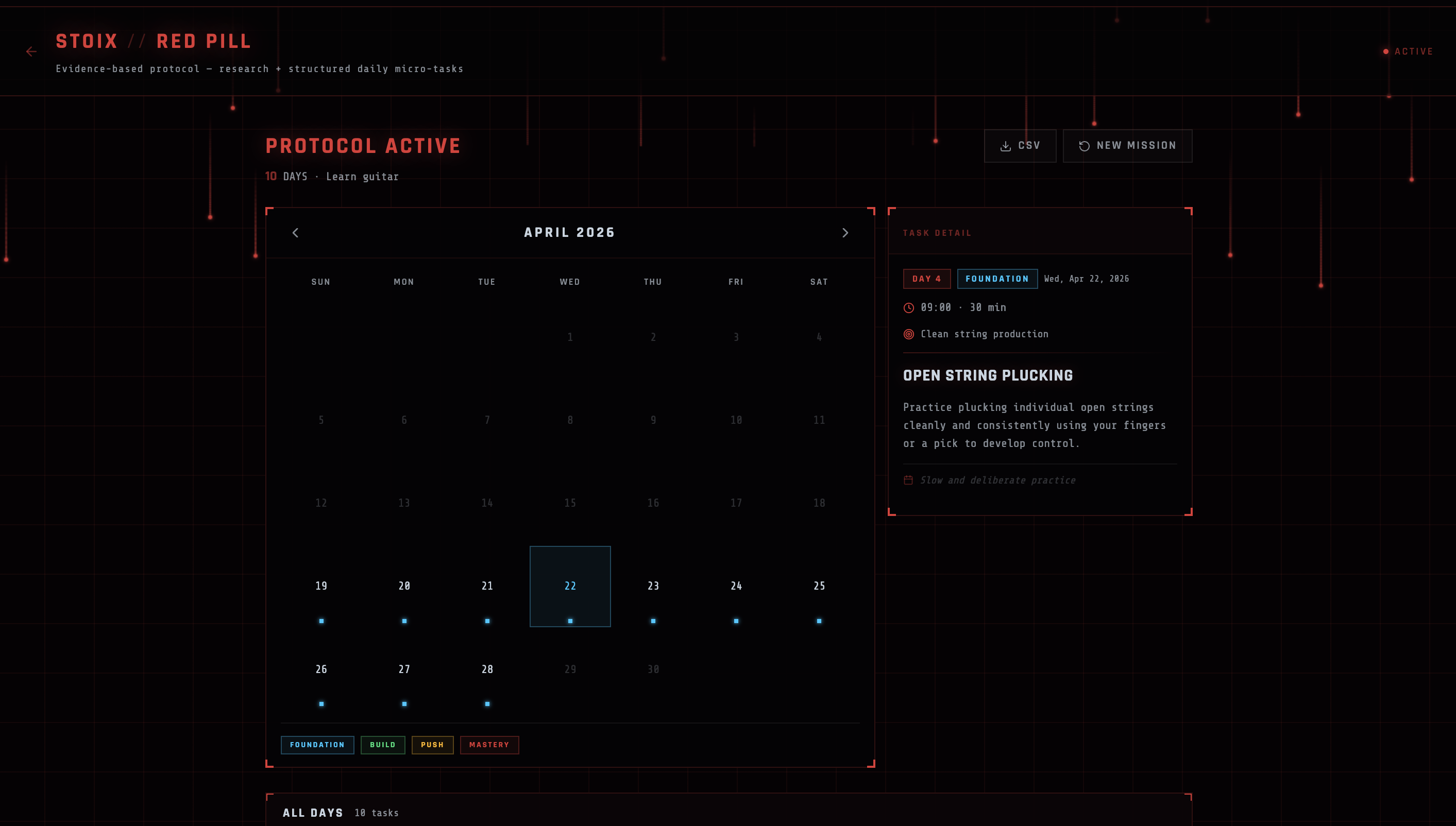
Red Pill Results
-

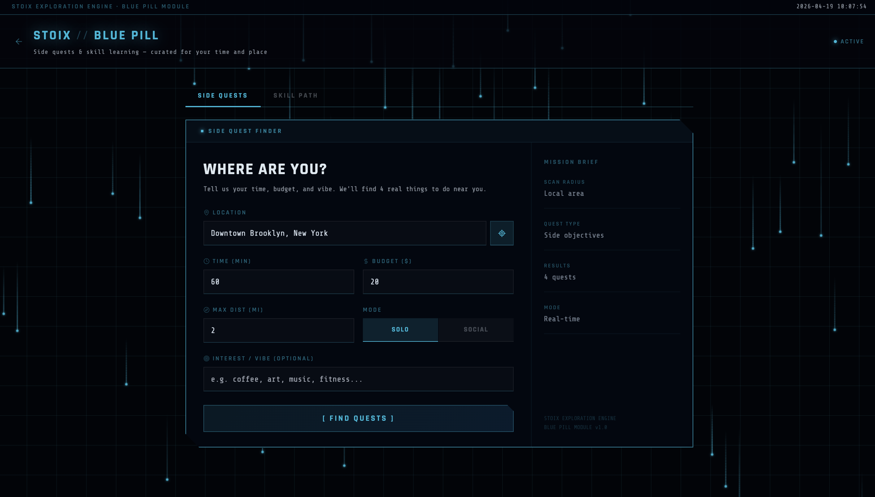
Blue Pill User Input
-

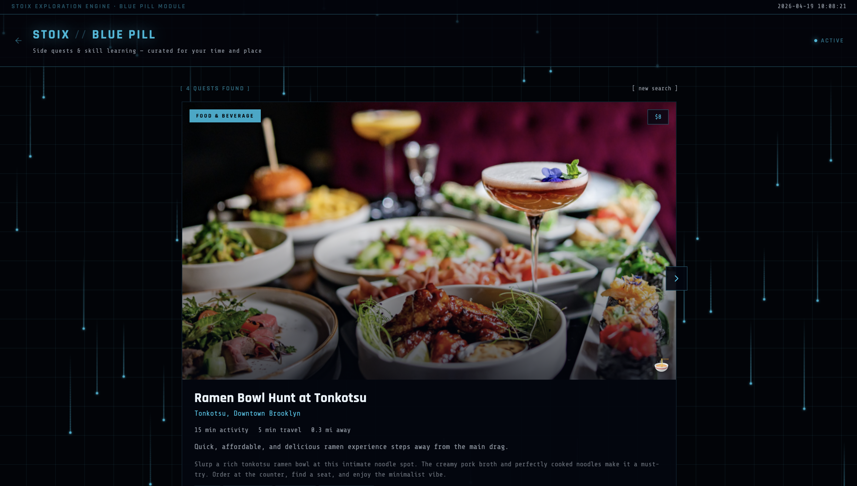
Blue Pill Results
Inspiration
Most of our daily routines are not intentional—they’re automatic. As students, we noticed two extremes: when work piles up, people feel overwhelmed and don’t know where to start; when free time appears, it often disappears into passive habits like scrolling or watching content. Existing tools either over-structure your day or leave you to figure everything out yourself.
We were inspired to design something that sits in between—something that helps people actively choose how to spend their time. The Red Pill / Blue Pill metaphor became a natural way to frame this idea: structure vs exploration, discipline vs spontaneity.
What it does
Stoix is a system that helps users make better decisions about how they spend their time.
🔴 Red Pill (Execution Mode):
Breaks down large tasks into smaller steps and schedules them realistically, reducing overwhelm.🔵 Blue Pill (Exploration Mode):
Suggests real-world activities (“side quests”) based on time, location, budget, and interests—helping users use free time more meaningfully.🧠 Skill Mode:
Recommends skills users can start immediately based on their available time, with step-by-step session plans and growth paths.
Instead of just listing options, Stoix filters and structures them so everything suggested is actually doable within the user’s time constraints.
How we built it
We built Stoix as a full-stack web application:
Frontend:
- Next.js + React + Tailwind CSS
- Cyberpunk-inspired UI with a dark, minimal, system-like interface
- Interactive landing page centered around choosing between Red and Blue Pill
- Next.js + React + Tailwind CSS
Backend:
- API routes (
/api/red-pill,/api/blue-pill,/api/skill-path) - Aggregates data from:
- Google Places (cafes, gyms, etc.)
- Event APIs (Ticketmaster/Eventbrite)
- Curated datasets for niche and free activities
- API routes (
AI Layer:
- Used AI models to:
- break down tasks
- rank and filter activities
- generate skill roadmaps
- Enforced structured JSON outputs to keep responses consistent and usable
Challenges we ran into
Time feasibility logic:
Ensuring every suggestion fit within the user’s available time required accounting for travel time, activity duration, and constraints.API inconsistencies:
Different APIs returned data in different formats, so we had to normalize everything into a single schema.UI complexity:
Designing a cyberpunk-style interface that still felt clean and usable was challenging—we had to avoid overloading the user visually.AI reliability:
Getting consistent, structured outputs from models required strict prompts and formatting rules.
Accomplishments that we're proud of
- Building a fully working, interactive prototype that connects UI, backend, and AI
- Creating a system that feels like a decision engine, not just another productivity tool
- Designing a cohesive visual identity that reinforces the concept (Matrix-inspired choice system)
- Successfully combining:
- planning
- exploration
- skill-building
into one unified experience
What we learned
- The biggest problem isn’t lack of tools—it’s decision overload
- Constraints (time, budget, distance) make recommendations far more useful
- A strong concept and framing can make a simple product feel powerful
- Clean execution matters more than having many features
What's next for Stoix
- Real-time personalization based on user behavior and preferences
- Social features (shared quests, group planning)
- Deeper integration with calendars and daily schedules
- Smarter recommendation models that adapt over time
- Expanding beyond students to broader user groups
Stoix aims to evolve into a system where people don’t just manage time—they design it intentionally.
Built With
- claude
- google-places
- javascript
- nextjs
- tailwind
- typescript

Log in or sign up for Devpost to join the conversation.