-
-
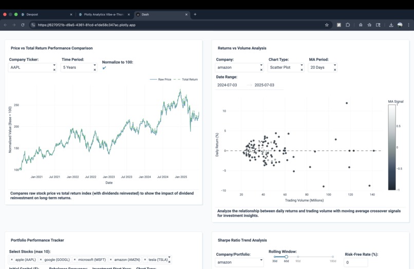
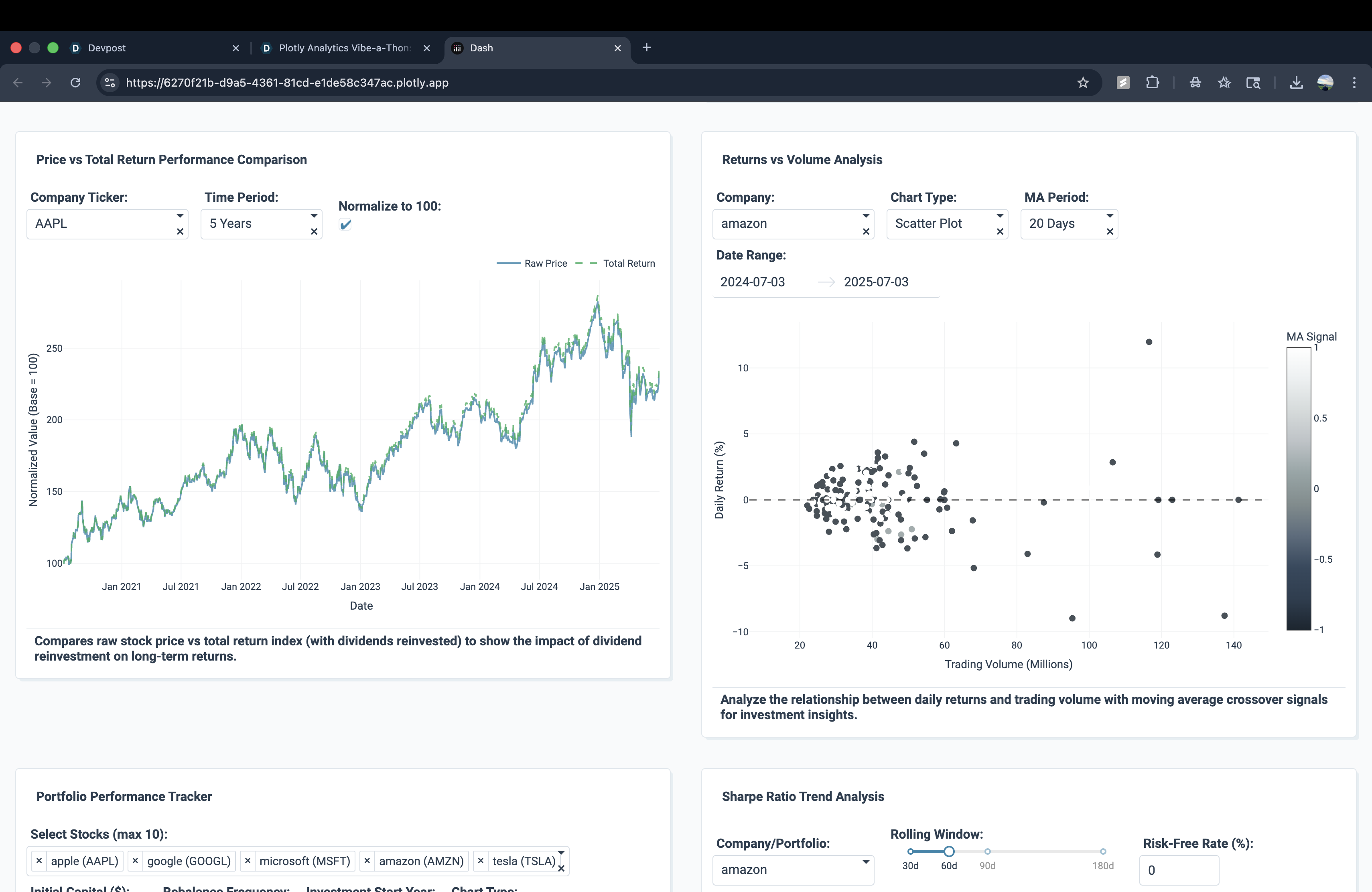
Price vs Total Return + Returns vs Volume: Compare raw price vs dividends reinvested and analyze return-volume relationships.
-
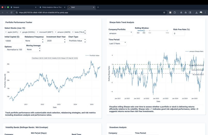
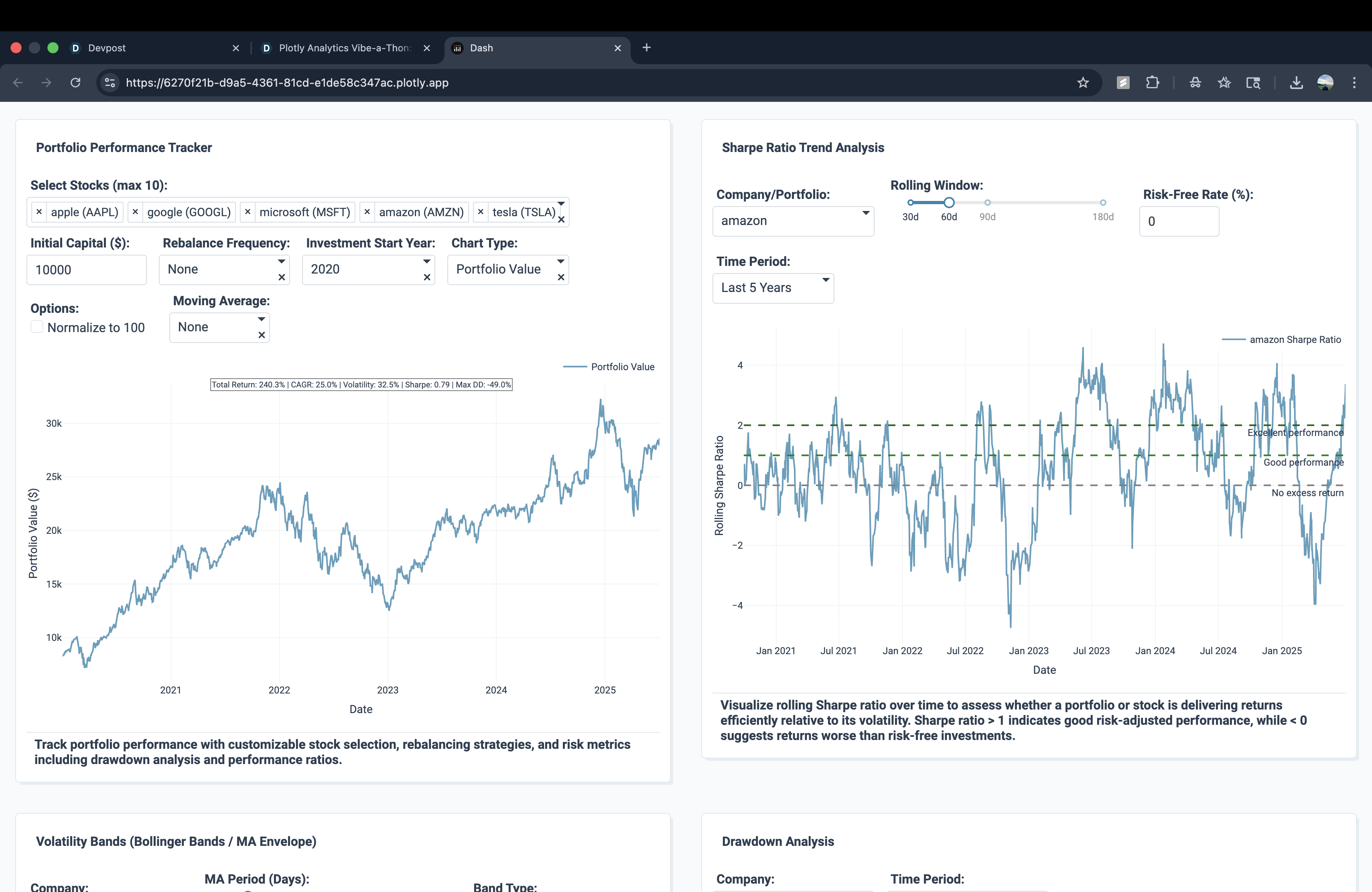
Portfolio Tracker + Sharpe Ratio: Build custom portfolios and assess risk-adjusted returns with rolling Sharpe ratios.
-
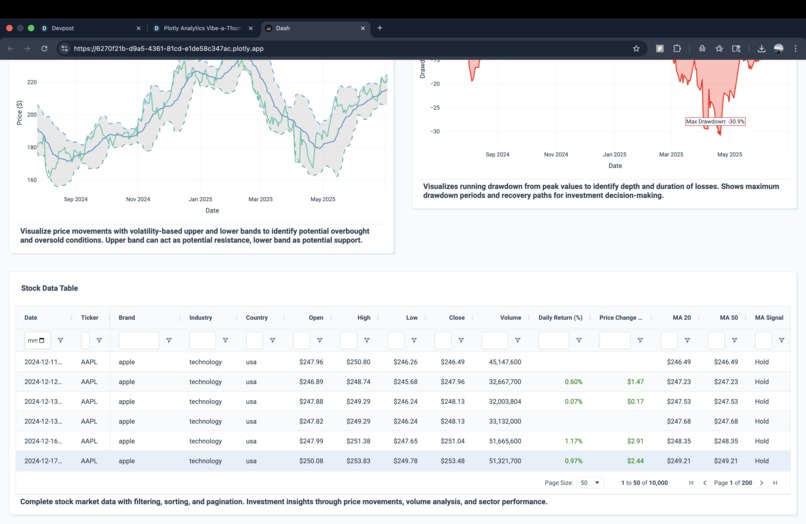
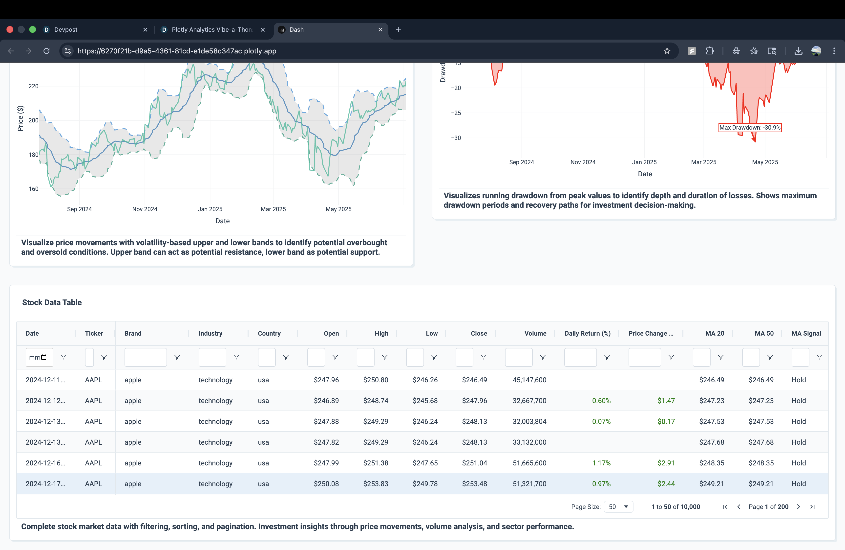
Stock Data Table: Explore detailed stock data with filters for prices, returns, moving averages, and signals.
-
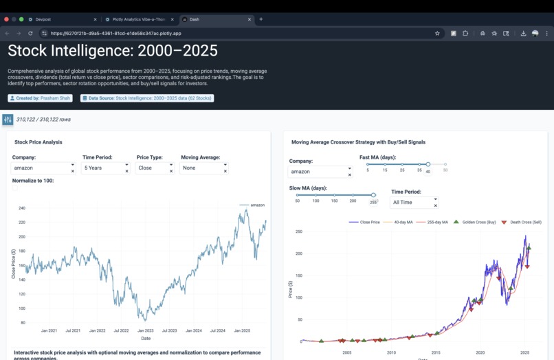
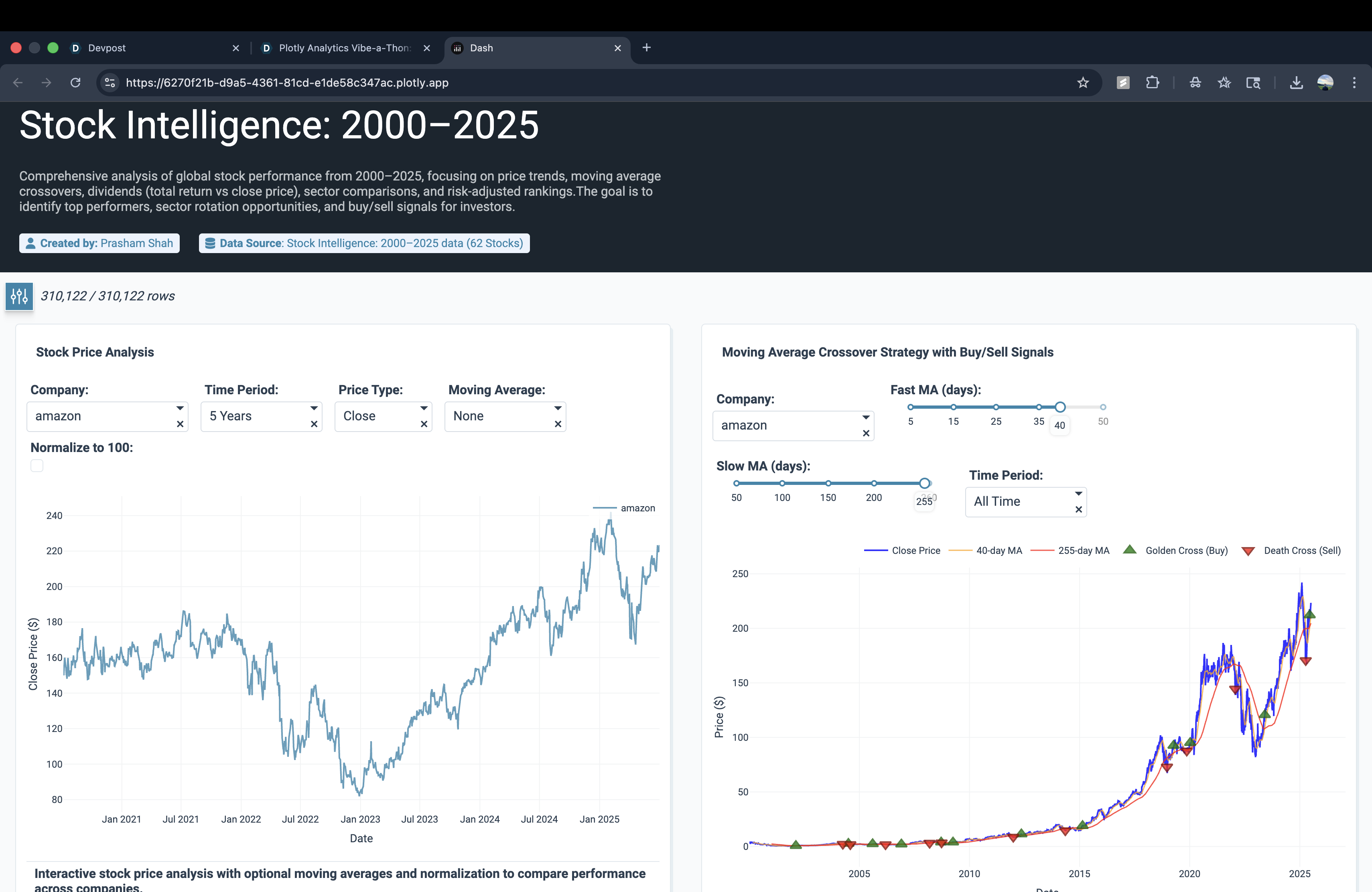
Stock Price + MA Crossovers: Visualize long-term stock price trends with moving averages and buy/sell signals.
-

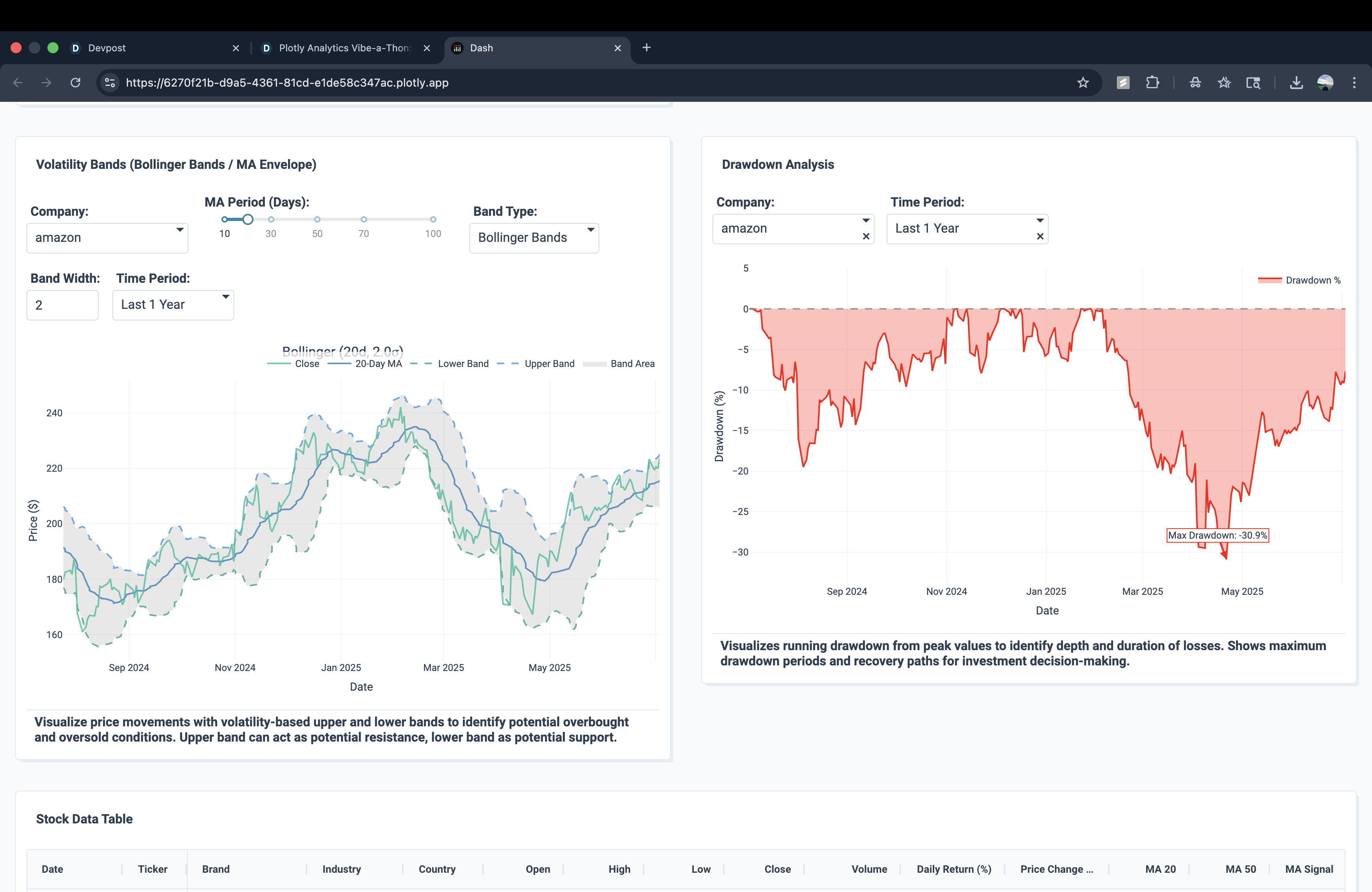
Volatility Bands + Drawdown: Track market volatility with Bollinger Bands and measure losses with drawdown analysis.
Inspiration
The inspiration for this project came from one of my financial classes. We explored how stock performance can be analyzed with indicators such as moving averages, volatility measures, and portfolio metrics. That experience motivated me to build an interactive app where these concepts come to life visually.
What it does
Stock Trends Explorer is an interactive Plotly Studio app that analyzes 62 global stocks from 2000–2025. It helps users explore stock price trends, compare companies, track portfolio performance, and understand investment strategies using tools like moving average crossovers, Bollinger Bands, drawdown analysis, and risk-adjusted metrics such as the Sharpe ratio. The charts are fully interactive they can be zoomed in or out to focus on specific time frames and also downloaded for further use.
How we built it
We built the project using Plotly Studio Pro Plan. The dataset includes historical stock prices, volumes, and dividend information for 62 companies. Plotly Studio’s AI app builder was used to generate the base layout, which was then refined through edits and customizations. Key features include:
- Stock price analysis with normalization and moving averages
- Moving average crossover charts to highlight buy/sell signals
- Price vs. total return comparisons to show dividend effects
- Returns vs. volume scatter plots for volatility insights
- Portfolio performance tracker with CAGR, volatility, Sharpe ratio, and drawdowns
- Volatility bands and rolling Sharpe ratio trends
Challenges we ran into
- Managing the AI credit limits in Plotly Studio, which required careful planning and efficient editing
- Balancing advanced financial analysis with a simple, user-friendly interface
- Handling a dataset with more than 300k rows while keeping the app responsive
Accomplishments that I'm proud of
- Building a comprehensive stock analysis dashboard fully in Plotly Studio
- Designing a project that connects classroom finance concepts with real-world investment analysis
What we learned
We learned how to combine financial theory with interactive data visualization. The project improved our ability to design dashboards, present risk-return tradeoffs in a visual form, and make financial concepts easier to understand. We also learned the importance of optimizing both performance and usability when working with large datasets.
What's next for Stock Trends Explorer
Next, we plan to expand the app with live stock market data and sentiment analysis from financial news. The goal is to make Stock Trends Explorer a tool that delivers real-time insights alongside historical analysis.

Log in or sign up for Devpost to join the conversation.