Inspiration
We started with a simple question: why do some exoplanets get confirmed while others stay as candidates? When we looked at NASA's Kepler dataset, the answer was clear. The transit method favors planets that orbit fast and block more starlight. That is not a flaw in the science. It is a built-in property of how the detection works. We wanted to make that bias visible to anyone, not just astrophysicists.
What it does
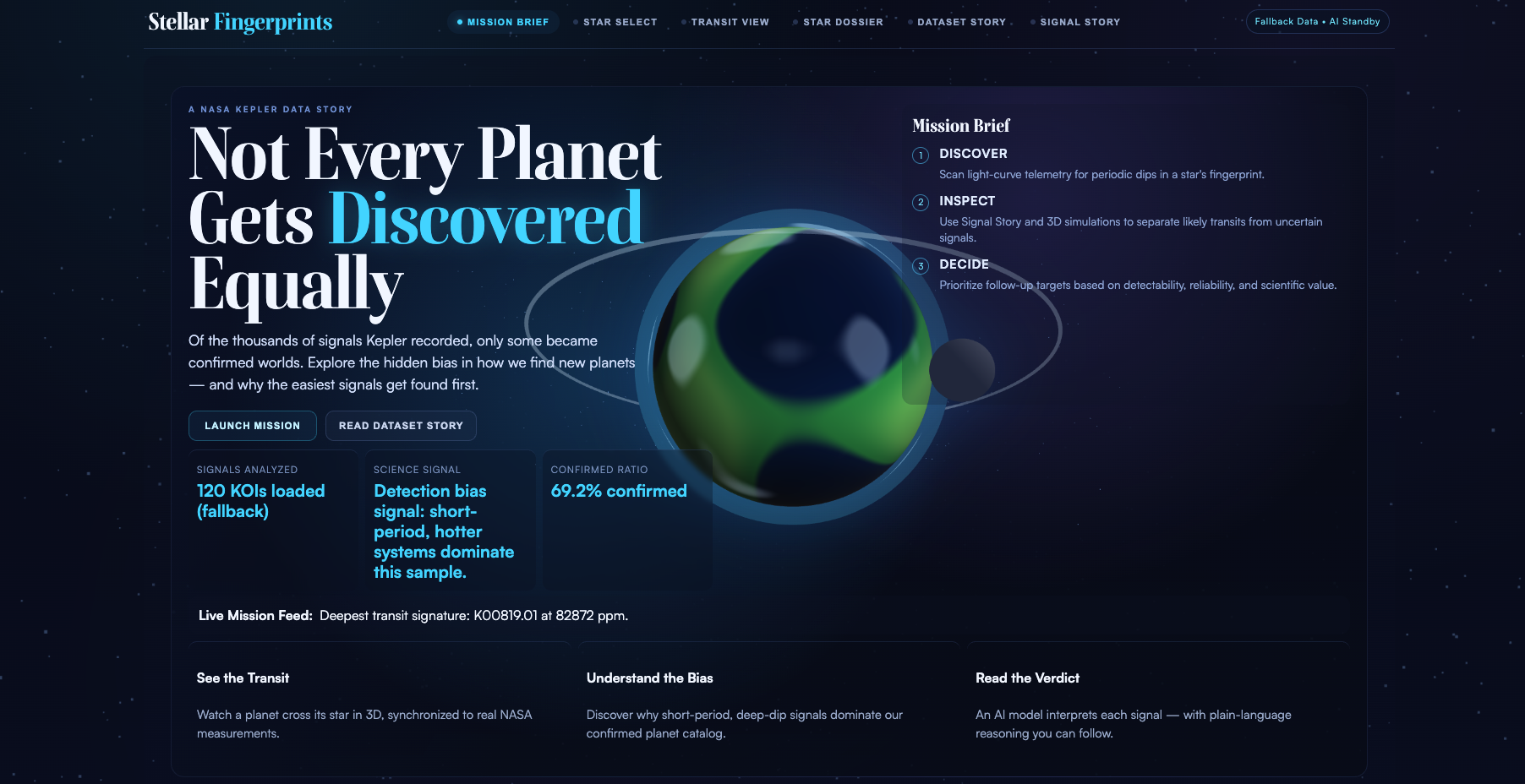
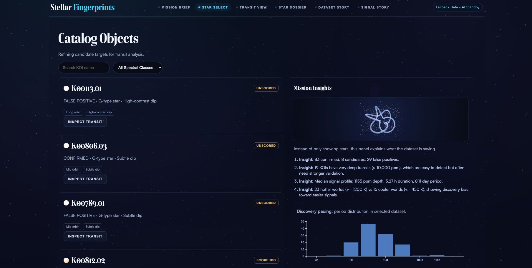
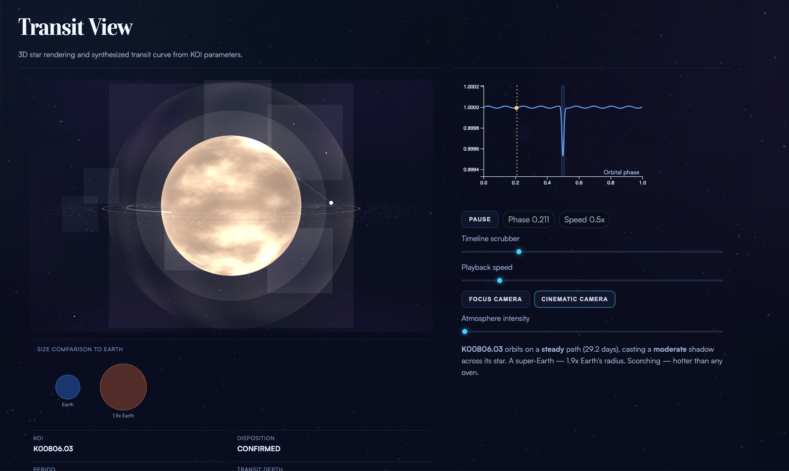
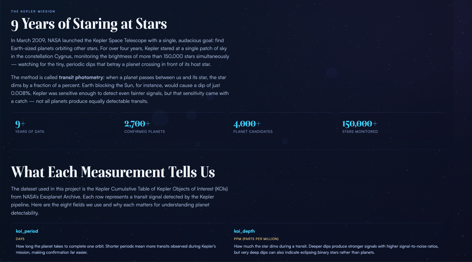
Stellar Fingerprints is a browser-based interactive experience that guides users through the Kepler exoplanet dataset. It has six screens that follow a narrative arc: start with a mission briefing, browse a catalog of 120 Kepler Objects of Interest, inspect a star system in 3D with a synchronized light curve, read a plain-English dossier of every measurement, explore the dataset's bias through charts and interactive tools, and then see an AI model interpret the transit signal.
Two interactive features stand out. The first is a draw-your-own-light-curve canvas where you sketch a transit dip and the app estimates what kind of planet could cause it. The second is a habitable zone explorer where you adjust star temperature and radius with sliders and see which planets from the dataset fall in the zone where liquid water could exist.
Every raw number in the app gets a human-scale translation. Transit depth in parts per million becomes "like dimming a stadium light by 0.05%." Equilibrium temperature in Kelvin becomes "hotter than a kitchen oven." The goal is to make the data feel intuitive.
How we built it
The frontend is React 18 with Vite 5 as the build tool. React handles the screen layout and component structure. A separate runtime engine in plain JavaScript handles all the behavior: state management, hash-based routing, data fetching, Three.js rendering, D3 charts, Canvas drawing, and TensorFlow.js inference. This split keeps 3D performance high while preserving React's component model.
The 3D star systems use Three.js with custom GLSL shaders for procedural star surfaces, corona effects, and planetary atmospheres. No image textures. The light curves and dataset charts use D3.js. The draw feature uses the HTML5 Canvas API with mouse and touch event handlers. The habitable zone explorer recalculates luminosity and zone boundaries from the stellar parameters in real time.
For data, the app first tries a live query to NASA's Exoplanet Archive TAP service. If that fails, it loads from a localStorage cache. If that is empty, it falls back to a bundled sample of 120 KOIs. The app works offline.
The ML path loads a TensorFlow.js model for in-browser inference. When model artifacts are not available, it falls back to a deterministic heuristic that produces the same user experience. The user never sees a difference.
Typography uses Boska for serif headings and Satoshi for body text, both from Fontshare. The design system uses a dark cinematic palette with cyan and gold accents.
Challenges we ran into
The biggest challenge was making scientific data accessible without dumbing it down. Terms like transit depth, equilibrium temperature, and spectral class are precise and meaningful. We did not want to remove them. Instead we paired every technical value with a plain-English companion so both audiences are served.
Coordinating React's component lifecycle with imperative Three.js and D3 rendering required careful architecture. React owns the DOM structure, but the runtime engine mutates it directly by ID. Getting these two systems to coexist without conflicts took iteration.
Performance was a constant concern. The app runs four Three.js scenes simultaneously (background starfield, intro Earth, catalog mini-scene, and the main transit view) plus D3 charts and Canvas drawing. Keeping frame rates smooth on mid-range hardware meant capping pixel ratios, limiting particle counts, and being careful about when we trigger re-renders.
Getting the habitable zone physics right in a way that still felt interactive was tricky. The luminosity calculation and zone boundaries had to update on every slider input without lag, while plotting 120 data points and recalculating which ones fall inside the zone.
Accomplishments that we're proud of
The draw-your-own-light-curve feature. It connects the abstract concept of a transit dip to something physical. When you draw a shape and the app tells you "that looks like a Super-Earth at 2,400 ppm," the detection method clicks in a way that charts alone cannot achieve.
The human-scale translations. Every measurement in the app has a plain-English note. This single feature does more for accessibility than any amount of visual polish. Non-scientists read "Close to Earth-sized" instead of "1.91 R-Earth" and the data becomes real to them.
The data pipeline resilience. The app tries live NASA data, falls back to cache, falls back to bundled data, and handles model unavailability with a heuristic. Nothing breaks. The demo works on stage, on a plane, or with spotty conference Wi-Fi.
The 3D star rendering. The procedural shaders generate unique star surfaces with granulation, limb darkening, corona effects, and plasma shells. They respond to the selected KOI's spectral class, so a cool red dwarf looks different from a hot blue-white star.
What we learned
We learned that storytelling matters more than feature count. Early versions of the app had more controls, more data fields, and more screens. Cutting features and focusing the narrative made the experience stronger.
We learned that translating raw science into plain language is harder than the code. Writing "Like briefly dimming a room light by 0.05%" for a transit depth of 500 ppm required understanding both the science and the audience. That translation layer took more thought than most of the JavaScript.
We learned that hybrid architectures (React plus imperative rendering) work well when you define clear boundaries. React owns structure. The runtime engine owns behavior. They communicate through DOM IDs. It is not the standard React pattern, but it fits a project where 3D performance and DOM rendering need to coexist.
We also learned how much observational bias shapes our picture of the universe. The confirmed exoplanet catalog is not a random sample of what exists. It is a sample of what our instruments can see. That was the insight we built the whole project around.
What's next for Stellar Fingerprints
Train and deploy the real TensorFlow.js model. The architecture and inference path are built. The heuristic fallback works. But a trained model on the full Kepler cumulative table would produce more nuanced predictions and let us show feature importance scores.
Add more dataset comparisons. Kepler is one mission. TESS, the successor mission, has a different observational bias (shorter observation windows, brighter stars). Showing both datasets side by side would make the bias story even more compelling.
Build a guided tour mode that walks first-time users through the narrative without requiring them to explore freely. This would make the project work better in presentation settings where the audience is watching a single screen.
Add sound design. The 3D scenes and transitions would benefit from subtle ambient audio. A quiet hum that shifts pitch with star temperature, a soft click on transit events, and a tone shift when the AI verdict lands.
Expand the habitable zone explorer to let users place a custom planet and see where it would fall. Right now it shows existing data. Letting users create hypothetical scenarios would deepen the interactive learning.


Log in or sign up for Devpost to join the conversation.