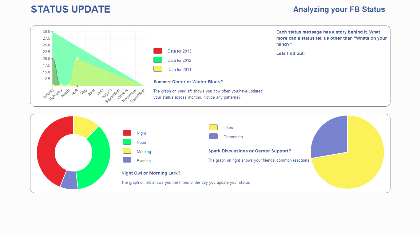
The dashboard represents an analysis of the user's FB status.
The line graph displays the number of statuses the user has updated per month for the year 2011, 2012 and 2013. PS: For representative purposes, the number has been multiplied by 10. So 10 on graph= 1 status.
The doughnut chart shows the times of the day user updates his/her status.
Morn: 6:00 am - 12:00 Noon: 12:00- 18:00 Even: 18:00 pm - 00:00 Night: 00:00 - 6:00The pie chart shows the likes/comments ratio the user's status receives.
Thus the dashboard tries to shed light on the user's FB interaction patterns using their status and attempts to take a slant look at a regular status update.

Log in or sign up for Devpost to join the conversation.