-
-
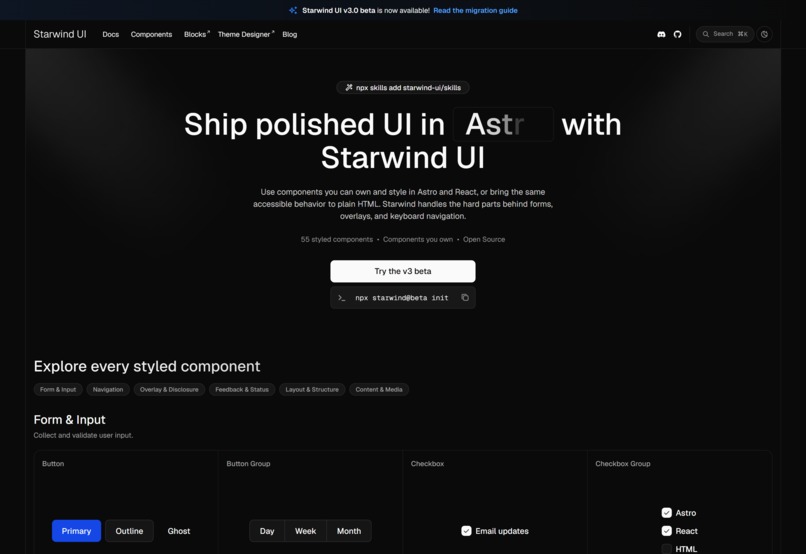
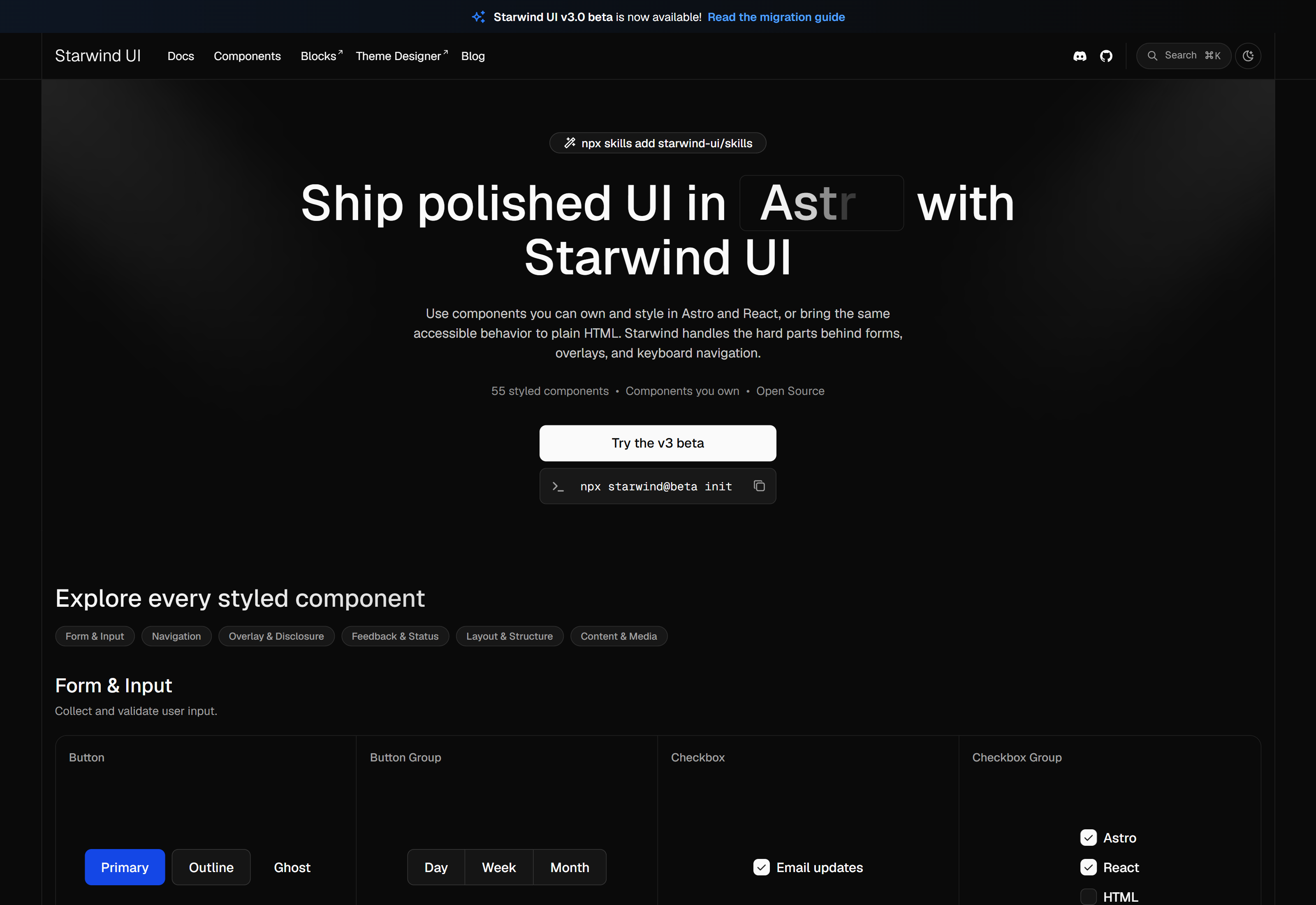
Starwind UI beta landing page hero section
-
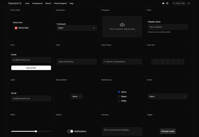
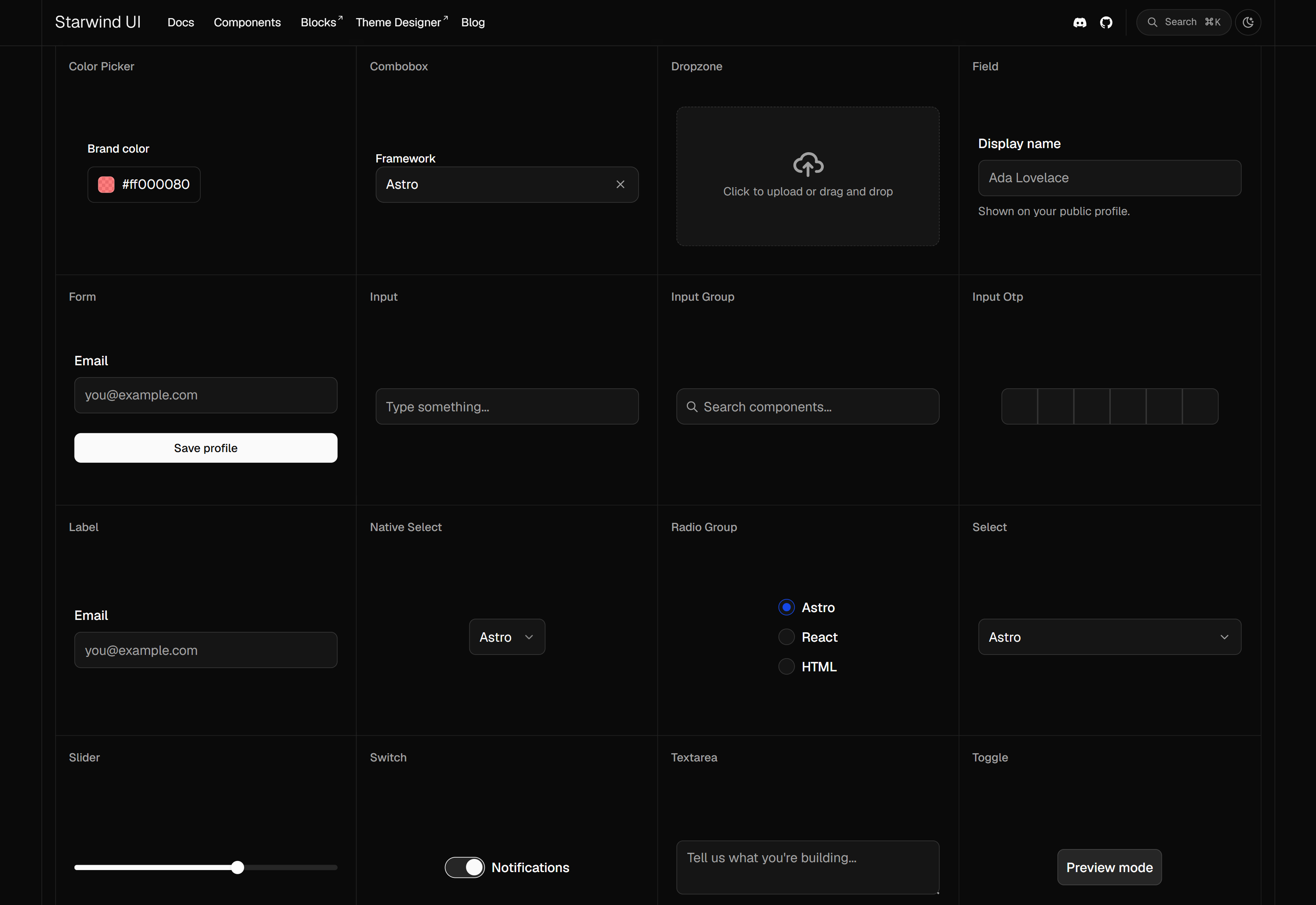
Form & Input components
-
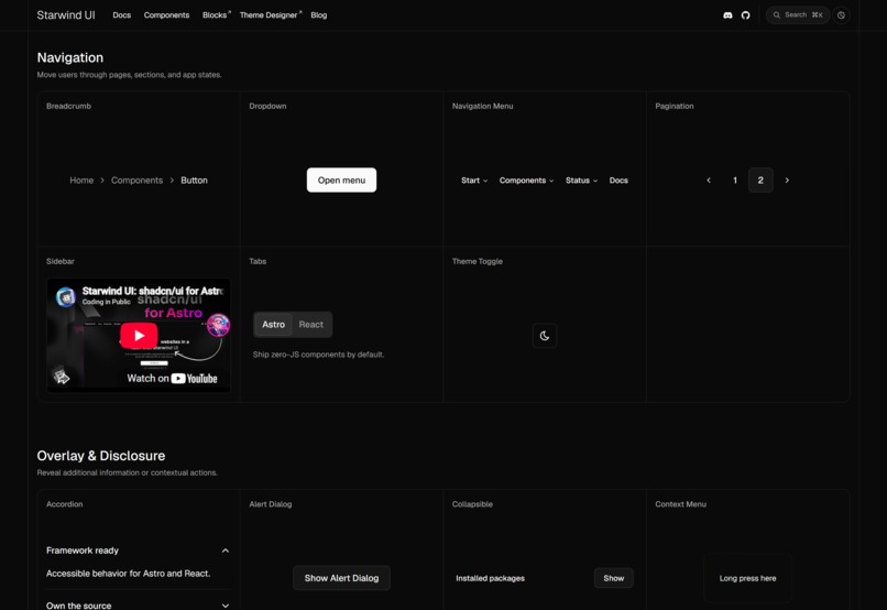
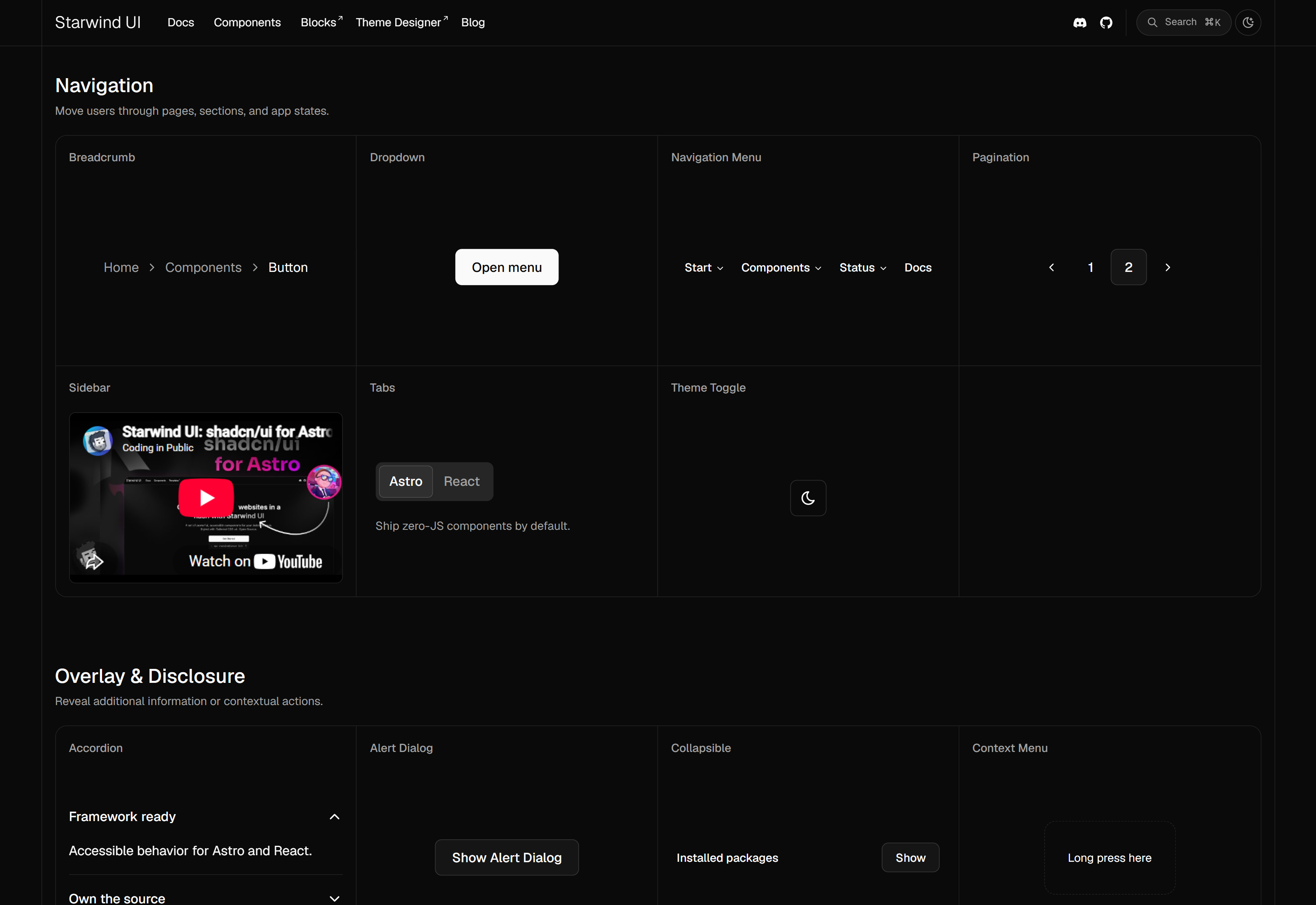
Navigation components
-
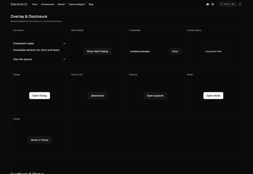
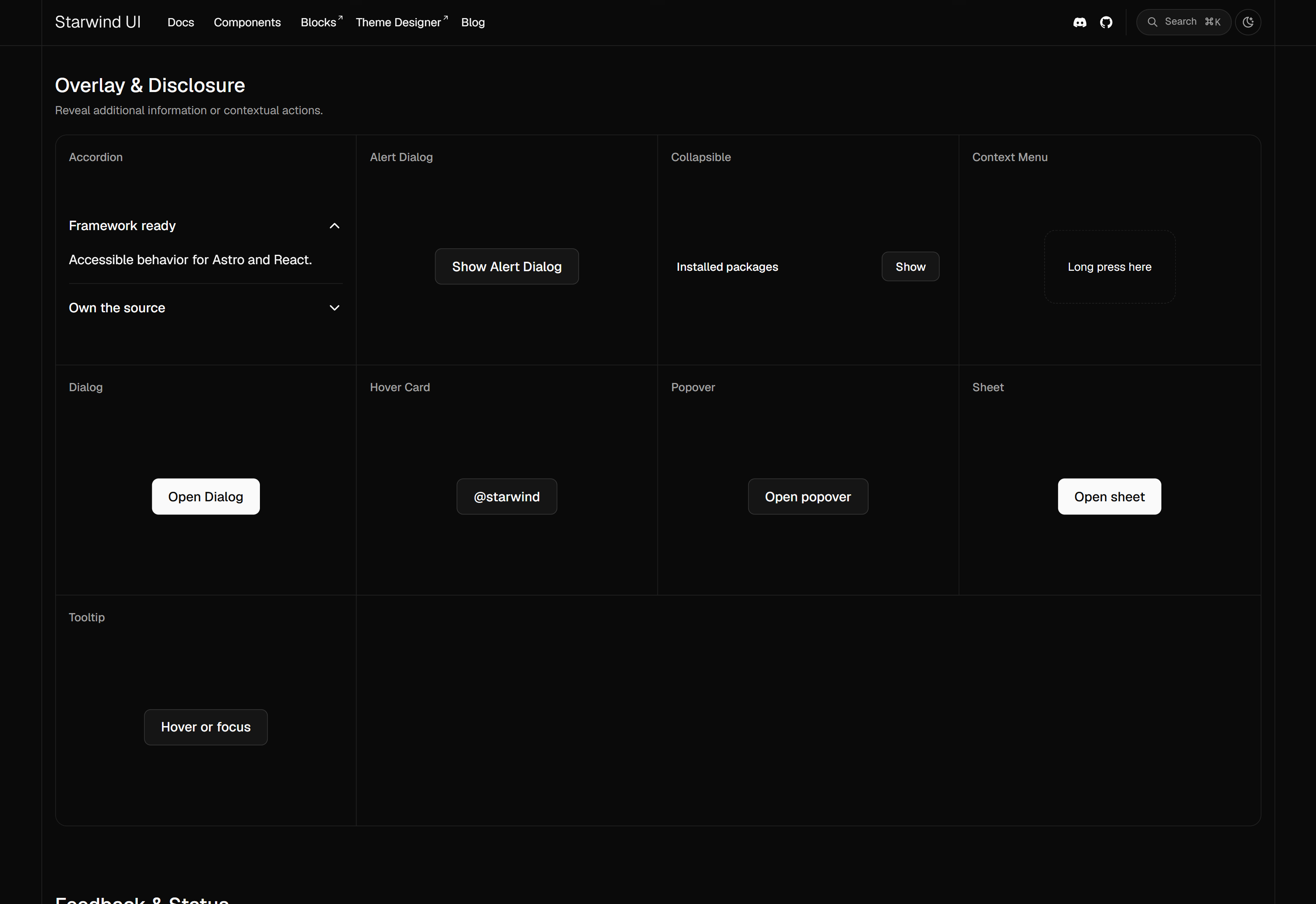
Overlay and Disclosure components
-
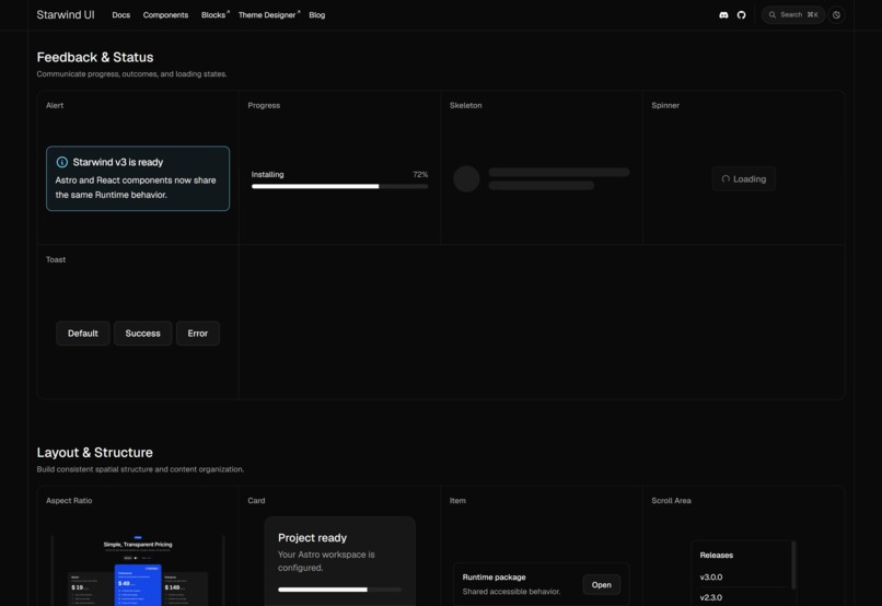
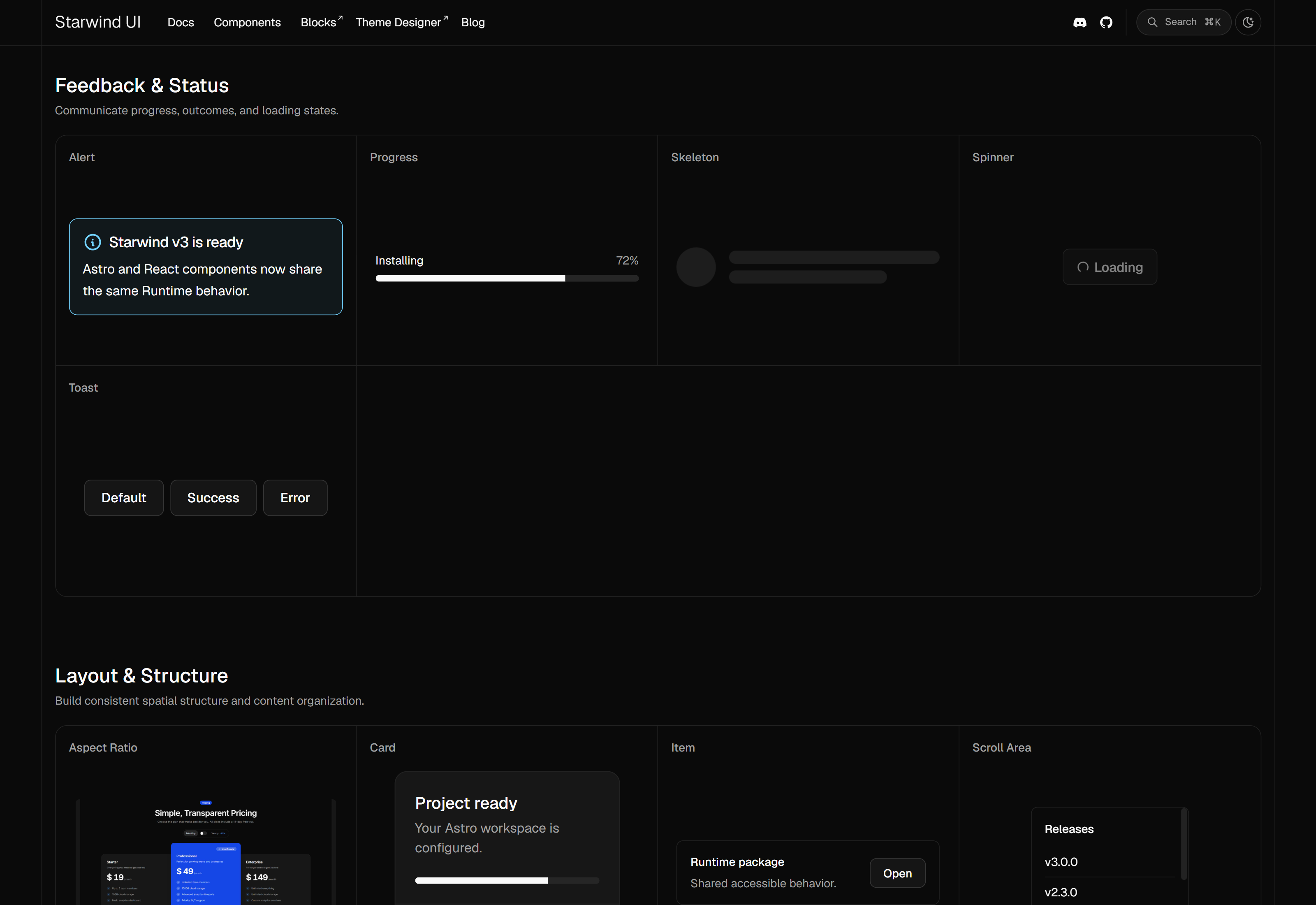
Feedback and Status components
-
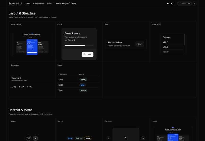
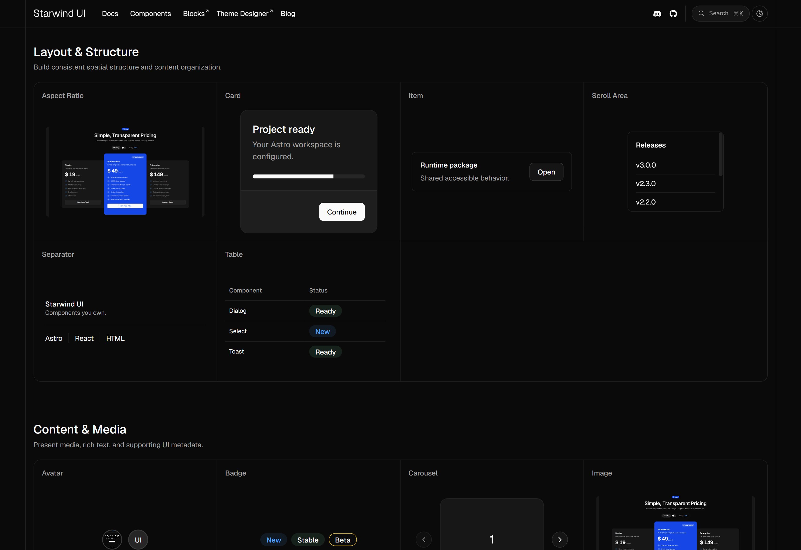
Layout and Structure components
-
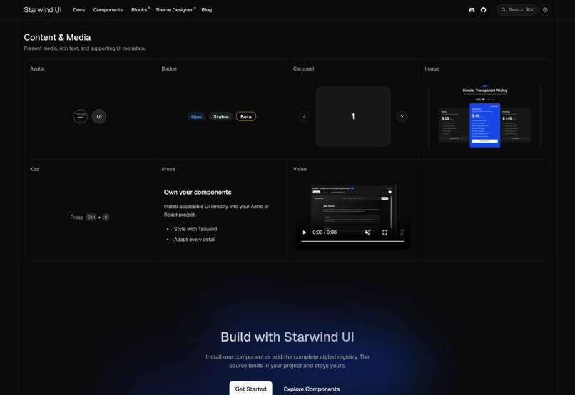
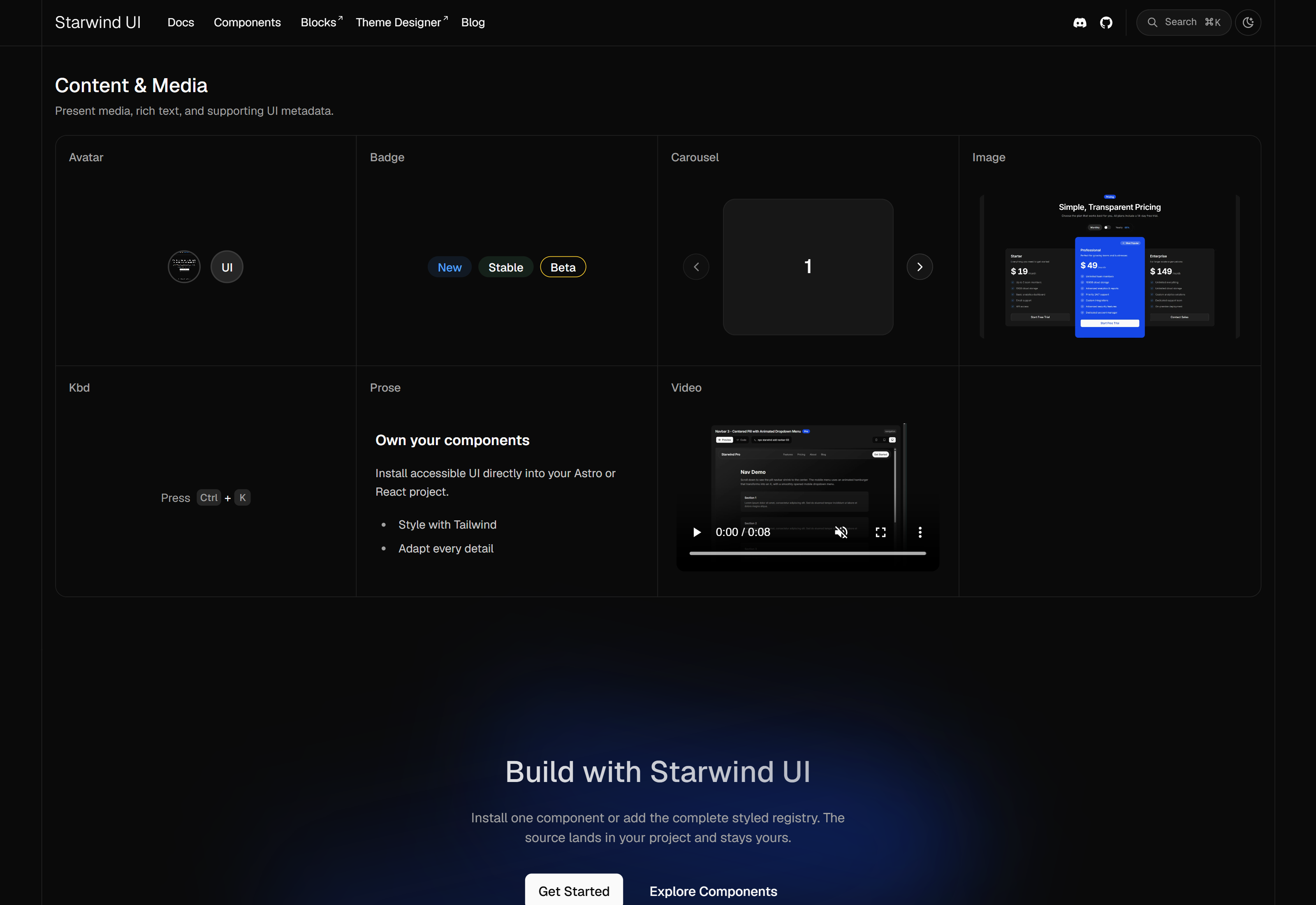
Content and Media components
Inspiration
I started Starwind UI before OpenAI Build Week as an Astro and Tailwind CSS component library inspired by shadcn/ui’s ownership model: polished components that live inside your project and remain understandable and customizable.
As Starwind grew, I kept encountering a deeper problem. Accessible behavior, including focus management, keyboard navigation, forms, overlays, dynamic collections, and lifecycle handling, is difficult to build well and easy to duplicate incorrectly across components and frameworks.
I wanted to preserve Starwind’s Astro-first identity while creating one portable behavior foundation for Astro, React, and eventually other frameworks.
During the July 13 to July 21 submission period, I used GPT-5.6 through Codex as my primary engineering collaborator. My goal was to turn that architectural direction into a more complete, measurable, and release-ready product.
What it does
Starwind UI provides accessible Tailwind CSS components with familiar Starwind/shadcn-style ergonomics. Developers install the styled components into their projects, where they can understand and customize the resulting code.
I built Starwind around three layers:
- A framework-neutral DOM Runtime which owns behavior, state, focus, forms, overlays, and lifecycle.
- Primitive adapters connect frameworks to that Runtime.
- Styled adapter contracts generate Starwind’s public markup, variants, slots, icons, and Tailwind classes.
The public Runtime beta currently gives Astro and React the same 36 Primitive component families and more than 50 styled component families. The starwind CLI handles framework-aware installation, updates, migrations, and dependencies.
Starwind also includes a DOM-first form system that preserves native forms and FormData while adding validation policies, accessible Field and Fieldset composition, server and asynchronous errors, and participation from custom controls such as Select, Combobox, and Color Picker.
How I built it
During Build Week, I used Codex across architecture, implementation, testing, debugging, documentation, performance analysis, and release engineering.
I developed a repository-native workflow around it:
- I capture product and architecture decisions in Markdown specs.
- I divide approved specs into dependency-aware tickets.
- Codex implements scoped changes in isolated Git worktrees.
- Separate Codex passes review the work against the spec and repository standards.
- Tests, acceptance evidence, remaining concerns, and completion notes are recorded in the repository.
- Context maps, ADRs, project vocabulary, and custom Codex skills preserve knowledge across sessions.
The largest published feature from this period was the Runtime-backed Color Picker. I completed its color model, pointer and keyboard behavior, form integration, Astro and React adapters, generated styled components, canonical demos, CLI installation and migration, documentation, and release gates.
I also improved the underlying architecture for various components. One example is that I narrowed the Button Runtime initialization so ordinary native buttons no longer receive unnecessary controllers or per-element listeners. JavaScript is now reserved for the explicit focusableWhenDisabled behavior.
To prove that the portability model could extend beyond Astro and React, I built a private Vue 3.5 validation slice. It includes generated components, SSR, hydration, browser tests, and a production demo. Vue remains deliberately unpublished, but the work exposed and helped correct shared component and generator assumptions.
Finally, I hardened the beta release process. It now regenerates artifacts, validates package and registry consistency, consolidates styled-component version changes, runs browser smoke tests, enforces size budgets, and tests published packages inside disposable Astro and React projects.
Challenges I ran into
Complex components rarely fail in isolation. Color Picker crossed color math, pointer capture, overlays, forms, generated composition, and visual styling. One subtle problem involved preserving saturation while brightness was zero so dragging through black did not lose the user’s horizontal position. Another involved keeping editing controls usable after clearing an optional value.
Framework portability was another major challenge. Different frameworks have different lifecycle, state, event, ref, SSR, and hydration models. The shared contracts need to describe component meaning without forcing every framework to imitate React or Astro.
Performance and package size were also easy to misinterpret. Package roots, individual imports, combined application bundles, lazy chunks, and source-published Astro files all measure different things. I had to build repeatable tools before the numbers became trustworthy.
Keeping the Runtime, generated adapters, styled components, CLI registries, demos, documentation, and package versions synchronized required deterministic generation and automated drift detection rather than manual discipline.
Accomplishments I’m proud of
The Color Picker is now a real product surface across Astro and React. It includes accessible interaction, native form participation, multiple editing formats, generated styled components, CLI installation, migration from the legacy implementation, active documentation, demos, browser coverage, and package-size gates.
I also shipped several focused improvements during the submission period, including:
- Better Dialog and Sheet entry animations.
- Popover autofocus that preserves document scroll.
- Collapsible Accordions by default and corrected item borders.
- Native link items for Dropdown menus.
- Shared Card spacing variables.
- Correct Avatar sizing.
- Safer Progress normalization and mode transitions.
- Color Picker editing that remains usable after clearing.
- CLI dependency updates that respect the project’s detected package manager.
I separated stable public performance and package-size reports from environment-sensitive diagnostics, added dated benchmark snapshots, and tightened the public documentation boundary.
The release line advanced through beta.3, supported by deterministic changelogs, registry regeneration, package-size budgets, Astro and React smoke tests, and a published-package acceptance harness.
I am also proud of the private Vue proof because it validated the architecture without turning unfinished work into a public claim. It already found shared issues in component sizing, Progress state handling, generated exports, controlled state, and clean demo startup.
What I learned
The biggest productivity gain was not simply generating code faster. It was being able to run a disciplined process covering research, specification, implementation, review, correction, documentation, and release evidence at a scale that would normally be difficult for one developer.
Performance work reinforced the importance of measuring before optimizing. Some apparent package-size problems disappeared in combined bundles, while real bottlenecks appeared only with large collections, CPU throttling, or nested interactions.
I also learned how to use Codex more effectively as a solo developer. GPT-5.6 was strongest when I supplied durable context, precise vocabulary, narrow scopes, executable feedback, independent review, and clear completion criteria.
What’s next for Starwind UI
My immediate priority is to continue hardening the public Astro and React beta using feedback from real projects. I plan to improve component ergonomics, expand browser coverage, refine documentation, and continue measuring performance and package size.
I will also continue developing the Vue adapter privately. It will remain unpublished until its component inventory, styled output, CLI integration, documentation, performance evidence, and release gates meet the same standard as Astro and React.
Longer term, my goal is to move the Runtime packages from beta to a stable release and establish Starwind as the framework-portable component system I originally wished existed: accessible components developers can own, backed by behavior they do not have to rebuild themselves.
Built With
- 5.6-sol
- astro
- clack/prompts
- codex
- commander
- javascript
- pnpm
- react
- typescript
- vite
- vitest
- vue
- zod

Log in or sign up for Devpost to join the conversation.