-
-
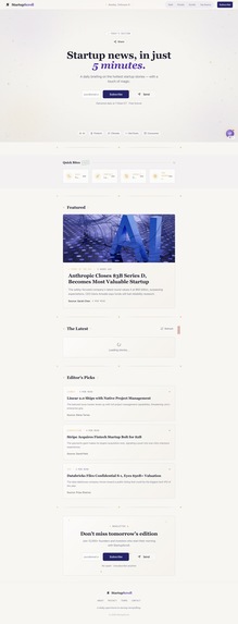
Home Page
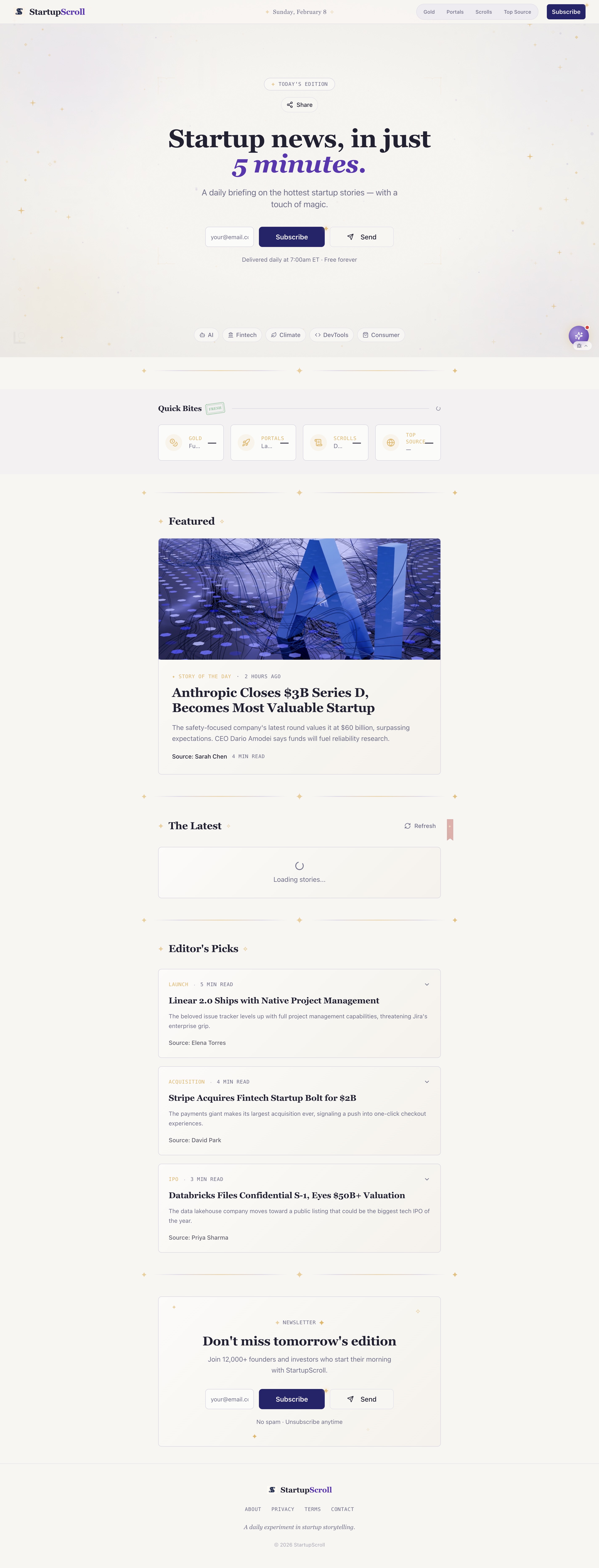
Inspiration
Startup news matters, but it can feel either overwhelming or weirdly boring. We love the clarity and daily rhythm of Morning Brew, and we wanted to explore how design could change how startup news feels.
StartupScroll was inspired by the idea that staying informed can be both efficient and delightful. We set out to build a daily startup digest that feels like a small ritual rather than a chore, combining editorial structure with a whimsical, magical interface.
What it does
StartupScroll is a daily startup news digest inspired by the Morning Brew format. It highlights the most important startup updates in a clean, scannable layout you can read in just a few minutes.
Each edition includes quick bites, top stories, and category browsing (funding, launches, deeper reads). The interface uses soft color, subtle star details, and playful typography to make reading feel special without sacrificing clarity.
How we built it
We built StartupScroll with Lovable for the frontend, focusing on layout, spacing, and typography to capture the feel of a real editorial publication.
We structured each story with consistent metadata (category, title, summary, and time) so the page stays easy to skim. We also designed reusable UI components like featured story cards, quick-bite sections, and navigation tabs to mirror the rhythm of professional news sites. We used Supabase as a lightweight backend for storing and organizing story data.
Challenges we ran into
Our biggest challenge was balancing a whimsical visual style with readability. Magical design can become distracting fast, so we treated the magic as atmosphere rather than decoration.
Another challenge was making the site feel realistic and polished under a tight deadline. Getting the story hierarchy, navigation, and spacing to feel like a real daily publication took a lot of iteration.
Accomplishments that we’re proud of
We’re proud of creating a cohesive editorial experience that feels both fun and trustworthy. StartupScroll blends clean information design with a playful aesthetic without feeling cluttered.
We’re also proud that the product captures the rhythm of a daily digest while still having a distinct visual identity.
What we learned
We learned how much visual hierarchy and spacing shape credibility. Small design decisions can be the difference between “professional” and “overwhelming.”
We also learned that constraints help creativity. By limiting features, we could focus on consistency, polish, and the overall reading experience.
What’s next for StartupScroll
Next, we want to automate the daily edition (ex: generating each morning around 7:00 a.m. ET) and pull from multiple reliable startup news sources.
We also want to add light personalization so readers can follow topics they care about, while keeping the same clean, magical reading experience.
If you want, paste what prizes you’re selecting (Most Magical, Best GenAI, etc.) and I’ll tweak a few lines to subtly match those categories.

Log in or sign up for Devpost to join the conversation.