-
-
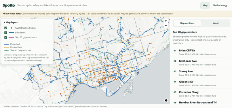
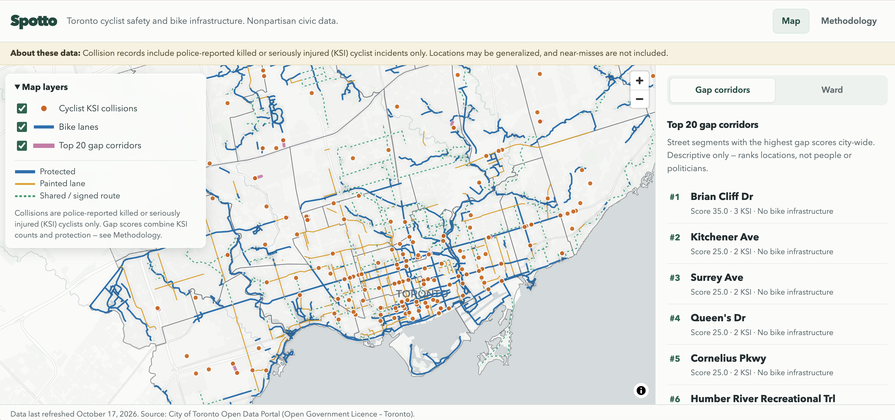
The opening page of Spotto with all maps initiated
-
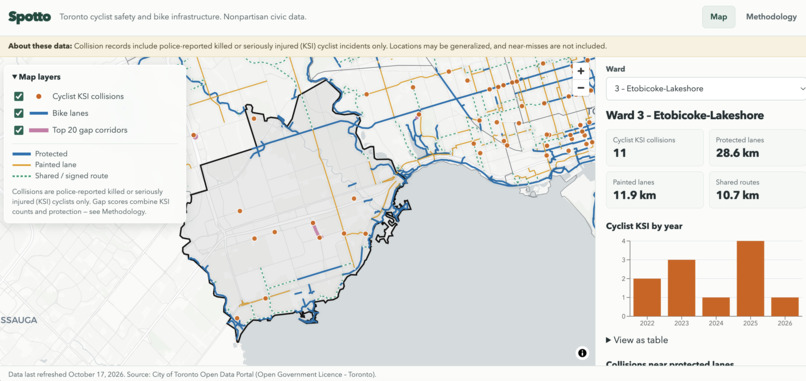
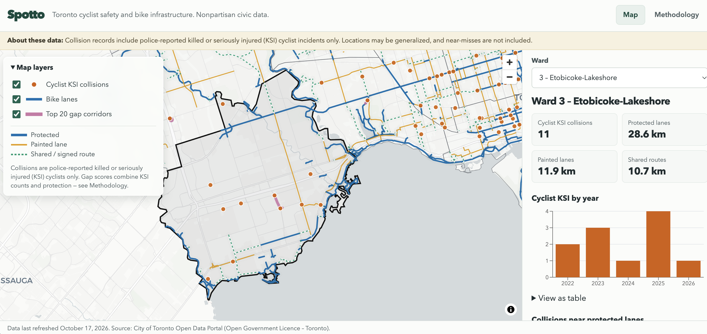
Ward specific data
-
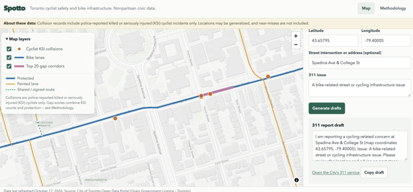
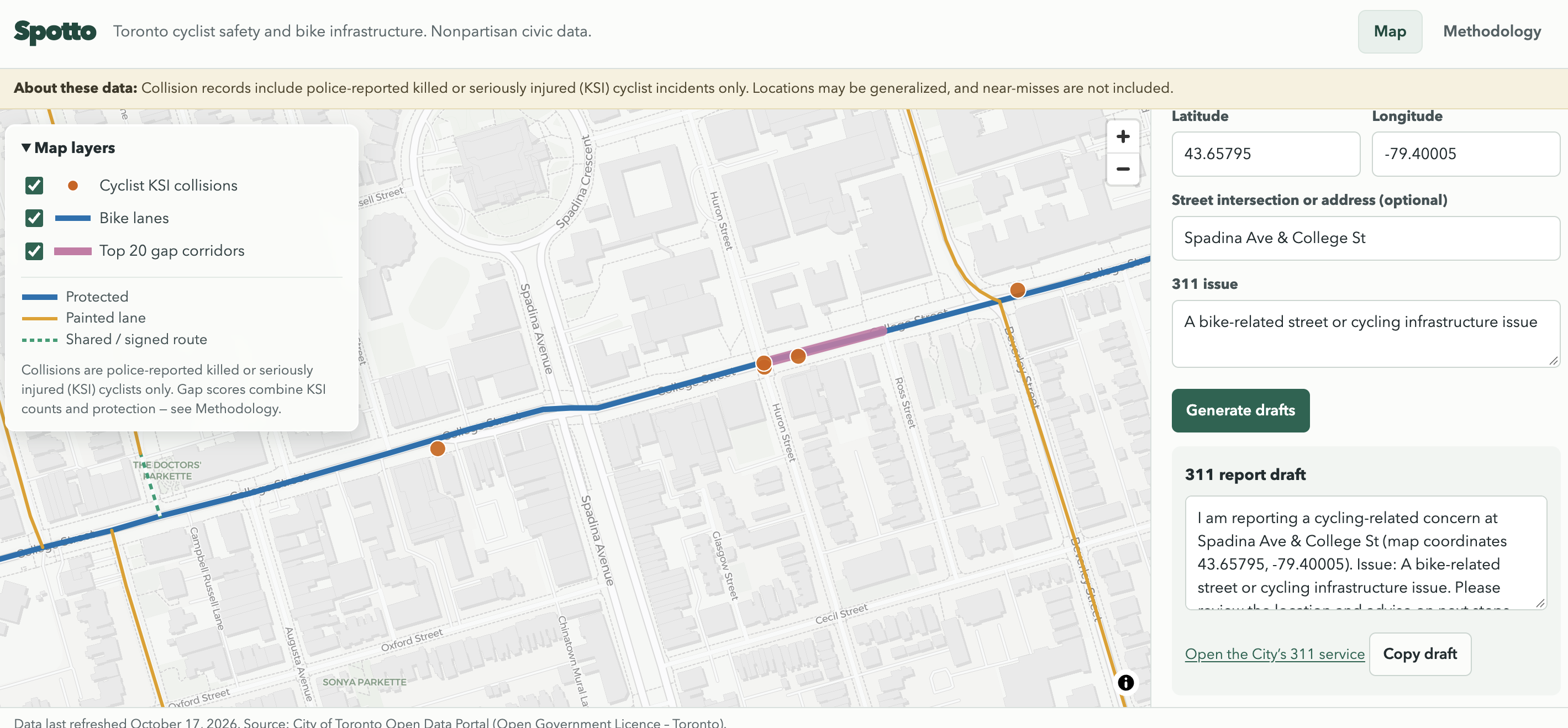
Accident-specific AI-generated issue statements to be sent to municipal leaders
-
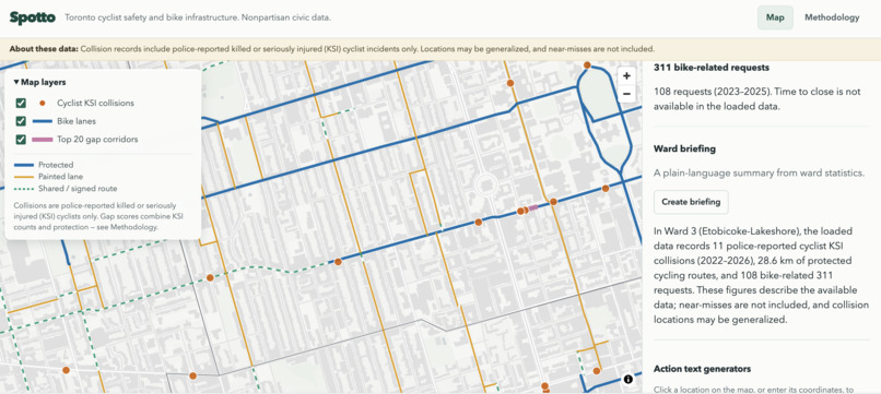
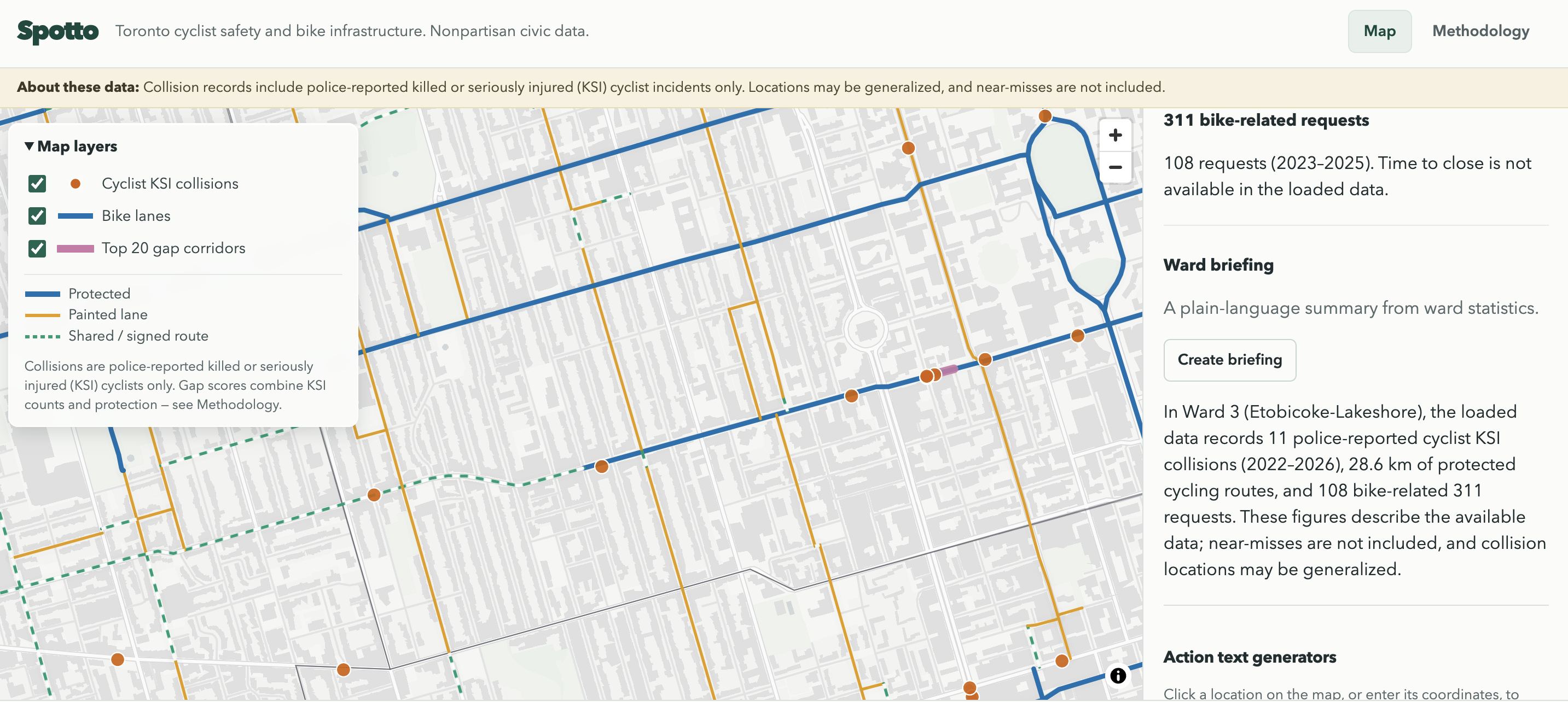
Overall ward briefing
Inspiration
Toronto has a lot of public data about cycling collisions and bike infrastructure, but it can be hard to connect that information to the streets and wards people care about. I built Spotto to make those patterns easier to explore and to help residents bring useful, local information into civic conversations. As a high school student in Toronto, many of my peers have felt the same way and want to be better informed on issues that directly affect us in order to make more informed decisions in the upcoming elections.
What it does
Spotto is an interactive map of Toronto cycling safety and infrastructure. People can explore recent police-reported cyclist collisions, bike lanes, ward statistics, and corridors where collision counts and infrastructure gaps stand out.
It also helps residents take action. At a chosen map location, they can draft a 311 report or a message to their councillor using nearby collision data, then review and edit it. They can share a map view or download data as CSV or GeoJSON. A Methodology page explains the data sources, scoring, and limitations.
How I built it
The site uses React, TypeScript, and Vite. Its API is written in TypeScript with Node and Express. PostgreSQL with PostGIS stores the data and supports geographic queries. Ingestion scripts retrieve datasets from Toronto’s Open Data Portal, filter them to recent periods, and calculate corridor scores. The website and API are deployed separately, with the database hosted on Supabase.
An optional AI question feature uses Anthropic through the backend. Claude can request answers from a small set of predefined data tools; it doesn’t generate SQL or access the database directly.
Challenges I ran into
This was my first time ever using Supabase, Render and Vercel to publish my website. While trying to set up the APIs for public use, I had difficulty using and navigating the sites. Despite this, I was able to effectively set it up the public typescript API.
Accomplishments that I'm proud of
I brought several public datasets into one map and made the results explorable by location and ward. I'm proud that the site pairs useful actions—like message and 311 drafts—with clear caveats, sources, and methodology, so people can see both the findings and their limits. I'm also proud of how I worked around the issue of how to sort the immense amount of data on Toronto's open source in order for the site to work quickly on other devices.
What I learned
Public data needs context. A map can make patterns visible, but it can’t tell the whole story: these collision records cover police-reported cyclist deaths and serious injuries, not near-misses or every unsafe experience. I also learned how much care it takes to join geographic data accurately and explain derived scores in plain language.
What's next for Spotto
Next, I'd like to make councillor details more location-aware and add more context to the safety picture. I also want to improve 311 outcome information as suitable source fields become available, and keep refining the site based on feedback from Toronto residents. Finally, I want to have a language translation button that makes transit information more accessible to people of all backrounds, languages and races in Toronto.
Built With
- css3
- express.js
- html5
- javascript
- maplibre
- node.js
- postgis
- postgresql
- react
- render
- sql
- supabase
- typescript
- vercel
- vite


Log in or sign up for Devpost to join the conversation.