Inspiration
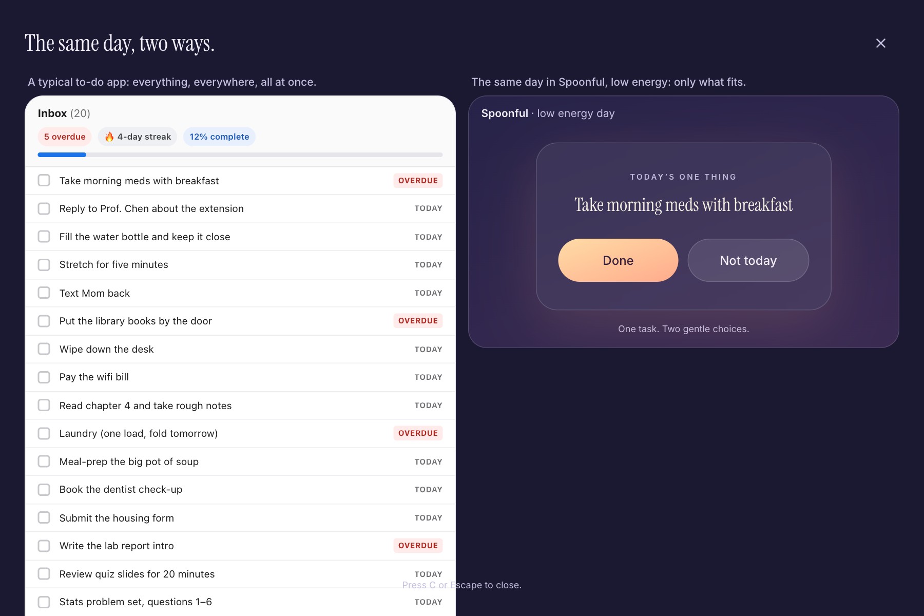
For people living with chronic illness (long COVID, ME/CFS) or ADHD, energy changes a lot from one day to the next. To-do apps don't: they show the same long list every single day. On a bad day, that list is the problem. It makes you feel behind, so you close the app and do nothing, and overdue badges and broken streaks turn a hard day into a failure.
Spoon theory gave me the shape of the answer: on a hard day you only have a few "spoons" of energy to spend. So the list should shrink to fit the spoons you have.
What it does
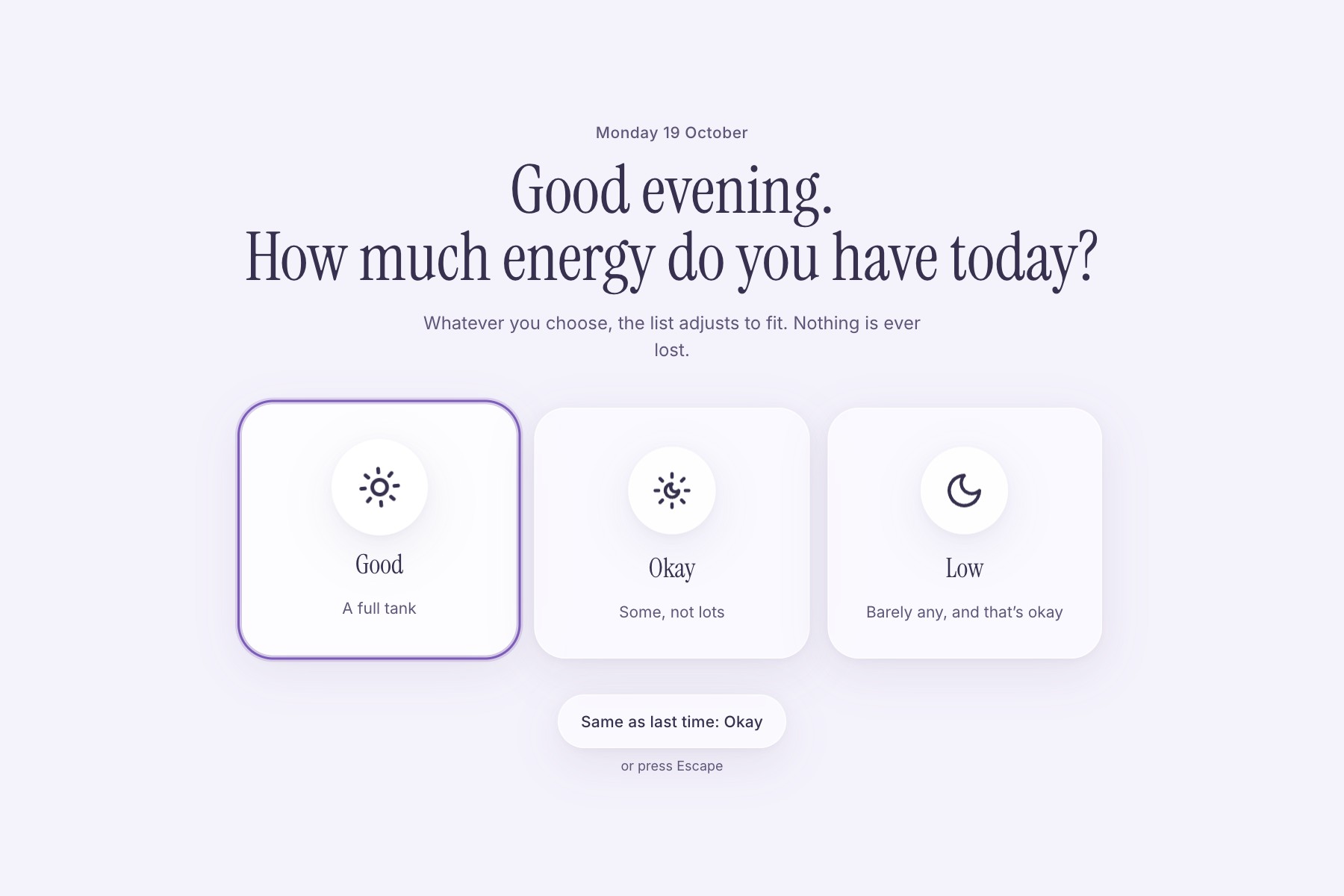
Whenever you open Spoonful, it asks one question: how much energy do you have today? (Or tap Same as last time and go straight in.)
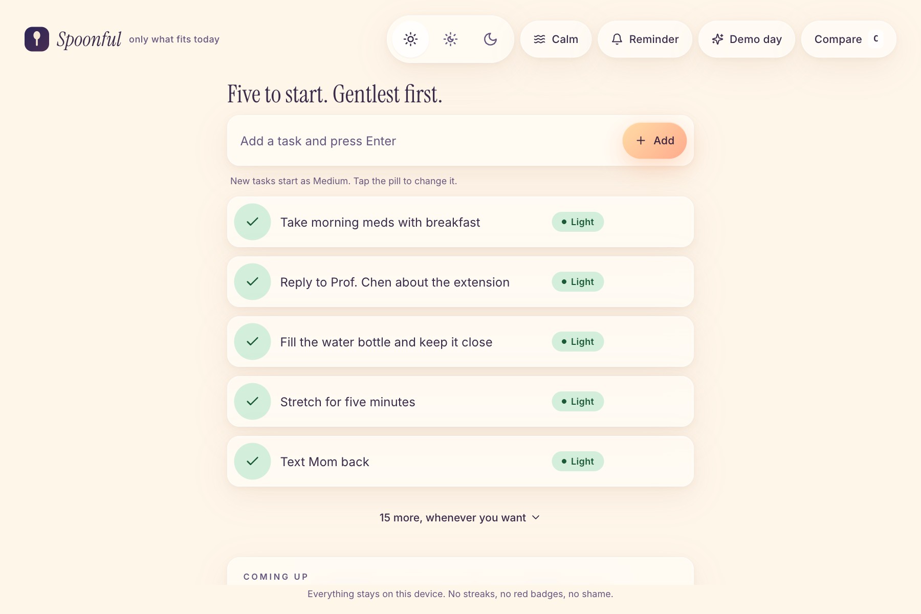
- Good: five tasks, gentlest first. The rest are one tap away, because good days are when people overdo it.
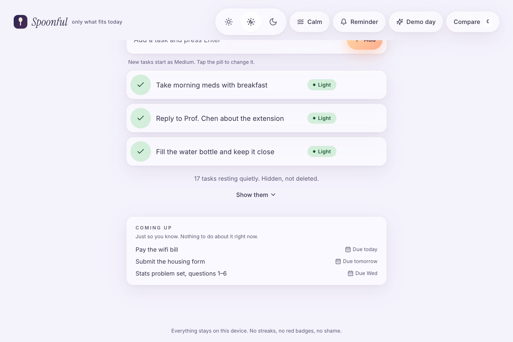
- Okay: only three light or medium tasks. Everything else is "resting": hidden, never deleted.
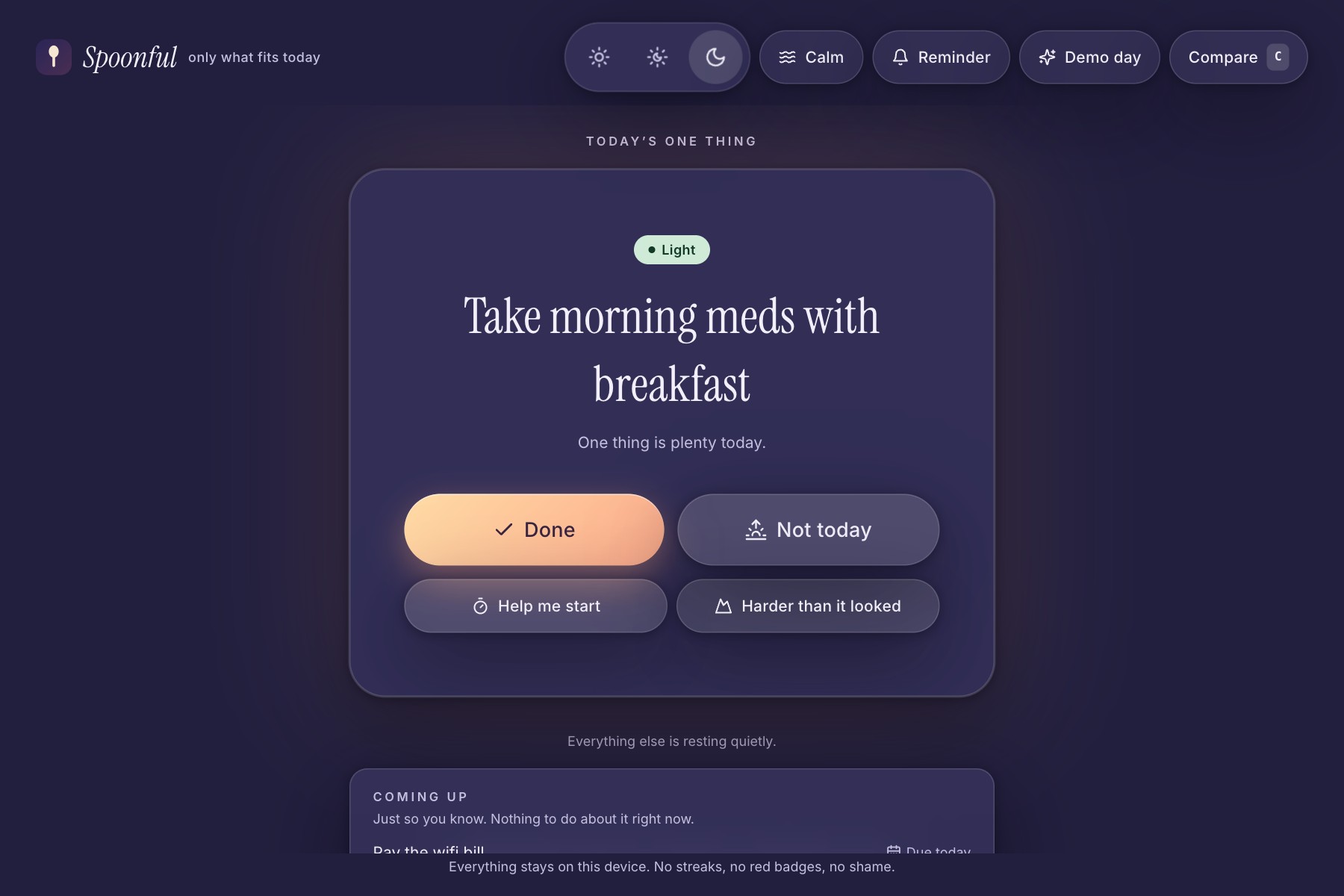
- Low: one light task, full screen, with two big buttons: Done and Not today. Not today quietly moves it to tomorrow and is never recorded as a failure.
On a low day there are two more gentle tools:
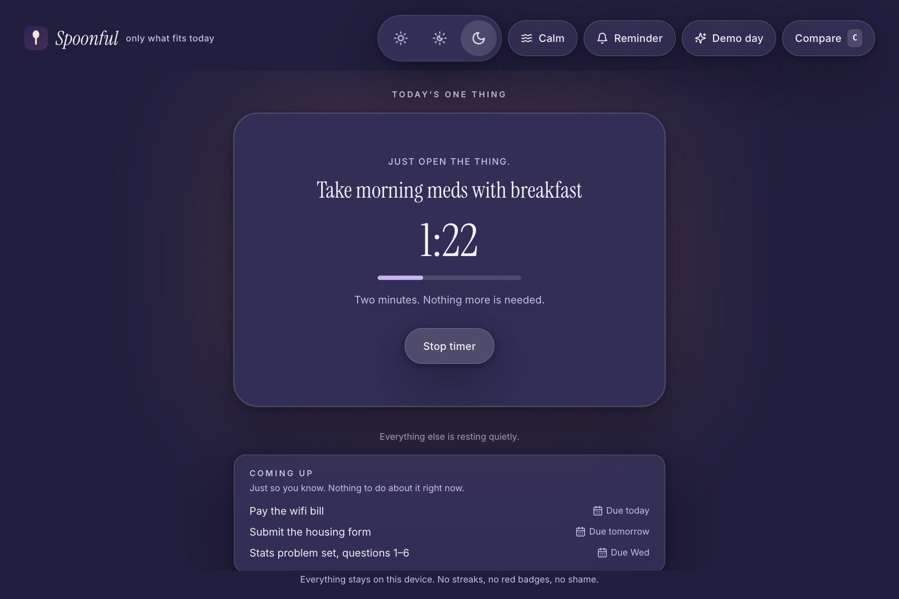
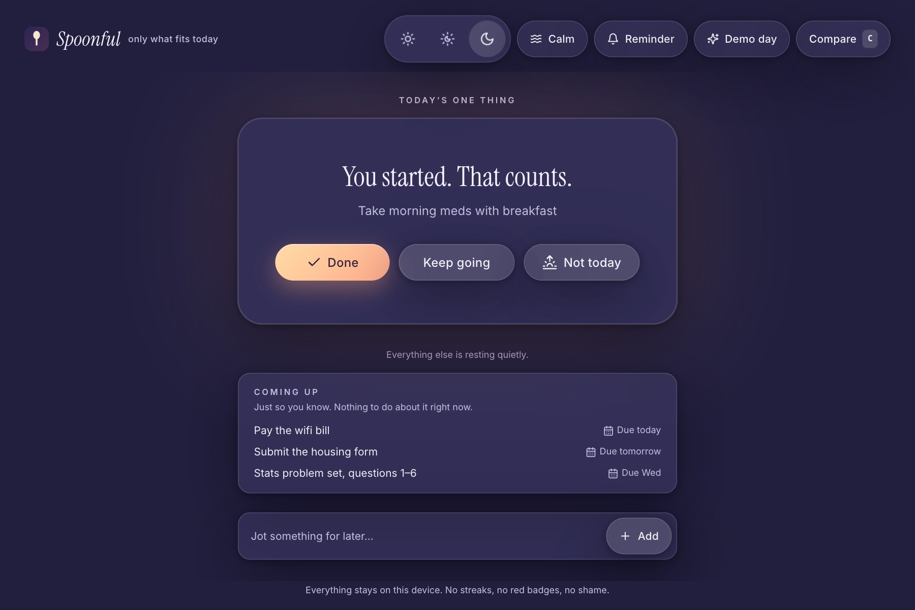
- Help me start runs a two-minute timer with one job: "Just open the thing." When it ends: "You started. That counts."
- Harder than it looked moves the task up one effort level and offers something lighter instead.
And everywhere:
- Capture in under three seconds. Type a task, press Enter. It starts as Medium; tap its pill to change it.
- Calm due dates. Tasks due in the next few days show up under Coming up, even while they rest. Never in red, never "overdue".
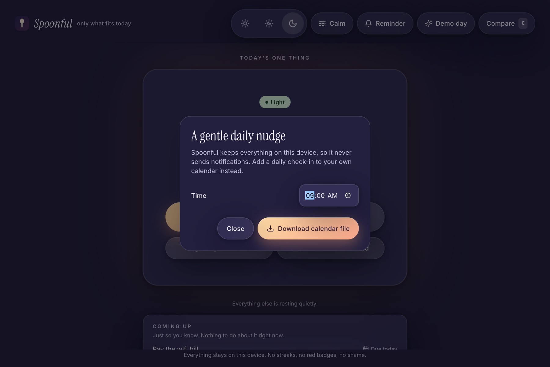
- A daily reminder without a server. Spoonful downloads a repeating calendar event, so the reminder lives in your own calendar.
- No account, no server, works offline. Your tasks never leave your device. No streaks, no red badges, no guilt counters, anywhere.
How I built it
- App: React 18, TypeScript, Vite, Tailwind CSS, Framer Motion and lucide icons. Tasks live in localStorage, and it installs as a PWA that works offline. Hosted on Netlify.
- Accessibility from the start:
- Every control works with a keyboard alone, with visible focus.
- View changes are announced to screen readers.
- Tap targets are 48px or larger, and text meets WCAG AA contrast.
- The app respects reduced motion and has its own Calm mode.
- Tests: 25 Playwright tests run against the production build. They include axe-core accessibility scans of every view: the check-in, all three energy levels, the timer, the edit form, the reminder dialog and the comparison view.
- Demo video: I recorded the real app with Playwright, so every click lands on the narrated word, and edited it in Remotion.
- AI help: AI tools (Claude and Gemini) helped me write code, tests and the video pipeline. The idea, the design decisions and the final review are mine.
Challenges I ran into
- Proving accessibility, not just claiming it. axe found real problems I had missed:
- Unselected effort pills sat at 2.6:1 contrast.
- The check-in buttons' spoken names didn't match their visible labels.
Getting the scans to wait until animations had settled was a puzzle of its own.
- Effort colours vanished from the production build. Tailwind removed the pill classes because their names were built at runtime. A safelist fixed it.
- Recording the demo caught a real bug. Occasionally, after "Not today", the next card stayed invisible. Now the next card appears immediately while the old one animates away, so the screen can never go blank.
- Testing a two-minute timer without waiting two minutes. Playwright's fake clock also froze the animations, so the tests shift only the system clock the timer reads.
- Dates. The tests first mixed UTC and local dates, which disagree for part of every day in India. Everything now uses the local calendar day.
Accomplishments that I'm proud of
- Real user testing changed the product. I gave the first version to a real user, and seven changes came straight from their feedback:
- three-second capture
- "Harder than it looked"
- calm due dates
- "Help me start"
- "Same as last time"
- the calendar reminder
- five tasks on good days
- Zero accessibility violations on every view, enforced by the test suite rather than promised.
- The Low screen: one task, two big buttons, and nothing on it that can make you feel behind.
What I learned
- Shame is a design decision. Removing overdue counters, streaks and red badges changed how the app feels more than any feature I added.
- On bad days, people don't want more features; they want fewer decisions. The most useful feedback asked for capture that takes seconds, with nothing to decide.
- Good days need limits too.
- Automated accessibility checks are a floor, not a ceiling.
What's next for Spoonful
- Testing with screen-reader users, and with more people who live with ME/CFS, long COVID or ADHD.
- Optional end-to-end encrypted sync between devices.
- Breaking a heavy task into lighter first steps.
- Learning from "Harder than it looked" to suggest better effort tags, entirely on the device.
- Translations.
Built With
- axe-core
- framer-motion
- localstorage
- lucide
- netlify
- playwright
- pwa
- react
- remotion
- tailwindcss
- typescript
- vite

Log in or sign up for Devpost to join the conversation.