-
-
-
SE
-
-
-
Inspiration
Almost every productivity tool is built on one quiet assumption: you wake up with the same amount of energy every day. A to-do list doesn't care whether you slept badly, are in pain, are masking all day, or are recovering from last week. It just grows, and when you can't keep up, the tool makes you feel like the failure.
We kept coming back to Spoon Theory, created by Christine Miserandino in 2003. To explain what living with a chronic illness is like, she handed a friend a handful of spoons and told her each one was a unit of energy. Every daily activity, from showering to getting dressed to commuting, costs spoons. When they run out, they run out. You can't just push through, and borrowing from tomorrow has a price.
The metaphor has since been adopted far beyond its origin by people with chronic illness, disability, ADHD, autism, long COVID, depression, burnout, and caregivers. They all understand something time-management apps don't: time is not the scarce resource, energy is. Two tasks that both take thirty minutes can cost completely different amounts of energy, and the same task can cost very different amounts on different days.
We wanted to build the tool we kept wishing existed: a workspace that starts from energy instead of hours, and that adapts to you instead of asking you to adapt to it.
What it does
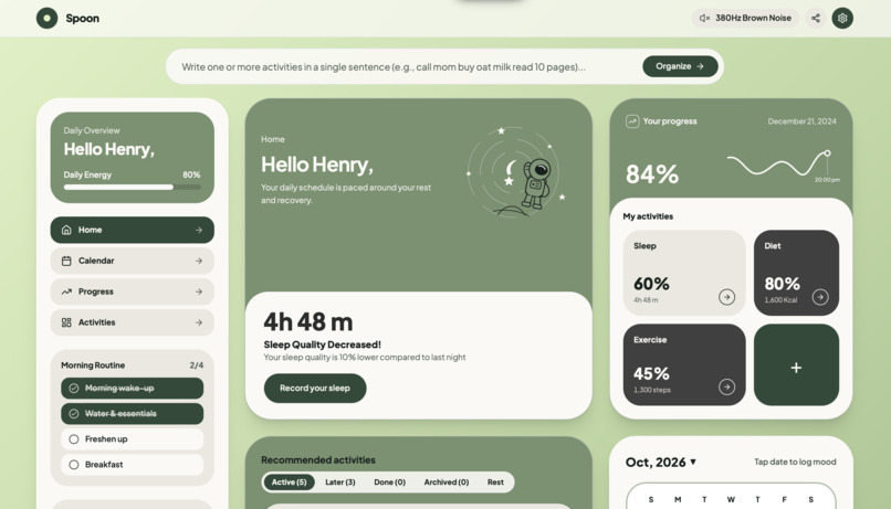
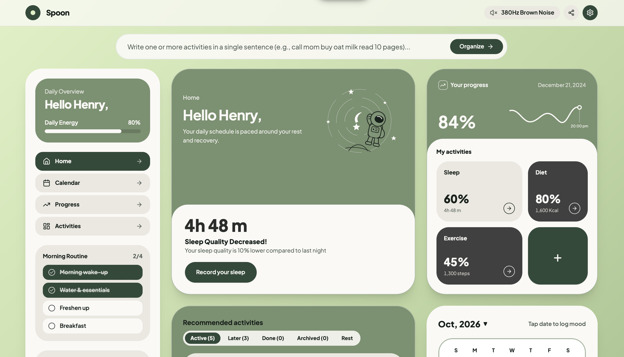
SPOON is a neuro-adaptive workspace where energy is the core resource. ("Neuro-adaptive" here means it adapts to your cognitive and sensory needs. It does not read your brain and is not a medical tool.)
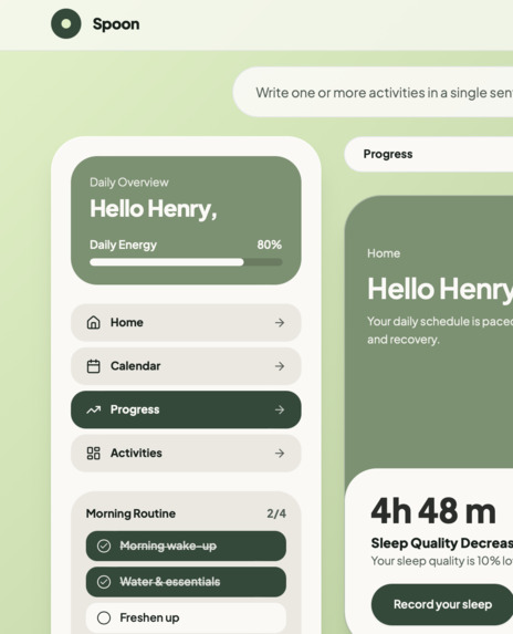
- 🥄 Daily spoon budget. Each day starts with a quick check-in where you set how many spoons you have, based on how you actually feel.
- 🧾 Tasks that cost spoons. Every task has a spoon cost, so planning becomes spending a budget instead of stacking a list. Your remaining energy updates live as you plan and complete work.
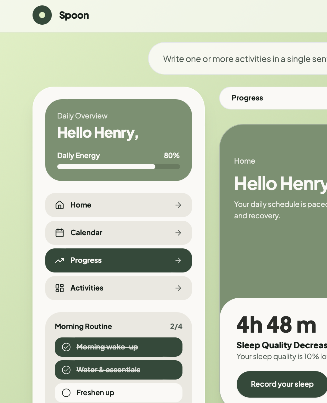
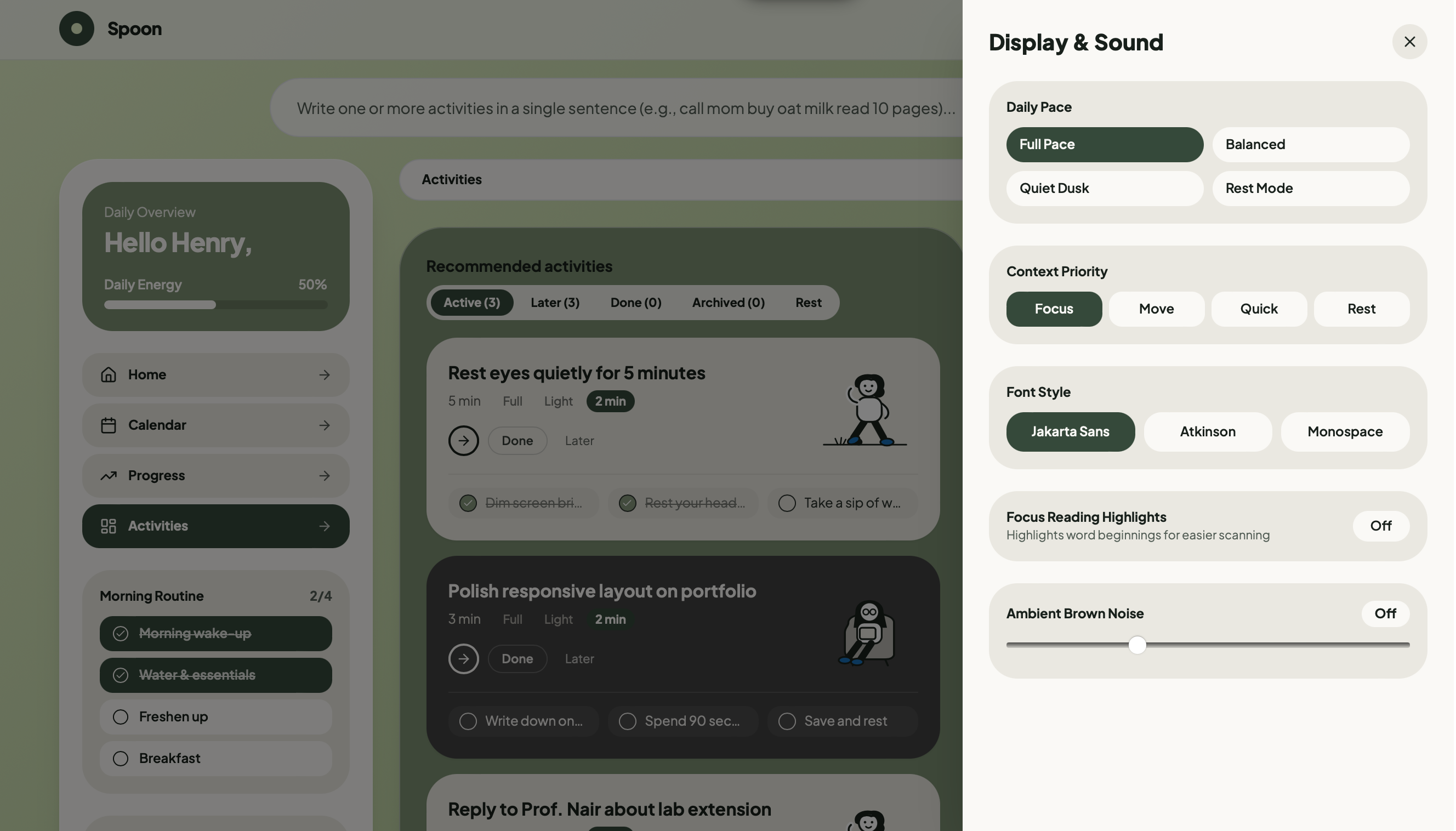
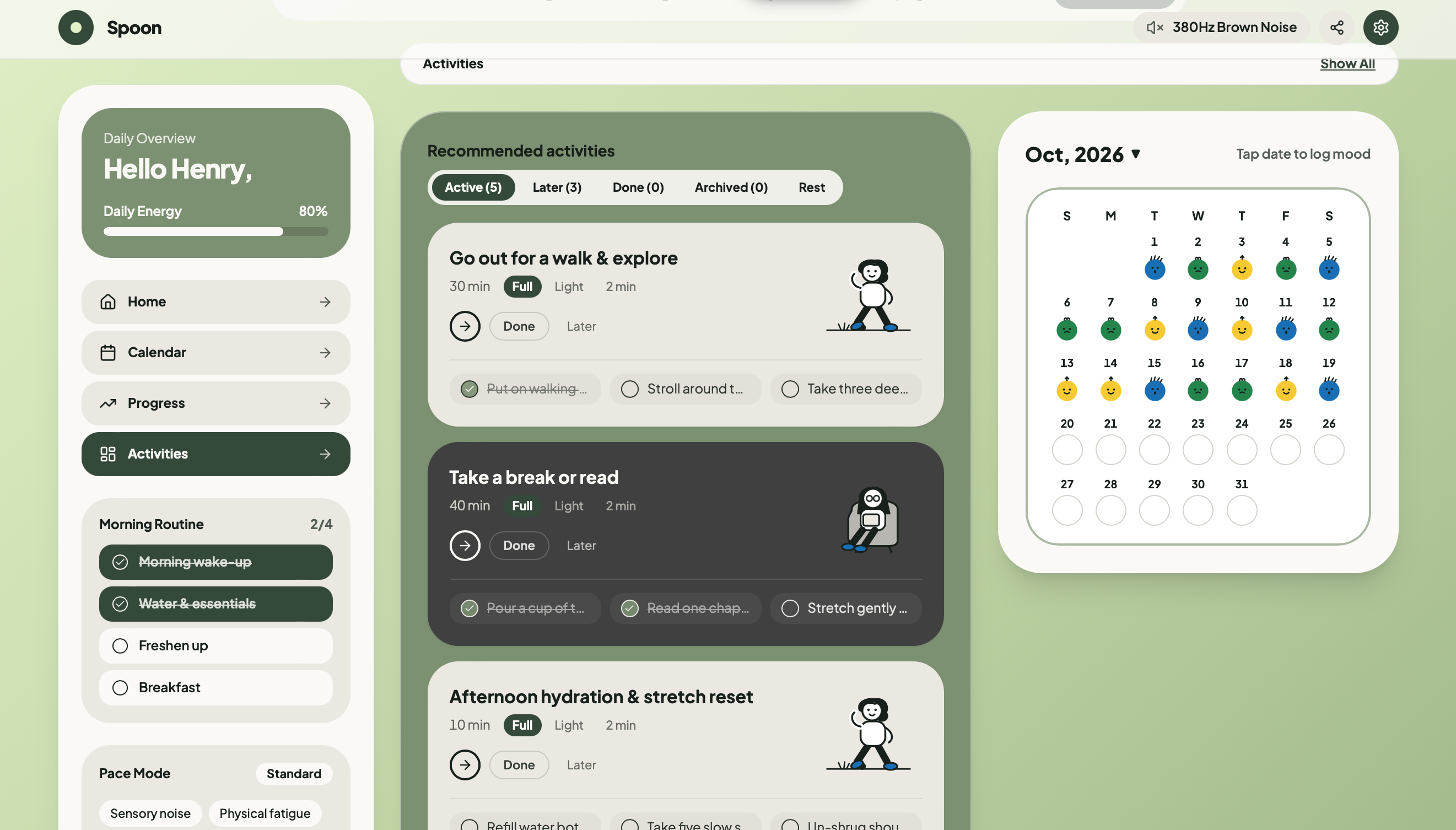
- 🎛️ An interface that adapts to your energy. As spoons drop, RHYTHM moves through energy states. With plenty of energy you see the full, dense workspace. As energy falls the UI simplifies: fewer elements, calmer colors, larger spacing, and only the essential tasks. At very low energy it shows a single next step and a recovery view.
- ⚠️ Overspend warnings, not guilt. Before you exceed your budget, RHYTHM pauses to ask whether you want to reschedule, drop, or split the task. If you choose to "borrow" spoons, you see what it costs tomorrow, which is Spoon Theory's central lesson.
- 🌿 Gentle language and motion. No streaks, no red failure states, no "you missed X". Wording is neutral and kind, and animations are slow, soft, and respect
prefers-reduced-motion.
The model behind it is simple on purpose. If $S_0$ is your starting spoons and $c_i$ is the cost of each completed task, your remaining energy is:
$$S_{remaining} = S_0 - \sum_{i \in \text{done}} c_i$$
The interface state is driven by the fraction of energy left, $\rho = S_{remaining} / S_0$. Illustrative thresholds: ρ ≥ 0.6 gives the full view, 0.3 ≤ ρ < 0.6 a focused view, and ρ < 0.3 a low-energy view.
Borrowing from tomorrow is modeled as debt with a penalty factor $\lambda \ge 1$:
$$S_0^{(t+1)} = S_{base}^{(t+1)} - \lambda \cdot \max\left(0,\ \text{spent}_t - S_0^{(t)}\right)$$
How we built it
- Next.js 14 (App Router) + React 18 for routing, layouts, and a fast, modern foundation.
- TypeScript throughout. Shared types for tasks, energy states, and settings live in a dedicated
types/module so the model stays consistent across the app. - Zustand for global state. The store holds the spoon budget, tasks, and current energy state. Because the interface mode is derived from this state, the whole UI reacts instantly and consistently without prop-drilling.
- Tailwind CSS for a token-based design system. Each energy state swaps a set of CSS variables (colors, spacing, density), so one component set can express several moods.
- Framer Motion for transitions between states, using layout animations and springs so elements glide, fade, and rearrange instead of snapping.
- Lucide React for a consistent icon language.
- Utilities in
lib/hold the pure logic (cost calculation, state derivation), kept separate from the UI so it is easy to reason about and test.
Challenges we ran into
- Adapting without jarring. A sudden layout change can itself cost energy, which defeats the point. We spent a lot of time tuning easing, duration, and which elements animate so mode changes feel like a slow exhale.
- Making the energy model helpful, not stressful. Anything with a number and a bar risks becoming another score to feel bad about. We removed streaks and failure colors and rewrote copy to be neutral and supportive.
- Less stimulation without looking unfinished. A calm, minimal interface can easily look empty. Getting hierarchy, spacing, and typography right with fewer elements took many iterations.
- Accessibility across every state. Every energy state needed to meet contrast requirements and work with a keyboard, and motion needed a real off switch.
- Keeping derived state coherent. Many parts of the UI depend on the same energy value, so we centralized it in one store and derived everything else from it.
Accomplishments that we're proud of
- Turning an emotional, deeply human concept into a working product with a clear interaction model.
- An interface that responds to the user's state, not just their screen size.
- A single design system that credibly expresses multiple moods through variables instead of duplicated components.
- Designing with sensory load, accessibility, and non-judgmental language from the very first screen, not as an afterthought.
- Shipping a polished, animated, typed codebase.
What we learned
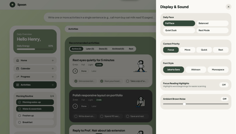
- Accessibility means choice. The best accessible design gives people control over motion, contrast, density, and pacing, instead of imposing one "accessible mode".
- Language is UI. Changing "overdue" to something neutral changes how a product feels more than any color tweak.
- Restraint is a feature. Motion and color communicate state powerfully, but only when used sparingly.
- A good state model makes everything simpler. Once energy was the single source of truth, the adaptive behavior almost fell out for free.
- Spoon Theory works because it makes the invisible visible. Good design can do the same.
What's next for SPOON
Spoon already helps you plan around your energy. The next wave has one goal: remove effort at the exact moments executive function is hardest, which are choosing, switching, starting, and ending the day. Every feature stays inside Spoon's calm botanical palette of sage, forest, warm stone, and charcoal. No confetti, no badges, no literal spoon graphics.
Executive-function support
- Pick one for me. A single quiet button in Recommended activities. One tap dims every other card and opens the 5-minute Quick Start for the best-fitting activity, so decision paralysis never blocks starting.
- Transition bridge. Switching context, such as moving from a focused desk task to a physical one, has a real cost that most planners treat as zero. When the next activity is in a different category, a calm 60-second card suggests a small reset: close your tabs, take a sip of water, let your eyes unfocus.
- Voice capture. A microphone in the one-line capture bar uses the browser's built-in Web Speech API to turn a rambling spoken thought into separate activity cards through our multi-task sentence splitter. No API keys and no typing when you're fatigued.
Sensory and time-awareness tools
- Sound profiles. Our brown-noise shield grows into three procedural Web Audio profiles: warm brown noise for racing thoughts, soft pink noise for reading and writing, and a gentle binaural theta pulse for rest breaks (headphones recommended). Everything is synthesized in the browser, so there are no audio files to download.
- Time-horizon arc. The orbit rings around the astronaut in the hero card will subtly show how much of the day is left, shifting from crisp morning light to warm dusk. A digital clock reading "14:37" means little to someone with time blindness.
- Breath pacer. An optional 4-7-8 breathing circle in the Quick Start modal guides two slow breaths before the 5-minute flow begins, to help settle the tension that often comes with starting a dreaded task.
Guilt-free continuity
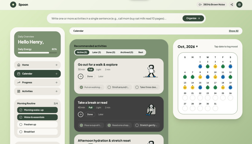
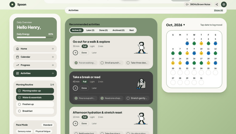
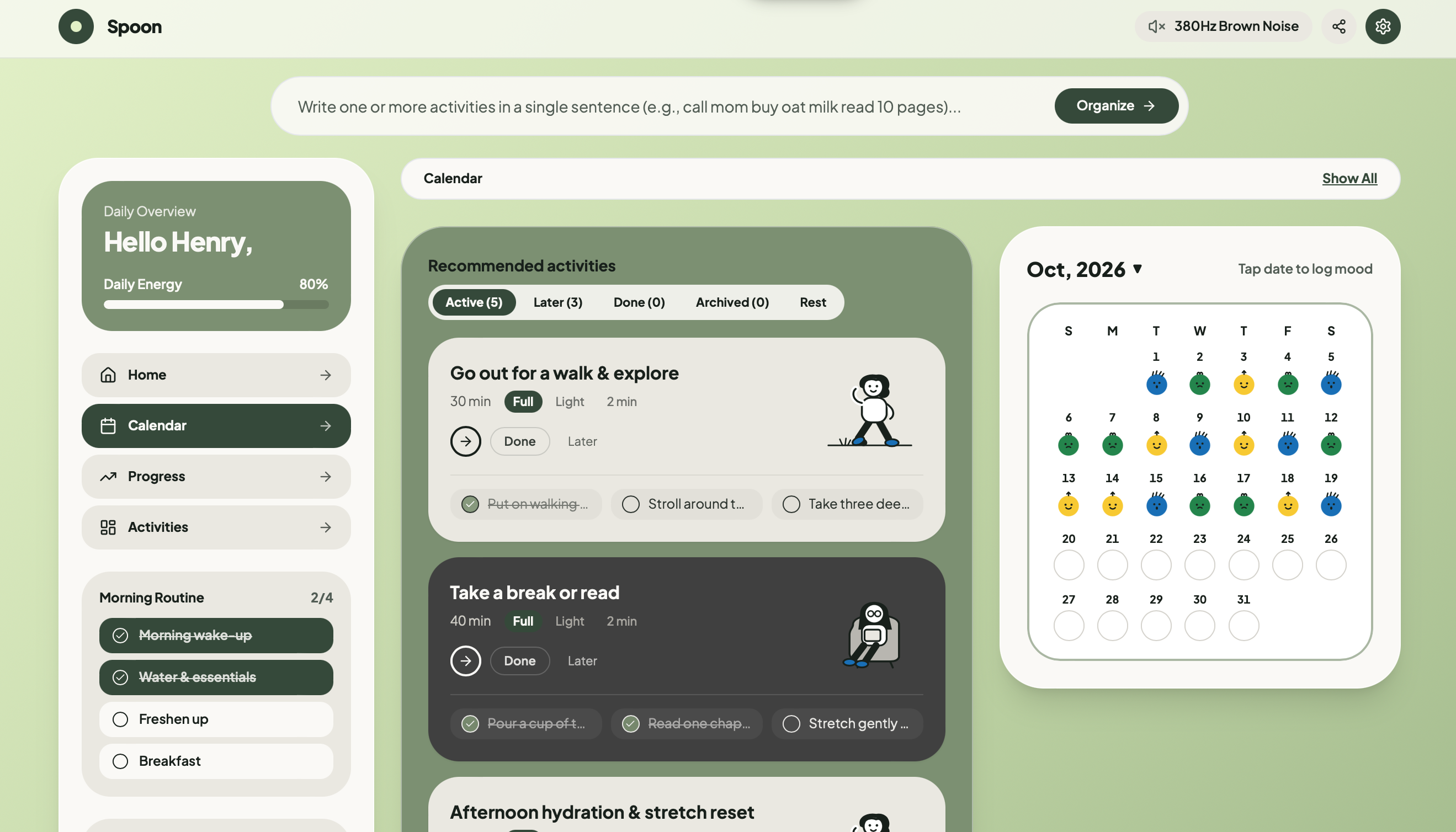
- Calendar day inspector. Tapping a date shows a two-line summary of that day's sleep quality, completed activities, and pace mode, so patterns become visible, such as which kinds of nights lead to low-effort days.
- Wrap up today. One calm button at the end of the day moves unfinished tasks into Saved for Later and shows a reassuring summary, so unfinished work doesn't follow you to bed.
Built With
- accessibility
- app-router
- css-variables
- css3
- design-system
- framer-motion
- html5
- javascript
- lucide-react
- next.js
- node.js
- postcss
- react
- responsive-design
- state-management
- tailwindcss
- typescript
- web-audio-api
- zustand


Log in or sign up for Devpost to join the conversation.