-
-
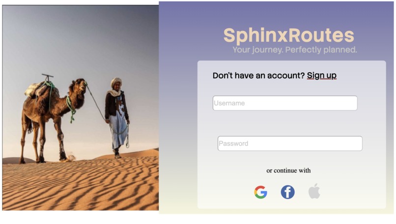
Log in page
-
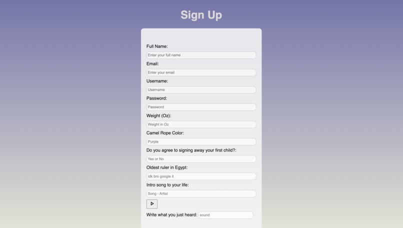
Sign up page
Inspiration
We were inspired by past examples of frustrating UI designs shown on YouTube and TikTok. We also took inspiration from The Impossible Game. Many of these were very creative with clever ways to still make the UI complete its task.
What it does
Starts you off with a login page that is wildly tedious. This is because it asks you a plethora of questions ranging from personal info to random trivia. If the user answers all the questions correctly they are allowed to pass. Onto the Sign In button. While the button appears normal it is actually entirely invisible. On top of this, it moves every time it is found and clicked on. This will happen 3 times before it will finally allow the user to click on it without it moving. Once it is clicked, it will take the user to the next page, a loading bar with a green ball under it. This loading bar will not move at all on its own. For the bar to move, the user must move the green ball and balance it on the center of the bar, which will then turn red, and hold it down for 2 seconds to move on to the next page. The last page is an actual sign in page, however, it has a twist. The words are all white, making it difficult to tell what is being written down.
How we built it
We built our project using Visual Code Studio, each of us worked on different pages and linked them all after finishing. Coding languages we used were HTML, CSS, and Javascript. While planning our project we used figma to design and brainstorm ideas together.
Challenges we ran into
Two of the three of us have never coded before beyond lessons online so there were a bunch of challenges. We struggled heavily with the visual side as layering and positioning is very complicated. Having our project be functional was also very difficult. For example we have a moving button and while we could get the button to move but getting it to stop moving was a challenge. We noticed that moving the file from laptop to laptop made the layout lose consistency and that was a problem we were not able to solve but absolutely would be able to with more time.
Accomplishments that we're proud of
We are definitely proud to have put as much as we did together in such a short time as new coders. While everything isn't perfect visually (we are still very proud of our visual design, making it as well as we could) we were able to get almost everything we wanted into the project and came up with more interesting ideas that we were able to implement as we worked.
What we learned
We learned that HTML, JS, and CSS can all be used in the same visual code file. Originally we thought they all had to be written in separate files and then linked together after, however while doing research we found out that they can all be used in the same file. This made the process much faster as we were able to include all the code in one file without having to struggle to link the files together.
What's next for SphinxRoutes
Our group wants to make the project much more polished as there are clear visual issues and a lack of design to some of the pages. We would also like to allow the user to actually sign in to the page as the sign in page currently does not lead to anything. The page can also be made more complicated by adding more puzzles with more complexity to them. Finally, we would like to add hints that feel like they fit with the puzzle a little better.

Log in or sign up for Devpost to join the conversation.