-
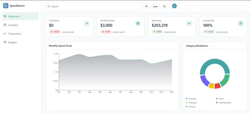
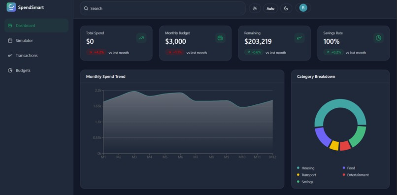
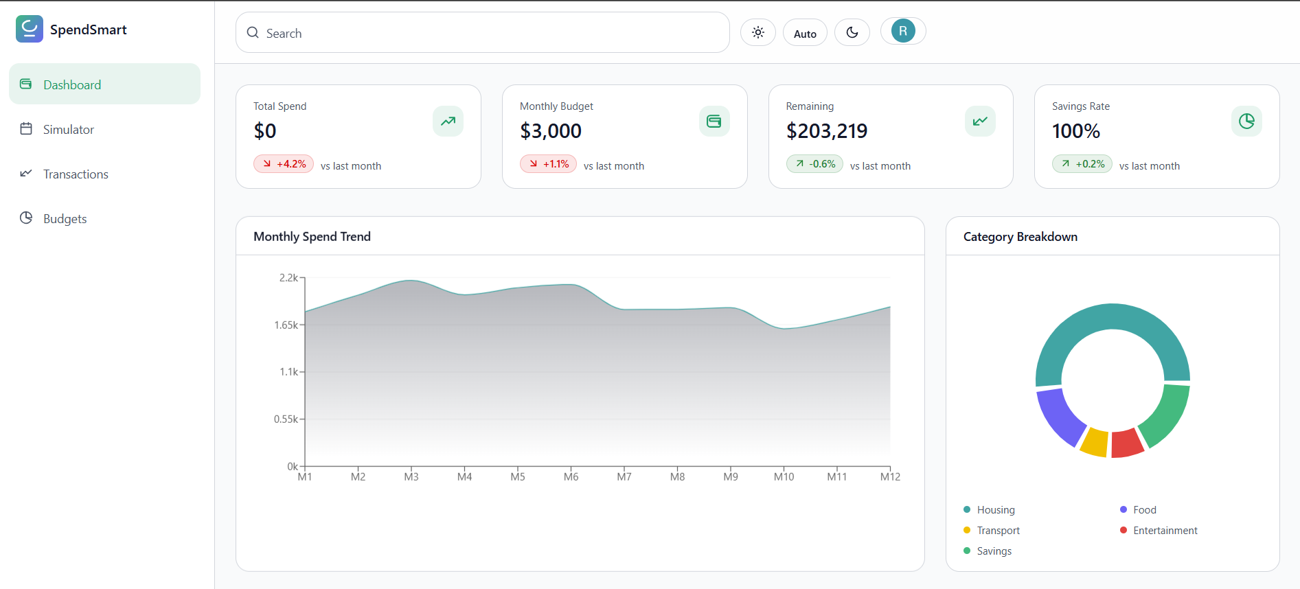
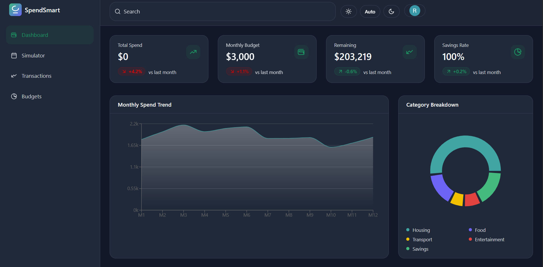
Dashboard
-
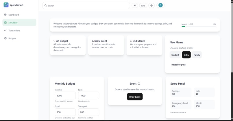
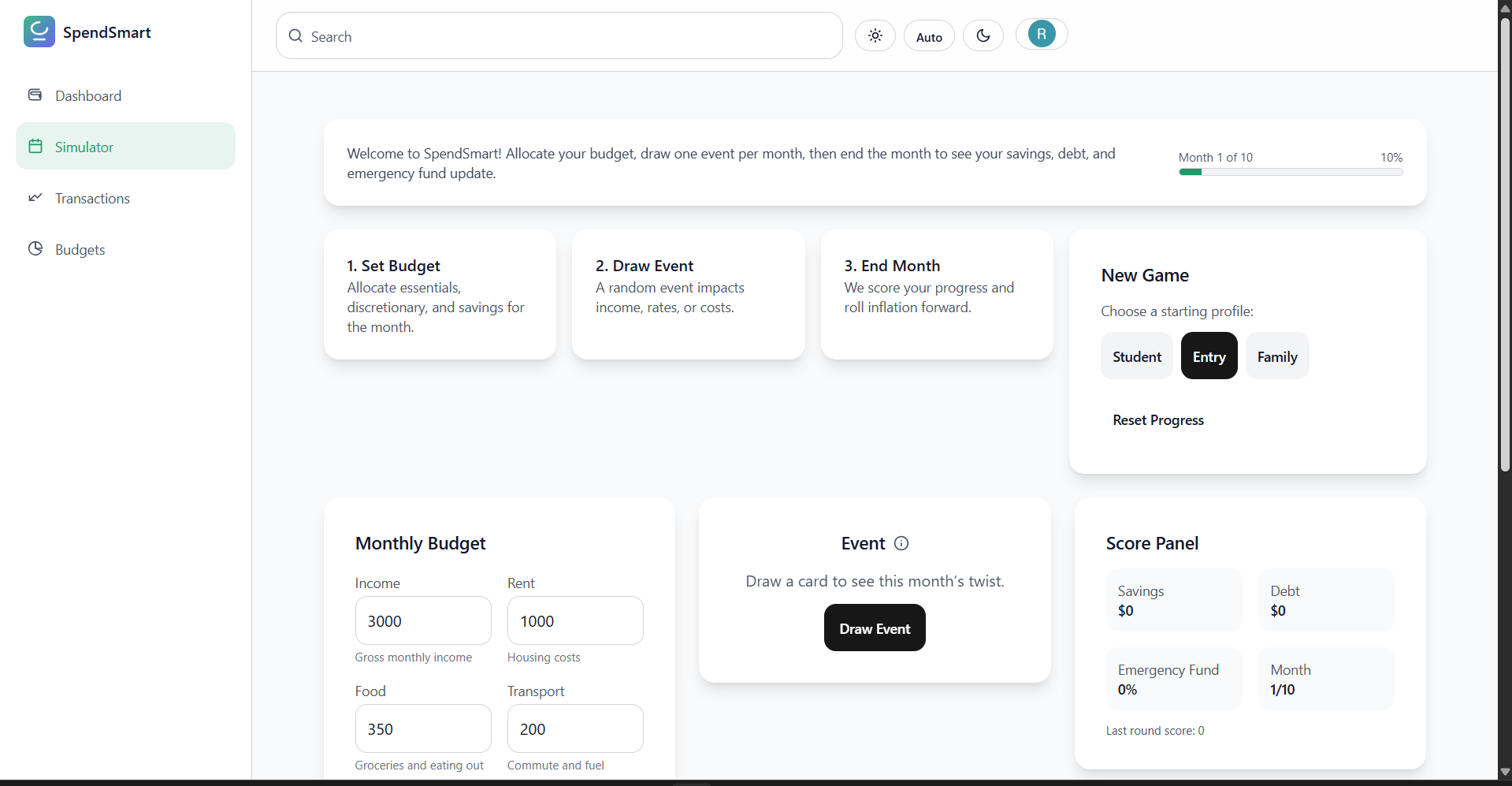
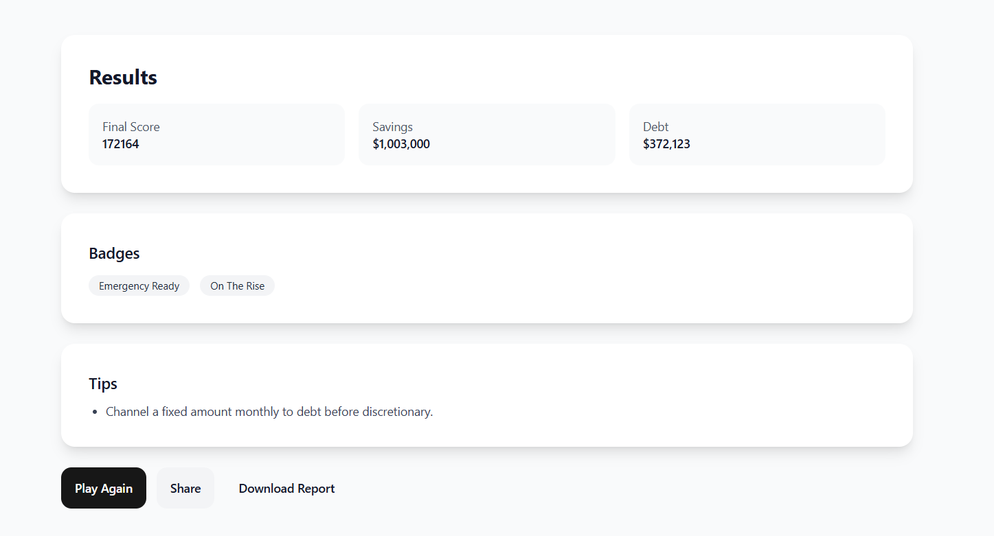
Simulator
-
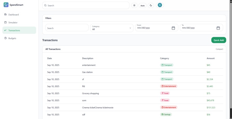
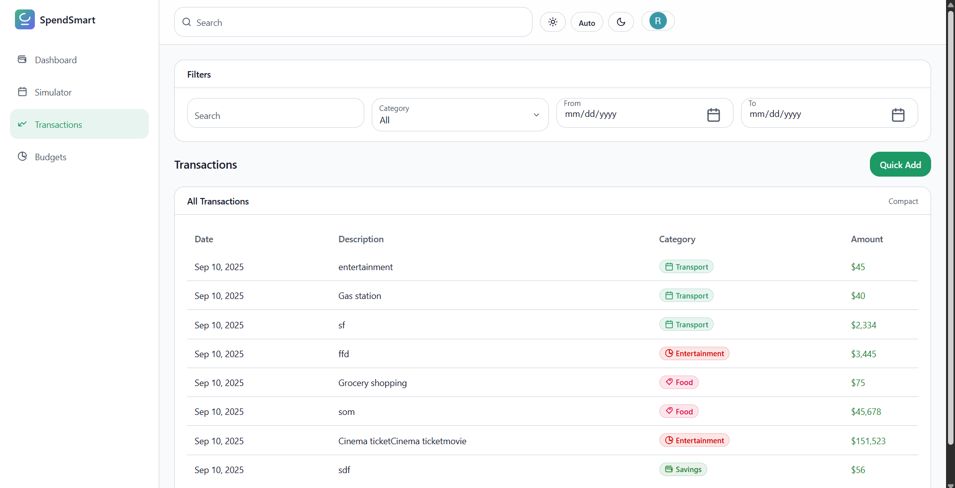
Transactions
-
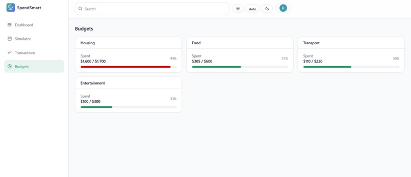
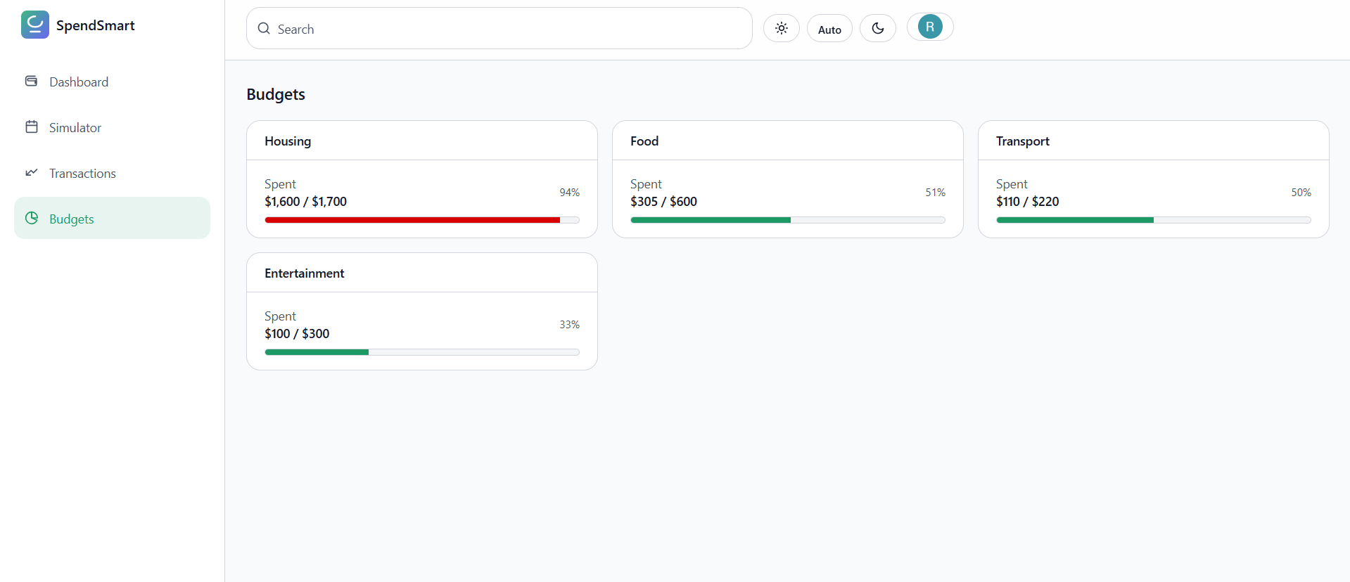
Budgets
-
Dark mode
-
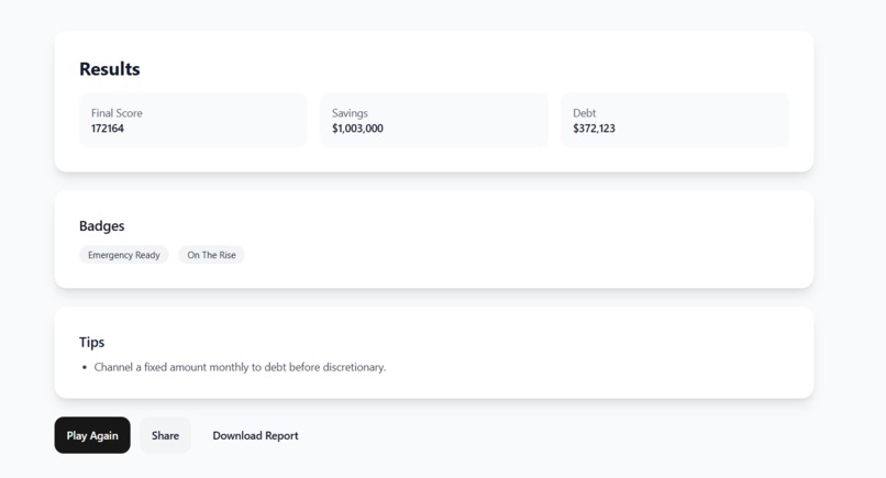
Results of the simulator
SpendSmart
Inspiration
Most months aren’t derailed by one giant purchase—they’re shaped by many tiny, forgettable ones. SpendSmart was inspired by the need to make those small decisions visible without adding friction.
The goal: a clean, fast, focused way to see where the money goes and make better choices tomorrow than yesterday.
What it does
- Presents a clean, scannable transaction list with categories and notes.
- Filters instantly by date, category, and merchant; fast fuzzy search for names/memos.
- Surfaces simple, honest metrics: totals, rolling balances, and per-category spend.
- Keeps context close to data: quick edit of tags/notes without modal mazes.
- Responsive by default: sidebar navigation and compact header work on mobile and desktop.
A few small formulas keep insights consistent:
Monthly savings rate:
$$ r = \frac{I - E}{I} $$
Rolling balance:
$$ B_t = B_{t-1} + I_t - E_t $$
Category utilization (soft cap progress):
$$ u_i = \frac{\text{spent}_i}{\text{cap}_i} $$
How I built it
- Frontend: React + TypeScript for typed components and predictable state.
- Styling: Tailwind CSS + PostCSS with config in
tailwind.config.jsandpostcss.config.js; shared styles insrc/index.css. - UI Architecture:
src/features/transactions/TransactionsPage.tsx— core view and derived state.src/components/Sidebar.tsx— navigation and layout frame.src/components/Header.tsx— search, filters, and quick actions.
- Data Modeling: store amounts as integer cents; format only at the edges to avoid floating-point drift.
- App shell & assets:
index.html,.envfor configuration, and branding insrc/assets/SPEND.png.
Challenges I ran into
- Currency precision: ghost cents during aggregation; fixed by using integer cents everywhere.
- Date handling: consistent parsing/sorting across locales/time zones; standardized on ISO strings and explicit formatting.
- Performance: keeping filters/search snappy on larger lists; reduced render work via memoized selectors and narrow props.
- Tailwind theming: balancing light, airy visuals with strong contrast and spacing for scanability.
- Accessibility: keyboard navigation and focus management without bloating the UI.
Accomplishments that I am proud of
- Instant, zero-jank filtering and search that scales with data size.
- A tight, readable layout that feels native on phones and desktops.
- Strong type coverage for domain models and component props.
- Clear separation between data derivation and presentation for easy extension.
- Small but meaningful math and formatting that make “How am I doing?” obvious.
What I learned
- Keep one source of truth; compute derived data in selectors, not component state.
- Tailwind is best when utilities live close to markup; use
@applysparingly for real patterns. - Money is special: store cents as integers; format late; test edge cases like refunds/reversals.
- Accessibility compounds when planned early: roles, labels, and focus order matter.
- Sensible defaults beat rare settings; fewer choices make the app feel faster and more consistent.
What’s next for SpendSmart
- Budgets and nudges: soft/hard caps per category with gentle alerts.
- CSV import/export with smart category mapping.
- Deeper analytics: month-over-month diffs, top movers, anomaly highlights.
- Offline-ready PWA and optional encrypted sync/backup.
- Multi-currency support and custom categories with per-category rules.
- Recurring transactions and upcoming-payment previews.
Built With
- css3
- firebase
- firestore
- html5
- javascript
- react-hooks
- typescript
- vercel


Log in or sign up for Devpost to join the conversation.