What it does
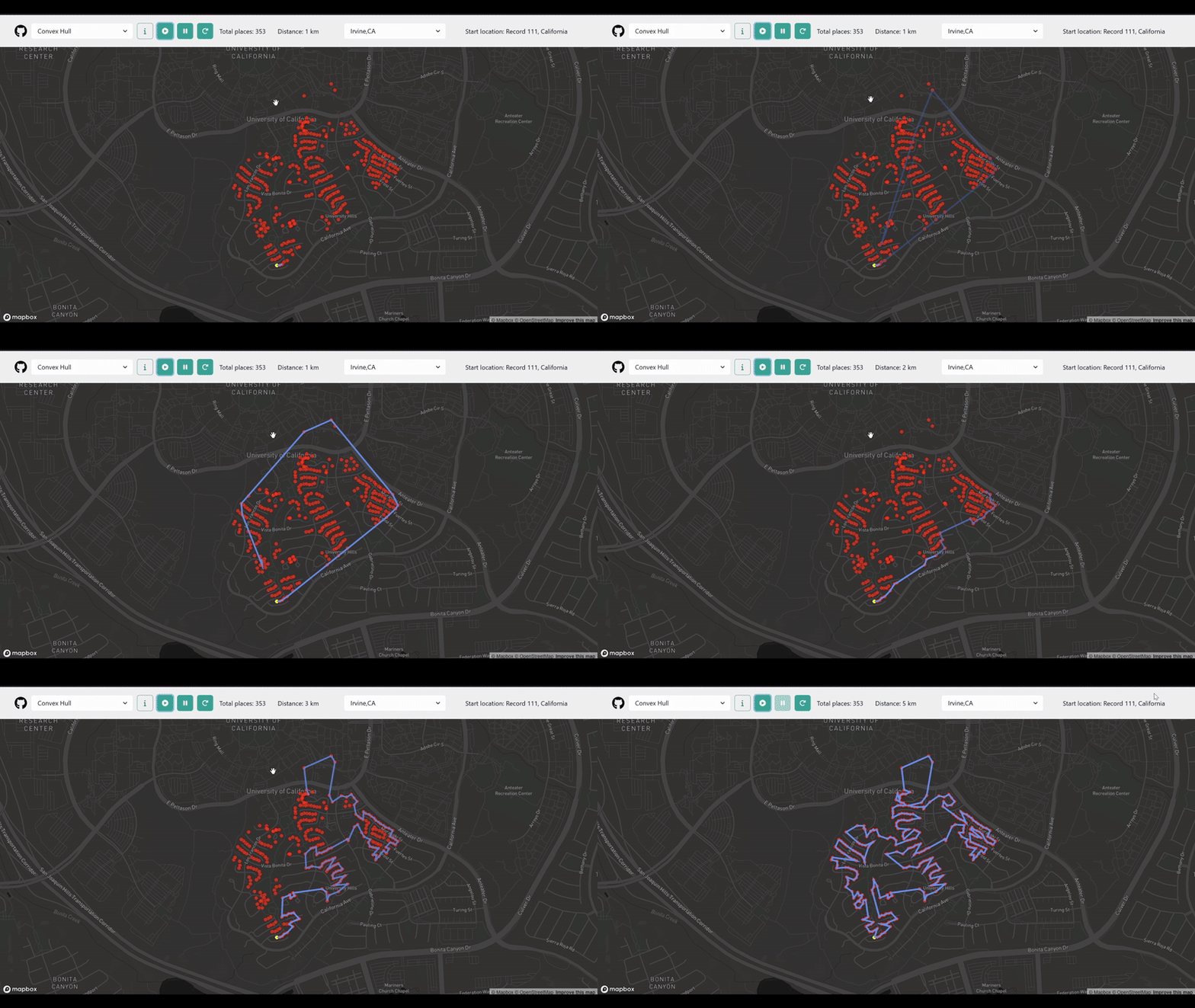
Our tool starts at UCI and maps out the shortest route to visit a set of addresses,
then layers in demographic insights like education level and gender equity
to highlight hidden trends in the community.
How we built it
Geocoded addresses with Geoapify
Merged with ACS census data from Melissa
Cleaned & processed lat/lon and education stats
Applied multiple TSP algorithms (e.g., Nearest, Cheapest, 2-Opt)
Visualized routes and insights with Folium, Matplotlib, and Seaborn
Challenges we ran into
Corrupted headers in raw CSVs from geocoding
Duplicated lat/lon columns causing plotting errors
Balancing speed and quality across TSP approaches
Accomplishments that we're proud of
Recovered and cleaned all data
Found a real-world insight: neighborhoods near UCI show higher female education rates
Built an interactive, easy-to-demo visualization tool
What we learned
How to work with messy real-world location + census data
That diversity insights often hide in plain sight
And that good visuals make a huge difference in communicating impact
What's next for SpeedFast
Add filtering by race/language/economic status
Use TSP variants based on equity, not just efficiency
Launch a UCI-focused web tool for outreach and planning teams

Log in or sign up for Devpost to join the conversation.