-
-
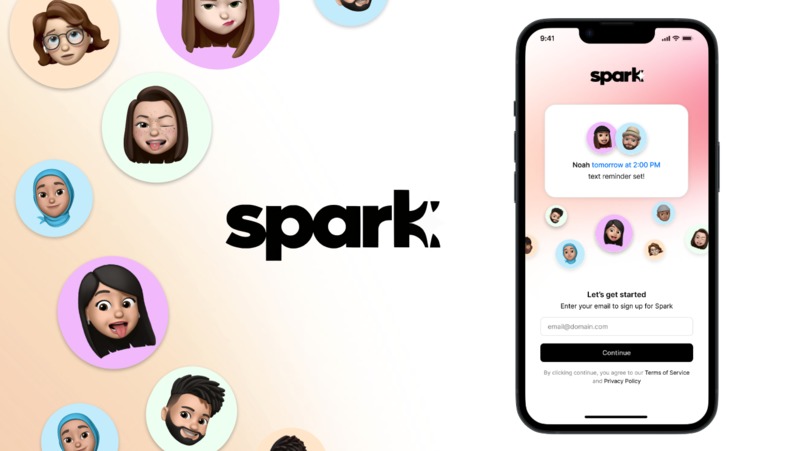
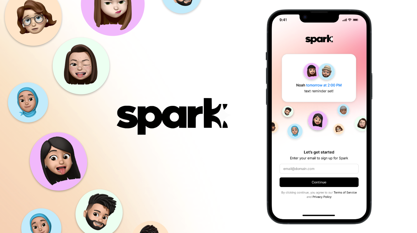
Spark Onboarding Page
-
Wellness Goal
-
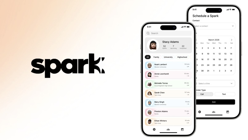
Main Interfaces
-
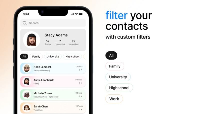
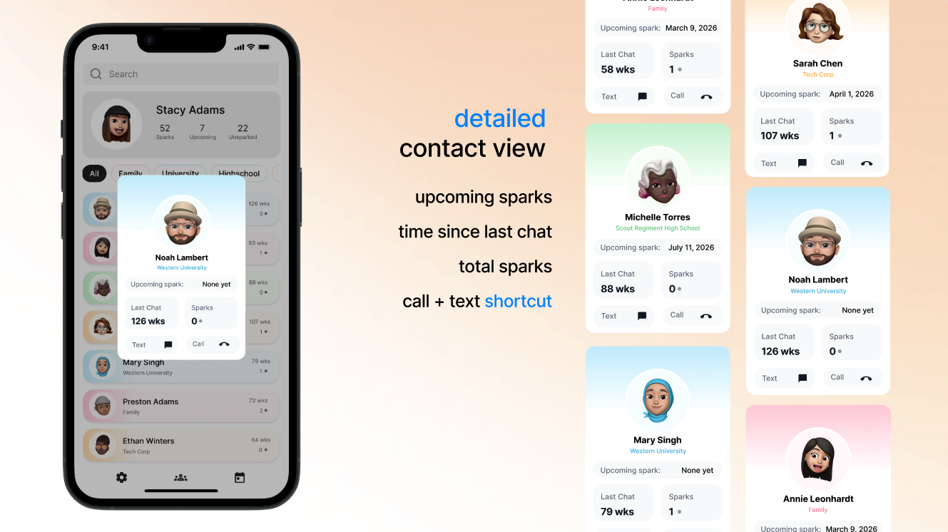
Contacts Page
-
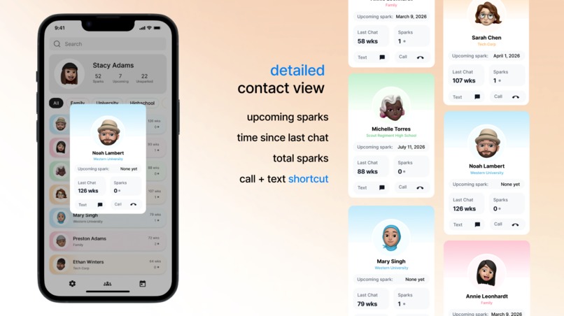
Detailed Contact View
-

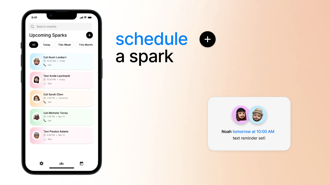
Scheduling Sparks Page
-

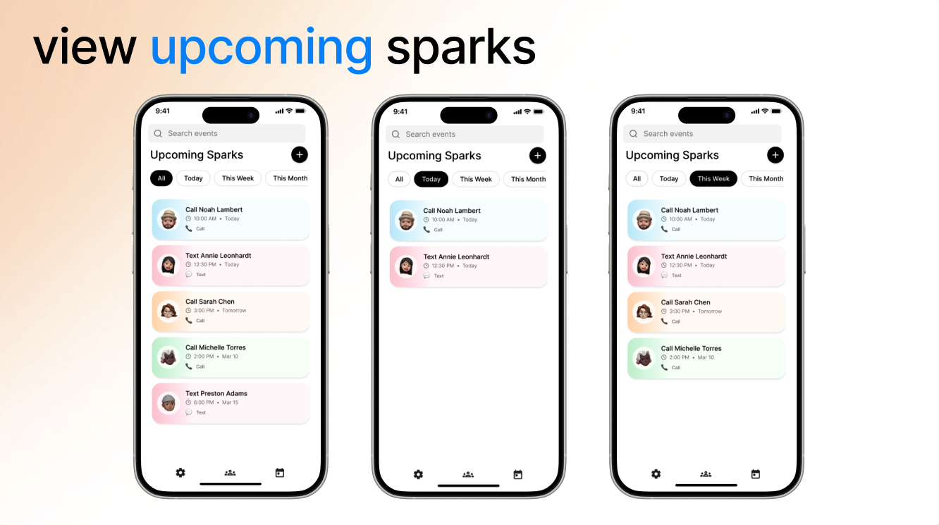
Upcoming Sparks Page
-

Safeguards


Inspiration
Humans don't just have five senses, we have over twenty. One of the most powerful is our sense of time and nostalgia, the feeling of remembering people and moments that once mattered to us.
Humans rely on shared experiences and interactions to feel how time passes. But when interactions become mostly digital, those signals disappear. We often see updates from friends online, but meaningful conversations become less frequent.
Spark was inspired by the idea of restoring our awareness of time in relationships by making the passage of time visible.
What it does
Spark is an app designed to rekindle relationships. It gently reminds you of old friends you haven't talked to in a while and encourages meaningful reconnection through simple, user-scheduled reminders.
Spark automatically imports your contacts and shows how long it has been since you last reached out. Users can schedule reminders called Sparks, view upcoming reminders, and quickly reconnect with people they haven’t spoken to in a while.
Instead of focusing on endless new content, Spark focuses on the people who already shaped your life.
How we built it
We designed Spark as a mobile app prototype using Figma.
We created interactive wireframes to simulate the full user experience, including contact filtering, scheduling reminders, and viewing upcoming Sparks. We also used Figma Make to explore and compare multiple interface variations and conduct A/B testing, allowing us to test different design approaches and refine the user flow.
Challenges we ran into
A major challenge was ensuring the app encourages connection without turning relationships into a game. To keep interactions authentic, Spark intentionally avoids gamification features like streaks, leaderboards, or rewards.
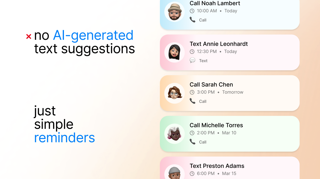
Spark also avoids AI-generated messages or suggested texts. Instead, it simply provides reminders, allowing the conversation itself to remain genuine and personal.
Another challenge was designing the scheduling interface. Creating a reminder system that felt quick and intuitive required balancing several dropdown menus for selecting contacts, dates, and times without overwhelming the user. Iterating on the layout helped us simplify the interface while still keeping scheduling flexible and easy to use.
We also had to carefully balance helpful reminders with notification overload, ensuring user-controlled reminders support relationships without becoming intrusive.
Accomplishments that we're proud of
We're proud of designing a tool that supports social wellbeing in a subtle and thoughtful way. Spark reframes technology from something that distracts us from relationships into something that helps strengthen them.
We’re also proud of creating a clear and intuitive interface that makes the passage of time in relationships visible without overwhelming users. Time is something we constantly experience but rarely see visualized, and Spark transforms that invisible passage of time into something users can clearly understand and act on.
What we learned
This was our first time using Figma, so we learned a lot about building interactive prototypes. We explored how to connect different wireframes, design navigation between screens, and create a cohesive user flow.
Most importantly, we learned how to design with the user in mind. By focusing on real user needs, we created a tool that enhances the sense of the passage of time and helps people stay connected to the relationships that matter most.
What's next for Spark
In the future, we plan to explore optional features like memory prompts, shared milestones, and reflection tools that help users celebrate important relationships.
Built With
- figma


Log in or sign up for Devpost to join the conversation.