Inspiration
Our inspiration came from a place of frustration. We looked at the current "money experience" offered by fintech and saw a critical failure. Most financial dashboards are built for a single "power user": a tech-savvy, sighted person who isn't overwhelmed by complex charts.
This "one-size-fits-all" approach fails financial learners like "Sarah," who may be colorblind and finds the cluttered, color-coded graphs confusing and overwhelming. It also completely excludes blind users like "David," who are justifiably skeptical of "accessibility" claims that often turn out to be nothing more than "bigger text." This isn't just a design flaw; it's a breakdown of consumer trust. Our inspiration was to build a dashboard from the ground up to create an empowering **money experience for everyone.
What it does
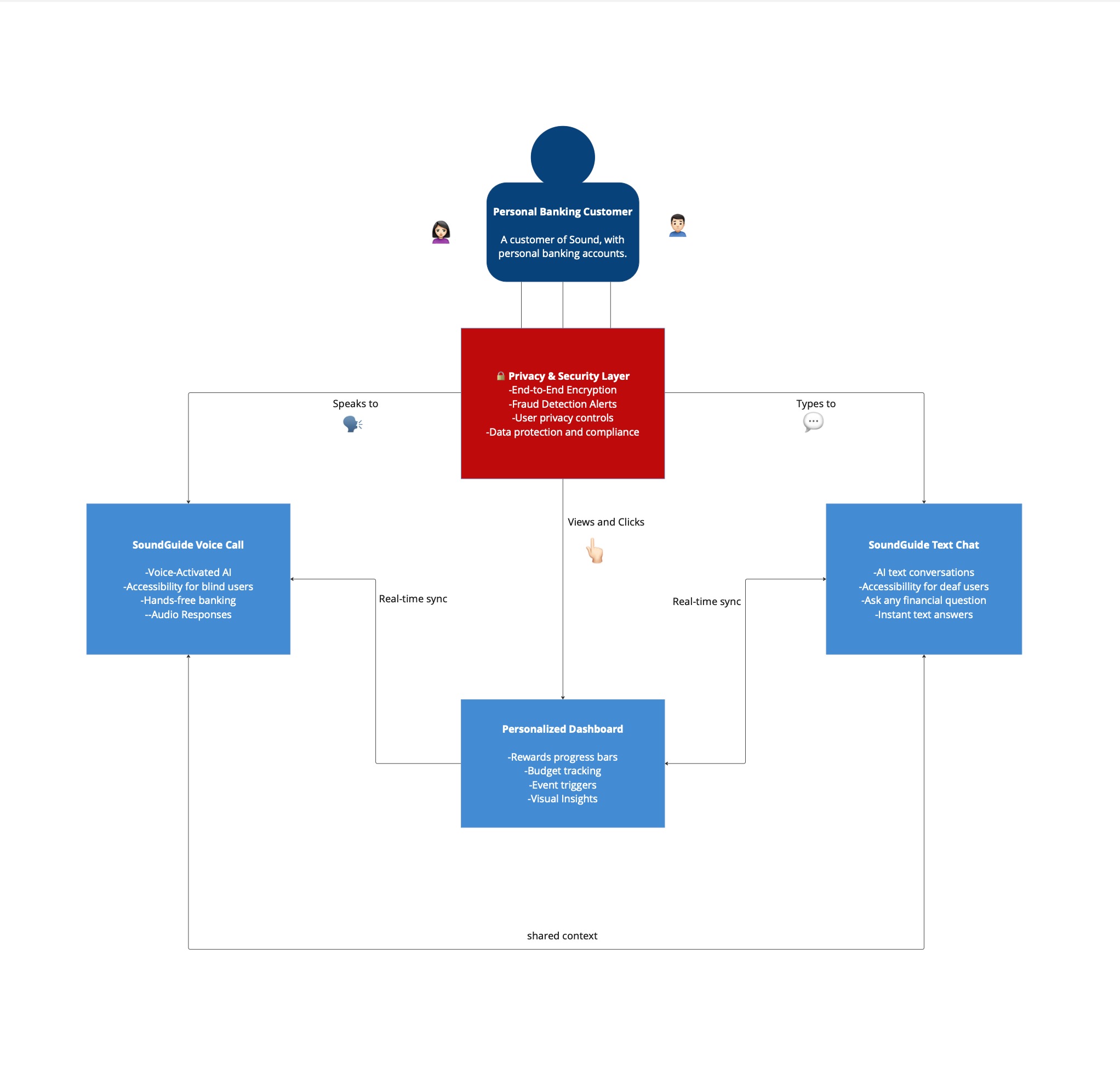
SoundGuide is a "financial buddy," not just an app. It's an accessible-first financial dashboard that serves all members, regardless of ability.
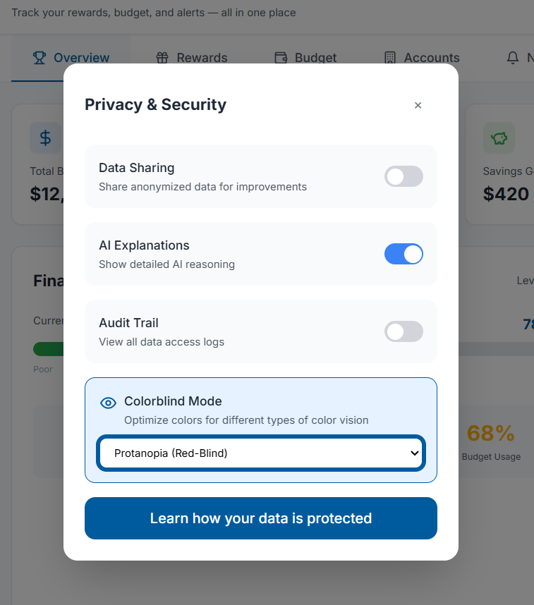
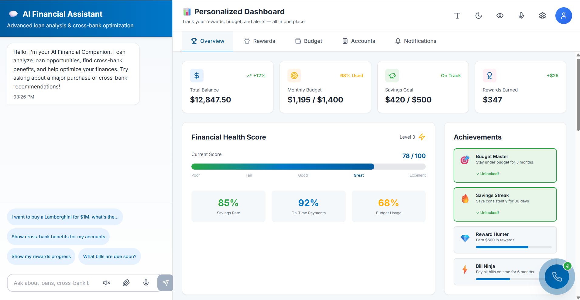
- For Visually-Impaired Users (like Sarah): It provides a clean, uncluttered interface with clear, comprehensive charts. A "Colorblind-Friendly Mode" uses high-contrast and distinct patterns, not just color, to differentiate data, making budgeting and reward-tracking intuitive.
- For Blind & Non-Visual Users (like David): It provides two revolutionary AI features:
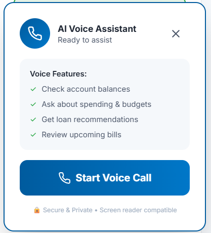
- The "AI Call Guide": A prominent, always-on floating button that launches a compassionate voice assistant. This AI can verbally guide a user through any part of the app or, more powerfully, complete complex forms (like a credit card application) entirely through conversation.
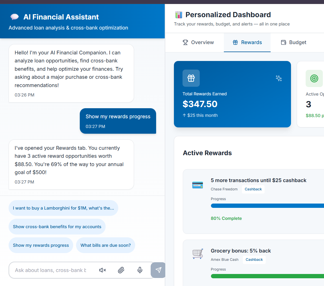
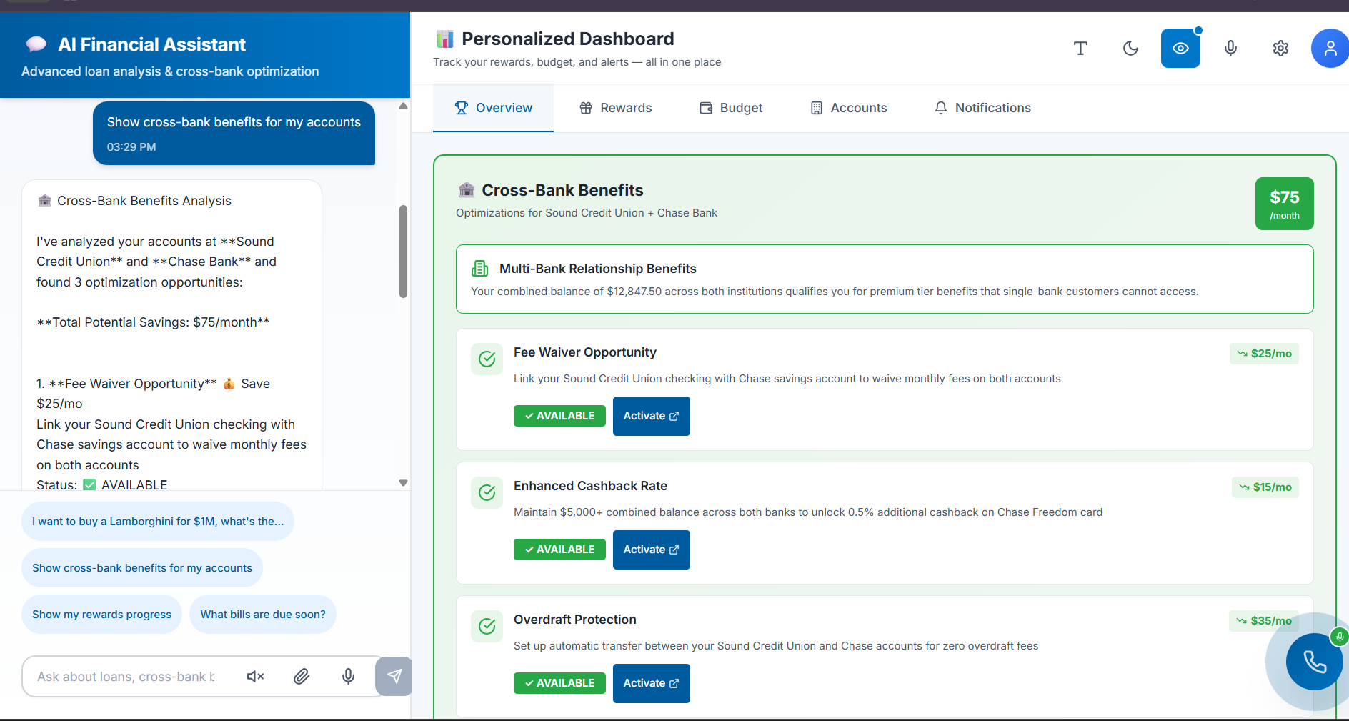
- The Conversational AI Dashboard: A powerful chatbot that replaces the need to find data. Users can simply ask: "How am I doing on my budget?" or "Activate my rewards," and the AI provides immediate, actionable answers.
How we built it
We built SoundGuide on a principle of persona-driven, "accessibility-first" design.
- Persona-Driven UI: We designed the visual interface specifically for "Sarah." This meant prioritizing clarity over data-density, resulting in clean, easy-to-read modules for budgets and rewards, and a high-contrast/colorblind mode.
- Dual-AI Architecture: The "magic" is in our two-part AI system:
- The Navigational AI (AI Call Guide): We conceptualized a system-wide overlay that maps the app's functions. The AI Guide uses this map to provide step-by-step verbal instructions or take over the task for the user.
- The Data AI (Chatbot): We designed this AI to hook directly into the user's financial data APIs. It uses natural language processing (NLP) to understand a user's intent, retrieve financial data, and even execute commands (like activating a reward).
- Frontend Focus: The floating "AI Call Guide" button was designed to be a permanent, easily accessible element that doesn't interfere with the standard visual UI, ensuring it's available on every screen.
Challenges we ran into
Our biggest challenge was David's exact criticism: how to create true *accessibility, not just a superficial fix. This meant rethinking the "dashboard" as a concept. A dashboard is visual, but the *data isn't. The challenge was to "liberate" the data from its visual-only container.
Another significant challenge was designing the AI Call Guide. It needed to be smart enough to handle complex, multi-step tasks like a credit card application (which has legal and compliance-heavy text) and make it feel as simple as a conversation.
Accomplishments that we're proud of
We are incredibly proud of David's "Wow." That moment of overcoming the deep-seated skepticism of a user who has been let down by tech time and time again was our primary goal.
We are also proud of creating a single product that solves the needs of two very different users. The simple, clean charts Sarah loves and the powerful AI David uses aren't in conflict; they're two sides of the same coin—good, accessible design. We successfully built a "financial buddy" that starts to rebuild that broken consumer trust.
What we learned
We learned that when you design for the "edges"—the users who are most often excluded—you create a better, simpler, and more intuitive product for everyone. The clean interface Sarah loved was a direct result of prioritizing clarity.
Most importantly, we learned that for many users, the future of accessibility isn't just about tagging elements; it's about AI. A compassionate voice (AI) can be a more powerful, intuitive, and inclusive interface than any screen full of charts. For David, the conversation is the dashboard.
What's next for SoundGuide
This is just the beginning. Our next steps are:
- Expand the AI Call Guide: Grow the AI's capabilities to handle the most complex financial tasks, such as mortgage applications, investment planning, and disputing a transaction.
- Proactive AI: Have the AI deliver proactive insights, just like a real "buddy" (e.g., "Hi David, I see your rideshare spending is high again. Would you like to set a special alert for that?").
- Deeper Personalization: Continue to build out features for all financial learners, using AI to simplify complex financial concepts and guide them toward their goals.
Built With
- bolt
- canva
- fastapi
- miro
- nanobanana
- perplexity
- python
- supabase
- v0


Log in or sign up for Devpost to join the conversation.