-
-

Search results!
-

Use your current location
-

Search for a location

Inspiration
The inspiration behind our project is the growing number of cities and states around the nation that are setting Stay at Home Orders, and the uncertainty surrounding that. A lot of our family and friends are not sure whether it is safe to go to the store to get the essentials, or if they should avoid going out at all based on the current situation.
What it does
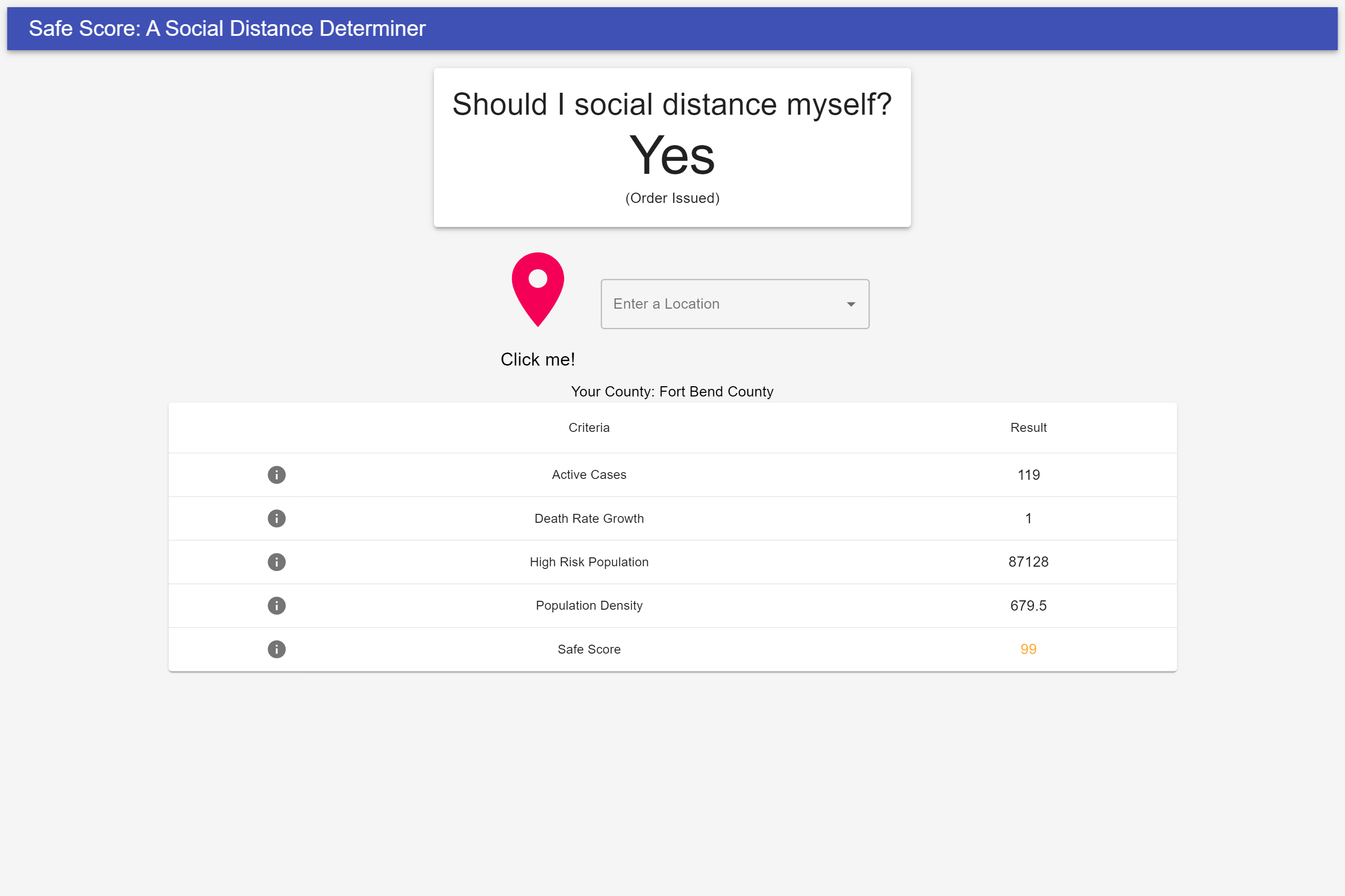
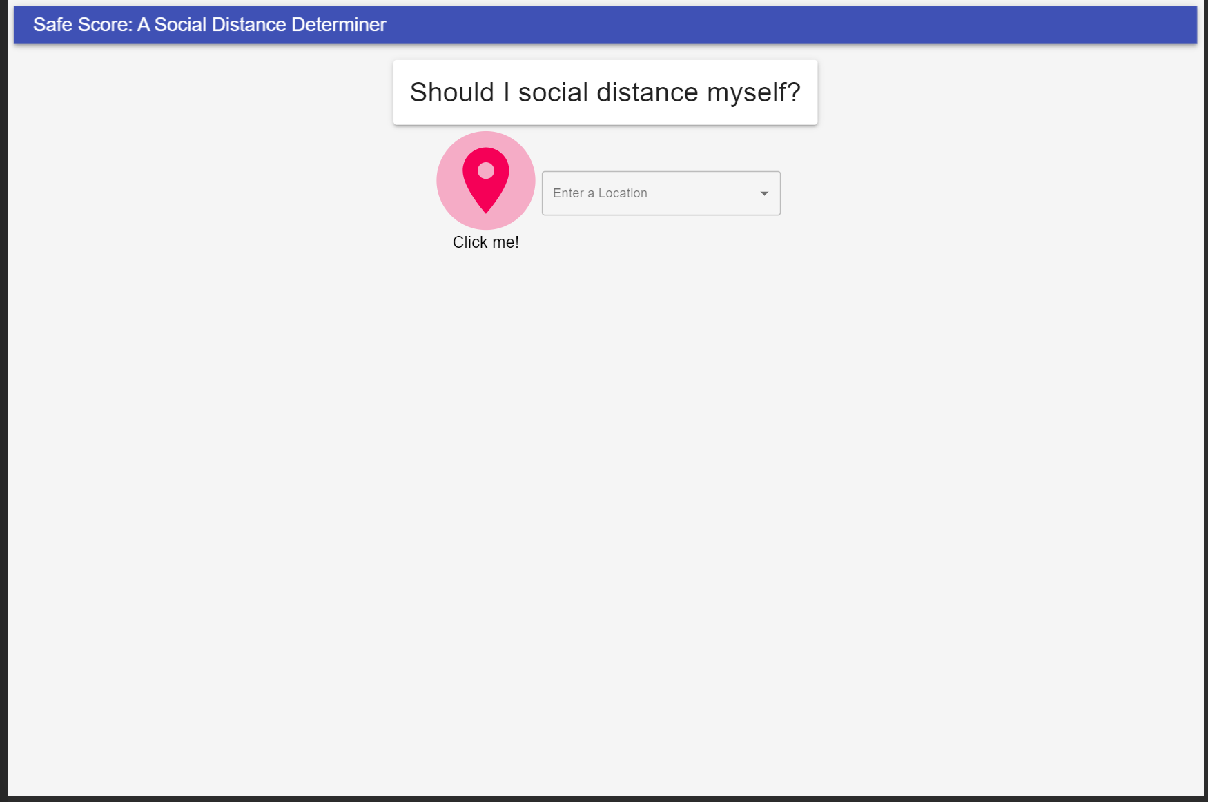
Our product helps people understand the severity of the current COVID situation and helps them make an informed decision to benefit themselves and everyone around them. This will contribute to flattening the curve especially in the United States, the Country with the most cases. People simply click a button to get their current location and will receive stats for their area, along with a final “Safe Score” (0 to 100) which summarizes the extent to which people should stay home.
How we built it
Our product was built using a variety of platforms and databases. We would like to thank the following data sources for providing data in the public domain:
- US Census Bureau
- New York Times
- John Hopkins Center for Systems Science and Engineering
We aggregate data by county from the John Hopkins Dataset and added crucial information from the US Census such as county size, population age distribution, density and size to calculate a preliminary “Stay at home index.” This is supplemented by data from The New York Times, which tells us the counties, states, and cities with preexisting stay at home or shelter in place orders to help strengthen our calculations.
Challenges we ran into
There were a few challenges we ran into. First, aggregating such a vast amount of data and organizing it to our liking was very difficult. The system we have designed supplements its decisions through many sources, and compiling the data into one dataset was challenging. There were many different formats of data, causing discrepancies in county names and such (New York County was referred to as New York City County and New York City in the same dataset). We solved this by carefully examining all the possible edge cases and also making sure to only compile the data we were using, making it easier to send payloads and process the data. Additionally, we had a dilemma for calculating the “Stay at home index.” We tried to determine the best weightages for calculating the score, and decided that the most crucial factors were:
- The number of confirmed cases, since more infected people can spread to others
- The area’s population density, since closer proximity increases the likelihood of spread
- The death rate and infected cases’ progression and current value, since this can help us predict future values
- The population of high risk individuals (mostly 65+), since they are much more strongly affected than others due to a weaker immune systems
- Any preexisting stay at home or shelter in place orders by local authorities, since the government’s decisions are the ultimatum (in addition to using common sense)
Accomplishments that we’re proud of
We are proud of creating a product that will help people gauge their social distancing, based upon a variety of important factors. This being our first major data aggregation project, we are proud of our product since it saves people time from scavenging the internet to help make their decision. This brings all the information into one place and makes it easy for users to find out. We believe that the main purpose of technology is to enhance and ease our lives, and we’re proud to say that this solution does exactly that.
What we learned
As high school students, this was our first project that involved parsing and calculating with such vast amounts of data and spark a significant change in the progression of the coronavirus.
We learned many things. First, we learned about the importance of making sure to clean up our data to make it easier on us in the long run. We encountered a swath of data formats in the datasets we used, and making sure that the data was adapted to be uniform was key for us. It helped us learn the importance of designing databases to work well within itself and use universally recognized data formats. Second, we learned of the importance of efficiency in code. In all of our previous projects, we have worked with small datasets and speed does not take much of a toll with inefficient code. Here, we parsed through millions of lines of data. Making sure that we trashed what we didn’t need, trimmed what we needed, and used efficient algorithms to process our data was key. Another important thing we learned was creating readable code. As we are opening the open source community to view and improve, we have added descriptive code comments to help understand our thought process and make it easier to receive feedback. Additionally, when we improve our project after the hackathon, we will be able to understand our code easily.
What's next for Safe Score - Can I Go Out?
Although we believe we’ve created a solid project, there is room to add more features for the convenience of our users. The next major step we plan to take in our project is aggregating data for local resources for people who are concerned about potentially being infected with coronavirus. We have found a few datasets that will help us find out hospitals that are officially testing for the coronavirus, and we can combine that with traffic data at those hospitals to direct users to a hospital with the correct resources while spreading the impact through multiple hospitals, helping them function at a higher rate of productivity and care.


Log in or sign up for Devpost to join the conversation.