-
-
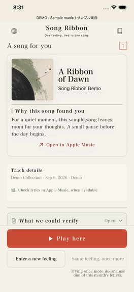
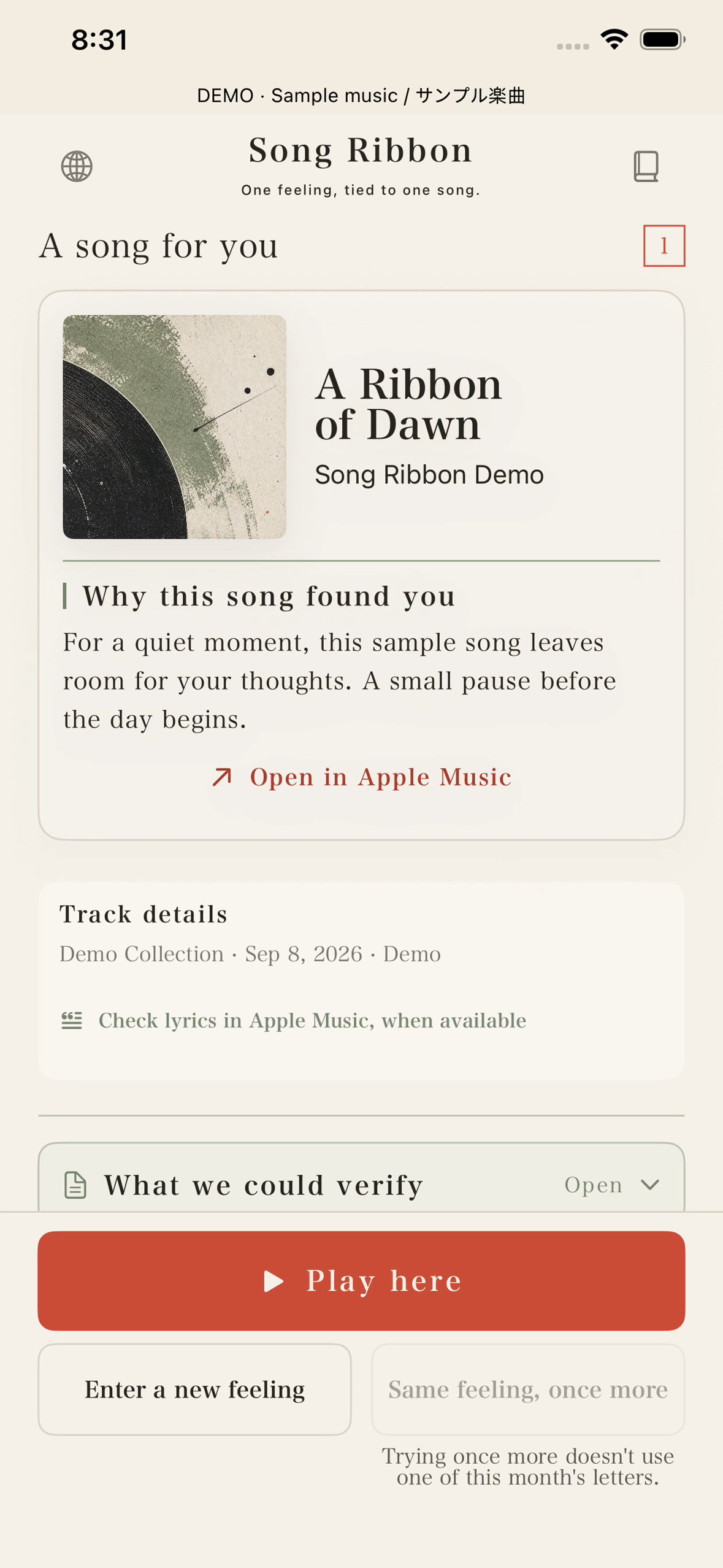
Single-song Demo interface on iPhone, with fictional sample music.
-
Song Ribbon app icon
Inspiration
Sometimes we know how we feel, but cannot name the music we want to hear. Song Ribbon starts with that small gap: a difficult evening, a quiet drive, or a moment that is easier to describe in a sentence than in a genre. We wanted choosing music to feel like receiving a thoughtful letter.
What it does
Write a short description of your current feeling and choose one song or a playlist. Song Ribbon returns music with a short explanation connecting the selection to your words. Playlist requests offer an approximate listening duration. You can read the track information, scroll through the songs, and start playback from the result screen. Playback uses Apple Music and requires eligible access; Song Ribbon Premium is a separate subscription.
How we built it
The app is built with native SwiftUI for iPhone and iPad. A shared Hono API generates structured recommendations and verifies the selected songs against Apple's music catalog. MusicKit handles playback on the device. RevenueCat manages the Song Ribbon subscription. The interface uses a warm paper background, editorial typography, green accents, and a vermilion primary action. Japanese and English video examples show the same interface in a dedicated Demo build with fictional sample music and simulated playback.
Challenges
We had to keep model suggestions separate from verified catalog results, make long song titles readable on small screens, and keep playback reachable while the result scrolls. The filming process also required separating UI demonstrations from live-service evidence: the submitted video uses fictional sample music and simulated playback, with no audio.
Accomplishments that we're proud of
The central flow stays small: words, a recommendation, a reason, and a playback action. Single-song and playlist results share a consistent reading order and bottom actions. The design leaves room for a person to remain in their current mood without promising that a song will change it.
What we learned
A technically correct result is not enough for a readable interface. Small details such as card spacing, long-text wrapping, button order, and the placement of playback feedback change how easily a person can move from reading to listening. We also learned to inspect recorded interaction timings rather than assuming that a caption describes the visible shot.
Design Award focus
Please look at the letter-like presentation of the selection reason, the spacing between music information and feedback, and the shared bottom actions in single-song and playlist results. The playlist can scroll while playback remains reachable. The Japanese and English versions keep the same restrained paper, typography, and color system.
Built With
- cloudflare
- hono
- musickit
- revenuecat
- swiftui
- workers

Log in or sign up for Devpost to join the conversation.