Inspiration
The pressing question of how to efficiently transition to renewable energy sources led me to this project. I was inspired by the urgent need to combat climate change and the realization that, despite abundant solar resources, many countries have not fully exploited this clean energy. My project is driven by the ambition of a solar-powered future where every nation realizes its full solar energy production potential, fostering a sustainable and eco-friendly energy environment.
What it does
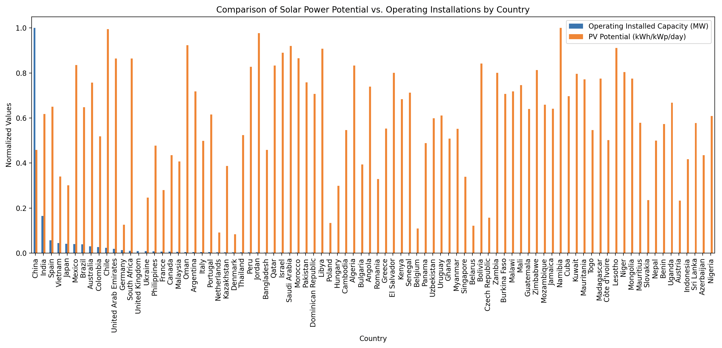
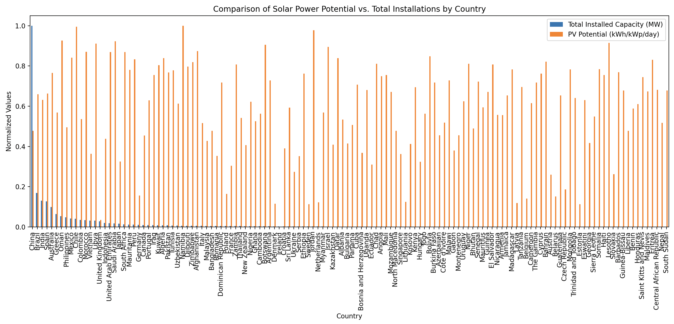
My project aims to reveal the untapped potential of solar energy across the globe by comparing the theoretical solar power potential of countries with their actual solar installations. By integrating the Global Photovoltaic Power Potential dataset with the Global Energy Monitor's Solar Power Tracker, we focus on projects over 20 MW to analyze disparities and highlight opportunities. This comparison not only identifies areas with significant solar resources that are yet to be harnessed but also showcases regions that have made remarkable strides in solar adoption. Our project is crucial for stakeholders in the energy sector, providing a clear picture of the solar landscape, guiding policy development, and encouraging investment in areas with high solar potential but low actualization, all while navigating the complexities of geography, infrastructure, and economic factors.
How I built it
I dove into data analytics, combining and cross-examining two essential datasets: the Global Photovoltaic Power Potential and the Global Energy Monitor's Solar Power Tracker. Through data cleaning, normalization, and statistical analysis, I translated complex datasets into an insightful visual story, converting intricate information into understandable and actionable insights for decision-making in solar energy initiatives.
Challenges I ran into
A significant challenge was aligning different datasets with distinct measurements of solar power potential and real installations. Moreover, grappling with the myriad of factors—from geographical limits to economic considerations—added layers of complexity to my analysis. Maintaining data precision and reliability while scaling the project to encompass a worldwide dataset was a demanding process that sharpened my analytical abilities.
Accomplishments that I'm proud of
I am particularly proud of my success in distilling large, complex datasets into a clear, interactive tool that illustrates the discrepancy between potential and actual solar power solutions. My project is an example of how data visualization can effectively communicate sophisticated information and act as a catalyst for change in renewable energy policies globally.
What I learned
Through this endeavor, I've deepened my knowledge of the global energy framework, the nuances of solar power potential, and the socio-economic and environmental factors that impact renewable energy adoption. I've refined my technical proficiency in data analysis and visualization and have come to understand the significance of cross-disciplinary collaboration in tackling global issues.
What's next for this project
Looking ahead, I see my project evolving into a real-time updating platform that incorporates live data streams from solar installations and potential assessments. I plan to introduce predictive analytics to project future solar energy trends, providing guidance for reaching global sustainability targets. This tool will act as a decision-support system for policymakers, investors, and environmentalists, propelling the advancement of solar energy on a global scale.
Data Analysis
Based on the bar and scatter plots provided, here are some possible conclusions and observations:
Bar Plots:
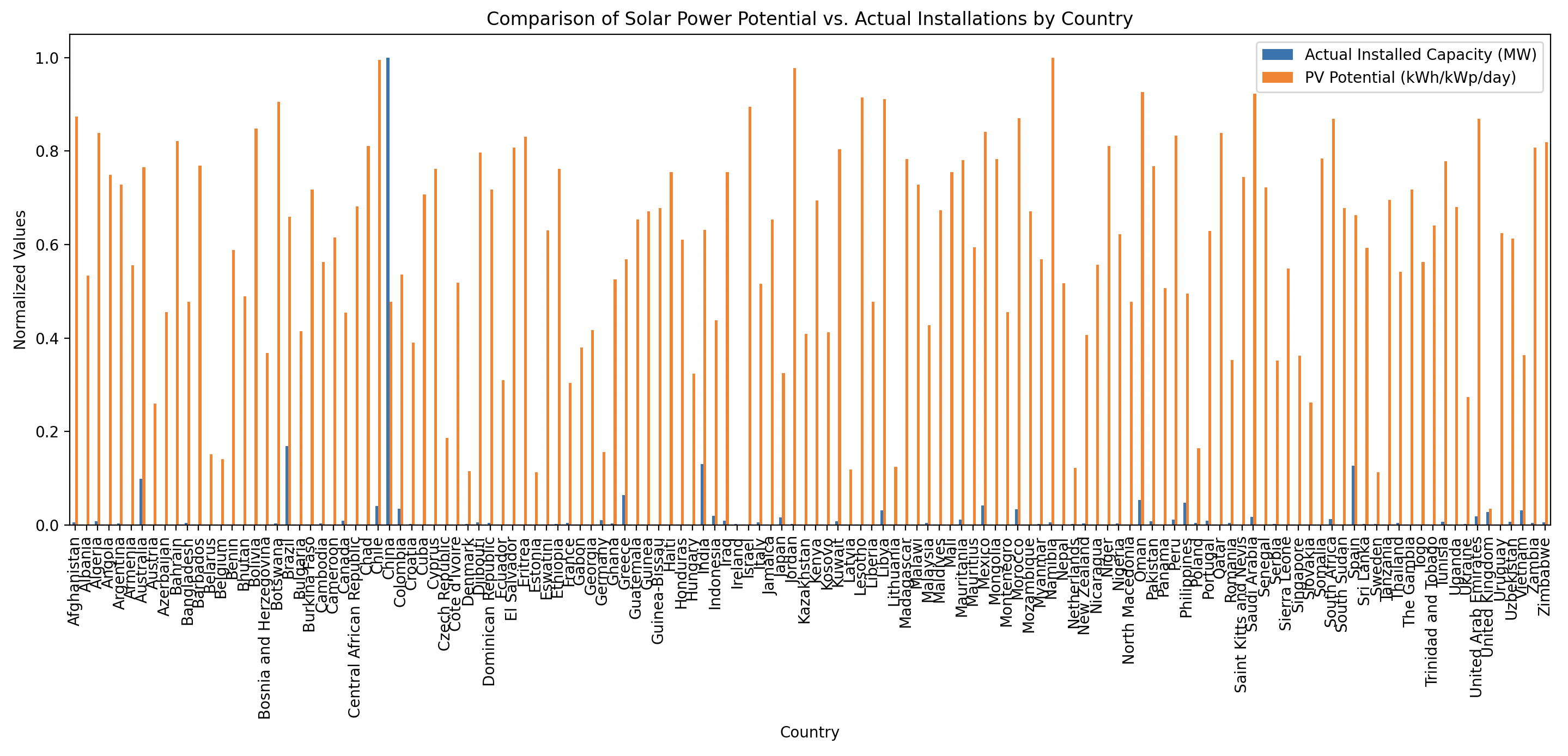
- Capacity vs. Potential: The orange bars (PV potential) are consistently high across most countries, indicating that the theoretical potential for solar power is generally large compared to the blue bars (installed capacity), which vary more significantly by country. This suggests that many countries have not yet fully utilized their solar energy potential.
- Relative Comparison: The normalization of values allows for a relative comparison between the installed capacity and PV potential. However, it also means that countries with very high potential and low installed capacity can appear to have a larger discrepancy than they would in absolute terms.
- Data Distribution: The distribution of the installed capacity (blue bars) appears more uneven compared to the solar potential, with some countries showing a significant installed base while many others have much less. This could indicate that solar power development is at different stages across these countries.
Scatter Plots:
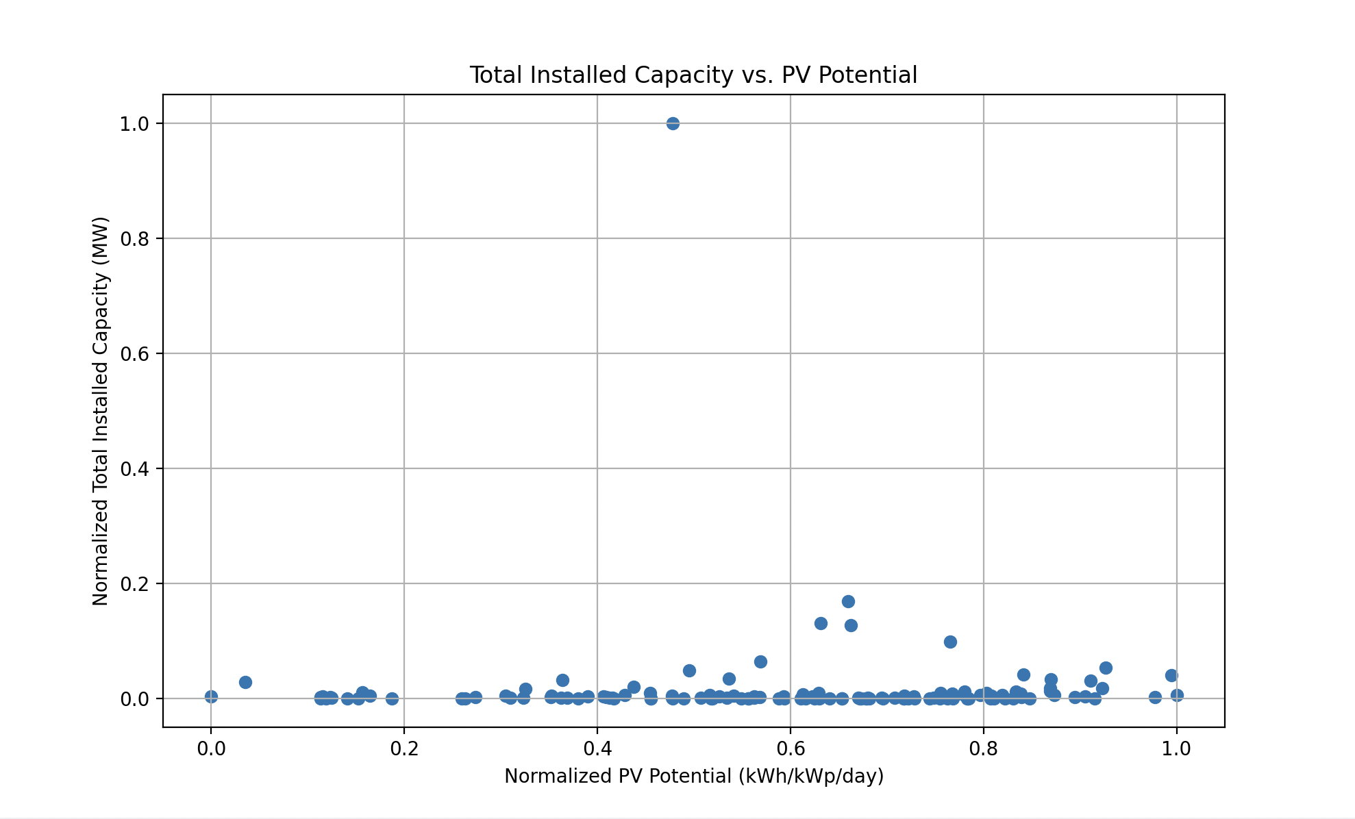
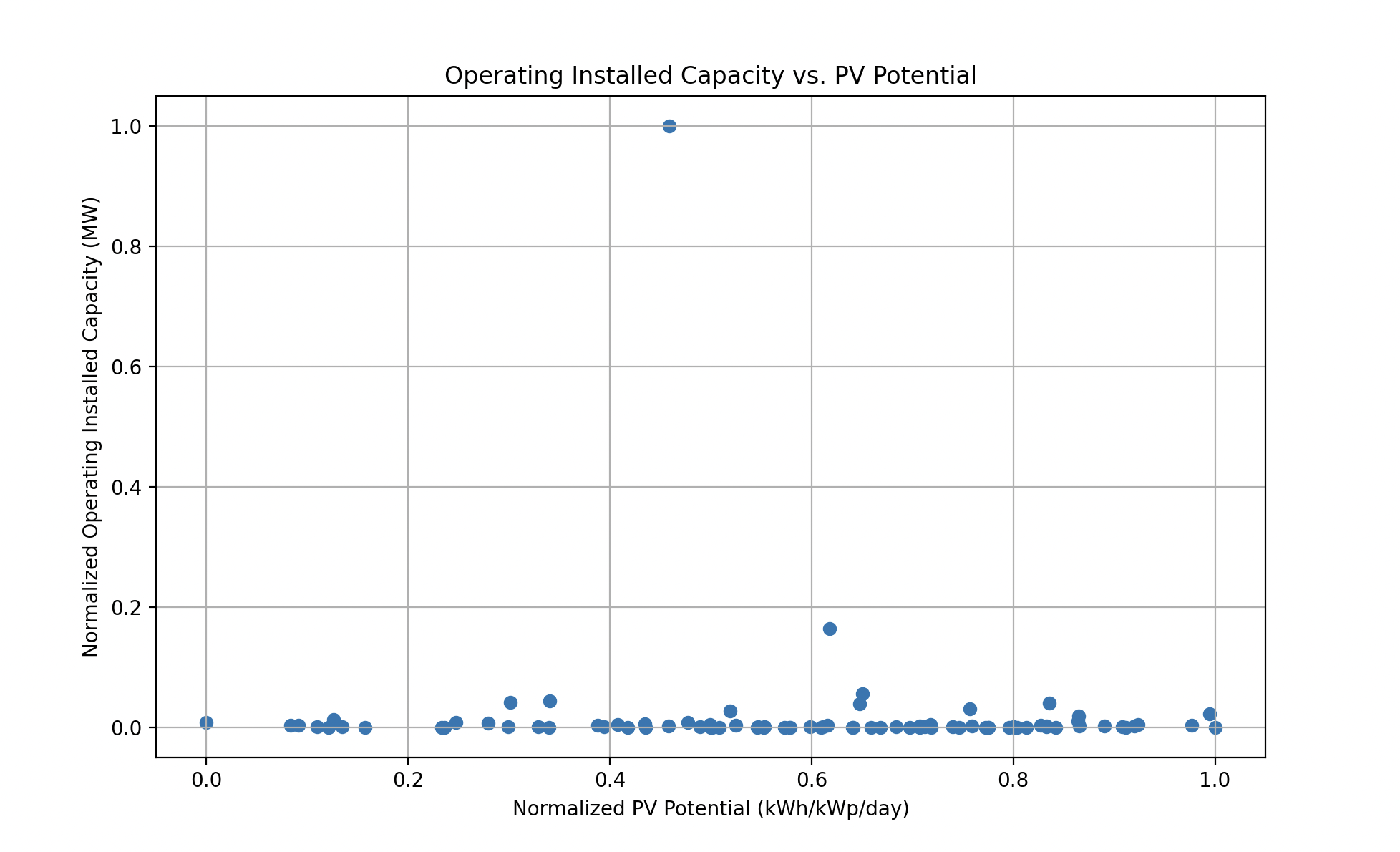
- Correlation: Both scatter plots show most data points clustered near the origin, indicating that for most countries, both the normalized installed capacity and normalized PV potential are low. There are a few countries with higher normalized installed capacity, but they do not necessarily have the highest PV potential, suggesting that factors other than just potential influence the development of solar capacity.
- Outliers: There are a few outliers with high normalized installed capacity, which may be due to a high level of solar development or possibly smaller countries where the normalization process makes their relative capacity appear larger.
- Data Density: The dense clustering at the lower end could suggest that many countries are still in the early stages of developing their solar capacity or that the normalization process has compressed the scale, making it difficult to discern between countries with small differences in capacity.
Overall Observations:
- There's a general trend that countries are not fully exploiting their solar potential, as indicated by the consistently high potential versus actual installed capacity.
- The outliers in the scatter plot, particularly those with high installed capacity but not necessarily high potential, may be countries with favorable solar policies, economic conditions, or other factors that support solar development.
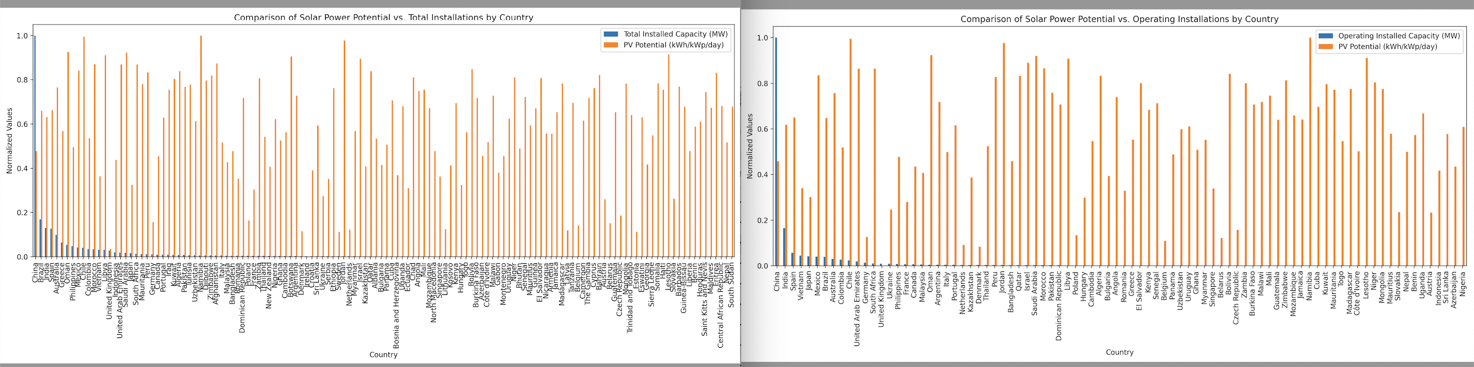
- The similarity between the "Total" and "Operating" plots suggests that the majority of the installed capacity comes from operating solar farms, and other statuses like "under construction" or "planned" do not yet significantly contribute to the installed capacity figures.
Considerations for Further Analysis:
- Investigating the reasons behind the high potential but low actual installations in many countries could provide insights into barriers to solar deployment.
- Examining the outliers with high installed capacity could reveal successful strategies or conditions that promote solar energy development.
- Including additional data, such as economic, policy, or energy consumption figures, might provide a more comprehensive understanding of the solar energy landscape.
These plots are a starting point for discussion, and further analysis would be needed to draw more detailed conclusions.

Log in or sign up for Devpost to join the conversation.