


Inspiration
A lot of people in our own families have wondered whether switching to solar is actually worth it, and where it makes the most financial sense. When we looked at Zenpower's dataset, we realized they were asking the same questions from a business angle: which customers to target, which regions have the highest untapped potential, and how to make a compelling case for solar adoption. That overlap felt like a natural fit. We decided to build an interactive dashboard that could answer those questions for both a sales team and an individual homeowner at the same time.
Problem Statement
We took on the Zenpower track, intending to design an interactive, responsive, and visually rich analytics platform that helps Zenpower expand its business operations. The core challenge was turning raw permit records, solar resource data, and electricity rates into clear, actionable insights about where solar demand exists, where it is growing, and how to quantify the savings potential for any given customer or region. We prioritized UI/UX throughout, because data that is hard to read does not get used.
What It Does and How It Helps
Solar IQ gives Zenpower a full-picture view of the US solar market, from national trends down to individual ZIP codes. Every visualization is designed to answer a specific business question.
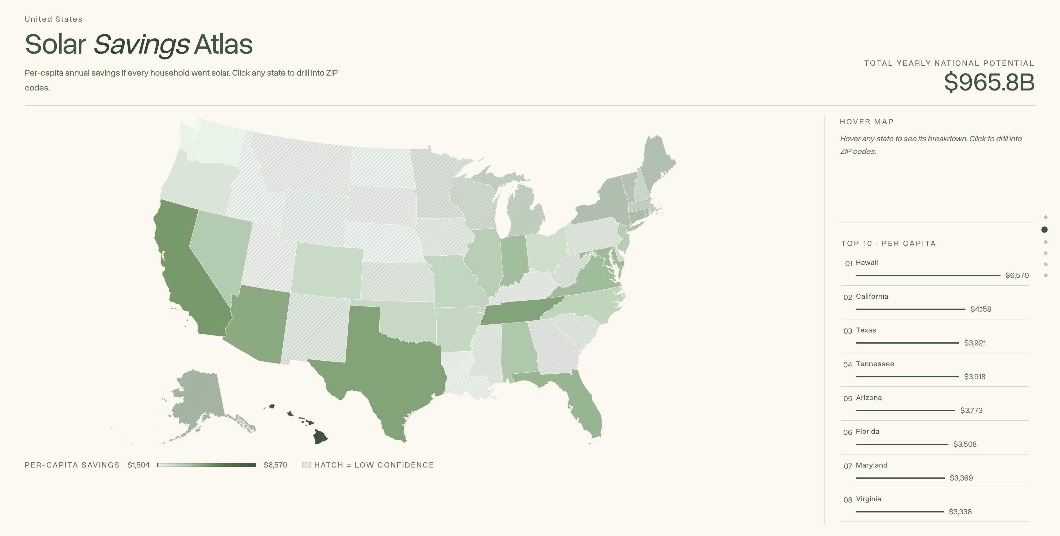
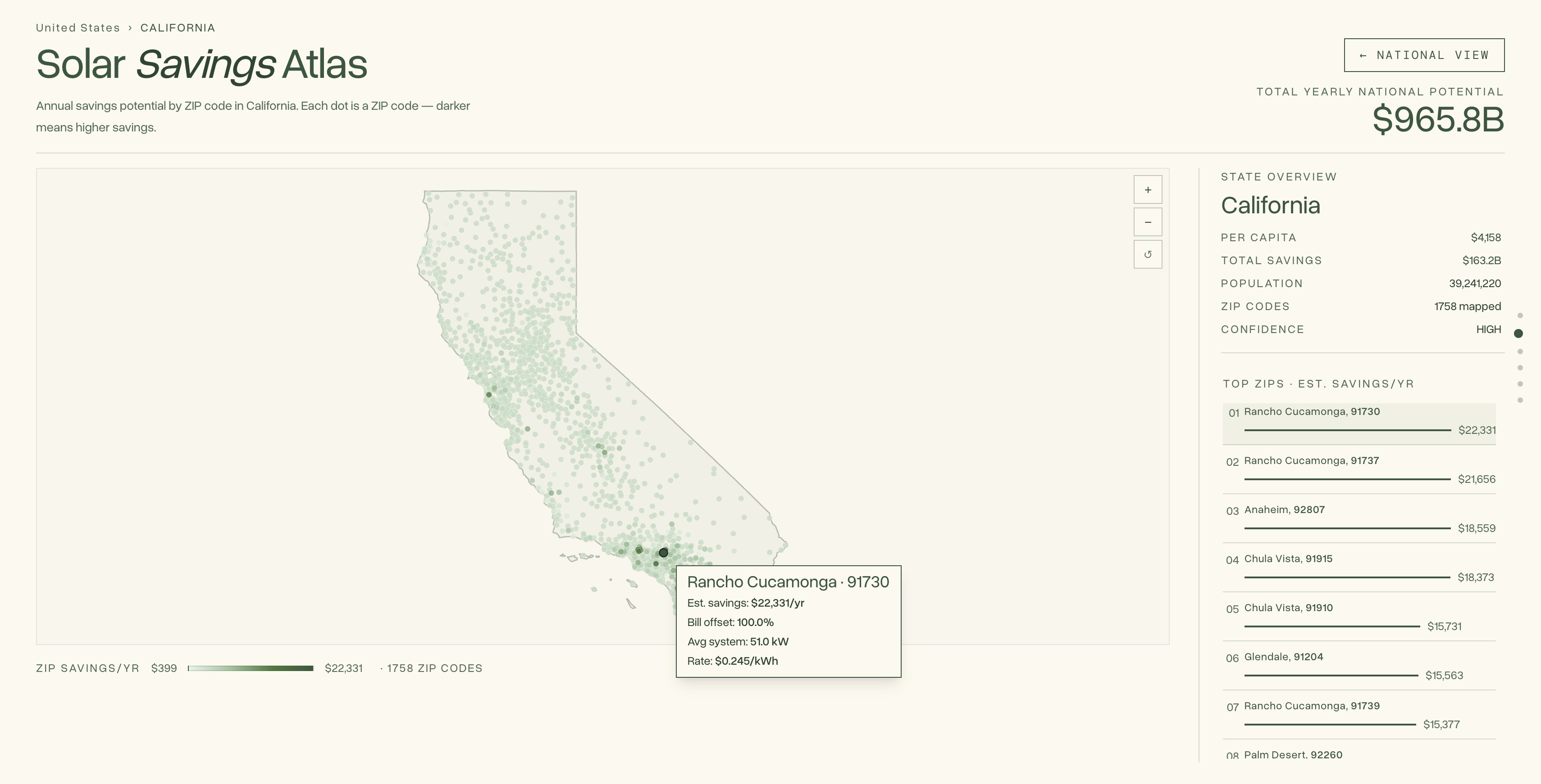
Solar Savings Atlas maps per-capita annual savings potential across all 50 states, then lets you drill into any state to see savings by ZIP code. For Zenpower, this allows the team to visually identify which municipalities have the highest financial incentive for customers to switch or maintain solar, and prioritize outreach accordingly.
Potential Savings Calculator lets a sales rep or prospective customer enter any ZIP code and monthly electricity bill and instantly see their estimated annual savings. It cross-references local irradiance scores from NREL with state-level utility rates from the EIA to produce a personalized number, ensuring calculations are accurate and location-specific.
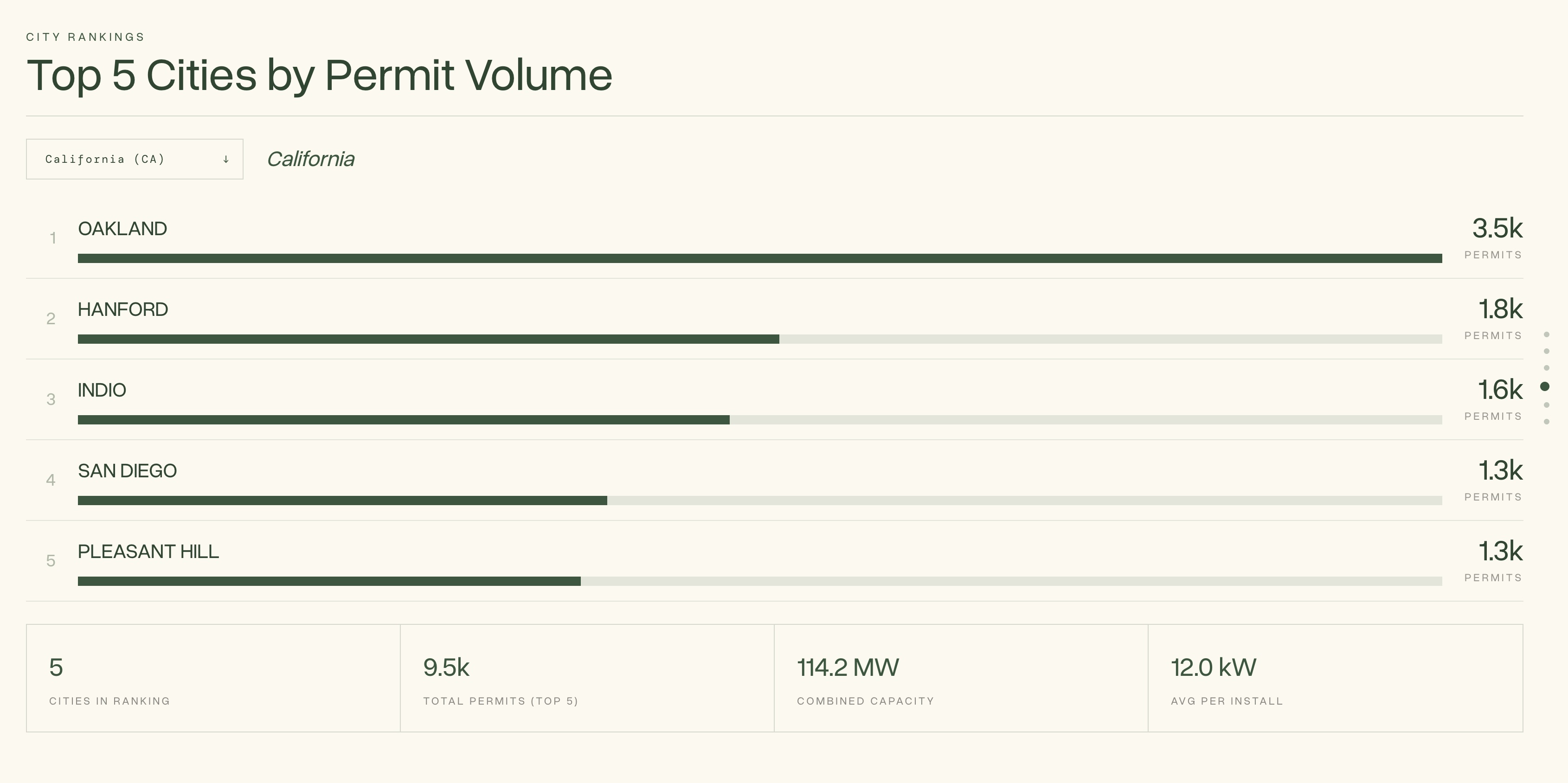
Top 5 Cities by Permit Volume ranks the most active solar markets by total permit count, filterable by state. This helps Zenpower identify where demand is already proven and where a sales push is most likely to find receptive customers.
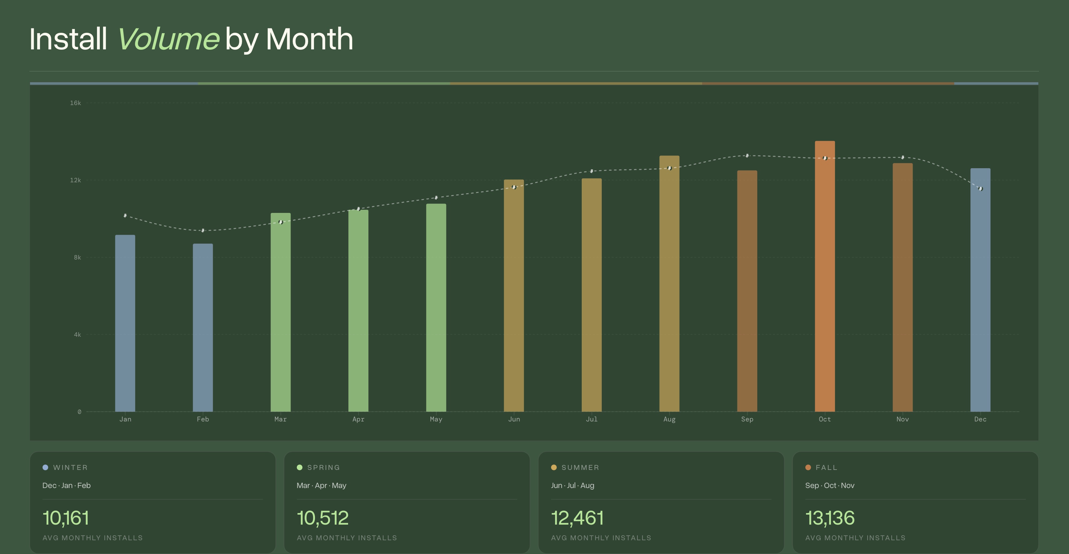
Install Volume by Month shows seasonal trends in solar installations going back over a decade. Spring is consistently the peak season, which gives Zenpower a data-backed case for when to ramp up marketing and sales capacity to capture customers at the right time.
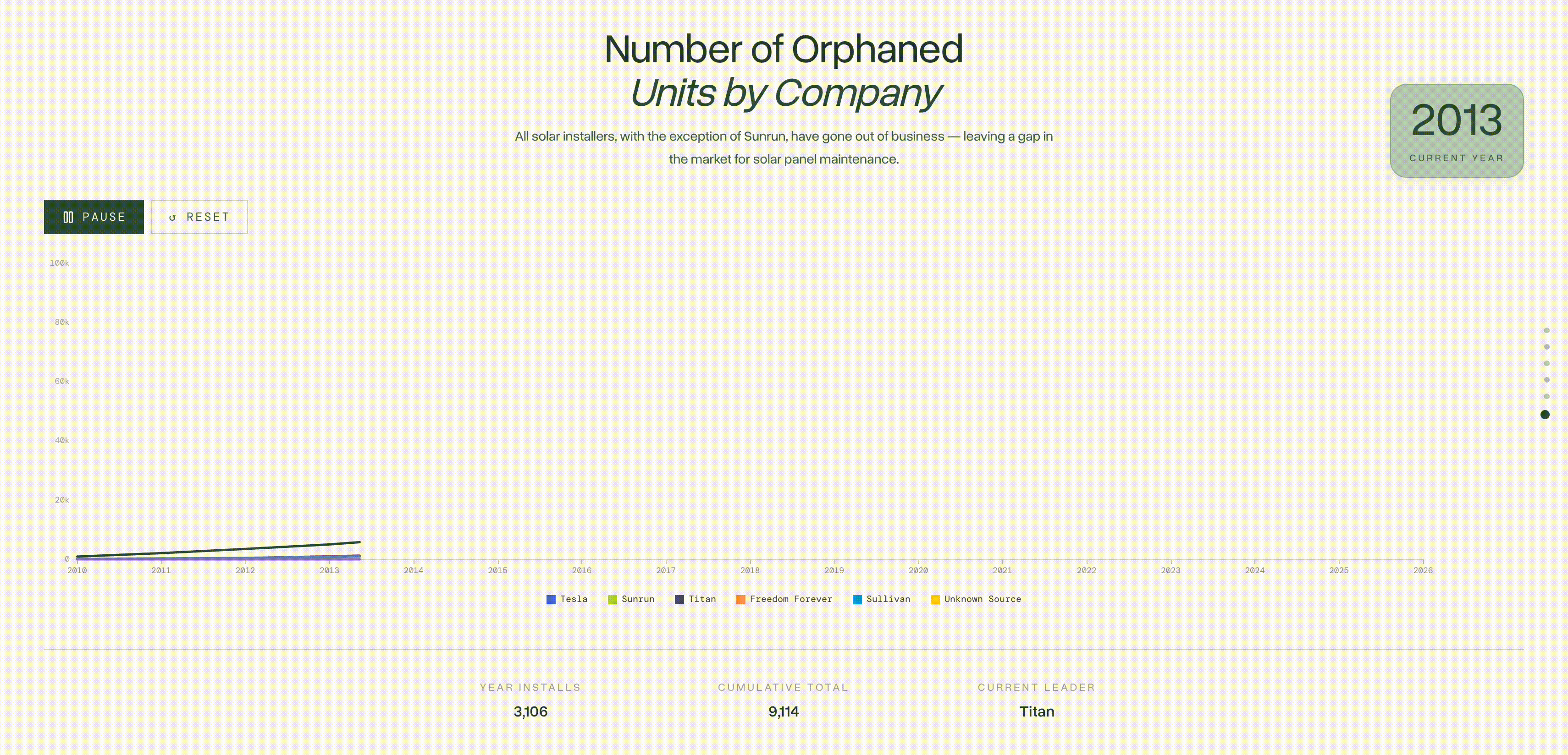
Orphaned Units by Company is an animated timeline showing cumulative installs by installer from 2010 to the present. Except Sunrun, every major installer in the dataset has gone out of business, which means hundreds of thousands of solar panels now have no service provider. This is Zenpower's core market opportunity, and this chart makes the scale of it impossible to ignore.
The platform focuses on customer acquisition as its primary value: helping Zenpower find the right regions, the right seasons, and the right customers to target with confidence.
How We Built It
Data Sources
- Zenpower / Records Dataset: The core permit records database covering installs from multiple companies, including issue dates, system sizes in kW, and ZIP codes
- Sullivan Solar, Titan Solar, Sunrun, Freedom Forever: Supplemental installer datasets, some address-based, which we parsed with regex to extract ZIP codes
- NREL Solar Resource API: ZIP-level irradiance data (GHI, DNI, and optimal-tilt values) fetched with a multi-threaded script with exponential backoff and checkpoint resumption
- EIA Annual Electric Power Industry Report: State-level residential electricity rates, used to convert kWh generation into dollar savings
- US Census ZCTA Population Data: Household counts per ZIP code used to project city-level full-adoption scenarios
- US Census ZIP Code Shapefiles / GeoJSON: Geographic polygon boundaries for all ZIP codes, used to build the choropleth maps
Data Pipeline
Our Python pipeline (pipeline.py) runs seven analytical queries against the cleaned and merged data to calculate savings and other metrics.
The savings formula is: `avg_kw * tilt_annual * 365 * 0.80 * electricity_rate, where tilt_annual is the optimal-tilt irradiance from NREL serving as a proxy for peak sun hours, and 0.80 accounts for real-world system losses.
Tech Stack
- React 19 + TypeScript, TanStack Start (SSR), TanStack Router
- Vite
- Tailwind CSS
- Apache ECharts
- D3-geo + TopoJSON (choropleth maps)
- Three.js (3D isometric house on the hero)
- Shapely (Python, geometry simplification)
- NREL Solar Resource API, EIA 861, US Census, Zenpower dataset
Challenges We Ran Into
The biggest challenge was data coverage. We found that not every ZIP code has a permit history, not every permit has a system size recorded, and NREL irradiance data does not exist for every ZCTA. To avoid leaving huge gaps in the national map, we built a three-tier geographic fallback: if a ZIP has no observed data, we substitute the state mean; if the state mean is also unavailable, we fall back to a national constant. We tracked the source of every estimate (observed, state mean, or constant) so confidence levels are reflected in the visualization.
We also had to unify five different installer datasets that each used different schemas, some with explicit ZIP codes and some with raw addresses that needed to be parsed. Regex-based address parsing with ZIP extraction let us bring those into the same pipeline without losing install records.
Accomplishments We're Proud Of
This was our first time working with 3D models in Three.js, and getting the house on the hero section to feel polished was a real highlight and a visualization we all love. We are also proud of the D3-based choropleth map, which required learning how geographic projections, TopoJSON, and custom color scales work together directly in the browser. Building that from scratch rather than relying on a mapping library gave us a lot of control over the design.
We're proud to have learned a lot about working with geospatial data through navigating the differences between postal ZIP codes and Census ZCTAs. We also got a much better understanding of how solar economics actually work. This project helped us decipher how irradiance, system size, efficiency losses, and utility rates combine into a savings estimate, and where the uncertainty lies through making those calculations.
What's Next for Solar IQ
We would love to connect with the Zenpower team to better understand their specific sales workflows and add features that map directly to how they operate. On the data side, we are interested in incorporating the DSIRE API to layer in state and local solar incentives, rebates, and net metering policies, since those can dramatically change the ROI calculation for a given customer. A more comprehensive regional policy view would make the savings estimates more accurate and the pitch to homeowners even stronger.
Resources
- ZenPower GitHub: https://github.com/Zen-Power-Solar/DataHacks-ZenPower-Challenge-Spring-2026/tree/main
- Location Data by ZIP: https://www.kaggle.com/datasets/manishagarwal/us-zip-geojson-w-approx-zcta-census-data?resource=download
- Population Data from US Census: https://data.census.gov/table?t=Counts,+Estimates,+and+Projections:Population+Total&g=010XX00US$8600000
- Annual Industry Power Report (EIA): https://www.eia.gov/electricity/data/eia861/
- NREL API (Solar Irradiance): https://developer.nrel.gov/docs/solar/solar-resource-v1/
Built With
- d3.js
- echarts
- geopandas
- nrel-solar
- python
- react
- shapely
- tailwind
- tanstack
- three.js
- topojson
- typescript
- vercel
- vite


Log in or sign up for Devpost to join the conversation.