-
-
SnapFont app icon.
-
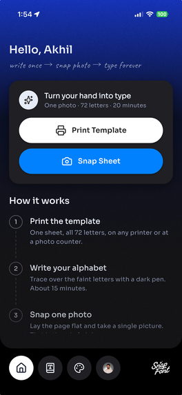
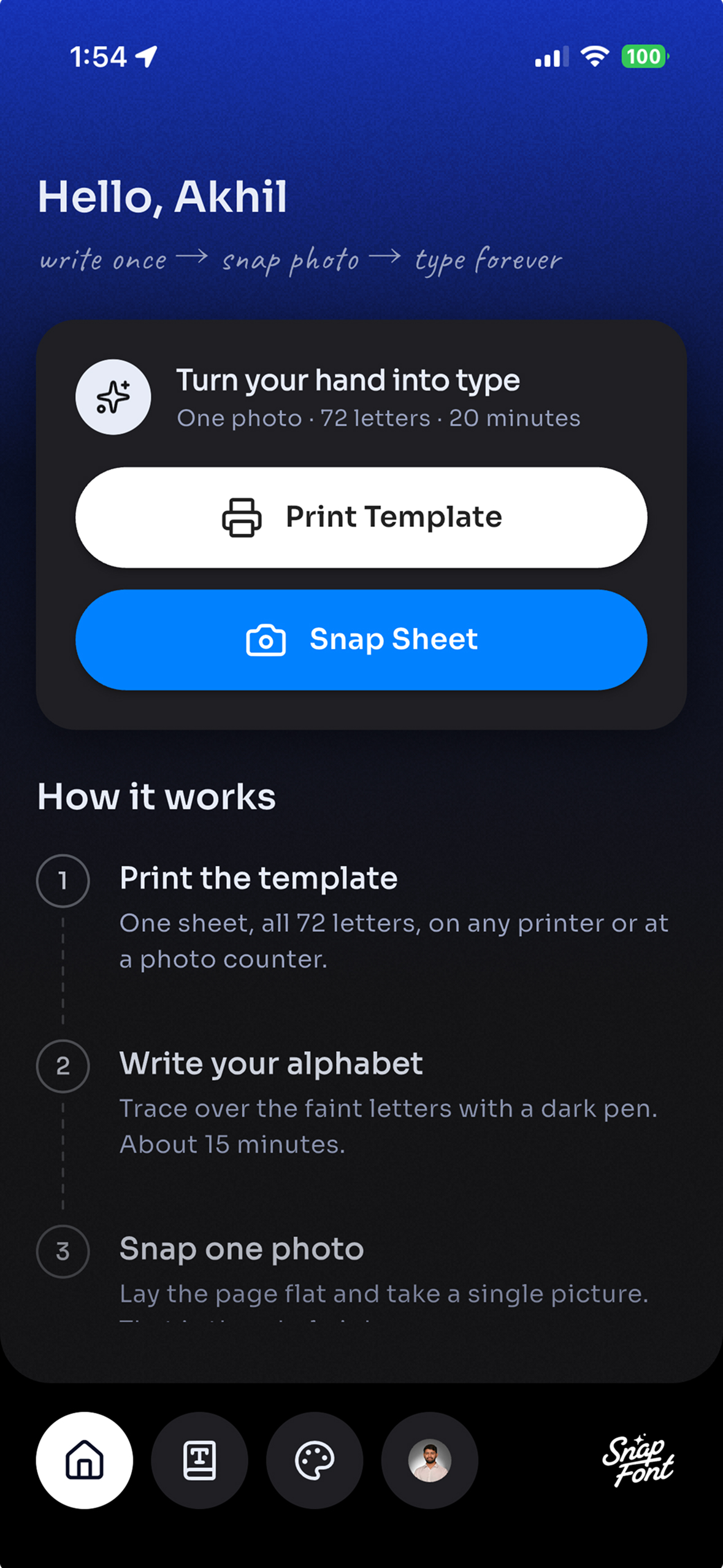
Print the template, write your letters, and scan one sheet to create your handwriting font.
-
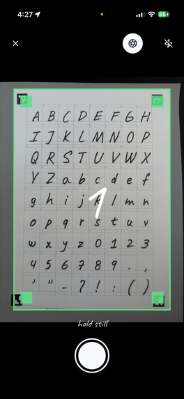
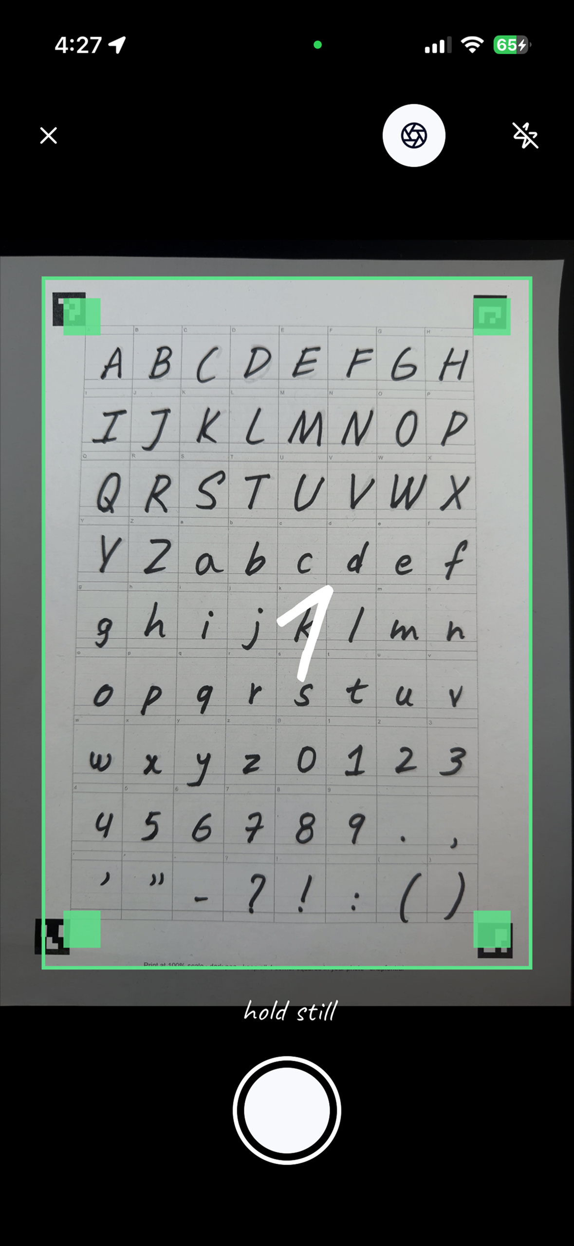
Camera guidance helps frame the sheet and its corner markers for a clear photo.
-
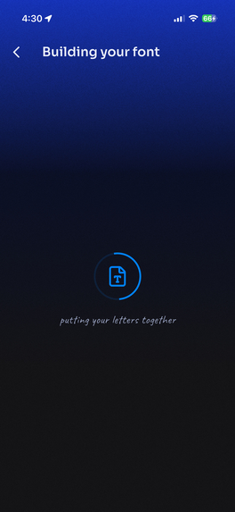
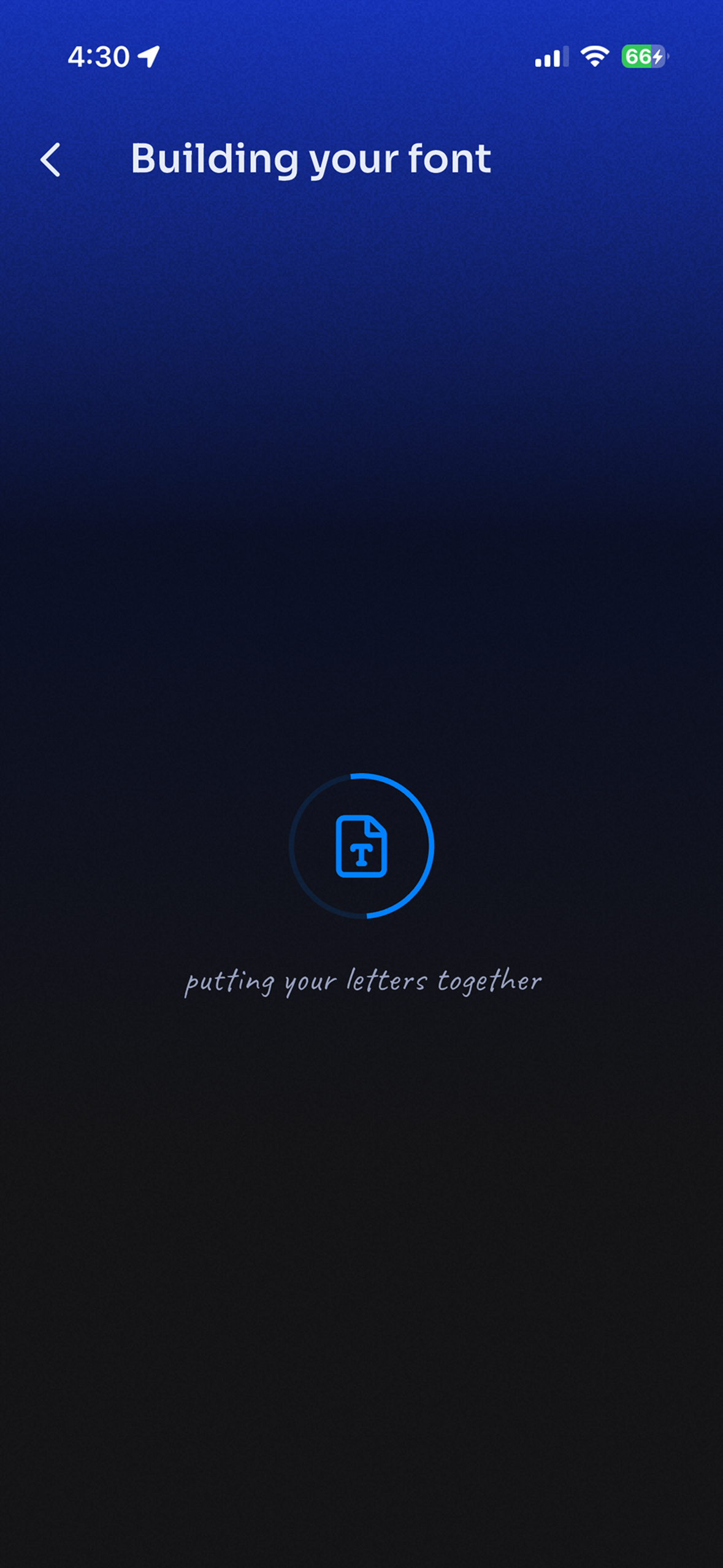
SnapFont processes the captured letters and builds your personal font.
-
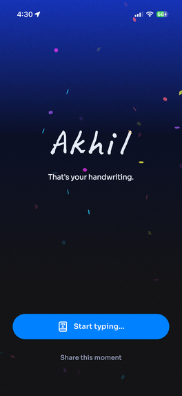
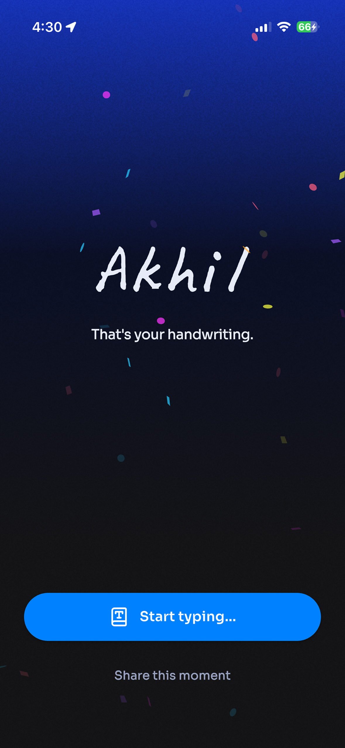
The reveal: your name appears in your own handwriting before you are asked to create an account.
-
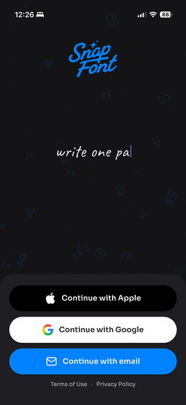
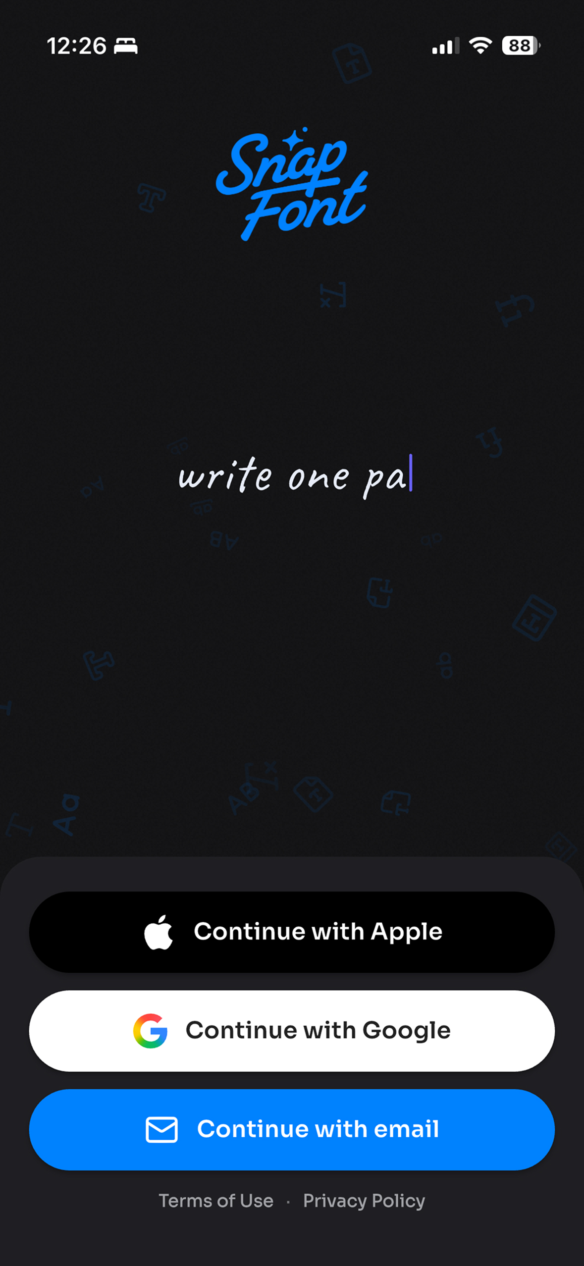
Save your progress by signing in with Apple, Google, or email after the handwriting reveal.
-
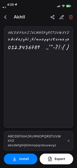
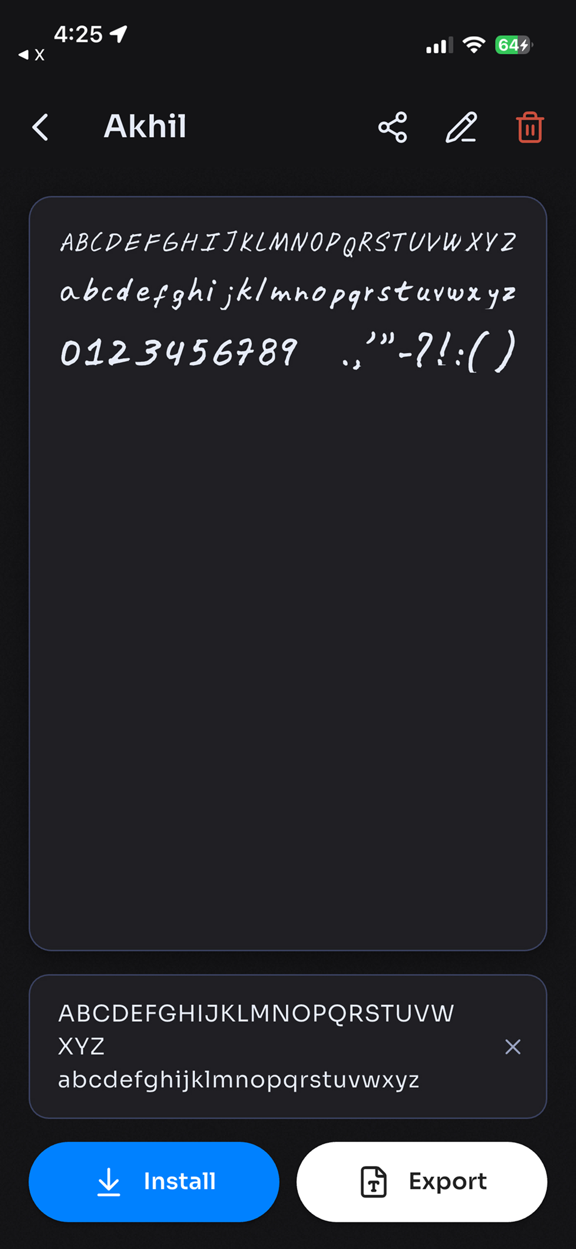
Preview your letters, numbers, and punctuation, then install or export your font.
-
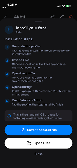
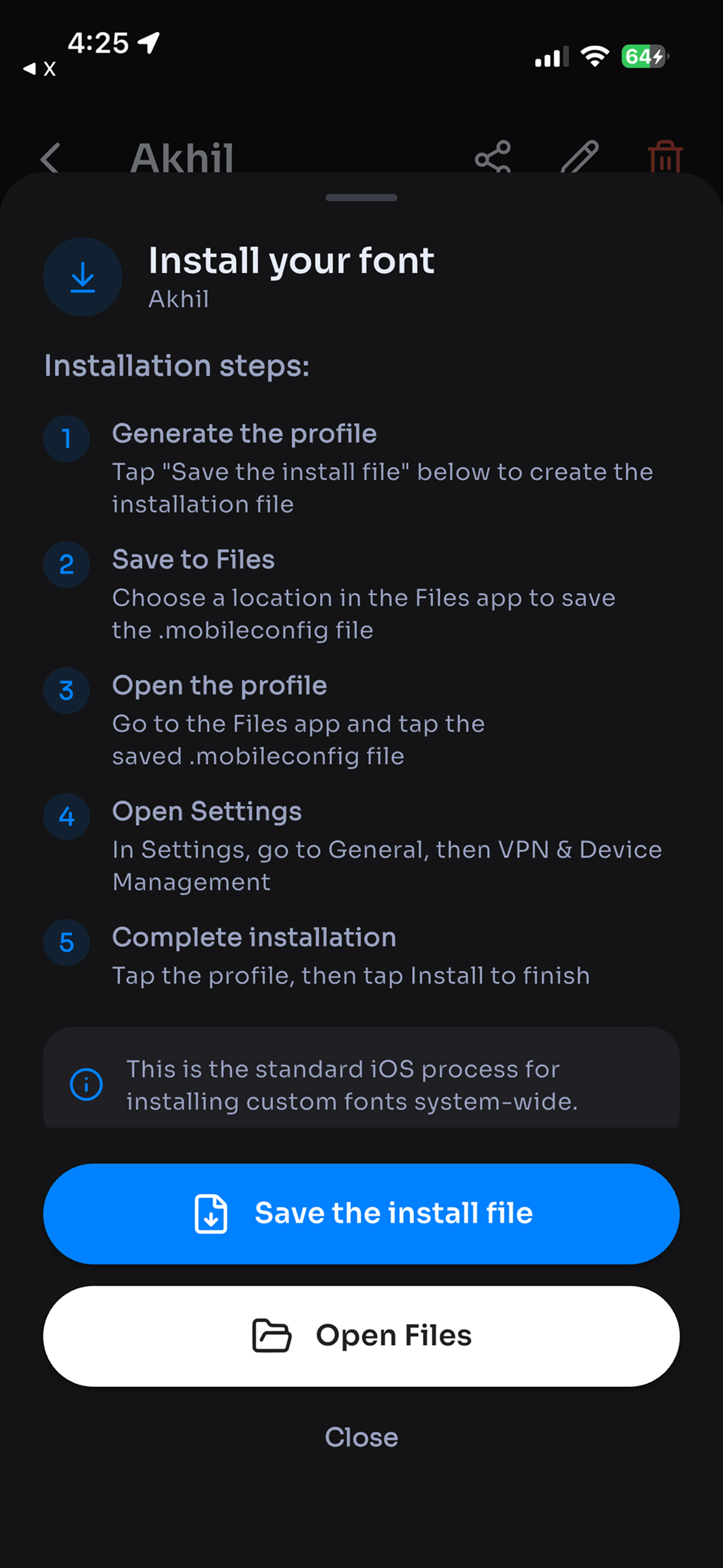
Guided iOS installation walks you through saving the font profile and installing it in Settings.
-
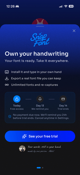
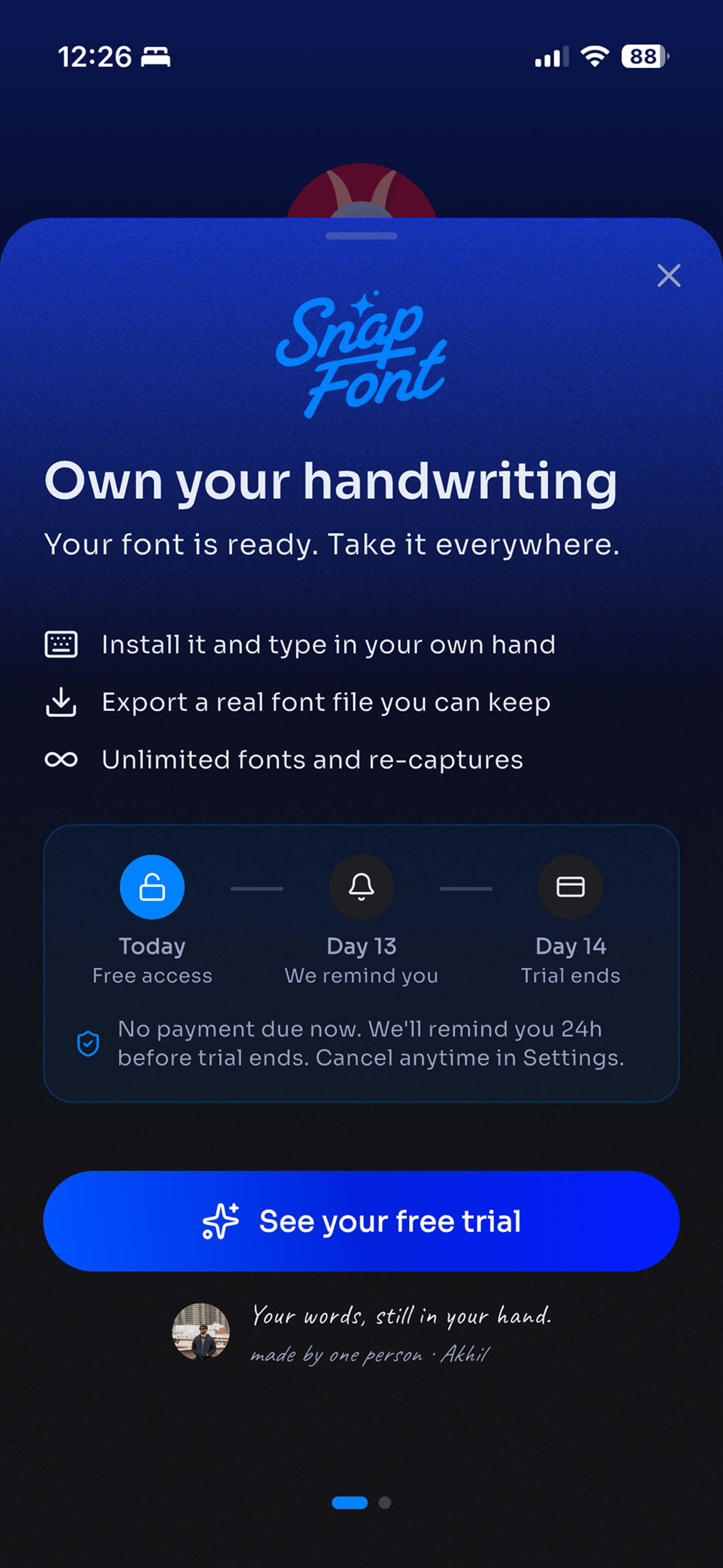
Explore Pro benefits and the 14-day trial timeline after seeing your handwriting come to life.
-
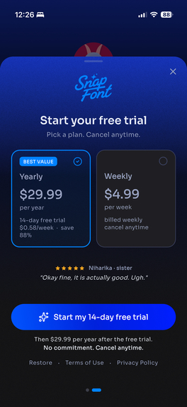
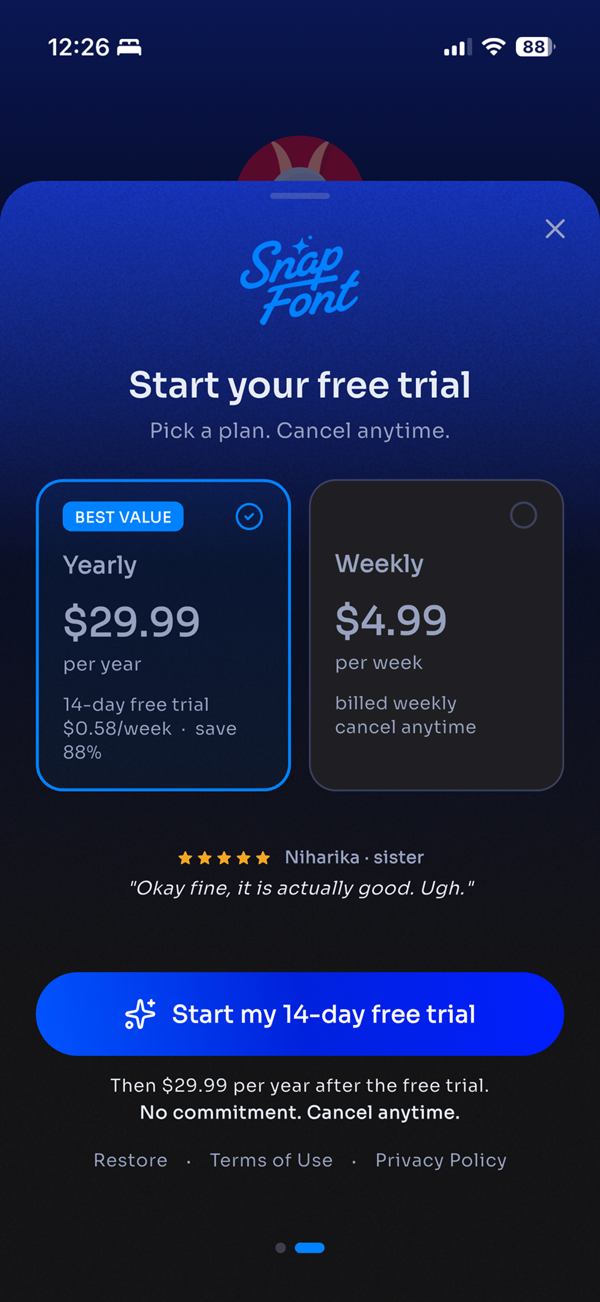
Choose an annual or weekly plan, with a 14-day free trial shown for the annual plan.
Inspiration
I shipped a handwriting font app before this one. It worked, and I could not honestly recommend it to anybody.
To make a font it asked you to photograph your letters one at a time. Sixty plus photos, one per character, each one framed and cropped by hand. People started, got somewhere around the letter M, and quit. The reviews said the same thing in different words: I gave up.
The problem was never the font engineering, which is the part I had spent months on. It was the twenty minutes of tedium standing in front of it. A feature nobody finishes is not a feature, it is a wall with your logo on it. SnapFont exists to take that wall down.
What it does
You print one sheet and trace the faint letters on it with a dark pen. It takes about fifteen minutes and feels closer to handwriting practice than to filling in a form. Then you photograph the page, once, and that is the entire input.
The app finds the four corner markers, corrects the perspective for whatever angle you held the phone at, cuts out all seventy two letters, cleans them up, traces them into outlines, and builds a real TrueType font. Then it shows you a sentence typing itself in your own hand.
I would rather not oversell the timing. Fifteen of those twenty minutes are you writing. The part the app does takes about a minute on a decent connection.
Installing it, where the two platforms stop being the same
On iPhone and iPad the font installs system wide. The app wraps your TrueType file in a com.apple.font configuration profile, hands it to the share sheet, and walks you through saving it into Files and confirming it in Settings. After that your handwriting is simply a font: available in Pages, Keynote, Notes, and anything else that reads the system font list.
It is three steps and I could not get it down to two. Apple does not let an app install a font silently, and I decided that hiding that behind a spinner would be worse than admitting it. So the install sheet says plainly which step you are on and offers to drop you into the Files app at the point where you need it.
Android does not permit a system wide font install at all without root, so there the app exports the .ttf and hands it to anything that accepts a custom font. I would rather ship the honest version of a platform limit than paper over it.
One purchase, two phones
Pro is a subscription, sold through RevenueCat on both stores.
When a purchase completes, the RevenueCat webhook reaches my backend and mints a license key shaped SNAP-XXXX-XXXX. The buyer reads that key inside the app and can redeem it on one more device.
There are two decisions in there I would defend. The key alphabet contains no zero, no O, no one, no I and no L, because these keys get read aloud across a room and retyped by somebody who is already mildly annoyed. And the entitlement lives in Firestore rather than inside either store's receipt, which means the second device does not have to be on the same platform as the first. Someone who bought on an iPhone can put their own handwriting on their partner's Android phone.
Handwriting is personal. Charging the same person twice for their own handwriting felt wrong, and the license key was the cheapest honest way out of it.
How I built it
Flutter, one codebase for iPhone, iPad and Android.
The pipeline runs on Cloud Run in Python: ArUco markers for the corner detection, OpenCV for the segmentation and cleanup, and the TrueType build itself happens server side. Every letter is scored against the others so the font is calibrated to your own baseline rather than to a generic one. That mattered more than I expected. Handwriting that is internally consistent reads as handwriting, and handwriting snapped to a grid reads as a font pretending to be handwriting.
Firebase carries auth, Firestore, Storage, App Check, Crashlytics and push. The landing page is Next.js with a programmatic SEO layer. The whole thing was built in public on X, one post at a time, from day zero.
Challenges I ran into
Seventy two characters, not ninety two. My first template had every character I could think of on it. It was overwhelming, and people wrote worse because of it. Cutting twenty characters made the fonts better, which is not the trade I expected to be making. Tired handwriting is bad handwriting.
The letters had holes in them. My first real font came out with gaps inside the strokes. I fixed the wrong thing twice before finding the actual cause in the thresholding step, and I am not certain I would have found it that week without someone on X recognising the pattern.
When to ask for the account. The first build asked before you had anything. Nobody signs up for a promise. The account is now asked for after you have watched your own handwriting type itself, and never before.
A photo that did not take. The phone and the server disagreed about what counted as a valid sheet, so a perfectly good photo could come back rejected with an error the user could do nothing about. That one cost me a debugging session I did not enjoy.
Two stores, two answers. Apple approved 1.0 and Google rejected the listing on the same day, over a badge on my first screenshot. Both were fair, which was the annoying part.
Accomplishments that I am proud of
The reveal. Watching a sentence type itself in your own handwriting is the moment the whole app is built around, and as far as I can tell it lands.
Twenty minutes start to finish, against an hour of photographing letters one at a time.
Zero setState left in the codebase after a state management audit. iPad support added late without breaking the phone layout, which I did not expect to get away with. And a paywall that does not appear until your font already exists.
What I learned
Building in public changed the app, not just the marketing. I asked which of five App Store screenshots to cut, and the replies told me the whole set was wrong, so I replaced all five. I posted about asking for an account before the font was built, and the answer came back unanimous enough that I moved it that evening.
The other lesson arrived with the Play rejection. A store listing is read by somebody who has never heard of you and gives it half a second. Everything on it has to be true about the app in front of them, not about you. I knew that in the abstract and still had to be told.
What's next for SnapFont
Magic mode, which fills in the letters you did not write in a style matched to the ones you did. The Samsung Galaxy Store. And more languages on the template, starting with the ones people have already asked for.

Log in or sign up for Devpost to join the conversation.