-
This will be on our GitHub!
-
-
-
-
-
-

-
-
-

-
-
-
-
-
-
-

-
-


Inspiration
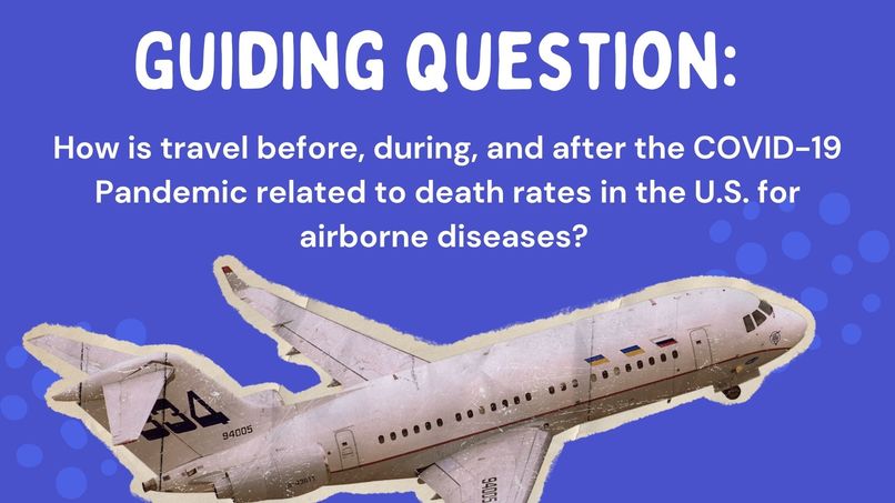
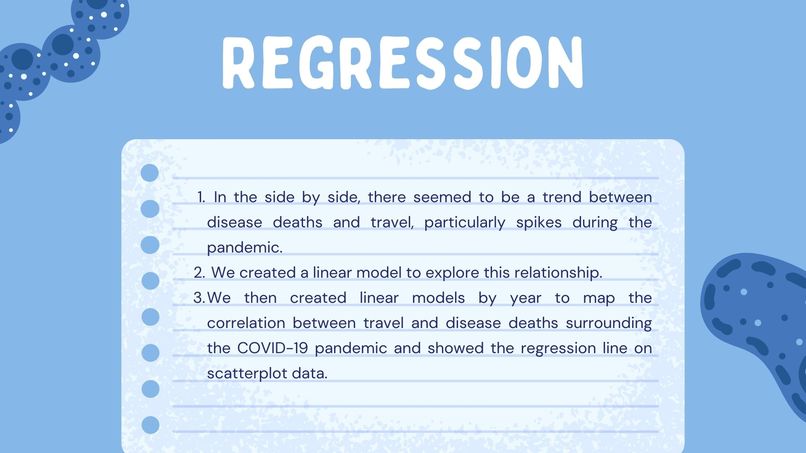
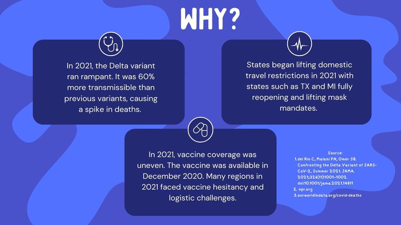
Like many of our peers, our lives changed during the COVID-19 Pandemic. A recurring theme our team experienced was the migration to the virtual realm as the world began to shut down. As the world was cooped behind closed doors, many were eager for human connection. As travel restrictions lifted, reports of spikes in cases around travel hotspots followed. Our team wanted to explore travel patterns during the pandemic and its impact on deaths of COVID-19 and two other airborne diseases: pneumonia and the influenza virus. Since pneumonia and the flu have been common for a longer period than COVID-19, we also wanted to see if the pandemic specifically had an influence on death and travel. We hope that this data can help inform future public health strategies and understand our collective responsibility in safeguarding communities from disease.
What it does
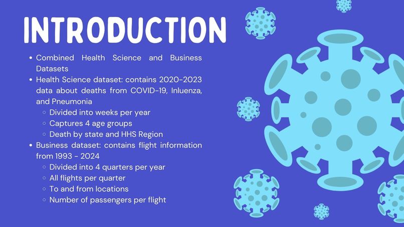
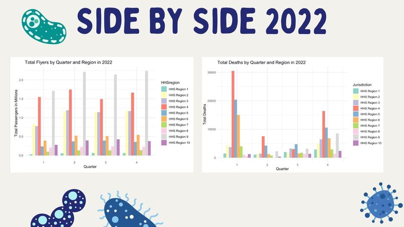
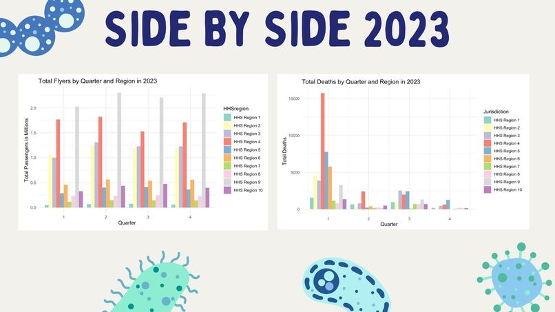
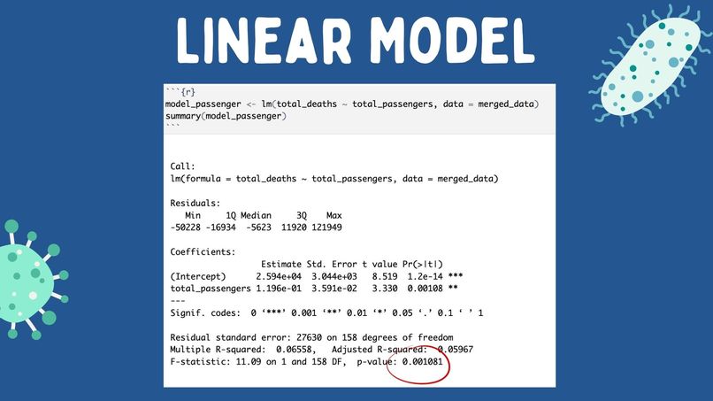
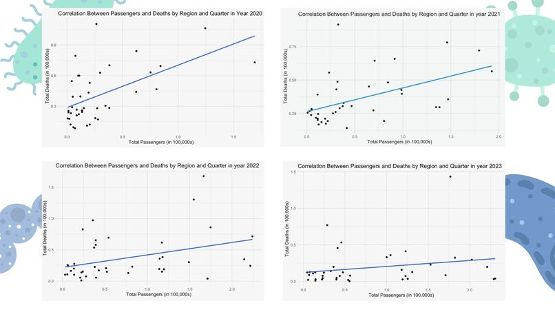
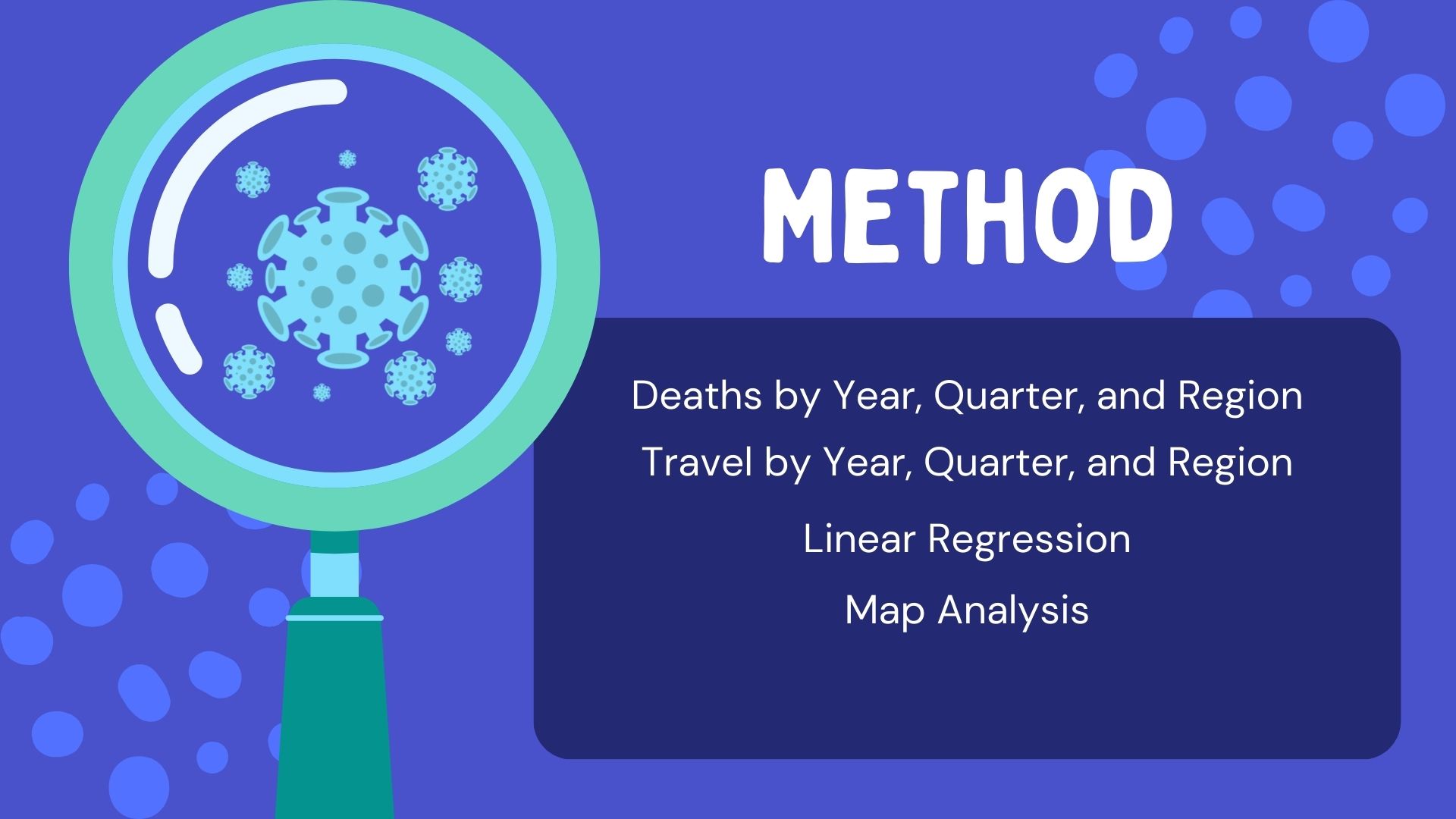
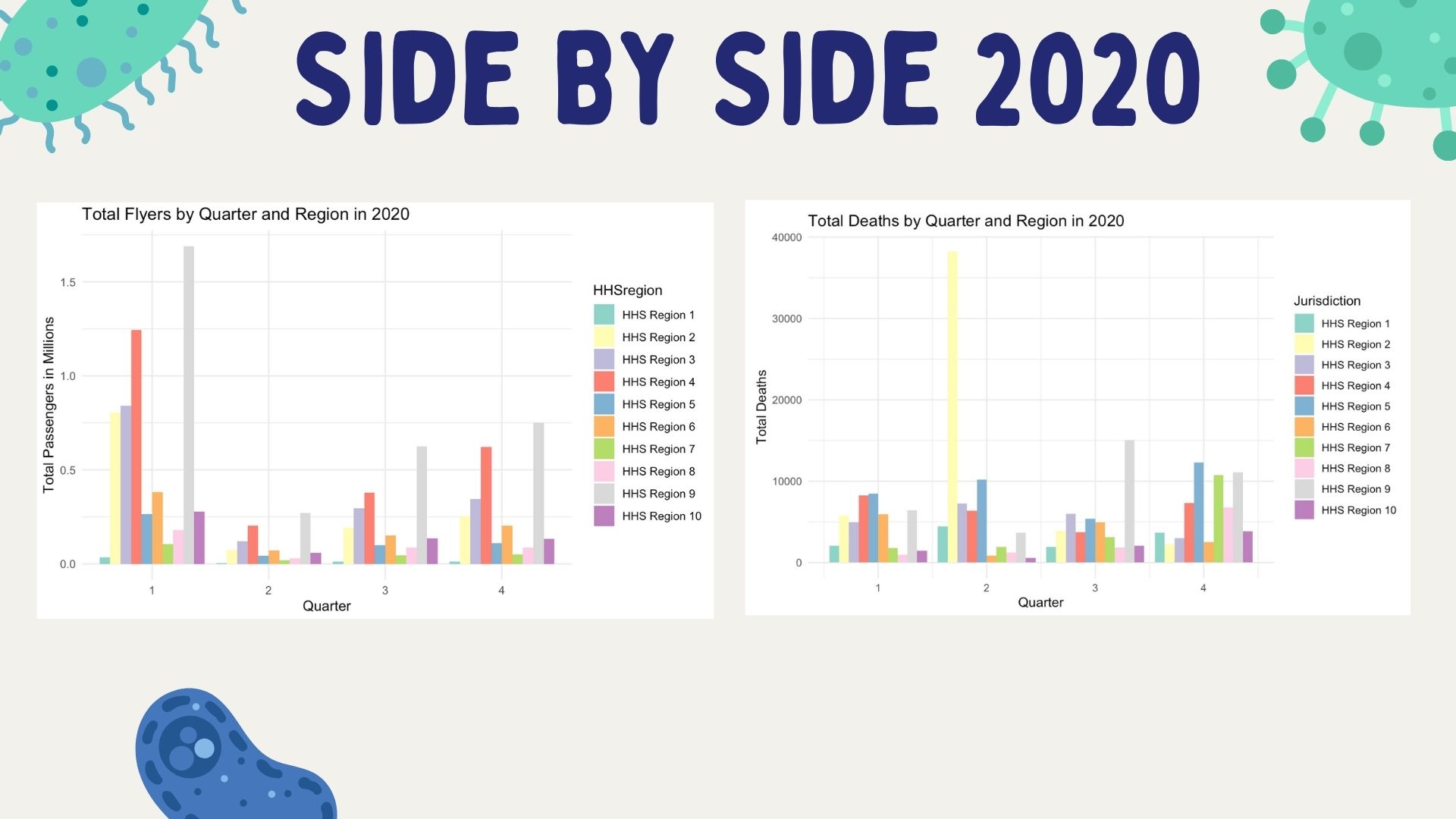
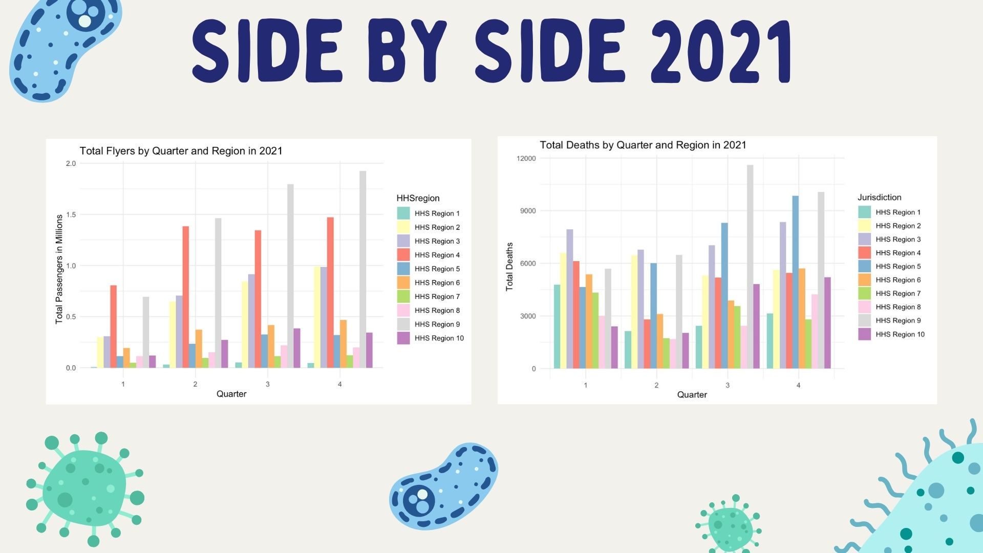
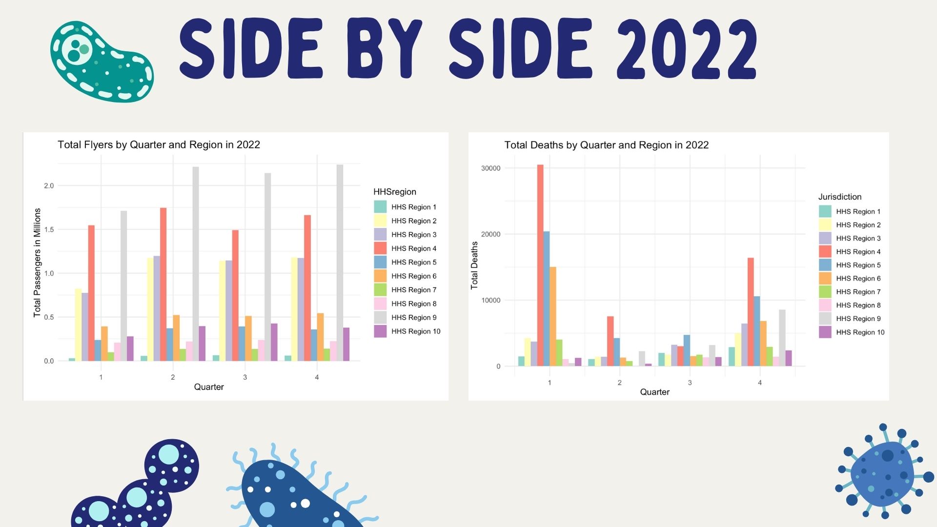
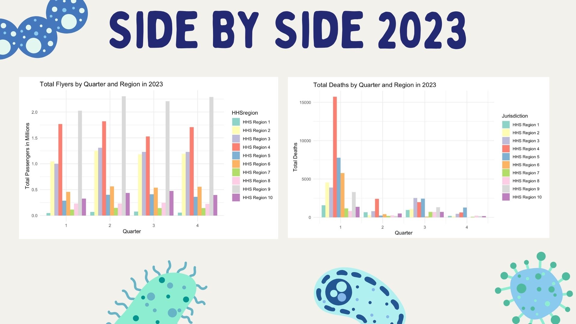
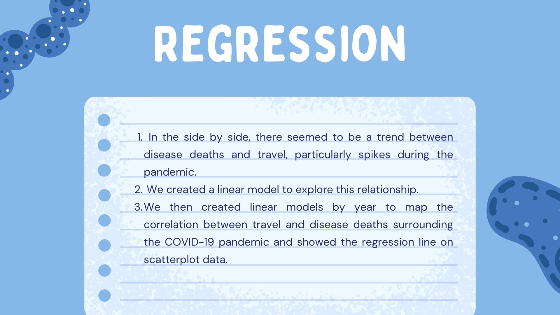
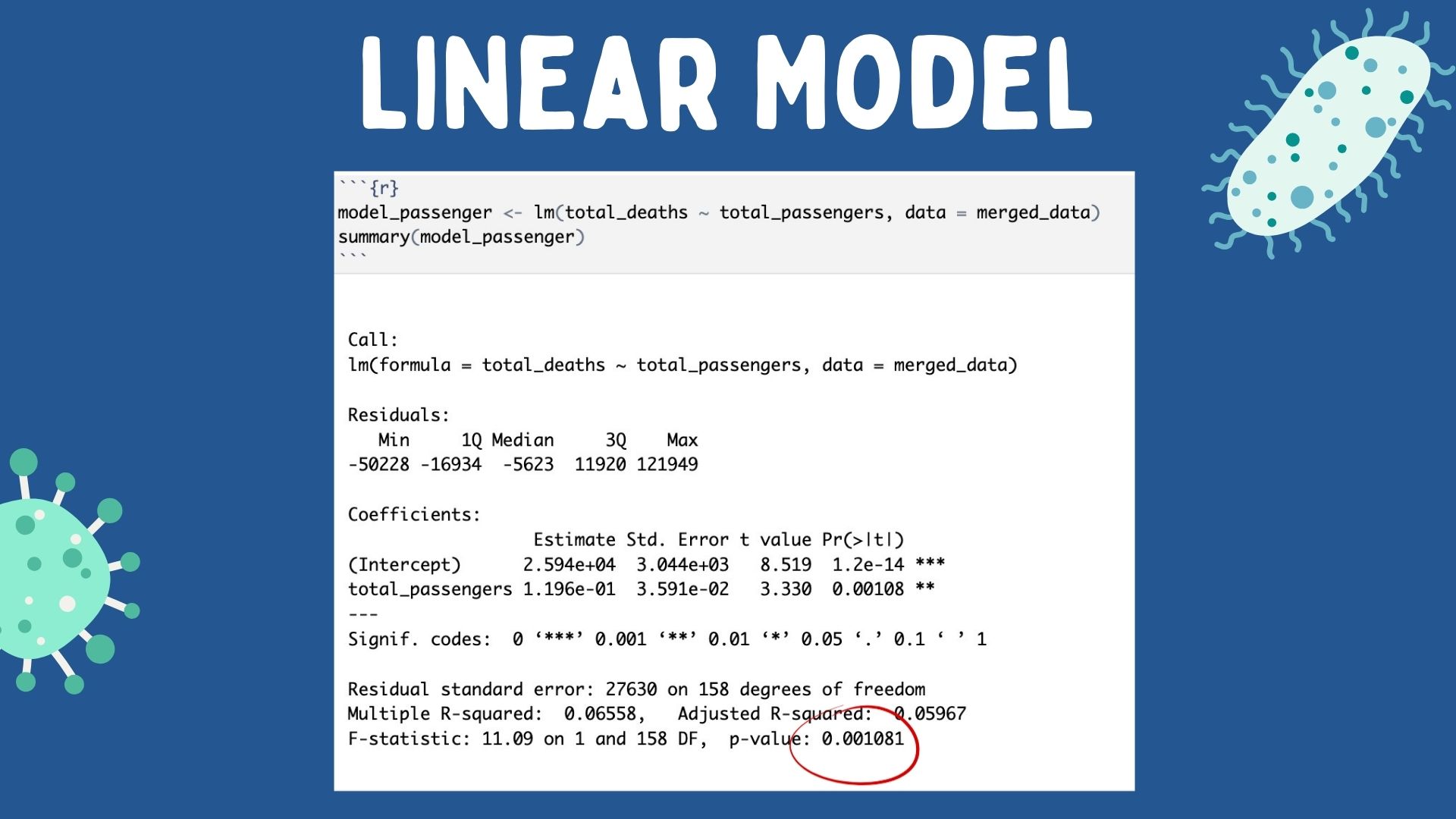
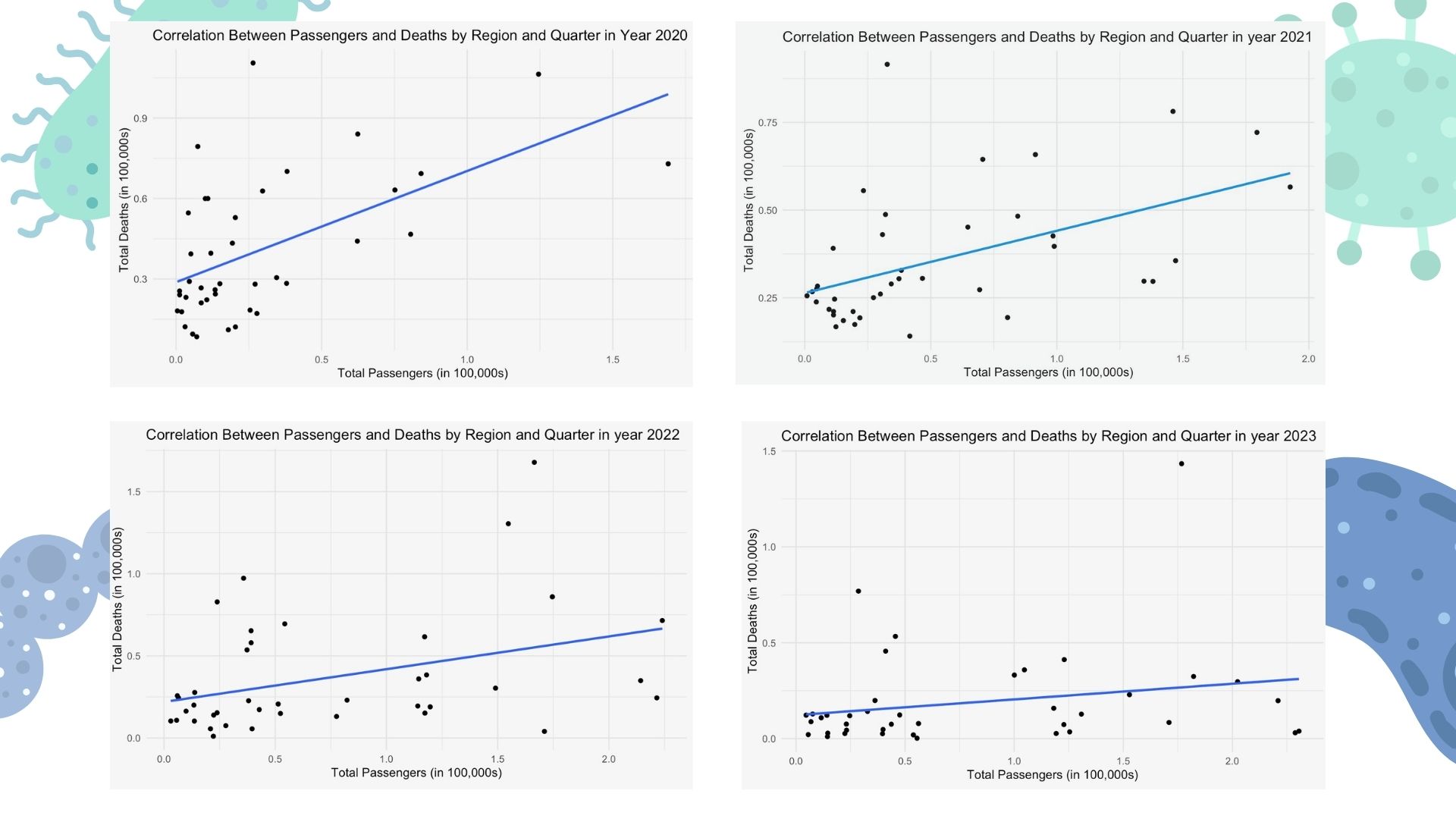
This project analyzes CDC data from 2020-2023 alongside Kaggle U.S. travel data from 2020-2023. The project examines travel trends and death trends analyzed by HHS Regions and year (divided into quarters). It also explores the correlation between total deaths from airborne disease in 2020-2023 and the total passengers that have traveled in 2020-2023 using linear regression.
How we built it
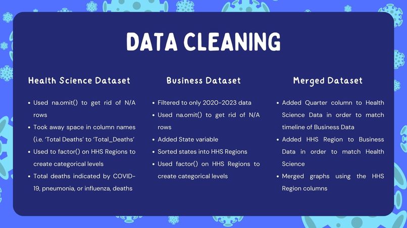
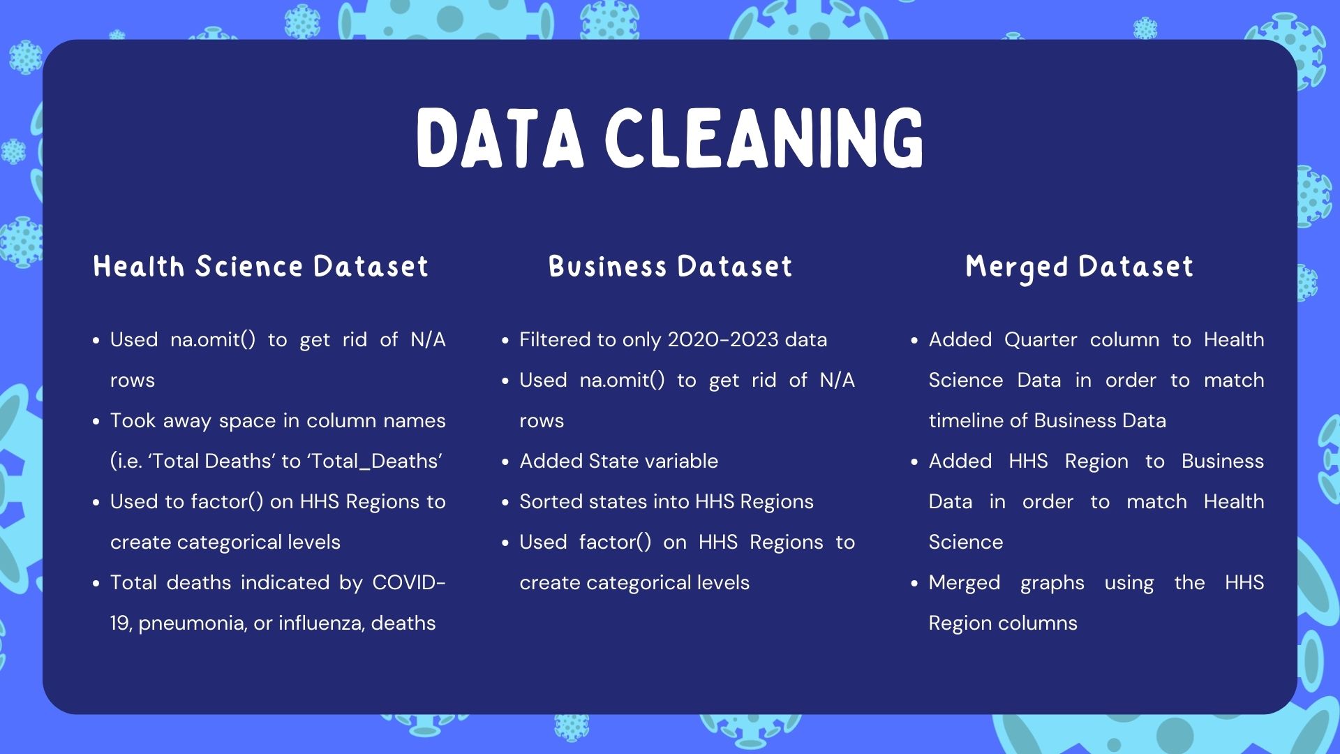
- We cleaned the datasets, omitting N/A rows and creating variables in order to merge the travel and the disease death data using Excel and R.
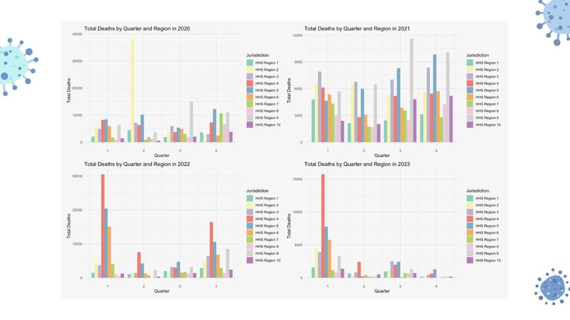
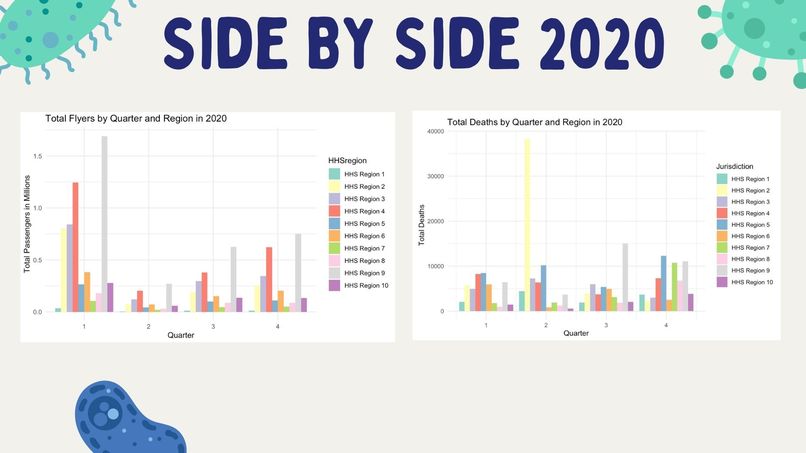
- We created visualizations in order to see trends among U.S. domestic flyers and U.S. deaths cuased by COVID, pneumonia, and influenza using R and Python.
- We ran linear regressions to see the relationship between COVID-19, deaths, and domestic flyers.
- We researched possible causes to explain the correlation between disease deaths and domestic flyers over time.
Challenges we ran into
- N/A rows caused us headaches.
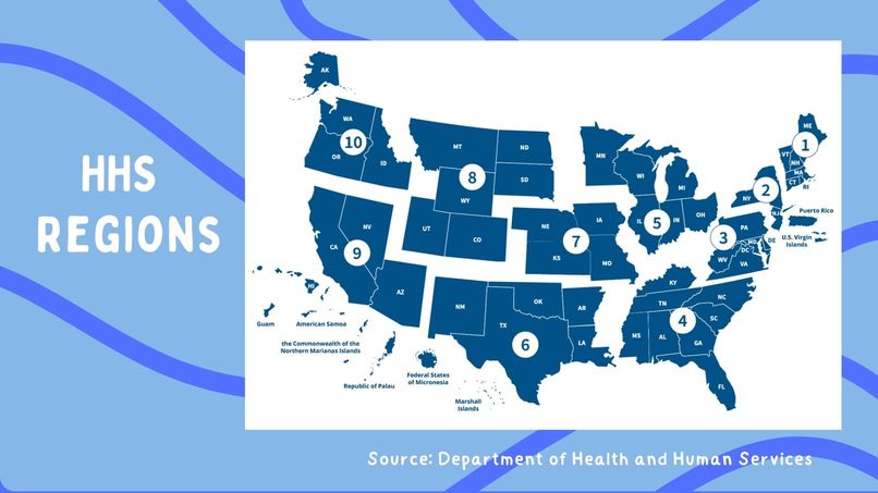
- We needed to create a states column in the travel dataset and sorting the states into HHS regions.
- It was our first time merging data.
- We wanted to create a interactive visualization and needed to figure out how.
- We were unsure of which regression and correlation metrics to use.
Accomplishments that we're proud of
- This is our first data science hackathon! We are proud of finishing it!
- We were able to create an interactive visualizaiton with our data.
- We were able to create graphs that told the story of COVID and travel.
What we learned
- We sharpened our data visualization and storytelling skills.
- We learned how to use R and Python for data science.
- We learned how to merge and more effectively create columns.
- We learned about time management.
What's next for COVID's Story:
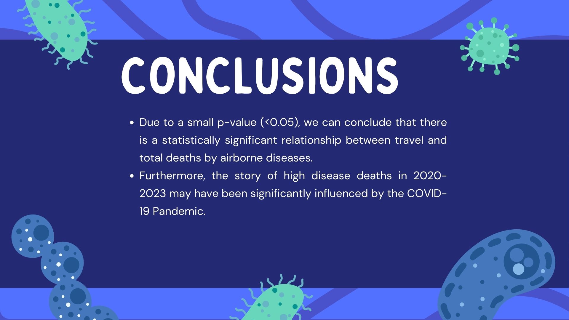
- Travel is highly correlated with deaths due to airborne diseases. Thus, we need to take greater precautions in travel.
- We should explore this dataset alongside additional variables such as: travel restriction lifts by state, mask mandates by state, and other public policies and their timelines that may have affected infection during travel; infection rates of airborne diseases; and public consensus on vaccinations and masks by region.


Log in or sign up for Devpost to join the conversation.