-
-
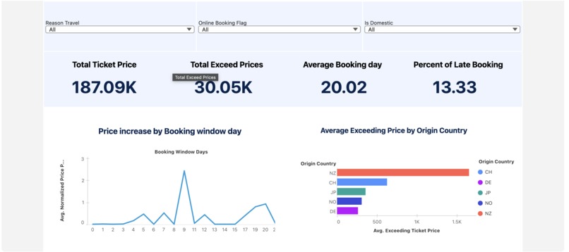
Visualization for the submission

Inspiration
Airline business has been a prevalence business for a while even since the airplane could be produced commercially. Furthermore, we know that when the customer wants to travel with the plane, there is a huge gap for the price they could pay when the booking is closer to the deadline (for instance, the business trip). However, despite how good the dynamic pricing the business has, there is always a space for the improved price. In this project, we want to show how much loss the business has and the group split of what the cause of the loss are
What it does
This project displays the data related to the price of the airplane ticket and the possible loss from the airline business
How we built it
We use the Tableau Next from the Salesforce provider to create a dashboard that could display the data
Challenges we ran into
Since this project is worked on by a single person, and also one without any experience on the tableau, this project has a high learning curve before the start in terms of how to process the data and how to make a good data from the source.
Accomplishments that we're proud of
Finishing the dashboard and succeed in connecting data with the dashboard.
What we learned
I have learned how to work with Tableau for the first time, which expands my knowledge of Data Visualization
What's next for Sky Saver
The next step would be to combine several data sources together in order to create a more meaningful data from the airline business. For instance, the location of the airlines which could be applied for the

Log in or sign up for Devpost to join the conversation.