-
-

icon
-
shipaton_thumbnail
-
shipaton_screenshot_2
-
shipaton_screenshot_3
-
shipaton_screenshot_1
-
shipaton_screenshot_4
-
shipaton_screenshot_5


Inspiration
I have sensitive skin, and even products labeled "for sensitive skin" often gave me breakouts. Like most people, I chose skincare on review sites, checking for ingredients I thought suited me and for good reviews. It kept failing, and I wanted to understand why.
What users taught us
My first idea was an ingredient checker: learn which ingredients suit you and avoid the rest. Interviews with people who struggle to find skincare changed that.
- Ingredients matter, but "ingredients alone don't tell me anything, and I wouldn't decide on that."
- Nobody kept records for themselves. Instead, they actively read other people's reviews to avoid failures and feel safe buying.
Asking "why rely on reviews when other people's skin is different from yours?" led to the real problem: people don't understand their own skin. There is no way to collect and compare past experiences, only memory, so nobody develops their own criteria for choosing products.
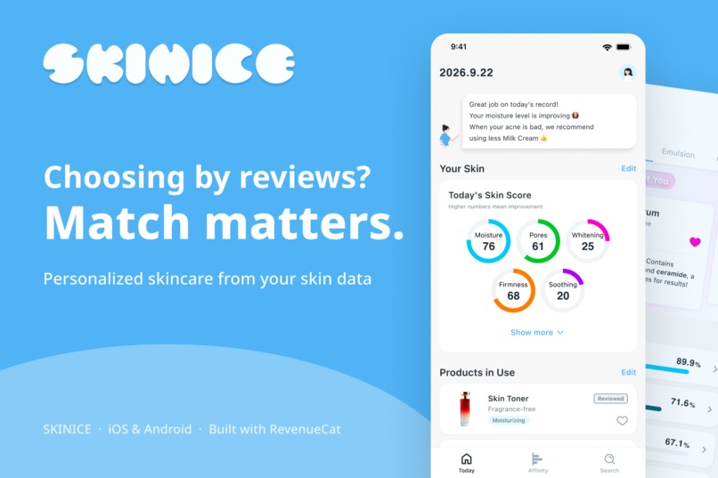
So Skinice is not an ingredient lookup tool. It is a personal experience that helps you grow your own criteria by learning your skin's patterns.
What it does
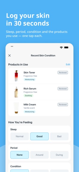
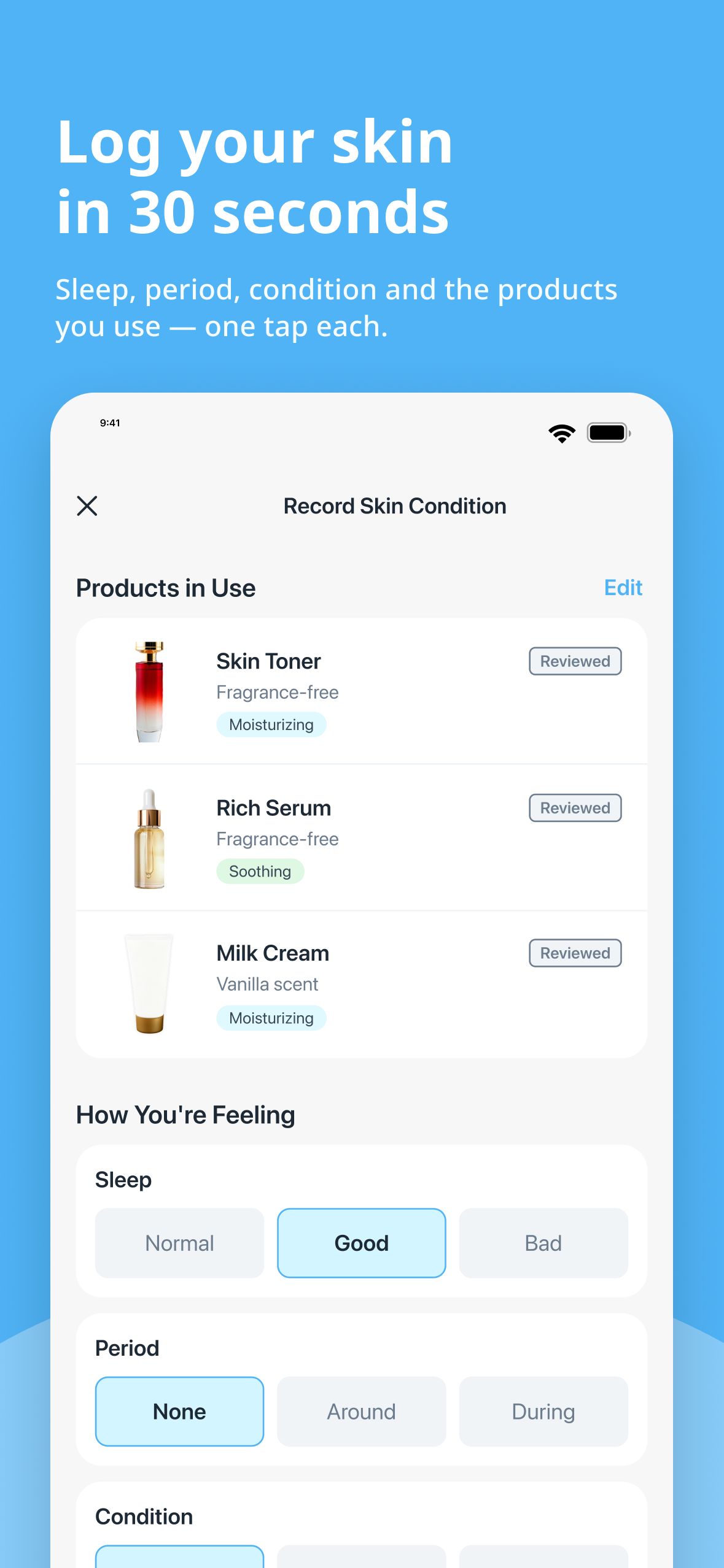
- Log in about 30 seconds: sleep, period, condition and stress are one-tap choices, next to the products you used and your rating of them.
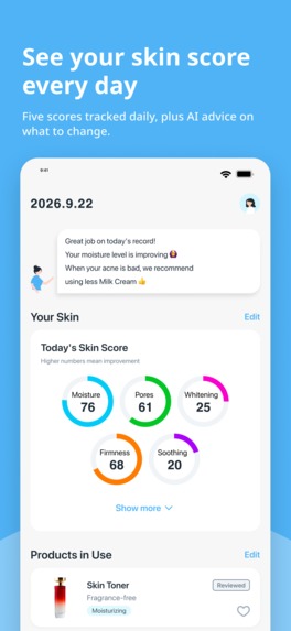
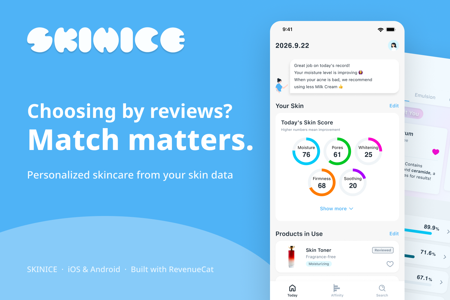
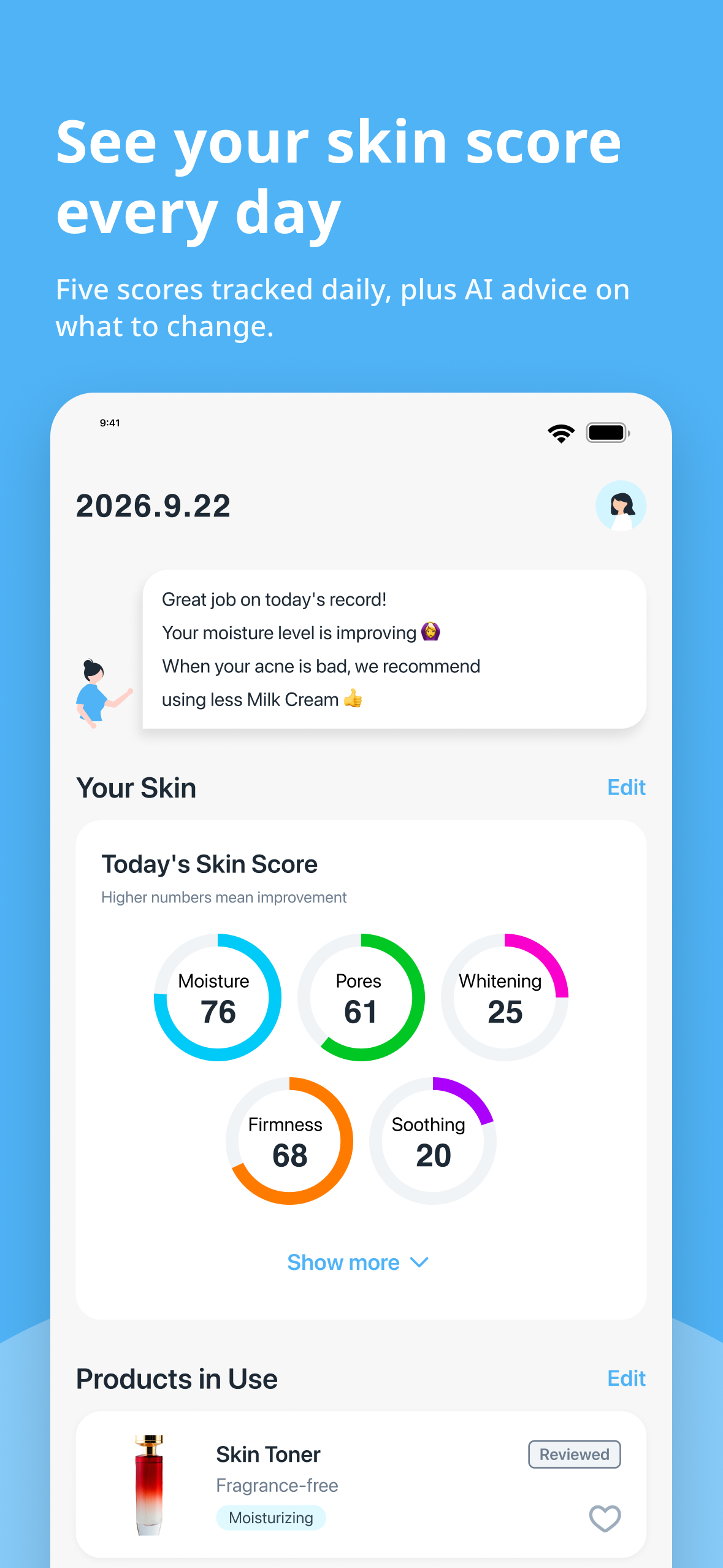
- See your skin as numbers: daily scores for Moisture, Pores, Whitening, Firmness and Soothing, plus a short coach message with one next step.
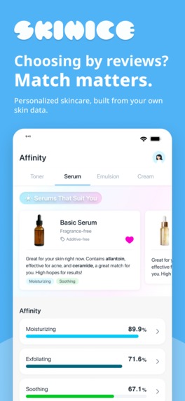
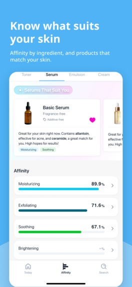
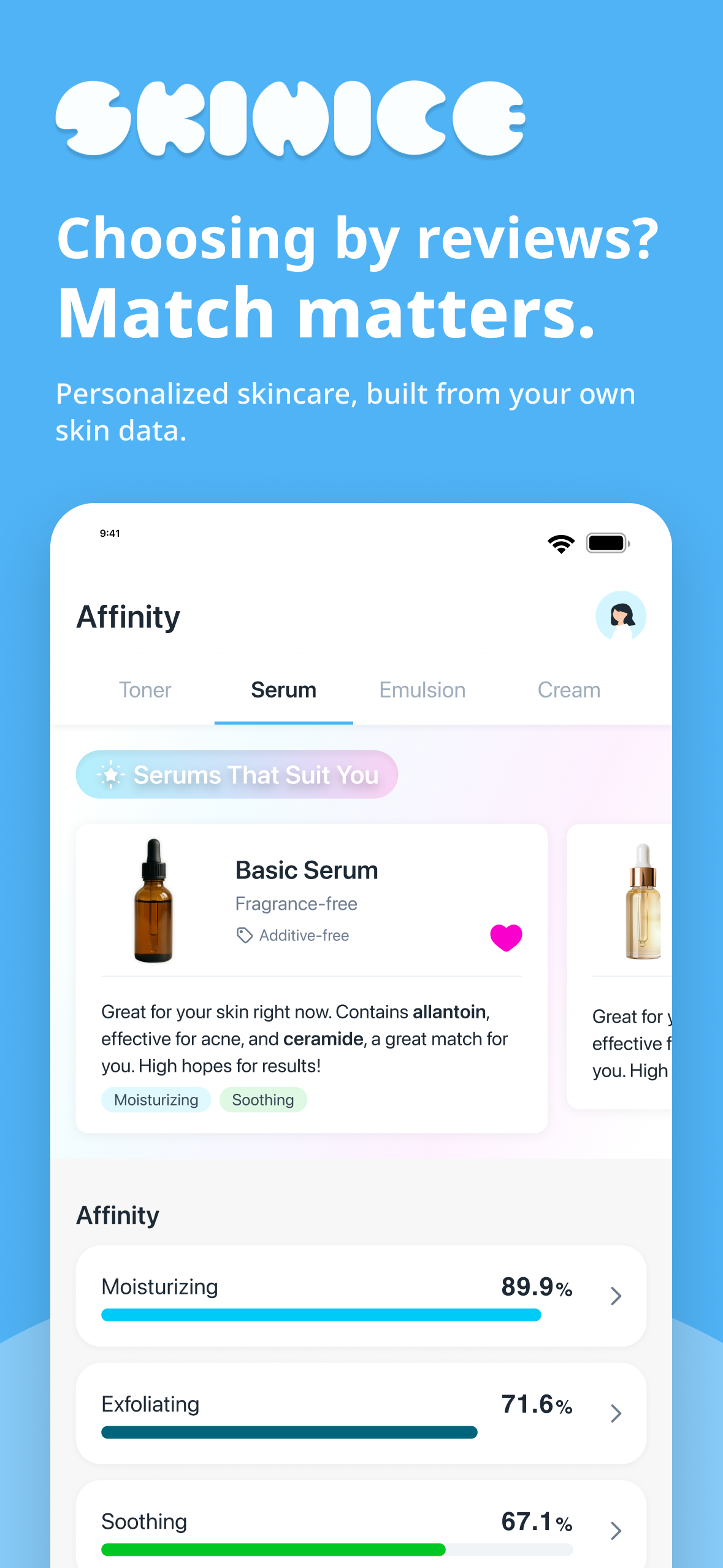
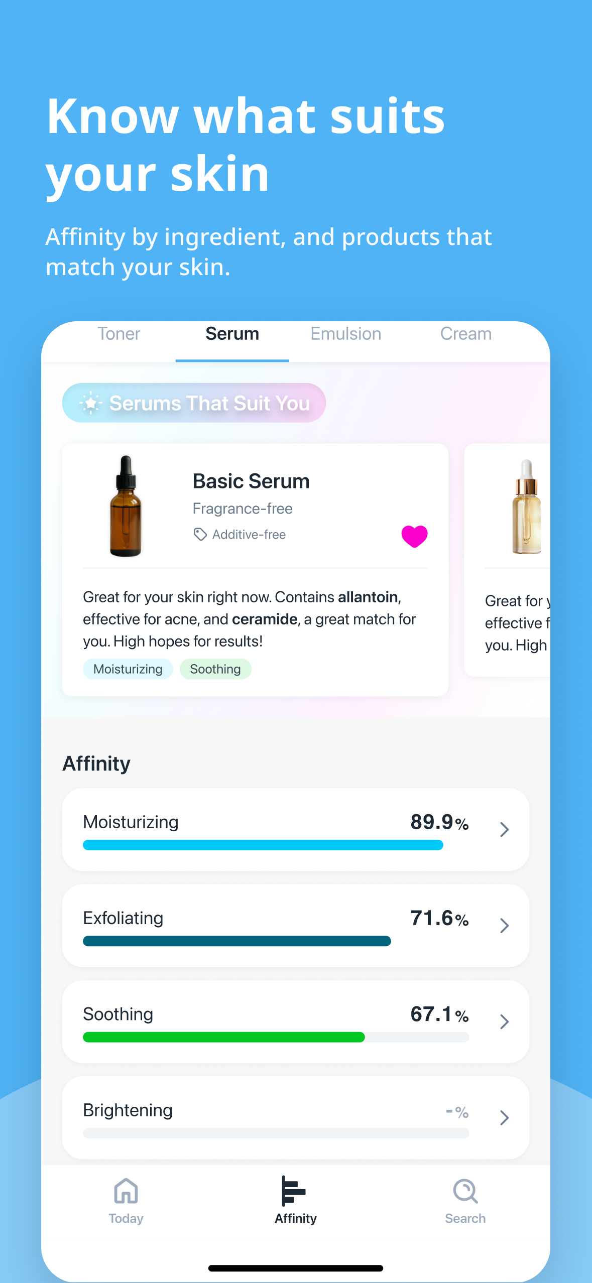
- Affinity: match scores by product type (toner, serum, emulsion, cream), always with a plain-language reason.
- Recommendations: your tendencies and products that are likely to suit your skin.
Who it's for: people with sensitive or acne-prone skin, and anyone tired of choosing skincare by guesswork.
How we make money
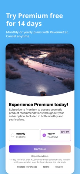
Logging and your skin history are free. Skinice Premium unlocks personalized recommendations and affinity insights: Monthly ¥480 or Yearly ¥3,900 (32% off), both with a 14-day free trial. Subscriptions, trials and the paywall run on RevenueCat.
How we built it
- Research: analyzed how people search and review on popular Japanese skincare review apps, interviewed users, then built a persona and a customer journey map.
- Information architecture: object-oriented UX with four core objects (Cosmetics, Skin, Affinity, Ingredients), each mapped to list and detail screens.
- UI: inspired by self-tracking apps for periods, health and self-care, designed in Figma and refined with user feedback.
- App: Flutter / FastAPI/ AWS
- Monetization: RevenueCat SDK for subscriptions, the 14-day trial and the paywall.
Challenges
- Taking users' words at face value. Comments like "it'd be handy to see how others felt about a product" pointed toward yet another review app, which wouldn't get users to their goal or stand out from existing services. We threw away two prototypes before finding the real need.
What I learned
- Surface-level statements aren't the problem itself. Asking "does this convenience actually lead to the goal?" and "why do they do this?" is what got us to the right product.
- Small words matter. Testers said "Analysis" sounded like a lab, so the tab became "Affinity." They also wanted comments on the products they already use, so we added advice there.
What's next
Begin SNS marketing and acquire users.
Awards we're targeting
HAMM Award · RevenueCat Design Award · RevenueCat Peace Prize
Built With
- amazon-web-services
- claudecode
- codex
- dart
- fastapi
- figma
- flutter
- postgresql
- python
- revenuecat


Log in or sign up for Devpost to join the conversation.