


Our Pitch Deck/Slides :- https://docs.google.com/presentation/d/17ebQrA4Gc2nHcZ0GnaEzsfKVoiVyQ_ap/edit?usp=sharing&ouid=113556770226284689562&rtpof=true&sd=true
Inspiration
I had built three side projects, and they all looked identical. Bootstrap buttons. Material UI cards. Chakra UI forms. The same sterile, corporate aesthetic that screams "I used a template." No matter how unique my ideas were, they all blended into the sea of generic web apps.
The problem isn't just that these libraries exist, it's that they've created a monoculture. Every startup, every side project, every portfolio looks like it came from the same design system. We've optimized for "professional" and lost all personality in the process.
I tried everything, tweaking configs, buying premium kits, hiring designers. Nothing worked because everyone uses the same corporate-looking tools that prioritize polish over personality.
Then I realized: What if we rejected the corporate aesthetic entirely? What if UIs looked hand-drawn; human, imperfect, memorable? What if they looked like something you'd sketch in a notebook instead of a boardroom?
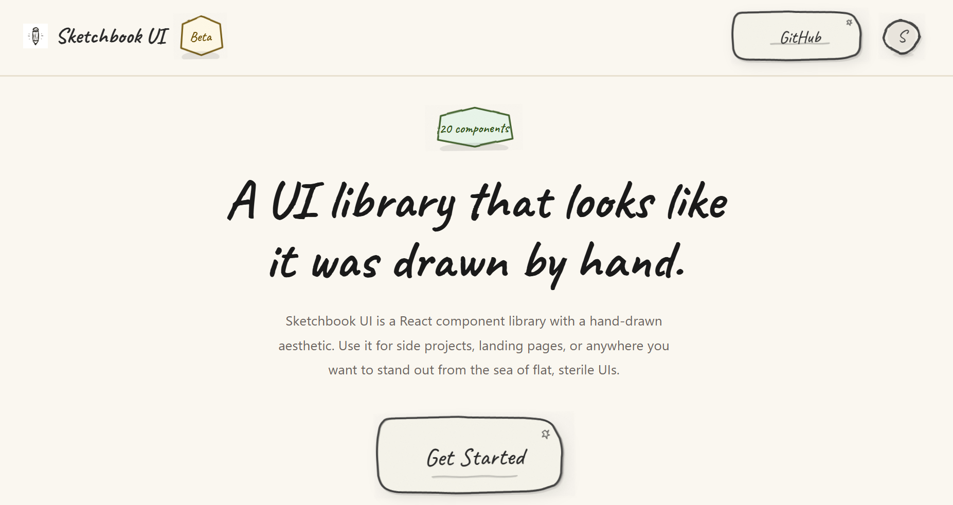
That's when Sketchbook UI was born, a rebellion against sterile, corporate design. A way for indie developers, students, and small teams to build interfaces that feel fresh, human, and alive. This is for every underdog whose brilliant ideas get dismissed because they "look like every other SaaS product."
What it does
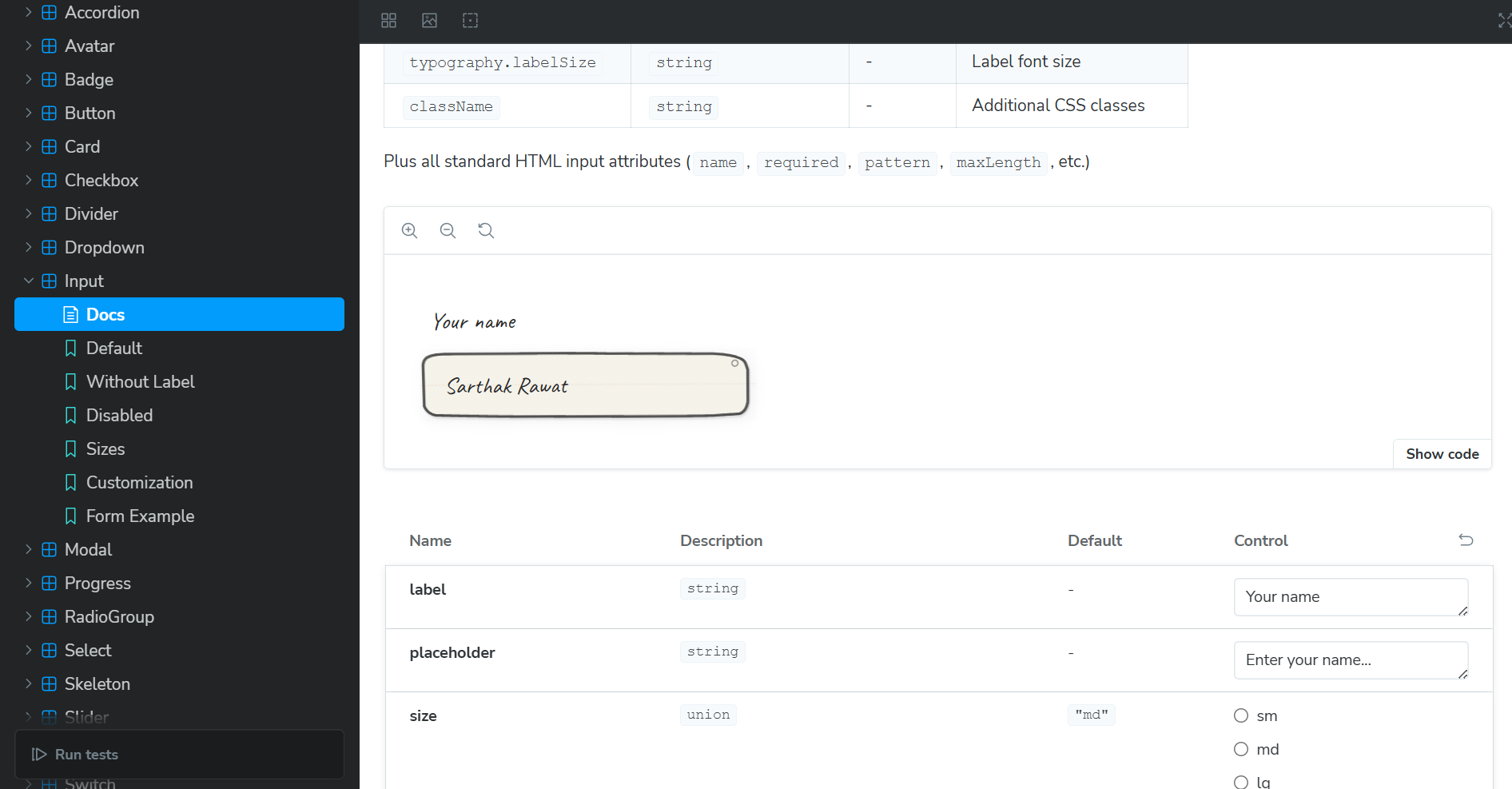
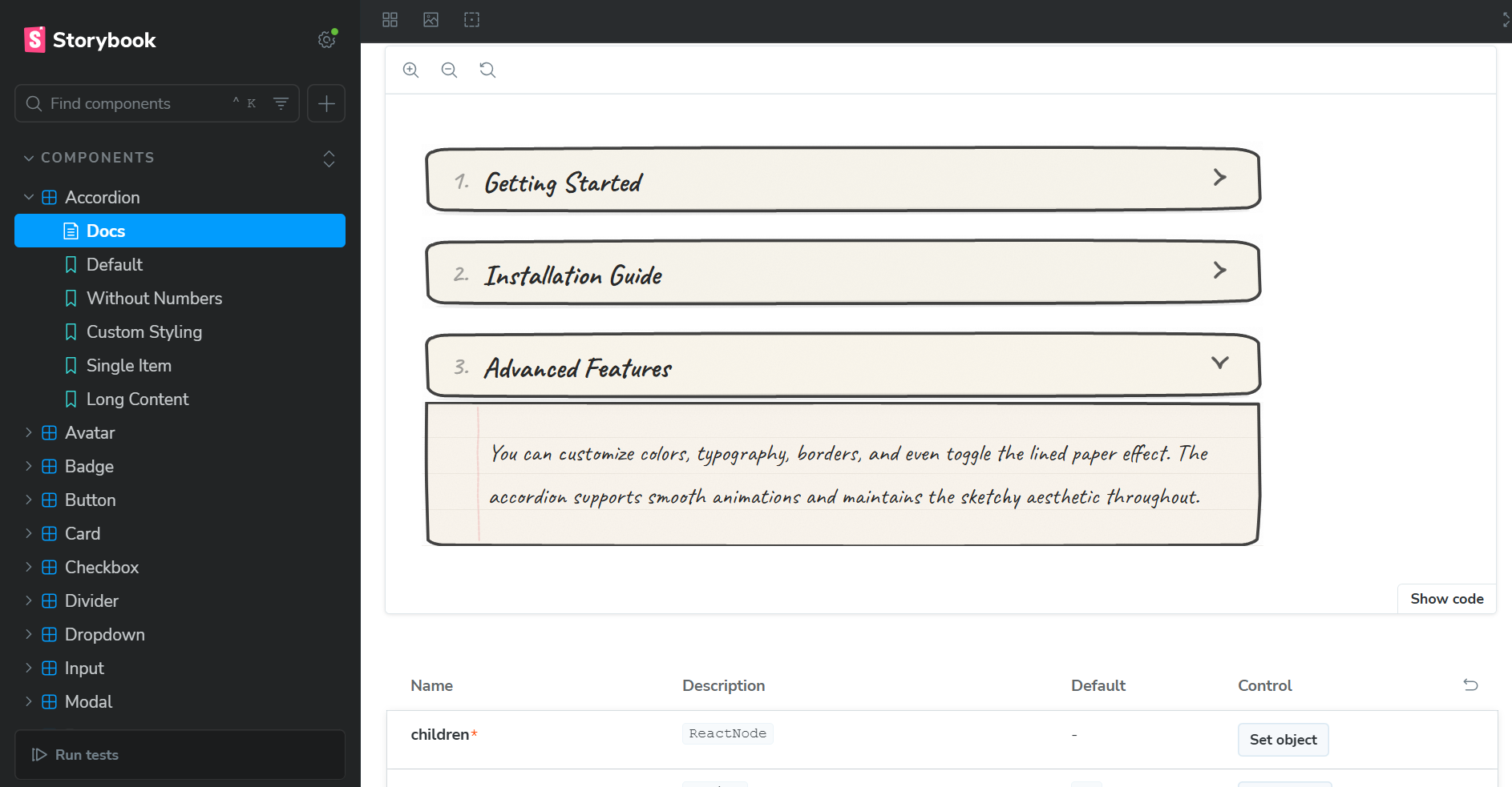
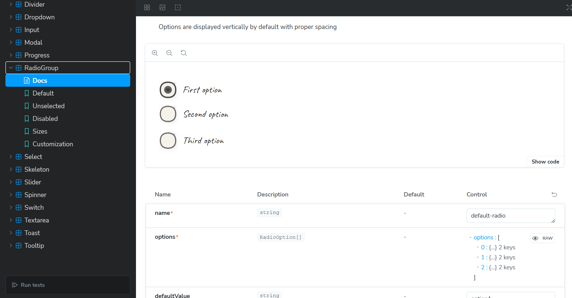
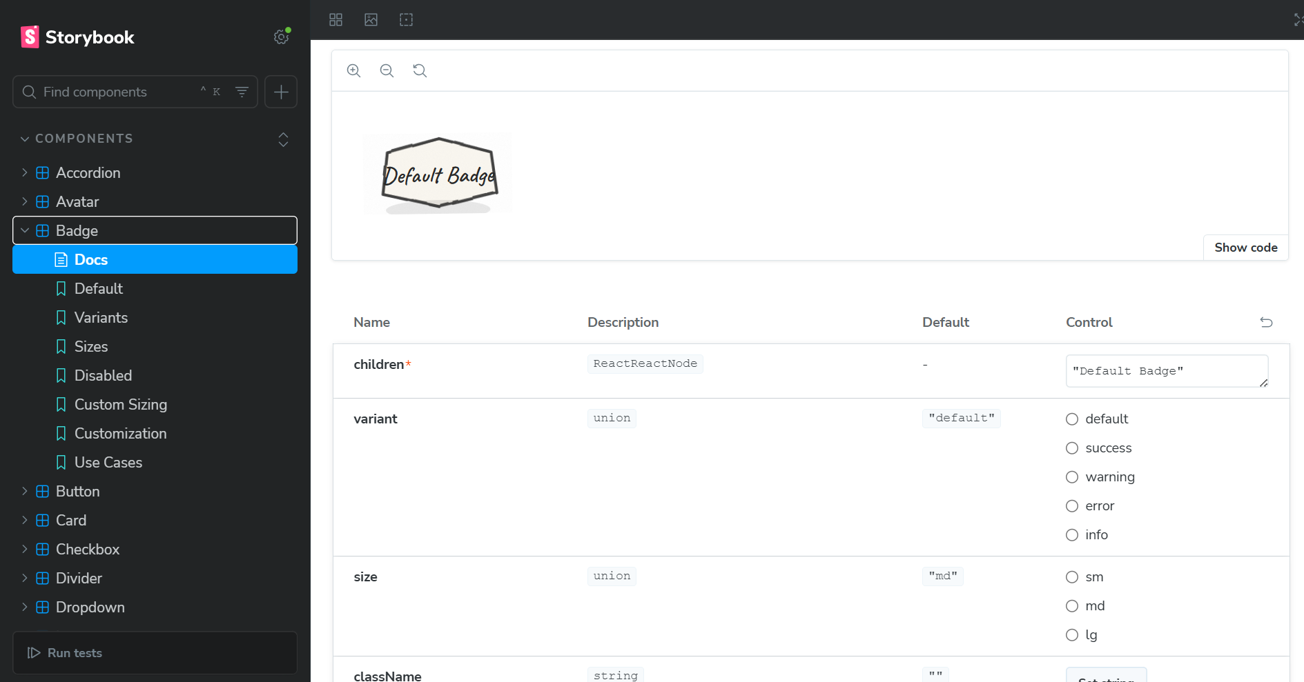
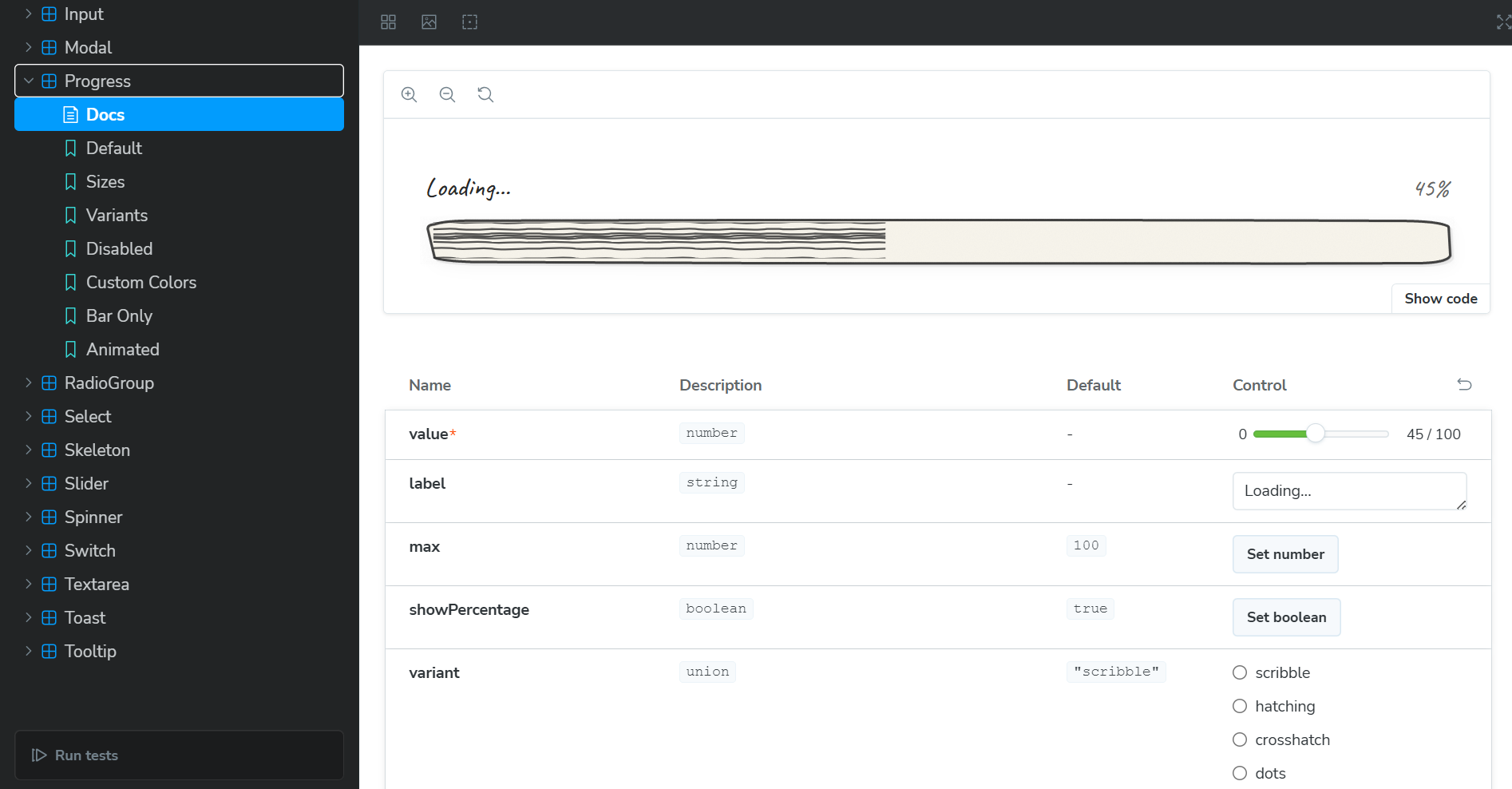
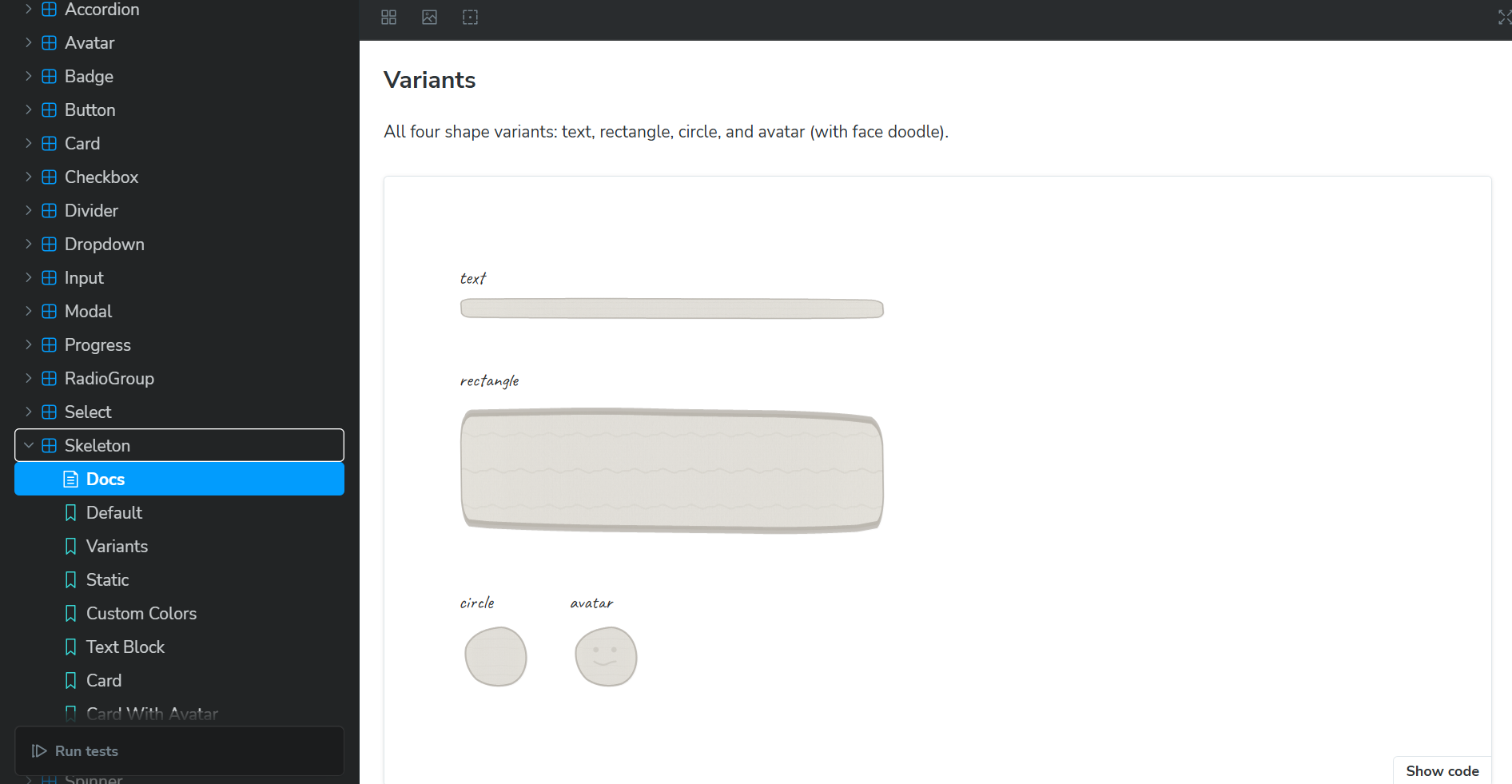
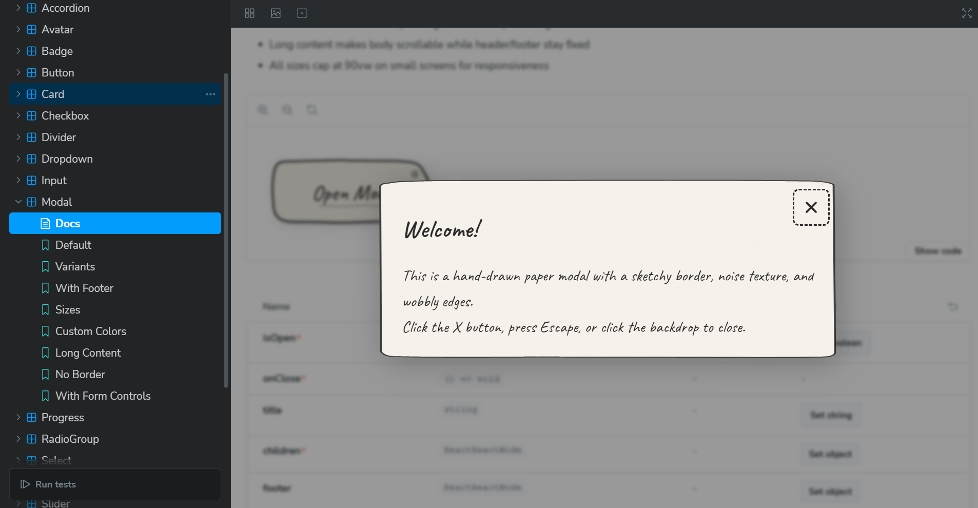
Sketchbook UI is a React component library that breaks free from corporate design language. Instead of sterile, polished interfaces, it creates hand-drawn, human-feeling UIs that look like they were sketched in a notebook.
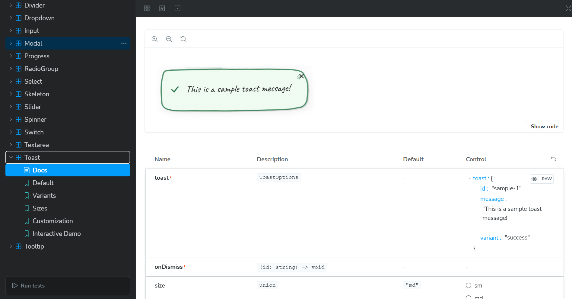
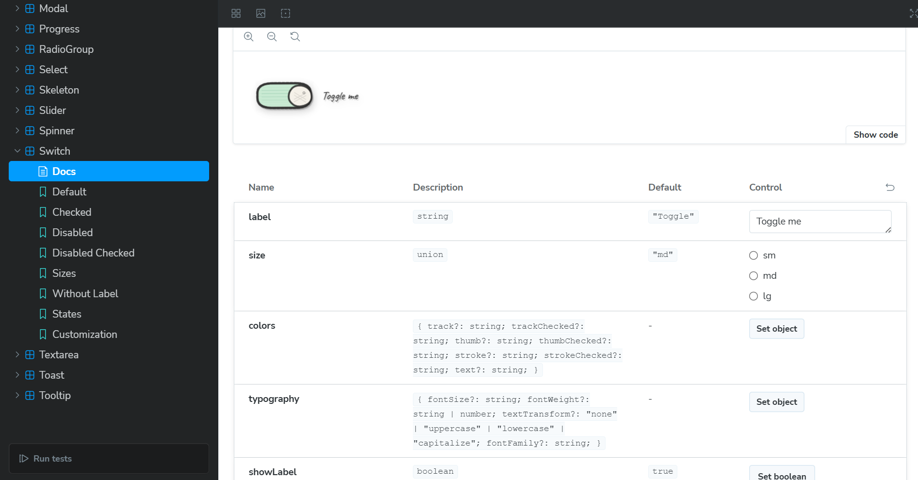
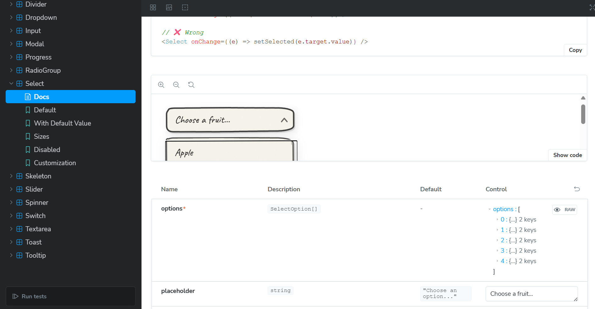
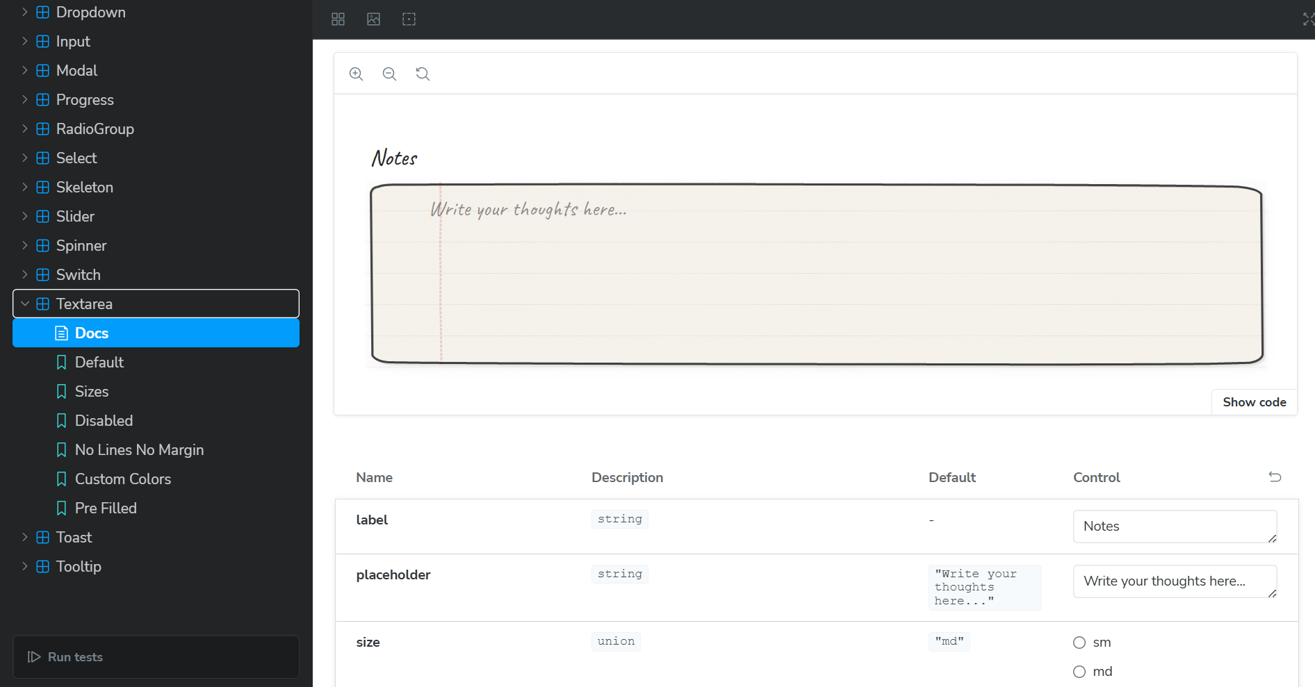
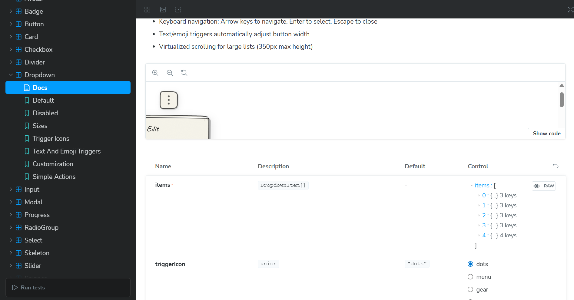
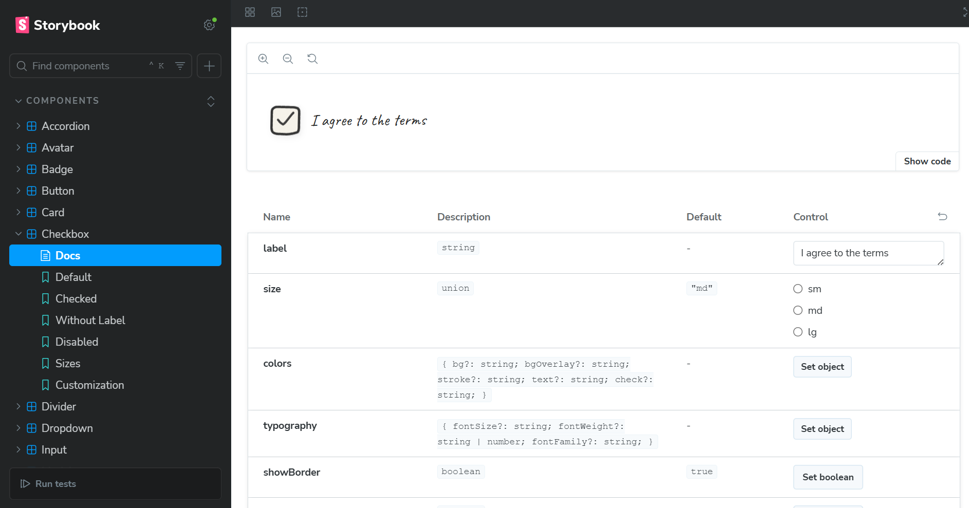
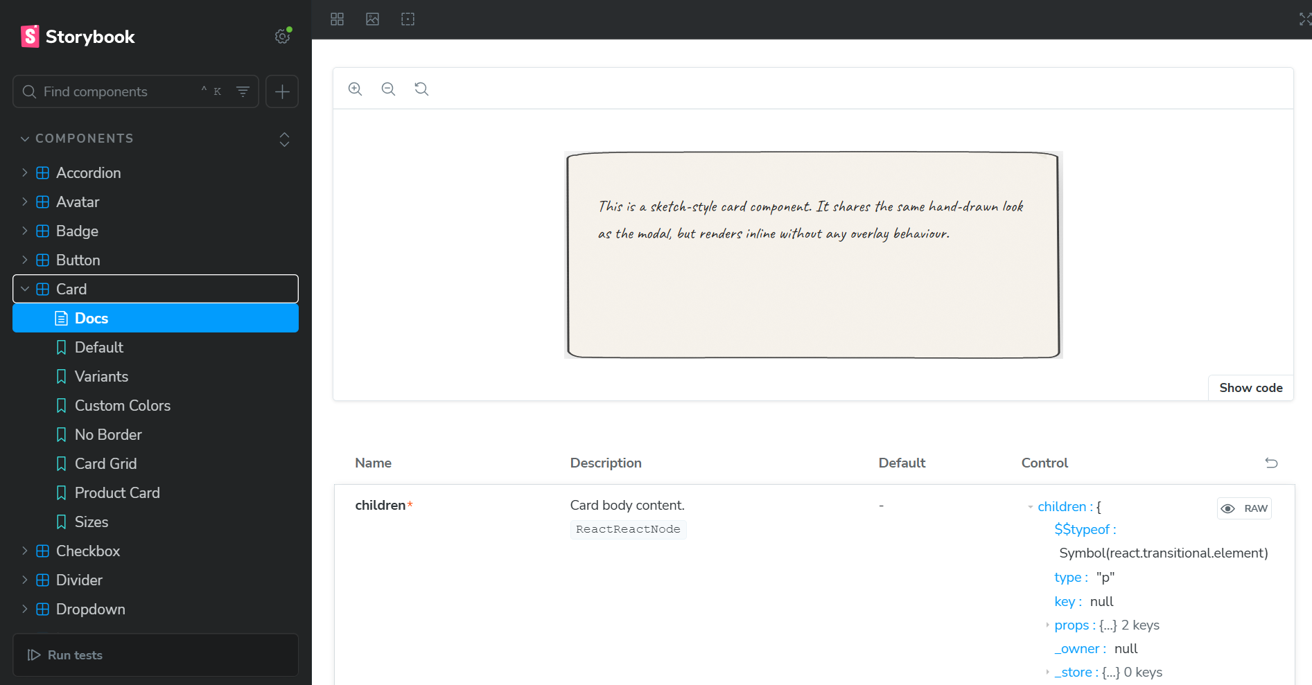
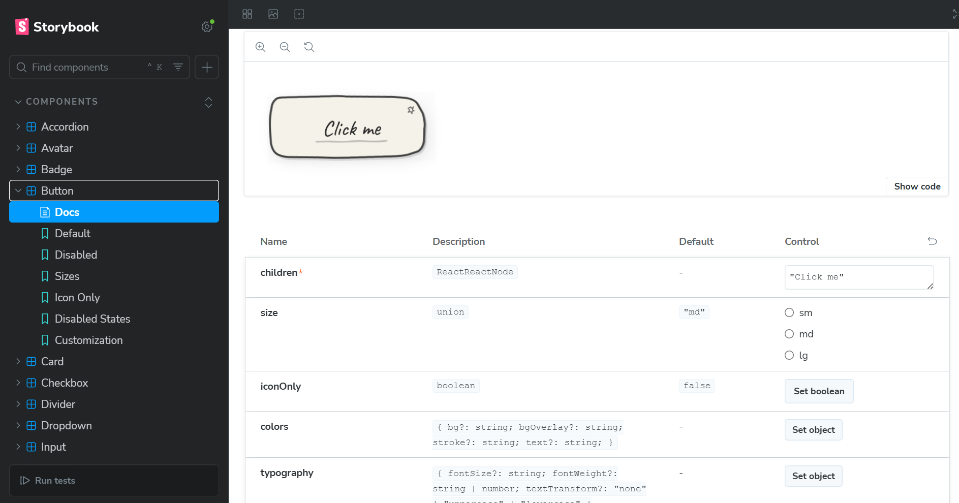
20 Production-Ready Components: Button, Input, Modal, Toast, Accordion, Select, Slider, and more, everything you need to build a complete interface that doesn't look like every other SaaS product.
What Makes It Different:
- Human, Not Corporate: Wobbly borders, paper textures, organic shapes—embracing imperfection instead of pixel-perfect polish
- Fresh Aesthetic: A complete departure from Material Design, Ant Design, and every other corporate design system
- Authentic Hand-Drawn Look: SVG-based rendering with Bézier curves, not just a different font on the same old components
- Fully Customizable: Override colors, fonts, and styles while keeping the human-centered aesthetic
- TypeScript-First: Complete type definitions for perfect IDE autocomplete
- Accessible: Keyboard navigation, ARIA attributes, screen reader support—personality doesn't mean exclusion
- Zero Dependencies: Just React + two tiny utilities. Tree-shakeable and performant.
npm install sketchbook-ui
import { Button, Card } from 'sketchbook-ui';
Target Audience: 10M+ React developers tired of corporate design language—indie hackers building memorable products, students creating standout portfolios, startups wanting to look different from every other startup.
How we built it
Tech Stack: React, TypeScript, Vite, Storybook, with zero runtime dependencies beyond React.
The Architecture:
Sketch Primitives System: Reusable components (
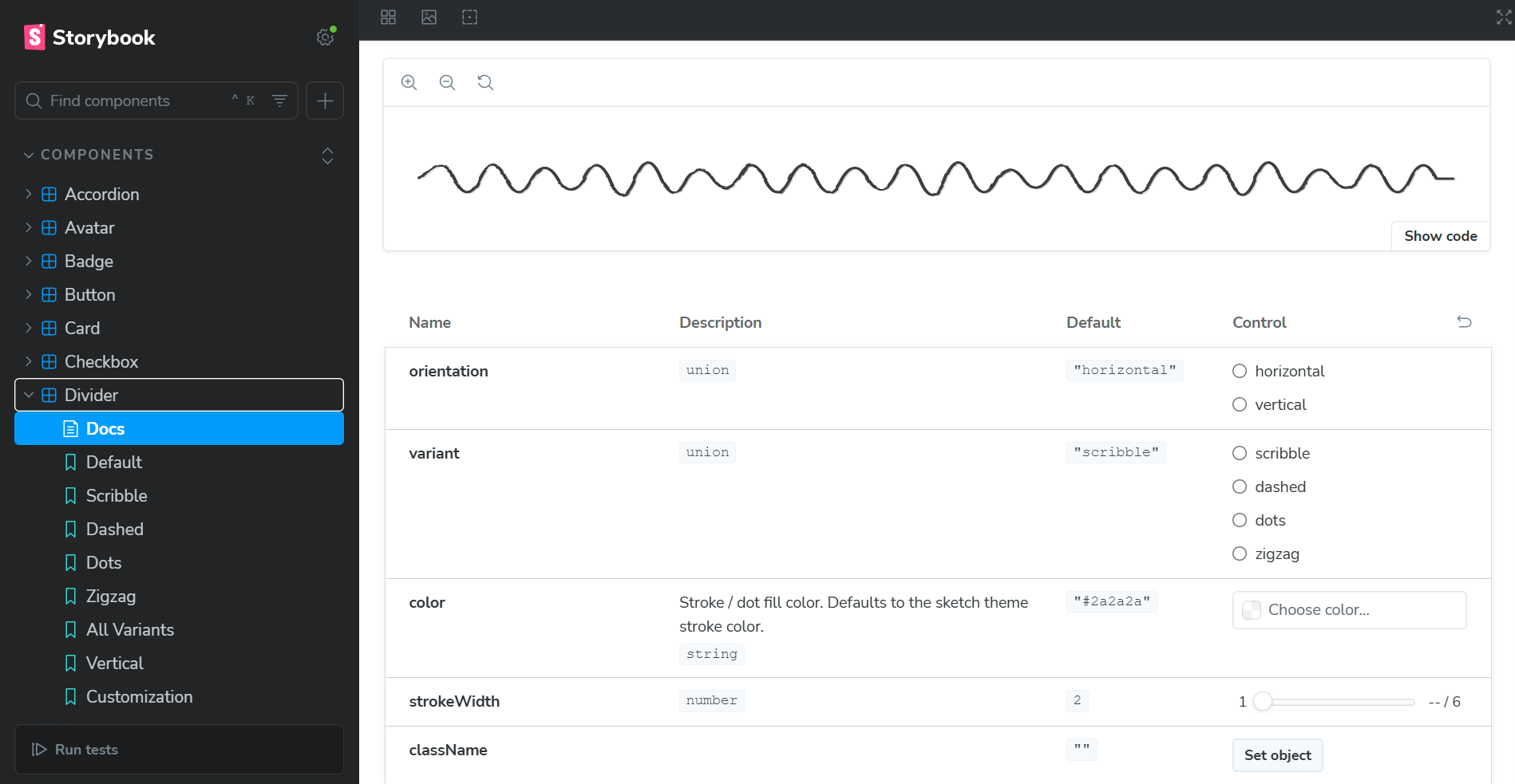
SketchProvider,SketchPaper,SketchBorder) that create the hand-drawn aesthetic using SVG filters and noise patterns.SVG-Based Rendering: Every component uses hand-crafted SVG paths with Bézier curves for wobbly, organic shapes. Paths are proportional (using percentages), so they scale perfectly with content.
Dynamic Sizing: Custom
useSketchSizehook with ResizeObserver makes components responsive—buttons grow with text, inputs expand with content.Advanced Features:
- Virtual scrolling for performance
- Custom keyboard navigation hooks
- Global toast system without external state management
- Portal rendering for modals
Development Process: Built 5+ versions of each component, tested with 20+ developers, created 60+ Storybook stories, and implemented comprehensive accessibility features.
Challenges we ran into
1. Making SVG Paths Scale Dynamically
SVG paths are typically fixed-size, but components need to grow with content. Solution: Proportional path system where coordinates are percentages + custom ResizeObserver hook for real-time recalculation.
2. Achieving Authentic Hand-Drawn Aesthetics
Most "hand-drawn" UIs just use handwriting fonts on top of the same corporate component structure. That's not enough, it still feels digital and sterile. I studied real notebook sketches and implemented: Bézier curves for wobbly lines, dual-stroke technique for varying thickness, SVG turbulence for paper texture, and displacement filters for irregularity. The goal was to create something that feels genuinely human, not corporate design cosplaying as hand-drawn.
3. Performance with Complex SVG Filters
SVG filters are computationally expensive. Solution: Shared filters in SketchProvider, virtual scrolling for lists, and reduced filter complexity where users wouldn't notice the difference.
4. Accessibility Without Compromising Aesthetics
Built semantic HTML underneath SVG decorations, implemented ARIA attributes, custom keyboard navigation hooks, and tested with screen readers. Accessibility and aesthetics are partners, not enemies.
5. Building a Toast System Without Dependencies
Created a lightweight global state system using JavaScript closures and React hooks—no Redux or Zustand needed. Sometimes the best solution is understanding fundamentals and building exactly what you need.
Accomplishments that we're proud of
- 20 Production-Ready Components that completely reject corporate design language—with full TypeScript support and zero runtime dependencies
- A New Aesthetic Category: Created something that doesn't exist in the React ecosystem—a human-centered alternative to corporate design systems
- Comprehensive Documentation: 60+ Storybook stories covering every variant and edge case
- Accessibility First: Keyboard navigation, ARIA attributes, and screen reader support—proving that fresh, human design doesn't mean sacrificing accessibility
- Advanced Features: Virtual scrolling, dynamic sizing, global toast system, portal rendering
- Authentic Design: Not corporate design with a handwriting font—genuine wobbly borders, paper textures, and organic shapes using advanced SVG techniques
- Built Alone: Every line of code, every SVG path, every component—100% my work
- Shipped a Real Product: Not a tutorial project—a production-ready library developers can actually use
Most importantly: I built an alternative to the corporate design monoculture. There are hundreds of component libraries, but they all look the same—polished, sterile, corporate. Sketchbook UI proves you can build something fresh, human, and memorable without compromising on accessibility, performance, or code quality.
What we learned
Technical Skills:
- SVG is incredibly powerful—it's a complete graphics system capable of any visual effect
- Performance optimization is about smart trade-offs, not perfection
- TypeScript's upfront cost pays dividends in developer experience
- Accessibility must be built in from the start, not retrofitted
- Documentation is as important as code
Design Principles:
- Constraints breed creativity—rejecting corporate aesthetics forced me to rethink every interaction
- Consistency is key—shared primitives ensure visual harmony without feeling corporate
- Details matter—subtle rotations, textures, and wobbles create human feeling
- Less is more—20 great components beat 30 mediocre ones
- Imperfection is beautiful—embracing wobbles and irregularity instead of pixel-perfect polish
Business Insights:
- Solve your own problems—the best products come from scratching your own itch
- Niche down—compete on personality and human design, not corporate polish
- There's a market for alternatives to corporate design language
- Open source can be both generous and profitable
- Community feedback is invaluable
Personal Growth:
- I can build complex things, six months ago, I didn't know SVG filters. Now I've built an entire design system.
- Perfectionism is the enemy, ship and iterate based on real feedback
- Asking for help isn't weakness, it's smart
What's next for Sketchbook UI
Short-Term
- 6 more components (Tabs, Breadcrumbs, Pagination, Date Picker, File Upload, Data Table)
- Dark mode and pre-built themes (Blueprint, Sticky Note, Graph Paper)
- Video tutorials and migration guides
Medium-Term
- Figma plugin and VS Code extension
- Community contributor program
Why This Matters:
Sketchbook UI isn't just about pretty interfaces. It's about breaking the corporate design monoculture that makes every app look the same. It's about democratizing fresh, human design for developers who can't afford expensive custom design. It's about proving that you can stand out, feel human, and still be accessible and performant.
Every indie developer who launches with Sketchbook UI is one less person whose brilliant idea gets dismissed because it "looks like every other SaaS product." Every student who builds with it creates a portfolio that actually stands out. Every startup that uses it proves you don't need to look corporate to be taken seriously.
Built With
- react
- storybook
- tailwindcss
- typescript

Log in or sign up for Devpost to join the conversation.